William Mark Sommer
In 1999, Ed Templeton released his first book, Teenage Smokers. The book was a simple design of 30 photographs and 3 illustrations with a small forward by Aurelie Voltz, and an Interview by Jerome Sans. The book was just made for a corresponding photo show at Alleged Gallery, but the show and book took off like a wildfire giving Ed worldwide attention even awarding him $50,000 from the Italian Search For Art competition. From Teenage Smokers he also conceived a direct sequel to the book Teenage Smokers 2, released 2015 by Super Labo, and a sister project Teenage Kissers in 2011 that was produced by Seems. Teenage Smokers has gone on to becoming a classic photo book that has been referenced by many artist and even talked about in Martin Parr and Gerry Badger's "The Photobook: A History Volume III" being called a, “brand new, most handsome example of this contemporary classic.”
Ed Templeton is an artist photographer residing and from Huntington Beach California. Ed’s creation started when he first picked up skateboarding and got into punk music. Pursuing a professional career in skateboarding, he was surrounded by other creative’s shooting photography, making videos and creating board graphics. Within that time he picked up a camera and started documenting the things he saw, the places he would go, and every intimate detail of his life. Though Ed has no formal training in art being surrounded by the likes of Jason Lee, Mark Gonzalez and many other artistic skateboarders, he gained an education most of us could only dream of. Ed started exhibiting his work in 1993, and eventually gained a world following even more than his skateboarding career.
Ed as a creative in book arts has been challenging the way photography is shown in the book form. Ed has a created over 44 books and zines ranging from simple zerox folio, accordion books, to classic perfect bound books that showcase his works in these diverse monographs. More than just the structure of the book, Ed brings a different life to his work by utilizing many different layouts from photos in a collage form, sometimes applying pull out pages, to full layouts of exhibitions with drawings and his hand written type giving a new narrative to the work than the simplicity of single photos. These different methods of structures and layouts help to give his work an even more personal touch and diverge his photographs from the traditional way of showing photos in the book form.
Though Ed Templeton was not the first to many of the methods used in his photo books he has really innovated the whole field of with his ways of stepping beyond the traditional photo book. Traditional photo books have stayed fairly formulaic to the white page on the left photo on the right, until Ed Rusche created his Twentysix Gasoline Stations, this book helped usher a Renaissance to book making all together, but also gave artist like Ed Templeton a new way to experiment with the form. Being close to the punk rock zine creators of the 80s- 90s Ed and many of his contemporary’s have used the ideals of Rusche to make photo books more affordable mass produced art work. This way of creating books has made it more available for people like myself to own a work of art like theirs.
Photos courtesy of :
http://ed-templeton.com/ Information found on: http://ed-templeton.com/ https://en.wikipedia.org/wiki/Ed_Templeton https://www.huckmag.com/topics/ed-templeton/ Thrill of it all podcast: https://www.youtube.com/watch?v=R51VaxuKchI Epicly Laterd: https://www.youtube.com/watch?v=_Hei3ti0G3k Video By: Gracious Living by Lucas Chemotti, https://www.youtube.com/watch?v=wlK43Tz8KSY Matthew Jessie The world of photo books is changing. Over the past several years a shift has occurred from viewing a photo book as simply a vessel for photographs to be displayed to the idea of a photo book not only functioning as a vessel, but also as a complete object that balances the importance of its contained images with concerns more associated with artist’s books. This is in part due to technological advances within printing that have allowed smaller publishers to not only break through the larger market, but to also reshape it. This newer trend in photo book publishing now allows small publishers to focus more on the photo book as an object, creating both large and small editions of beautiful book-objects. Roma Publications is a small photo book publisher based in the Netherlands. They describe themselves on their website by saying,” Roma Publications is an Amsterdam based art publisher, founded in 1998 by graphic designer Roger Willems, and artists Mark Manders and Marc Nagtzaam. It is used as a platform to produce and distribute autonomous publications made in close collaboration with a growing number of artists, institutions, writers and designers. Related to the content, every issue has its own rule of appearance and distribution, varying from house to house papers to exclusive books. The publications so far are in editions between 2 and 150,000 copies. Occasionally, Roma also curates exhibitions.” I initially learned of Roma Publications through their working with Belgian photographer Geert Goiris. His work and subsequent book Proliferation from 2014 is described by the publisher as,” Published to coincide with the exhibition of a series of photographs by Geert Goiris at the Mauvoisin Dam (Valais, Switzerland), this sublime series of 30 images suggests a timelessness and contained restlessness through its potential narratives of place and collective memory. Labyrinthine trees, strange rock formations, contemplative figures, man-made objects and wide mountain landscapes work together to instill a sense of serenity on the observer, yet one that evokes a certain tension, a primal longing generated by the environments Goiris portrays.” The book helps to convey narrative through its attention to such ideas as sequencing, image layout, variety of treatment, conceptual consideration, and its beauty as a book-object. As opposed to exhibitions of the work, the book form helps to accentuate the feeling of being lead on a journey through what could be seen as incoherent places and subject matter, but by being constrained to seeing only one to two images at a time and in a very specific sequence, the images are unified, offering a sort of juxtaposition of fact and fiction. Something I really appreciate about this book is that it initially offers only images, allowing the viewer space to formulate their own interpretations of the work, but at the end is an essay as well as an index of all included images with titles and Goiris’ own descriptions of various lengths. Published in a small edition of three hundred and including a signed Lambda print, Proliferation has been out of print since I first learned of it a few years ago. Initially valued at around sixty-two US dollars, the few remaining new copies being sold on the Internet now fetch upwards of four hundred. Below are selected spreads from within the book, the included Lambda print, and a view of Goiris' exhibition of Proliferation at the Mauvoisin Dam in Valais, Switzerland. Jonathan R. Wright In a low relief, or bas-relief (basso-relievo), the design projects only slightly from the ground and there is little or no undercutting of outlines. * The project I wanted dot research was low relief sculpting. The first time I saw a sculpture from it was from some image’s heather showed up in class and I physically saw one of the here samples/test she did at a workshop. That was a about 2 years ago. The topic came back around this semester in her advance book art class. That’s when I knew I was interested in low relief sculpture after she gave us a in class demo. So, I decided to try it out myself. I got a chance to interviewed Tom Balbo a Cleveland native papermaking, ceramics artist and he answered some of my questions to help me get a full understanding on how to sculpt in low relief. Here the conversation: Interview with Tom Balbo: Jonathan Wright: What are they best materials to use for low relief sculpting? Tom Balbo: Cast Ceramics bisque wear, recycled materials, plastics materials, plaster made sculptures, build up sculptures with the laser cutter TB: Avoid glass, raw metals, anything that can oxidizes, raw wood unless it’s really well sealed. JW: What are the best fibers to use for low relief? TB: Cotton with a light beating (1hour), flaxseed, Kozo if you want to go the sculpture route. JW: What are some of the challenges when making low relief sculptures? TB: Make sure it doesn’t have a lot of underbite, don’t over beat fibers it will shrink more. Dry the back of the couched paper. Watch as it slightly damping. weigh it down but not too much weight. Wait a couple of days after you taken off, because paper tend to move or expand if its slightly dampened. Vacuum table I normally empty tank after 1 or 2 casting. Basically, trail and era JW: Who taught you have to make low relief sculptures? TB: I taught myself with low relief, ceramics major casting in plasters mould, and experimenting. Light beating for sculpting compared to the beating for sheets. I failed on my 1st attempt at the low relief sculptures, but with the help of Tom Balbo and Heather Green I can make a better sculpture. Sources:
* https://www.britannica.com/art/relief-sculpture#ref161320 image(s) courtsey of: https://www.quora.com/What-is-the-difference-between-low-relief-and-high-relief-sculpture other images by Jonathan Wright Interview with Tom Balbo 11/12/18 Tom Balbo website: http://www.balbogalleries.com/ By: Elizabeth Z Pineda “My interest is interlinearity, this ‘in-between’, the portion of knowledge and the world that we ignore or omit, or consider negative space — the pause in a sentence, the gesture before the act, the twilight between two portions of the day.” Robbin Ami Silverberg Robbin Amy Silverberg is an artist working in Papermaking, Book Arts, and Installation art. Silverberg is the founding director of Dobbin Mill and Dobbin Books, a hand-made papermaking studio and a collaborative studio working in artists books, respectively. Silverberg has been an instructor for papermaking/artist books at the Center for Book Arts, NYC since 1986, and is Associate Professor for “Art of the Book” at Pratt Art Institute, NYC since 2002.[i]She has published extensively and her work has been exhibited in numerous countries around the world. Dobbin Books publishes 5-10 editions of small artist books yearly. They are either collaborations with artists and/or writers from other countries, as well as from the US and/or solo works by Silverberg. Conceptually her work focuses on thought and analysis of words and the function of inserted text in lines already written and or printed. This use of text is one of the most visually astonishing things in Silverberg’s work. There is a formality created by the constantly repeating words. An incessant voice telling the viewer a story. The narrative is captivating as it is elusive. The text can either be multiplied over and over, wrapped around objects, and or simply be a single word crafted out of hair and embedded in an object. However, this is not the only absorbing part of her work. She places equal attention to the entire process of her craft, beginning with the paper she uses and thinks of its function not only as substrate but as an active part of the work.[ii]This is true whether it is her own book or any other work published at Dobbin Books. They are books which explore a wide scope of themes ranging from issues of identity, memory, loss, life, and death. They are also about women’s issues, their voices, and value. Historical themes dealing with war and the Holocaust, literature, and reflections on the self are also present in her work. These themes are approached in an almost obsessive way, with Silverberg deciding with strict detail on every part of the process, from its design, structure, the materials that will be used in the making of the handmade paper, to the final crafting of the book form. A few titles of books which stood out to me are;Detritus, Home Sweet Home, Proverbial Threads, Testament Patriarch, Dusters, Safer-Code, andJust 30 Words. It was difficult to make selections but I’ve selected these works because I found each moving in a unique way. Detritusis a work about 9/11. The artist states that two weeks after 9/11 she entered “Ground Zero to check if the Ampersand Foundation’s apartment still existed. I walked amongst the abandoned buildings covered in thick layers of dust, with trees covered in paper detritus as if they had genetically altered leaves.I grabbed some of these papers and some handfuls of the powder; much later I made paper with pulp filled with these remains, along with ripped up maps of New York City.” Detritusis a series of five different books in which the artist is trying to understand life in her hometown after the horrific event. Home Sweet Home, Proverbial Threads, and Testament Patriarch are all books that deal with women, how they are viewed, valued, and their perceived roles in society. About Home Sweet Homeshe says that she "'designed' an architectural album of an imaginary middle-class suburban house, filling its plans and layout with the many proverbs I've found about woman in the home.”[iii]Dustersis part of a series of books that was born from the artist’s discovery in Kyoto, Japan of a duster made from a block-printed book. This inspired her to create works in which she is thinking of common objects and how to create text that speaks of the transformation of the object to a book form and the duality which it presents. She has created several works in the form of dusters, dust pans, brushes, hand mirrors, etc. since 1998.[iv]In Safer-Codethe artist cut into a copy of Jonathan Safran Foer’s Tree of Codesillustrating her interest in the “interlinearity” of text, the pause and act of words, the empty space. Just 30 Words is a book with the following description: Postcards have been found that were written by deported Hungarian Jews to their relatives from Auschwitz, dictated by SS officers. Rules for responding correspondence can be found on the front: “Answer only on a postcard, (maximum 30 words), in German via the Hungarian Jewish Association. 12 Sip Street, Budapest, VII.”[v] Silverberg was originally trained as a sculptor in the late 1970’s[vi]and learned bookbinding in Vienna in the early 1980‘s which is when she started making artists books. The way each project is produced and executed vary from one to the other. However, the one thing constant to each work produced by Dobbin Books is the use of the paper made at Dobbin Mill, giving each a unique quality and definitive look to the creation of works by Dobbin Books. [i]Silverberg, Robbin Amy. Web. 02 October, 2018. http://robbinamisilverberg.com/biocv/ [ii]Silverberg, Robbin Amy. Web. 02 October, 2018. http://robbinamisilverberg.com/dobbin-books-dobbin-mill/ [iii]World Catalogue. 12 November, 2018. Web. http://www.worldcat.org/title/home-sweet-home/oclc/122777513 [iv]Silverberg, Robbin Amy. Web. 12 November, 2018. Artist Statement. [v]Silverberg, Robbin Amy. Web. 01 November, 2018. http://robbinamisilverberg.com/artwork/editions/just-30-words-interlineary/ [vi]Andrew, Jason. Walt Street Journal. 11 November, 2018. Web. https://www.wsj.com/articles/SB10001424052748704644404575481781993126388   Duster 2 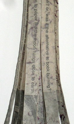 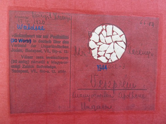 Just 30 Words Merit Eads  Walter Hamady, born in 1940, attended the Cranbrook Academy of Art in Michigan as an undergraduate and founded his own press - The Perishable Press Limited - in 1964. Two years later he established the Shadwell Papermill and began exploring the creation and usage of handmade paper. Since its inauguration, The Perishable Press name is credited with designing and publishing over 131 titles by numerous authors and visual artists(1). I will be discussing one of Hamady’s personal works, the Interminable Gabberjabbs series. I had the opportunity this past week to visit ASU’s Special Collections and take notes on Hamady’s fifth book in the series, For the Hundredth Time Gabberjabb Number Five. (Due to the signing of an honor agreement, I cannot post the pictures I took. These images were found online.) Hamady is an accomplished poet, creating a sense of flow and unusual softness through his use of syntax and embellishment to even the simple prose that follows along the actual poems in the book. What struck me the most about the Gabberjabb series is how Hamady ignores the traditional rules we as readers have come to expect from codex-form books, particularly in his use of structure and language. Hamady’s Gabberjabbs have been described as a game of “Hunt the Footnote”(2), and upon viewing Gabberjabb Number Five(3) I found this to be more true than I could have anticipated. Housed in the second to last page of the book is a library card folder with a small pamphlet-stitched booklet boasting the title “👣NOTES”(4) that serves as an accompanying reading guide. 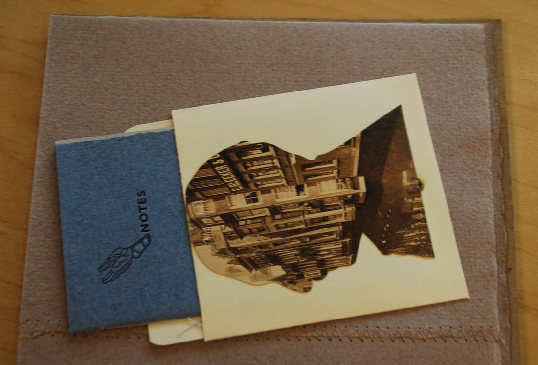 Gabberjab Five(6) contains 43 unique footnotes (numbered from “97²” to “140”, which is followed by a letterpressed STOP sign on the backside of the booklet) sprinkled throughout its text that truly embellish the reading experience. In one hand I held the booklet while with the other I flipped the pages of the book itself. Normally when I read text with footnotes - often academic papers of some kind - I read the whole page first and then view the footnotes second, but this book genuinely might have changed the way I read from now on. Hamady’s wild treasure map of a book structure forces the reader to remember that “[p]leasurable mystery of pre-literacy,”(7) that childhood-like experience of trying to make sense of the mess of symbols in front of us. It was refreshing, and having to think through every page that I read made me appreciate the content and Hamady’s artistic vision all the more.  The other aspect of Hamady’s Gabberjabbs that had me enamored from the beginning was the fact that, in these texts, spelling, punctuation, and capitalization follow the rules of prose at their own leisure. When Hamady mentions meeting the “General Sturgeon,” or over the course of ten footnotes makes the slow change from “Ibid.” to “tit bite,” there’s a sense of playfulness that just makes you smile as you’re reading. His dismissal of textual conventions isn’t solely for humor, though; in an odd way, it emphasizes the very specific emotions that his works manage to convey. Capitalizing several Words in a Phrase makes you take just a moment longer to savor each of them, and ov coarse 2 spell a word rong in th 1st place is a very purposeful statement that affects how you pronounce it in your mind as you read. ‘Incorrect’ text is just as important as ‘correct’ text is when it comes to conveying emotions, personal thoughts, and broad concepts, and Hamady’s Gaggerblab Five truly calls to attention how textual forms can affect the content they choose to portray. I had already been inspired by the few images of Hamady’s works that I could find online and the articles in journals praising his unique bookforms, but after seeing it in person, I’m more awed than ever by how he works and by how successful it really is.
(1) “Walter Hamady.” Wikipedia, 30 July 2018, https://en.wikipedia.org/wiki/Walter_Hamady. Accessed 8 Nov. 2018. (2) Lyndon, Mary. “The Trojan Horse of Art: Walter Hamady, The Perishable Press Limited and ‘Gabberjabbs 1-6’.” Visible Language, vol. 25, iss. 2, 1991, https://search-proquest-com.ezproxy1.lib.asu.edu/docview/1297966346?accountid=4485&rfr_id=info%3Axri%2Fsid%3Aprimo. Accessed 7 Nov. 2018. (3) A shortened form of the full title previously stated, For the Hundredth Time Gabberjabb Number Five, for purposes of readability and, to be quite honest, as an excuse from the author to continue to use the word “Gabberjab” in an academic report. (4) Approximated; in the real book, the ftNode(5) booklet is inscribed with a letterpressed symbol of Hermes’ winged sandal, followed by the word NOTES. (5) [sic] (6) Apologies; another shortened title. For intents of this report, For the Hundredth Time Gabberjabb Number Five will hereafter be referred to by varying versions of its title, including but not limited to Gabberjab Number Five; Gabberjab Five; Walter Hamady’s fifth Gabberjab; Gabberblab Five the Fifth One, etc. At the reader’s discretion, to what I am referring should be instinctive. (7) Lyndon, Mary. Hannah Whitaker Traditional stone lithography is a process of etching and pulling prints off of limestone slabs. The nature of this technique requires many chemicals and special equipment. As a result, this process is expensive and difficult to gain access to. In June 2011, french artist and teacher Émilie Aizier, pseudonym Emilion, invented a non toxic, home alternative to traditional stone lithography and coined the term Kitchen Lithography. The process sticks to the same general science of lithography however it substitutes vegetable oil for lithotine and cola for nitric acid. Through combining Emilie Aizer's research and kitchen lithography demonstrations from different parts of the world I was able to combine steps from each artist's techniques to further develop this non-toxic and accessible lithography process. * Images used in this tutorial are combined from several print attempts, as a result the key image may change form one photo to the next but that is not part of the process. 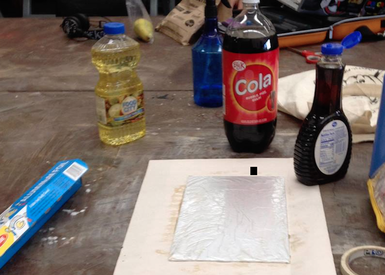 The materials you will need: Aluminum Foil Tape Mono Printing Plate (plexi glass) Cola Pancake Syrup Vegetable Oil A container larger than your plate with no holes Sponge/ Bowl of water Litho Crayons or Sharpie Oil Based Ink Brayer Paper Towels Paper (for print) The First Step: Creating your surface Wrap your mono printing plate in aluminum foil (matte side up) and carefully tape it down to the back of the plate * You must be careful not to leave finger prints on the plate as the grease from your hands may print. * For a smooth surface you can lightly dampen the plate with your sponge before putting down your foil. The water will help the foil cling to the plate and help prevent wrinkles. (However, if wrinkles do not bother you they can also be used aesthetically.) 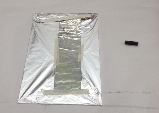 Second: Draw your image With a litho crayon or a traditional sharpie draw your image on the MATTE side of the aluminum plate. *If drawing in sharpie you must draw over your lines at least three times or they will not print. *Try to maintain a light hand as the foil rips easily * If a rip occurs you can seal it with tape however the edge of the tape will print (DO NOT LEAVE THE HOLE OPEN) 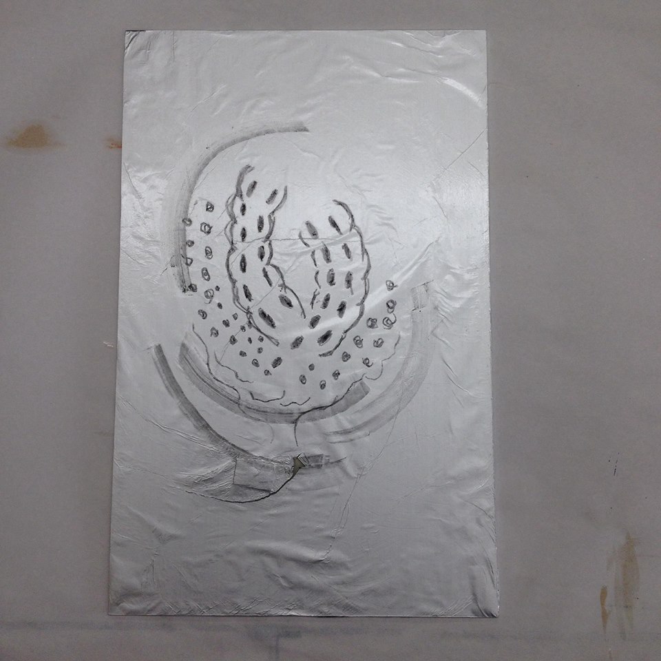 Third: "Gum" your plate Drop a small amount of pancake syrup onto your plate and buff it in with paper towels or cheese cloth. * Make sure there is enough syrup so that it fully and evenly covers the plate Fourth: Etch your plate Get your container and put your plate at the bottom. A this point you should start to pour cola into the container being sure that it hits every inch of your plate. Lift the container and move the liquid left to right for at least three minutes to ensure a complete etch. * If your image is drawn with sharpie you will need to do this process twice. * You cannot reuse this cola and the cola must be carbonated. Fifth: LAW with vegetable oil This is the last step before printing. With cheese cloth or paper towels rub vegetable oil all over the plate. When you do this your image will disappear but thats okay, the grease etch remains. Printing: Wet your plate with the sponge. It is important that you sponge your plate between each application of ink. You want water to be on your plate but you don't want it to be very wet. After sponging roll your oil based ink out onto the plate and watch your image re-appear. Once you've got your pressure set at the press run your plate through with a sheet of paper and pull your print! Researchers say that these plates can be used for up to editions of 50 if using a gentle hand however I have not tested this personally. 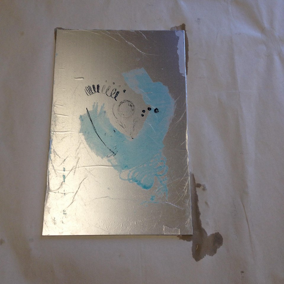 A Pulled PrintLearning Experiences "Flops"ReferencesSuminagashi, or “ink floating” is the oldest form of marbling paper that dates back to over 2,000 years ago in Japan. Suminagashi was mostly done by high priests for the royal court as a fine art. The priests would use a special Sumi-e ink that is dropped onto a still water surface and then blown to create a design on top of the water, then they would place paper on top of the water and the ink would transfer onto the paper. The technique of paper marbling goes very well with the art of calligraphy that was very popular in Japan at the time. A beautiful marbled background. As time goes on, around the 15th century, other styles of marbling started to develop in Turkey and Persia. Here they used a bit of a different technique to create wavy images they called “Ebru”, which means cloud, or wind-like. In central Asia they used oil inks which are much heavier. These oil inks required a medium to be added to the water called size so that the oil inks would stay at the top, which is essential for the marbling process to happen. This also allowed for more control over the way the inks moved, creating more patterns. Ebru used more colors than Suminagashi. Soon after, marbling became known in Europe. It still remained a special technique because not very many people knew how to do it, and the artists were keeping it a secret. The business of book binding was taking off and the bookbinders really wanted to learn how to marble the book cloth. It wasn’t until the 19th century when an Englishman, Charles Woolnough, published The Art of Marbling (1853) where he describes different methods of marbling, how to make certain kinds of patterns. No two marbles are exactly the same, making it a “monoprint” type of process. It relates to printmaking because it involves transferring designs and patterns onto paper and fabrics. Marbling is still used very often today, not only onto paper but onto surfaces of all kinds. I have once actually marbled my arm by dipping it into a tub of inks and slowly pulling it out. http://suminagashi.com/overview/. http://suminagashi.com/history/ https://en.wikipedia.org/wiki/Paper_marbling https://blog.bookstellyouwhy.com/the-history-and-techniques-of-marbled-paper 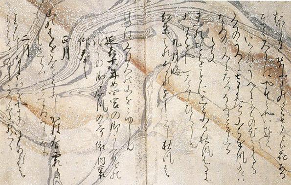 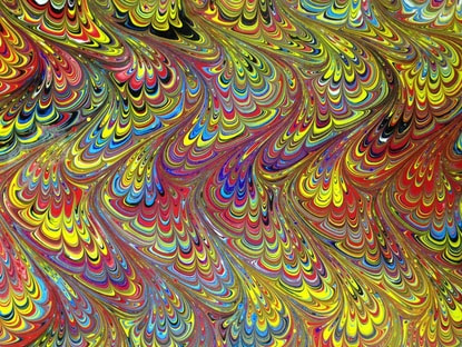 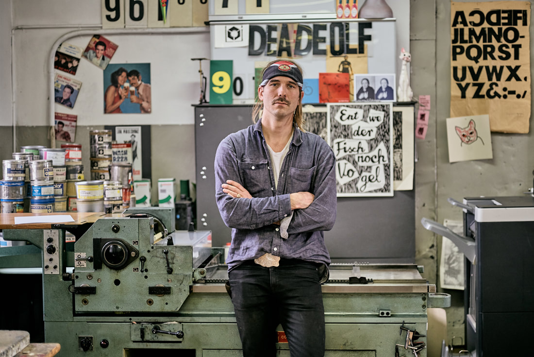
Samuel Rosenzweig
Dafi Kühne is a Swiss designer and letterpress artist who combines contemporary graphic design approaches with the art of letterpress printing. Based in Glarus, Switzerland, Kühne has been working full-time as a letterpress printmaker for over a decade, producing a wide range of artifacts including posters, brochures, and invitations for the world of music, art, theater, and film. Kühne prides himself on his ability to combine contemporary graphic design with printmaking techniques no longer practiced by the vast majority of designers. As a “no-digital-only” designer, Kühne cites his favorite tools as letterpress printing presses from the 1960s, traditional metal and wood type, pantograph cut wood blocks, laser cut blocks, polymer plates and handcuff lino and chip board. In addition to his computer, which is also an integral part of his process. In his Swiss studio, Kühne has collected over twenty tons of equipment. Kükne’s studio set-up includes three FAG Control 405 machines and a massive German Frontex loaded with seemingly endless dials and knobs. How the floor resists caving in remains a globally disputed mystery. To many designers, working exclusively in letterpress may seem tedious, unsustainable, crazy, or all of the above. For Kühne, the draw of letterpress comes from his ability to assert total control over the design and production process. Kühne states, “I am not a luddite or a romantic retro fanatic…it’s just about finding the right tool for producing my design.” For Kühne the printing presses are an important tool in the process of design, not just the final step. When you send a digital file to print, there’s no telling what will come back in the form of paper and ink. The designer relinquishes control after they send or upload a digital file. Kühne remedies this by being hands on from the start. “When it comes to printing I want to have full control over the whole process and the power to make all the decisions, such as choosing the colors and the paper, mixing the ink, setting the about of pressure and ink, according to my design concept.” Before taking on a client’s project, Kühne must make sure the concept and messaging are strong. Typography plays the leading role in the formation of the communication but color and texture are equally important. Kühne’s over 600 cases of type include favorites such as Caslon and Helvetica, along with more obscure typefaces such as Normal Grotesk. Perhaps Kühne’s biggest contribution to the world of contemporary letterpress, other than his work, are his informative and engaging videos, which explore alternative printing techniques. His video on casting plastic resin type explains how he made additional letterforms from a pre-existing metal typeface because he didn’t have enough type specimens to print a text-heavy poster. Other topics that Kühne covers include working with magnetic wood type, indirect printing, vinyl sticker type, and torn structures. Kühne’s work is appealing because it balances graphic design traditions with contemporary approaches. The hand-made quality can be felt not only in the aesthetics but also in the concept. As each step takes much longer on letterpress than it doesn’t on a computer, decisions are carefully calculated, leading to better choices, and better design. In a n era when designers can create hundreds of sketches on a computer in an hour or two, having an awareness of the image making roots of the letterpress are more important than ever. Setting type by hand allows for a sort of embodied cognition to take place, as a designer learns the classical components of typography. Hopefully more designers in the future will have an opportunity to discover the letterpress and incorporate traditional techniques in their own contemporary designs. Posters.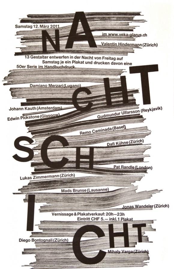
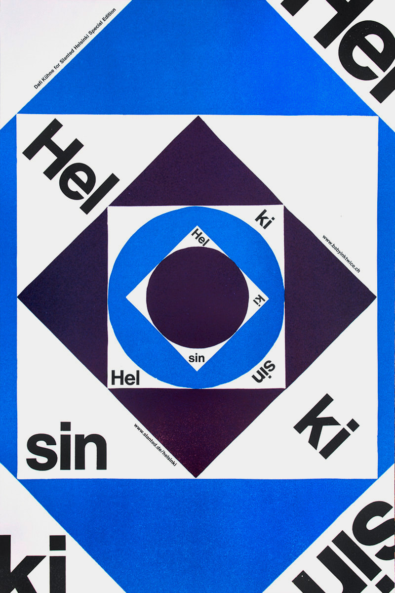
Video.Sources: Owen Pritchard, December 9 2016 True Print: the work of Swiss designer Dafi Kühne catalogued in fantastic new monograph https://www.itsnicethat.com/articles/dafi-kuhne-true-print-publication-091216 Luc Benyon, April 2018 A Look Inside Dafi Kühne’s Swiss Alps-based, Mindblowingly Vast Letterpress Studio https://eyeondesign.aiga.org/a-look-inside-dafi-kuhnes-swiss-alps-based-mindblowingly-vast-letterpress-studio/ Dafi Kuhne’s Vimeo Channel https://vimeo.com/dafi Monica Wapaha Through various forms of art, Contemporary Indigenous Artists have been addressing preconceptions of Eurocentric views of their culture, identity and the isolation of reservation life for decades. The history of Indigenous peoples, including Contemporary Indigenous Art are often left out of the conversation. Through history and popular culture, the image of Native Americans has consisted of monolithic celluloid characters and old images created by Edward S. Curtis. Beautiful, yet these photographs have unfortunately contributed into stereotypes that Indigenous people are artifacts. There are a few artists whom have taken these photos and ideas of the past into their own hands in creating art work revolving these views. Living in two worlds is often a theme in Indigenous art and is used when confronting the preconceptions of the Eurocentric gaze. This gaze is associate with lack of knowledge on Indigenous people and their culture but only familiar with them through western films, old photos, and stereotypes. They are unaware that there are 562 federally recognized tribes. Today’s Contemporary Indigenous artists are challenging the ways conventional museums depict Indigenous peoples, culture and art. We will be taking a closer look at these artists and how they are able to bring these topics into discussion with performance and photography. James Luna, is an internationally renowned performance and installation artists who is Puyukitchum, Ipai, and Mexican American Indian (James Luna). His art consists of aspects of Indigenous identity, isolation and misinterpretations of his culture. In his historical The Artifact Piece, he changed Contemporary Native American Art forever. The Artifact Piece performance was created in 1987, when Luna was attending the San Diego State University and at the time, his focus was in art education. The performance allowed the viewer to participate in the reality of the current state of the American Indian in a contemporary setting. Luna displayed his belongings such as; his divorce papers, music he enjoyed, photographs and himself in a display case. Luna has been such an influential artist to Contemporary Native artist. 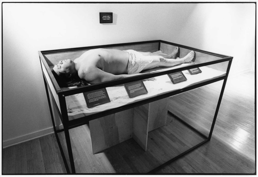 James Luna The Artifact Piece 1987 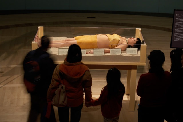 Erica Lord Artifact: Revisited 2008 Artifacts and stereotypes play a huge roll in how the world perceives the identity of Native Americans in society. Another part of the stereotypes is in the perceptions and reality in which they are often considered a mere joke comparison to their ancestors and “all the real Indians died off”. It is often hard for non-natives to believe that Indigenous people are a current living culture. Today Contemporary artists are often said to be “manufacturing artifacts”. 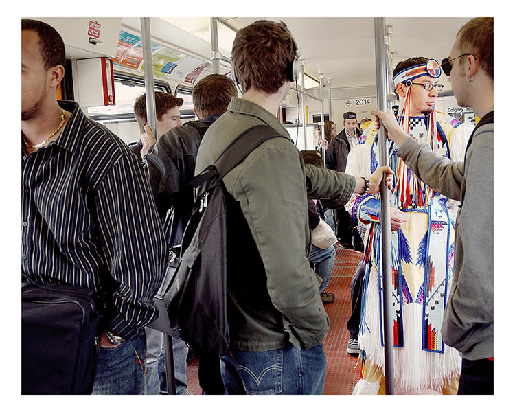 Terrance Houle Urban Indian Series #3 2005 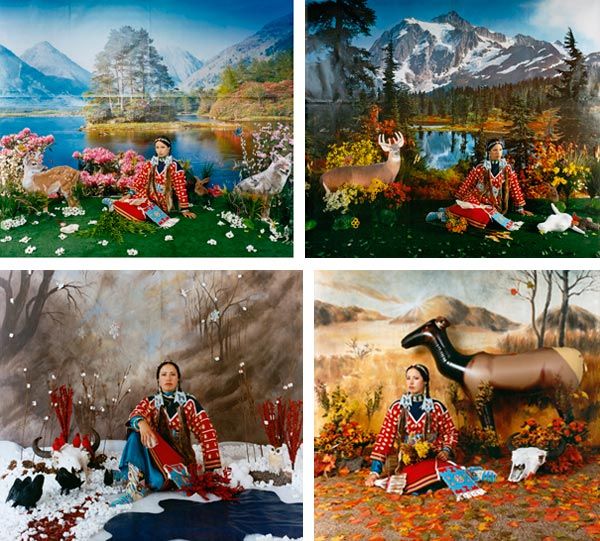 Wendy Redstar Four Seasons 2006 These artists and their work are very important and powerful. Their content and reasons behind the creation is needed in Contemporary Art. Since the time I started this research James Luna unfortunately passed away this year and I was deeply saddened by it. The contribution to of his work to Contemporary Native art has changed it forever. He has inspired a whole new generation of Native Artists. Through different forms of art especially performance, Erica Lord, Terrance Houle and Wendy Redstar have been creating art about their culture, identity and the isolation of reservation life. These Contemporary Indigenous Artists are opening the conversation to these topics. With in the Contemporary Art there is room for Indigenous art.
Citation Erica Lord. Other Peoples Pixels. 2018. www.ericalord.com . Accessed 20 January 2018. James Luna: Transforming the ordinary into the extraordinary. James Lune 2017. www.jamesluna.red/artwork . Accessed 2 February 2018. Selz, Peter. The Art of Engagement, Visual Politics in California and Beyond. Pg 165 Terrance Houle. www.terrancehoule.com . Accessed 18 January 2018 Thompson, Chuck. Cowboys and Indians: Voice. www.cowboysindians.com/2018/01/wendy-red-star-and-the-indigenous-voice . Accessed 6 February 2018 Mario Munguia Jr. Last December I visited the House-Studio Museum of Diego Rivera and Frida Kahlo, located in the San Angel neighborhood in Mexico City. There are three buildings on the plot, two were Rivera and Kahlo’s own studio-homes, and the third was dedicated to the designer of the whole complex Juan O’Gorman, an architect, muralist, and friend of Rivera. The largest and most prominent building is Rivera’s studio, which served as the highlight of my visit, not because of the size and design of the building itself but for the careful curation of his personal objects inhabiting the studio allowing the setting to come alive as a vibrant and imaginative environment. The objects I refer to included jars of pigments for painting, books, sketches/studies on display, unique furniture, but most importantly items from his personal collections. Rivera was an obsessive collector of Latin American Folk art, and pre-Columbian artifacts. Although one could focus on the history of Rivera’s collection as a whole I decided to focus on one particular theme. After all my interest had peaked immediately when I first walked into the studio from across the room the first thing my eyes had met were two groupings of 12-foot-tall paper-mache figures. I had recently learned about the purpose of these figures on my trip. They are called “Judas” figures in Mexico named after the biblical Judas Iscariot. Judas of course is infamous for the betrayal of Christ, and the figures serve as effigies to be burned, beaten, and blown up specifically on the night before Easter Sunday. This tradition is European in origin but in Mexico it has taken on its own unique form through the characteristic designs and the rich history of “Cartoneria,” a term that refers to working with paper-mache figurative sculpture as a traditional Mexican craft. Judas figures vary in size and design, however you can identify them by their resemblance to Satan or devil like beings. Some may be small, life-size, or even monumental for larger celebrations. I use the term celebration for the usual festive nature of their destruction where communities gather to witness the tradition, also they are intentionally blown up by fireworks. Although throughout some instances of their history the ritual has been banned for the public predominantly because of the danger involving fireworks, but also because of the political implications associated with the figures, as in some cases Judas figures resemble unfavorable national and international political figures or personalities. According to my sources the estimated amount of Rivera’s collection of Judas figures ranged from 140 to 180. The source of where most of them came from can be linked back to now celebrated Mexican folk artist, Carmen Caballero Sevilla. Rivera one day came across Sevilla in a market. He invited her to his studio and unofficially became her patron. Sevilla only worked for Rivera for two years before her untimely death but is now properly credited for her magnanimous contribution to Rivera’s collection. She never signed any of her work, and remained in obscurity for years, she also lacked heirs to carry on her tradition because her remaining sons had died soon after she did. Most if not all the figures in the studio-home were made by Sevilla. Both the Studio-Home Museum and The Anahuacalli Museum (designed by Diego Rivera), in the nearby area that houses the large portion of Rivera’s collections, have done their best to keep Sevilla’s memory alive by displaying her work and arranging special exhibitions in her honor. The towering figures leaning against opposite corners of the giant studio window are all proper Judas figures. They are all unique one of a kind works exhibiting disproportionate bodies with oversized or shrunken heads, angular limbs, engorged bellies, some with symbolic wardrobe and others with painted ornate designs. They command the room with their massive presence and follow you with their eyes watching you around the studio perhaps wondering why so many visitors have invaded their space. Aside from these behemoths we find smaller figures, not Judas figures exactly, but peasants, skeletal vaqueros, and jesters situated in chairs or the placed on the furniture around the studio greeting the visitors with wide smiles, showing you the passage of time and sharing their personal stories as evident through their worn-down appearance. Anywhere you step there is no escaping their gaze, for even high above different groupings of hanging “Calacas” stare down at you. “Calacas” is a colloquial term in Mexico for skeletal figures, they are deeply embedded in the tradition of Mexican Folk Art celebrating the cycle of life and death and paying homage to link the culture has with honoring and remembering their ancestors. These hanging figures intrigued me for the variety found in their groupings. Like the Judas figures they also have deformed bodies, anthropomorphic parts, wide open rib cages, and stubby limbs. One cannot help but contrast their features in the way they are placed with their hanging neighbors, emphasizing overall their eccentric quality. The fact they were hung so high and obviously made of frail materials reminded me of the notion of death and temporality, and how the history contained within the actual manifestations mimicked the content of the skeleton as subject. This is not to say they are extremely somber, after all these figures were meant to be celebrated and proudly displayed. A commentary against the notion of the macabre and more on the vitality in the enjoyment in life. This idea I propose is evident in a pair of bride and groom calacas placed in the bedroom of Diego Rivera. Whether this pairing was placed there by the artist or more likely the curators does not matter. I believe it was most likely a symbolic reference to Diego and Frida’s tumultuous and definitive love story. I had also read that when Kahlo had died, Rivera dressed a Judas figure up with her clothes and belongings. A sad and maybe unsettling image, but one that paints the true symbolic and compelling nature of these magnificent figures, and the artist that collected them. http://cartoneria.com.mx/carmen-caballero-sevilla/
https://creativehandsofmexicodotorg.wordpress.com/2016/11/07/for-a-brief-shining-moment/ www.museoanahuacalli.org.mx/museo/colecciones.html https://creativehandsofmexicodotorg.wordpress.com/2017/04/03/blowing-up-judas/ https://encyclopedia2.thefreedictionary.com/Judas%2C+Burning+of http://www.mexican-folk-art-guide.com/judas-burning.html#.WoPGLUxFwRY https://mexicocityperambulations.blogspot.com/2017/11/diego-riveras-and-frida-kahlos-twin.html by Ruby Inurriaga In the spring of 1912, Pablo Picasso created the first collage. This work, Still Life with Chair Caning, is considered the first because it is the earliest known artwork to have taken familiar materials, such as random papers, and deliberately arrange them in a fine art context (Shields). This new direction in modern art was coined papier collé, a French phrase for “glued paper,” by Picasso and Georges Braque, an artist who worked closely with Picasso during the creation of Cubism. Collage was a groundbreaking movement because it was a drastic change from the traditional domain of painting, as the “procedures for laying out, pinning, and gluing papier collés resemble commercial design strategies more than they do the protocol of the fine arts” (Bois, Buchloh, Foster, Joselit, and Krauss, 114). Not only did the collage movement completely shift the entire vocabulary of Cubism, it has inspired art of all different styles and forms throughout the twentieth century and even today. 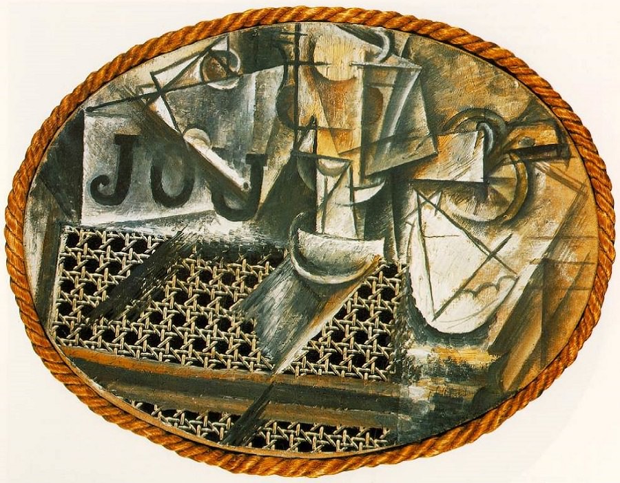 Picasso’s work, Still Life with Chair Caning, was created using oil and pasted oilcloth on canvas, rope, and a chair caning. The artwork depicts a still life and references objects that could be laid on a table in a café. In this piece, Picasso brought in foreign objects, like a chair caning, which could have been found in one’s seat at a coffee shop. The letters incorporated into the artwork could possibly be referencing newspapers that could have been laying on the table. This piece allowed Picasso to explore what would happen when other objects were inserted into a painting. He used pieces from the actual scene he was depicting and arranged them in a new, abstract way. Collage is an art form that accentuates process over product. A collage as a work of art, “consists of the assembly of various fragments of materials, combined in such a way that the composition has a new meaning, not inherent in any of the individual fragments” (Shields). Still Life with Chair Caning can be seen as a reinvention of the still life. 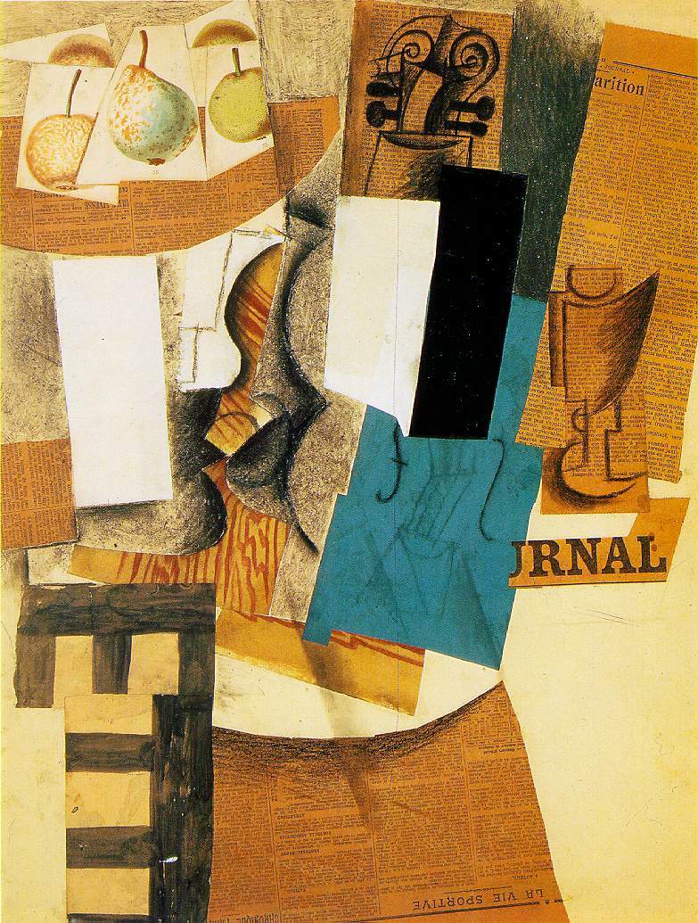 Picasso created many more collage works, one being Bowl with Fruit, Violin and Wineglass, made in 1912-1913 with charcoal, chalk, watercolor, oil paint, and cut papers. This piece also seems to depict a still life inspired by a café scene. In this artwork, separate printed pieces of fruit are placed on top of a paper cut-out shaped like a bowl. Newspaper articles have been cut up and used many times, and some even assume that Picasso was referencing the conversations that happened at the table in a café. Collage works were not driven to accomplish illusionistic representation, but instead relied on various materials and compositional logic.
Papier collé was a revolutionary movement in modern art as it seemed to attain several meanings; “the original identity of the fragment or object and all of the history it brings with it; the new meaning it gains in association with other objects or elements; and the meaning it acquires as the result of its metamorphosis into a new entity” (Shields). Due to the innovative nature of collage, it has served as source of inspiration throughout art history. Works Cited: Art, Philadelphia Museum of. “Bowl with Fruit, Violin, and Wineglass.” Philadelphia Museum of Art, www.philamuseum.org/collections/permanent/53855.html. Foster, Hal, et al. Art Since 1900. Thames and Hudson. Shields, Jennifer1. "Collage and Architecture." International Journal of the Image, vol. 2, no. 3, Oct. 2012, pp. 85. Still-Life with Chair Caning, 1912 by Pablo Picasso, www.pablopicasso.org/still-life-with-chair- caning.jsp#prettyPhoto. Val Lyons 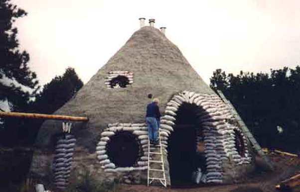 Papercrete is a medium most commonly utilized in the creation of Earthships. Papercrete, in its holistic form, is an alternative construction material constituted of paper pulp, aggregate (sand), and earthen clay.
Some folks add cement to this mixture for additional tinsel strength. As an artist concerned with the environmental repercussions of my studio-practice, I will promote this report to exclude the use of cement due to its contributions in greenhouse-gas buildup. That being said, papercrete has incredible potential to create great work without causing planetary destruction! This oatmeal-like mixture can be cast in molds to make bricks or structures, applied to surfaces, and pulled as sheets. The mix gains its strength as it dries out in the sun. Papercrete first appeared in US patents during the 1920’s. There is archival debate about the specific date, but its been nearly a century since the beginning of its uses in the US. At that point in history, paper was expensive to build with. Today it is seen as an opportunity for effective recycling and is reinforced with rebar in some instances for load-bearing. Little research has been quantified to represent papercrete’s structural integrity in relation to building code. That, however, did not stop it’s resurgence in the Southwest during the 1980’s. As Ian Dille wrote for the Texas Observer in 2014, “ […] various individuals in Colorado, New Mexico, and Arizona independently rediscovered the process and began experimenting with papercrete.” Dille continues to summarize that, “[…] in a sense the papercreters were unified by location. they tended to live on the fringes of the grid or off it entirely. Most resided in jurisdictions with lax building codes, or no building codes at all, where they could build without restriction.” The second generation of “papercreters” may have been geographically unified in their aversion to building codes, but were conceptually unified on a global scale with a vast historical lineage. Alex Wright, a team member of Watershed Materials, discusses parallel evidence of Ancient Egypt’s earthen construction tactics in his article Geopolymer Concrete, Egyptian Pryamids, and a New Way Forward for Sustainable Masonry. Data sediments to reveal that the massive pyramid blocks were cast in place. The durable substance was made of locally-sourced earthen materials and poured into wooden molds, where they would sit as they baked in the sun. Wright states, “[…] the Egyptians appear to have pioneered a geoploymer concrete that lasted throughout the history of modern humanity made from abundant common earthen materials found nearly everywhere on the planet. Compare that to the concrete we make that lasts half a century and comes with a disastrous carbon footprint.” Wright extends this notion of refection as he continues to re-imagine the potential for the future of building. By revisiting humankind’s universal heritage of composite-construction methods with naturally occurring materials, we begin to unfold the limitless potential for cleaner making. I believe that papercrete may be an ideal vehicle for environmentally-concerned investigations. Papercrete is lightweight and strong. Which makes it easy to move, store, and ship from studio to gallery. Artists have utilized this material in conceptual conversation about the human relationships to the building upon earth. Oscar Tuazon describes this “outlaw architecture” as a “physical […] experience of balance,” in his artist bio for the Luhring Augustine gallery. Tuazon utilizes papercrete with his “I Can’t See” series, in which the medium exists as it is contained within its wooden flask. The works feature inclusions of larger recycled paper scraps. Tuazon may be discussing the blinding clutter of consumption yet simultaneously re-invisions its potential condensing via its repurposing. Highlighting the possible potential for the future of our artistic and environmental interrelation is critical for sustainable studio practice. In light of the earth’s suffered damages, it feels unkind to turn a blind eye in the anthropocene. So let us take notice, make changes, and adapt our modes of creation. Let’s look to the world of paper-art and re-iamgine how it can stand to aid in that. Paper-making and book arts overflow into the realm of sculpture, but papercrete could break the levee. Dissolving boundaries between artistic disciplines and building bridges from practice to concept, papercrete holds weight in the potential for our future from our past. Ellie Weber The inclination to collect is indefinable. Some are so dedicated to the gathering, they are honored in the Guinness World Records for their unique collections. The unusual dedication holds mystery in both the discrimination of the category and attraction to it. The discipline in collecting such large quantities becomes an achievement in itself. Along with the assumed collections of products, toys, and superhero memorabilia, are the more peculiar accumulations. Most of these have related records pertaining to size, time, age, which at times seem even more mysterious than the associated collection. Examples of the less surprising collections include: Biggest coke cans collection, largest Barbie collection, and largest Superman memorabilia collection, most stickers, biggest record collection, and on. Sir Hugh Beaver, Managing Director of the Guinness Brewery, attended a shooting party where guests argued about the fastest game bird in Europe without any reference to conclude it. Several years later in 1954, he decided to start a “Guinness promotion based on the idea of settling pub arguments and invited the twins Norris and Ross McWhirter who were fact-finding researchers from Fleet Street to compile a book of facts and figures.” In the about us section on the Guinness World Records website, inspiring people is the purpose to keeping these records. Even their mission is to be the best at keeping records. Company values include integrity, respect, inclusiveness, and passion. Originally the Guinness Book of Records, Guinness World Records, has over 50,000 records in the database. It receives about 47,000 record applications from 178 countries annually, and approves around 6,000 of them. “We don’t define or recognize success in a conventional or limited way and so draw upon the entire range of superlatives to help people realize their potential and to re-examine the world.” The vision is “to make the amazing official.” This is a selection of unusual collections honored for being the biggest of their kind.  Somewhere in between, and an appropriate starting place is Martyn Tovey’s 1,700 collectible Guinness World Records items, including approximately 1,200 books Frank Divendal of the Netherlands owns the largest collection of bookmarks with 103,009 different bookmarks from all over the world, which he has amassed since 1982. He sorts them first by country. Within each country he arranges them by theme, such as bookshops, libraries, tourism, etc. Although he collects all types of bookmarks, his favorites are the ones made of paper.  Irene Sparks has the largest collection of ties counting at 21, 321. From New Zealand, she started her collection in 2000, because she wanted to make quilts from this collected accessory. It took her 2 years to make 3 quilts.  Manfred S. Rothstein has been collecting back scratchers since the 1970’s. He has 675 from 71 countries, and stores them in his dermatology clinic in Fayetteville, North Carolina. Although an entire category exists about the human body such as tallest and shortest people, longest fingernails, hair, and on, there are also several collections involving parts of the body, including bellybutton fluff and toenails. 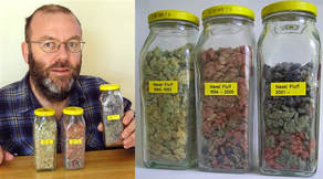 Graham Barker has the largest collection of naval fluff by a single person. He has been collecting it since 1984, and has a website dedicated to the collection. Here he describes the reasoning behind any good collection and explains how his fits into this successfully. These criteria include uniqueness, rarity, completeness of collection, and good condition of items. “It was on the 17th of January 1984 that I found myself under-occupied in a youth hostel in Brisbane. The night was steamy and stormy - too wet outside and too hot inside to do very much, and my attention drifted to my belly button. There it was ... fluff! I must have seen it before that night, but this occasion was the first time I ever picked it out and wondered about it. I became curious about how much navel fluff one person could generate (enough to stuff a cushion, maybe?), and the only way to find for sure was to collect it and see. My first piece of navel fluff was stored in an empty film canister, and the collection had begun. I've read that if you do something every day for three weeks it becomes an ingrained habit, and that’s what happened with collecting navel fluff. The ritual of removing fluff from my navel and putting it in a jar prior to my daily shower soon became a habit, and now that I've been doing it so long it would take some effort to stop. As the photo shows, the volume collected is disappointingly small for such a long time, and I doubt I'll ever have enough to stuff a cushion, but it may be handy for something one day.” The Australian goes on to describe the color of the fluff relating to clothing and type of washing machine used, as well as the reasons the body naturally collects it. He created a survey generating data about the physical properties and manufacturers of belly button fluff with 5,000 responses. 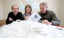 Atlantic PATH of Canada, Atlantic Partnership for Tomorrow’s Health Study, is part of the largest cancer study ever conducted in Canada looking at “how genetics, environment, lifestyle and behavior contribute to the development of cancer.” They are the proud owners of the largest collection of toenail clippings with samples from 24,999 individuals. The clippings were collected as part of a scientific study in researching cancer. An article in CBC news quotes Project director Dr. Louise Parker by explaining, "toenail clippings are really important because they tell us about environmental exposures over about the previous nine months — before the toenails were clipped and during that time they're exposed to all the things that you're exposed to in your diet, in the water that you drink, in the general environment.” The collection and study is ongoing. They are studying blood simultaneously. 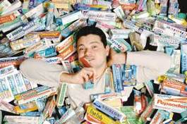 Val Kolpakov of Alpharetta, Georgia has the largest collection of toothpaste tubes consisting of 2,037 different tubes of toothpaste from all over the world. The collection started when he read about German Carsten Gutzeit who collected 500 tubes. “I thought that collecting toothpaste was a nice hobby for a dental professional. It allows you to learn more about your profession, I had friends all over the world, so I asked them to mail me toothpaste from the countries where they lived.” An English antique Georgian 1801 silver tooth powder box he considers the most rare and valuable because toothpaste was not invented at that point, so tooth powders were used. He paid over $1500 for it. “I have several toothpaste tubes that were dug out of World War II trenches, including Doramad toothpaste that had an active radioactive compound. During those times, some people believed that radiation [could] revive dead tissues and that radioactive toothpaste [could] revive your gums.”  Nancy Hoffman owns the largest collection of umbrella covers with 730. From Peaks Island, Maine her house became the site of the Umbrella Cover Museum in 1996. The collection includes covers from 50 different countries and was established as a celebration of the mundane. The museum even has an official song. Carsten Tews has 1,563 different mobile phones, which he has collected since 1998. The oldest mobile phone he owns is a 33-year-old TEKADE BSA 31. He lives in Germany. Malin Fritzell of Torekov, Sweden has been collecting paper dolls since the 1960s and has a collection of 4,720. 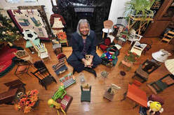 Barbara Hartsfield of Ellenwood, Georgia has a collection of 3,000 miniature chairs, which she has been collecting over 10 years. 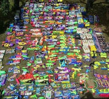 Chris Ried owns the largest collection of super soakers, with 340 of them. His first water gun is autographed by Lonnie Johnson, the inventor of the super soaker. Karen Ferrier of the UK has 1,117 different dalmatian-related items that she has been collecting since 1991. Karen’s collection includes a car and the items that used to belong to Dodie Smith, the author of 101 Dalmatians. 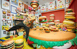 Harry Sperl, aka Hamburger Harry, from Germany has a collection of 3,724 hamburger related items. 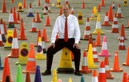 David Morgan of the UK has a collection of 137 different traffic cones. He owns a cone from about two thirds of all types ever made. As a traffic cone inventor and manufacturer, Morgan explains in a short documentary, King Cone, more about his collection. “I see them as little soldiers that are out protecting the public, and the public don’t notice it. I think it’s very sad when you see a cone that’s being discarded, that has done its work, and no one cares, and no one looks after it. So when I find them I actually bring them in and bathe them in hot water, keep them in a darkened room so the sun doesn’t fade them, then catalogue them.” 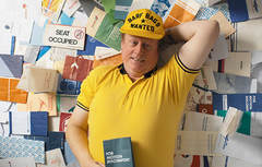 Niek Vermeulen of the Netherlands has 6,290 airline sickness bags consisting of 1,191 different airlines and almost 200 countries, which he has gathered since the 1970s. 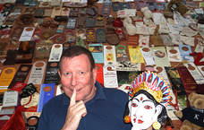 Rainer Weichert has collected 'Do Not Disturb' signs. He lives in Germany and the collection consists of 11,570 signs from 188 countries. Since 1990, he has been collecting them from hotels, cruise ships and airplanes. His favorite item is a wooden statue he collected from the Matahari Beach Resort in Bali. His most rare and valuable item is from the Olympic Village, in Berlin, from 1936. His oldest item is from the General Brock Hotel, in Canada, and dates back to 8 September 1910. Milan Lukich Valdivia has the largest collection of candy wrappers with 5,065 wrappers. Ralf Schroder of Germany owns the largest collection of sugar packets containing 14,502 different sugar packets. He started his collection in 1987. The oldest sugar packet dates back to the 1950's. Martina Schellenberg of Germany has the largest collection of napkins with 125,866 different ones. The collection is catalogued by theme and arranged in separate boxes. 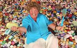 Carol Vaughan of the UK has the largest collection of soaps. She has collected 1,331 individual bars of soap since 1991. Miss Vaughn said she loves finding a new soap she hasn't seen before and likes to find ones that might seem unusual. "I was given one by a friend that is shaped liked cheesecake, you don't know whether to eat it or use it to have a wash," she said. The list goes on, with many missed and countless future champions. Regardless of the psychology behind the desire to amass these quantities as collections, the mystery beneath poses seemingly endless questions. With thoughts about human nature, cultural impacts, and societal entertainment, the extreme connects the mass. 1. http://goldenbookofrecords.com/tag/collection/
2. http://www.guinnessworldrecords.com 3.http://www.cbc.ca/news/canada/new-brunswick/toenail-clippings-record-set-by-atlantic-path-cancer-study-1.2508197 4. http://www.feargod.net/fluff.html 5. http://www.mlive.com/news/saginaw/index.ssf/2010/03/from_bamboo_to_chocolate_sagin.html 6. https://www.atlasobscura.com/places/umbrella-cover-museum 7. https://www.youtube.com/watch?v=tCXvUCoNS7w ? 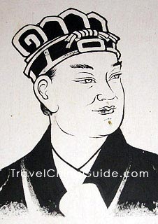 Modern paper making methods are attributed to Cai Lun, a member of the Chinese royal court, in 105 A.D. Prior to his invention, books were bulky, heavy, and inconvenient for scholars to travel with. Cai Lun’s technique utilized worn fishnet, bark, and cloth, and the resulting paper was light, easy to write and paint on, relatively inexpensive to produce, and durable.
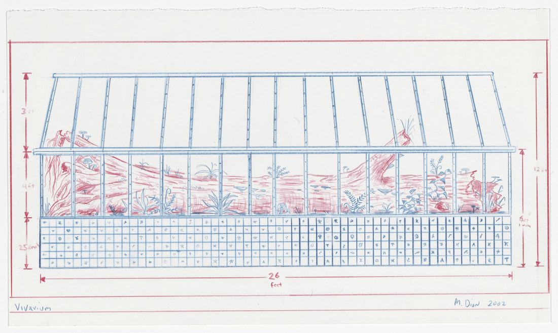
https://www.travelchinaguide.com/images/photoga Portrait of Cai Lun Cai Lun’s invention proved popular and useful, and found great favor within the royal house. The different regions of China eventually generated paper made with ingredients from that specific area, and were prized for their unique qualities. Wenzhou Juan paper, made from pickled bamboo, was used to print money and official documents. “Juan” in the name of the paper apparently signifies that the papermakers did not have to pay taxes on their business. The following is an old recipe for making Wenzhou Juan Paper, using the pickled bamboo method: “First step. To take off the bamboo’s leaves and cut the bamboo into approximately one meter. Then, split the bamboo into strips & tie up into the bundles. The workers called this ‘Sha.’ Second step. To put these bamboo bundles under the blazing sun in order to make them dry. Third step. To put these bamboo bundles into a stone pond full of quicklime and press them with big stones. This stone pond can hold the capacity of 1,500 kg. of the bamboo bundles. Fourth step. After 3-5 months, take the bamboo bundles out and put them under the sun for drying and then put them into clean water to wash the lime away and be ready for use. We call this process ‘pickling bamboo’. Fifth step. To put the pickled bamboo into the pit of the water power trip hammer, which is a simple hydraulic tool with a big water wheel driven by water and rotating as a turbine. It can propel a four-meter long wooden hammer slightly to crush the pickled bamboo into golden, fluff pulp. We call this process ‘smashing the bamboo bundle’, which is the only step in which the workers can use external force in the entire traditional method of papermaking. Sixth step. To put the fluff pulp into the stone pond with clean water and stir it completely and drain the water. It becomes the pulp. We call this process ‘stirring the fluff pulp’. Seventh step. To put the pulp into clean water and stir up thoroughly and use the sieve, which was made of small bamboo strips and scoop out the paper membrane. Then, to pile up these paper membranes and use a wooden board to squeeze out the water. We call this process ‘scooping out paper’. Eighth step. To depart and dry the paper. The piled paper membranes are very easily broken. Usually, this work should be done by female workers who are clever and deft and careful. After taking the membrane from the piles, the women workers had to put it on the absolute level ground or on the wall for drying.” This is apparently the same paper making method first utilized by Cai Lun, 1,897 years ago. The Chinese exported their paper making methods to Korea in 384, and in 610 a Korean monk brought his paper making knowledge to Japan. During a war between the Arab Empire and the Tang Dynasty, (the battle of Tallas – 751 AD), paper making workers and Tang soldiers were captured by the Arabs, who used the paper workers to set up a paper making factory in Bagdad. The Muslim paper makers substituted linen for mulberry bark, whereby linen rags were shredded, soaked in water, and fermented. The rags were then boiled, and beaten into pulp by using a trip hammer, which was an improvement initiated by the Arab papermakers. Baghdad became a center of paper making in the Muslim world, and paper mills in Damascus became a major source of paper for European countries. The increase in supply contributed to paper’s affordability, which allowed bookmaking to flourish. The tools and technique of making paper leaf depicted in a volume illustrating crafts and trades, Kashmir (Source) British Library: Making Islamic-style paper From the Middle East, paper production moved west incrementally, with the first African paper mill founded in Egypt around 850 A.D., which is slightly less than a thousand years ago. From Egypt, papermaking spread to Morocco, and then reached Spain by 950. After landing in Spain, paper continued its world tour, landing in Sicily, where it was put to great use by the Christians in their quest to spread the teachings of the Bible. By 1293, Bologna had their first paper mill, and sixteen years later, England joined the paper brigade. Germany finally joined the ranks of paper producing countries by 1322 in Dordrecht, spreading to Nuremberg by 1390. From there, Poland was making paper by 1491, and Russian papermakers were in Moscow by 1578. With the spread of easy, efficient, and inexpensive methods for producing paper, information and a wealth of knowledge was disseminated throughout much of the world, leading to the Renaissance in Europe, from which many cultural and industrial advances spread. The mapmakers of Europe added to the age of discovery, mapping the vast oceans of the world as well as newly ‘discovered’ continents. Paper changed the world. A 1475 woodcut world map, published in Rudimentum novitiorum. PUBLIC DOMAIN A 13th-century depiction of the world as a circle divided by into three continents, Asia, Europe, and Africa. BRITISH LIBRARY/ PUBLIC DOMAIN Barrett, T. (1992). Japanese papermaking: Traditions, tools, and techniques (2nd ed.). New York: Weatherhill. (Original work published 1983) Barrett, T. (2012). Paper through time: Nondestructive analysis of 14th- through 19th-century papers. Retrieved from the University of Iowa, Institute of Museum and Library Services: http://paper.lib.uiowa.edu/index.php · Bloom J.M. (2017) Papermaking: The Historical Diffusion of an Ancient Technique. In: Jöns H., Meusburger P., Heffernan M. (eds) Mobilities of Knowledge. Knowledge and Space, vol 10. Springer, Cham Open Access Chapter First Online: 17 January 2017 THE HISTORY OF ANCIENT PAPER MAKING AT WENZHOU AREA, ZHEJIANG, CHINA Pan Mengbu, Senior Research Librarian, Wenzhou City Library, China, and Zhang Yongsu, Associate Research Librarian, Wenzhou City Library,China https://www.degruyter.com/downloadpdf/books/9783598441790/9783598441790.157/9783598441790.157.pdf http://www.muslimheritage.com/article/beginning-paper-industry https://www.travelchinaguide.com/intro/focus/inventions.htm https://fabriano.com/en/324/history The Chinese symbol for paper: Andrew Caruso Mark Dion is a multidisciplinary artist born in 1961 in New Bedford Massachusetts. Dion studied at Hartford Art School of the University of Hartford Connecticut with a BFA and later returned for an honorary doctorate in 2002. From 1983 to 1984 he attended the School of Visual Arts in New York and then the prestigious Whitney Museum of American Art's Independent Study Program. He is an Honorary Fellow of Falmouth University in the UK and has an Honorary Doctorate of Humane Letters Ph.D. from the Wagner Free Institute of Science in Philadelphia. Adding to his a prestigious education, Dion exhibited at MOMA PS1 in New York, Guggenheim Bilbao, Minneapolis Institute of Art, Tate Gallery, and the Museum of Modern Art etc. (Bonakdar) Considering his many accomplishments, it is fair to say that Dion has made a great contribution to contemporary art culture. Dion blurs the boundaries between archeology art and history. Part of Dion’s methodology is to incorporate fieldwork excavation and cultivation into his work. (Hansen) This creative methodology has led Dion to many parts of the world, gathering both animal and plant specimens. Dion also collects historical objects from collections that have been long forgotten. Much of his work is large in scale; however, he also makes a fair amount of small works. Dion intends to engage the viewer in a way that changes our perception of the natural world and our relationship/influence on it. Dion states, “Like a historian, I am looking back and using images, displays and sculptures to understand how we’ve changed our notion on the natural world.”(Newman) A recurring theme in how Dion structures his work is by exploring and examining how we organize spaces and the objects within those spaces. Dion’s work touches on humanity’s treatment of the natural environment, which includes the natural flora and fauna in such environments. Some of his work has a very serious tone to it and other work is quite humorous, employing irony and improvisation. “When you are dealing with environmental issues, there is little good news on the horizon,” Dion said. “It is important to think about how to continue to have that conversation without being too grim. Humor is really that tool that we have, to help us bear some of the more difficult things we are talking about.”(Newman) The work also evokes critical analysis of many public institutions. Dion believes that these institutions shape the way we understand and interact with the natural world. It is important to open up a critical discussion that challenges our perception and conventions. Dion believes that it is the artist’s job to go against the grain of popular culture.(Bonakdar) The work appropriates many forms of scientific methods found in Archeology, Ecology and museum curation. Dion then fuses the methods together creating contemporary artworks that blur the lines between the rational and irrational.(Bonakdar) Dion wants the viewer to question the distinction between what is objective and what is subjective. Dion believes that it is crucial to question the authoritarian roll of the scientific community and its voice in society. (Art21) For the vitality of the collective, it is important to pay close attention. It is a necessity to and have a critical discourse on pseudo science, Ideologies and personal/social agendas that shape the spread of information. Dion often collaborates with Zoos, Aquariums and Natural History Museums and city projects. These collaborations give him an insight to the institutions inner workings, thus providing more of an informed understanding of their function. (ICA Boston) A good example and a personal favorite is Dion’s Neukom Vivarium project. This project was collaboration with the city of Seattle, the Seattle Art Museum as well as many other supporters. Dion located a gigantic hemlock tree was uprooted and toppled over into a ravine in a small area of old growth, 45 miles outside of Seattle. Fortunately, a watershed area protected the tree and as a result the damage from rot was miniscule.(Art21) Now that Dion located the perfect tree, with a great deal of help, the Hemlock was permanently installed in Seattle’s Olympic Sculptural Park. The Hemlock is housed in a climate-controlled vivarium replicating the trees natural environment. When Dion was asked what it meant to take the tree out of its natural setting and place it into the context of a gallery setting? He replied with, “I think that one of the important things about this work is that it’s really not an intensely positive, back-to-nature kind of experience. In some ways, this project is an abomination. We’re taking a tree that is an ecosystem-a dead tree, but a living system-and we are re-contextualizing it and taking it to another site. We’re putting it in a sort of Sleeping Beauty coffin, a greenhouse we’re building around it. And we’re pumping it up with a life support system- an incredibly complex system of air, humidity, water, and soil enhancement- to keep it going. All those things are substituting what nature does, emphasizing how, once that’s gone, its incredibly difficult, expensive, and technological to approximate that system- to take this tree and to build the next generation of forests on it. So, this piece is in some ways perverse. It shows that, despite all of our technology and money, when we destroy a natural system, it’s virtually impossible to get it back. In a sense, we’re building a failure.” (ART21) Like many of his projects, The Neukom Vivarium piece is a perfect example of Dion working from the scientific method. Some find it interesting that he would put so much effort into a project that could be destined for failure. Dion commits to the idea of an experimental model of art making. There is an inherit success in failure, for in failure we prove or disprove things.(Art21) The work is not about the tree even though it is the centerpiece of the project. Dion wishes for the viewer to contemplate nature as a process. A transition from decay to rebirth, one promoting a complex bio-diversity that thrives off the trees inevitable demise. As in much of Dion’s work, he wants you to acknowledge or increase your awareness to the mysteriousness of nature. And as a result, promoting a sense of wonder into the vast diversity and complexity within a natural system.
 Ellie Weber Known for his use of humble materials, Richard Tuttle is interested in the spaces between. In his use of material this occurs between the conventional and the everyday. In his art practice and process he hovers between expectation and intuition.  New Mexico, New York, D, #13, 1998, Synthetic polymer paint on plywood Born in New Jersey, Tuttle works between New York and New Mexico. He received a BA from Trinity College in Hartford, Connecticut. Although he commonly refers to most of his work as drawings, his eclectic array of materials include cardboard, wire, paint, rope, foam, wood, fabric, nails, and on. The forms vary from sculptures, prints, handmade paper, dyed textiles, assemblages, artist books, fabric objects, and on. Tuttle has exhibited in major museums throughout the world and received a National Endowment for the Arts Fellowship. 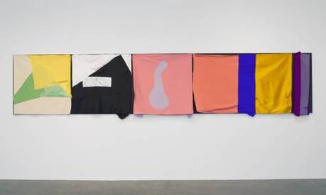 The Critical Edge III, 2015, fabric, wood, nails, hand-sewn brown thread; five black MDF panels and five fabric elements, 39-1/8″ x 15′ 1/2″ x 6-3/4″ “I love materials on the one hand and I’m not interested in materials on the other. How is it possible to love them to the degree I do and be absolutely not interested in materials.” 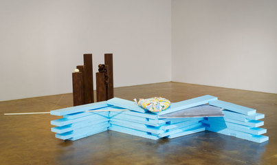 Richard Tuttle: 26, 2016 He is at once more interested in the properties of the materials and their accessibility than the craftsmanship in assembling them. Audiences have described his materials as poor, democratic, and waste. He accepts this reclamation as a solution for sustaining. “Because yeah I love a piece of tissue paper and I know the world doesn’t.” 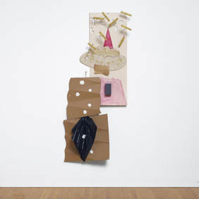 Sand Tree, Paper, cardboard, plastic, collage and wire, 1988 In an article on The Art Markets, Tuttle states, “to make something which looks like itself is, therefore, the problem, the solution. To make something which is unraveling, its own justification is something like a dream. There is no paradox, for that is only a separation from reality. We have no mind, only its dream of being, a dream of substance when there is one.” The series, The Place in the Window, II, specifically investigates material use with dyed cotton pulp draped and squished through simple mesh wire forms hung on the wall. In an interview on Art21 titled, Reality and Illusion, Tuttle describes a process of laying down string on the floor during an exhibition install as the space between these polarities. He mentions that if he were a better artist he’d have done this hundreds of times in different situations with different materials. He trails off, almost whispering, “I didn’t want to know them too well.” This piece with string on the floor he deems most successful in attempting illusion and calls it “yuck, yuck, fun.” He explains by saying the real looks like an illusion, this childlike quality is the fun.
The Place In The Window, II, #4, 2013, wire, mesh wall sculpture, 13 x 13 3/4 x 9 1/2 in Tuttle’s philosophy of life intersects with that of his art practice. In the Staying Contemporary interview on Art21, he describes his experience as a student remembering the herding of artists to define their noticeable style. He felt as if that was training to find the end of something, when he was and remains interested in finding the beginnings. Later in the interview he speaks to the hypothetical student about reflecting on process as much as the final piece. This back and forth between art and life is repeated throughout the years of him describing his work. “Making pictures is a tool for life. Life is so much more important than art, but than art’s importance comes when it’s a tool for life, makes life more available for us.” 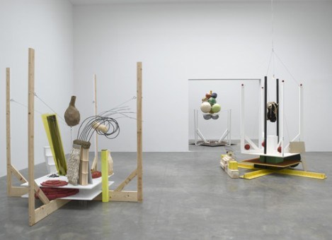 Installation View of What's the Wind, 2010-11 In the Art21 video, Art and Life, Tuttle further describes this relationship by mentioning Plato’s potential perspective of the artist as true philosopher, his theory being based on the artist research as limitless in discipline or resource. He believes that there is not enough time in one life to use all the doors. In another interview he describes this practice of blending art and life as harmonious. He declares that it is not so much living in the beauty as looking for it. These perceived polarities intrigue Tuttle in his own practice and his understanding of the pedagogy of art and its market. Also in the above-mentioned video, he talks of his sublimation of being characterized as an artist that works from personal expression or outside of it. He expresses the difference between realism and idealism respectively as everything outside yourself and everything that happens inside of you. He uses the example of an absence filling a solid and a solid filling an absence as a space to examine the disparity in these solutions. He then proposes this philosophy as a potential tool in defining or negotiating the space between opposites. This space between connects Tuttle’s material use, concepts, and philosophies. It often becomes apparent in the formal arrangement of pieces in exhibitions and installations. Work frequently gets hung at varied heights or placed off the wall in ways that force the viewer to navigate the space in subtly confrontational ways. He considers the object’s presence in space and the intersections around it.  Installation view at The Fabric Workshop and Museum, Philadelphia, of Both/And Richard Tuttle Print and Cloth, 2014 In the Art21 segment on Tuttle in Structures, he shares, “sometimes I look and say I didn’t make [that], but know I did, it’s beyond a barrier. Art needs a heightening of reality. I want to sustain the polarity where you can be the paintbrush of society and make society your paintbrush.” Tuttle’s relevance of material use in contemporary art is recognizable and at times confrontational. Sculptures and Installations bounce between playful and provocative. His use of handmade paper fuses traditional techniques with unconventional combinations. Artist books and prints in a variety of techniques stand alone in exhibitions and collections. Other mundane materials are elevated in their simple arrangements through scale, formal qualities, and their juxtapositions. Tuttle aspires to maintain his place among these undefined spaces 4 decades later.  The Triumph of Night, 2009, hand-cast cotton pulp, wood, wire, 14 x 32 x 6 1/4 inches (in box) 1. https://www.pacegallery.com/artists/474/richard-tuttle
2. https://art21.org/artist/richard-tuttle/ 3. https://www.sfmoma.org/press/release/sfmoma-presents-the-art-of-richard-tuttle major-r/ 4. https://www.moma.org/artists/5983 5. http://www.ulae.com/artists/RichardTuttle/ 6. http://www.nytimes.com/1997/02/16/books/art-books-whose-art-is-the-book.html 7. https://the-art-markets.com/2013/09/27/richard-tuttle/ 8. http://www.bowdoin.edu/art-museum/exhibitions/2014/richard-tuttle-prints.shtml 9. http://www.dehallen.nl/en/exhibitions/richard-tuttle/ 10.https://www.theartblog.org/2015/07/bothand-richard-tuttle-print-and-cloth-at-the-fabric-workshop-and-museum/ 11. https://www.inigoart.com/april-art-gallery-highlights-richard-tuttle/ 12. http://www.artnews.com/2016/06/15/shapely-numbers-richard-tuttle-at-pace-new-york/ Caroline Ivy Nike Georglou is a paper artiest who specializes in sculpture art. He produces them out of recycled ephemera and books from his local area. Georglou stacks the paper in brick form to create his sculptures. He manipulates the paper materials into different shapes such as wiggly lines, swirls and zigzag to add dimension and creativity to his work. He will also paint onto the books to create color and odd shapes that complement the direction and pattern of his paper brick paper placement. The pictures he produces of people and places out of pieces of square and rectangular 3-D shapes is amazing. I’m going to talk about three of his piece that stood out to me: A Night Swirling, Calypso and Turn into Light.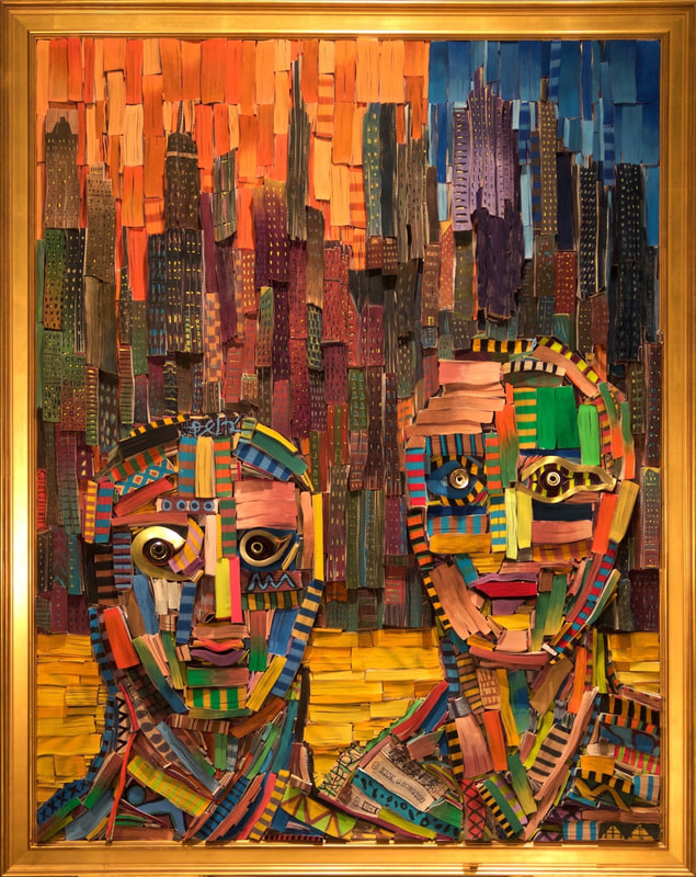 A Night Swirling, 2017 |
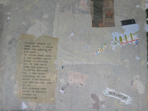


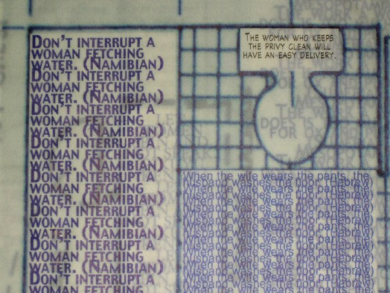


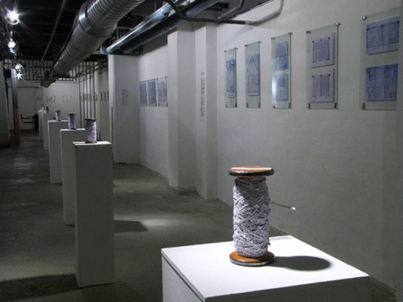
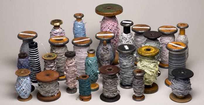
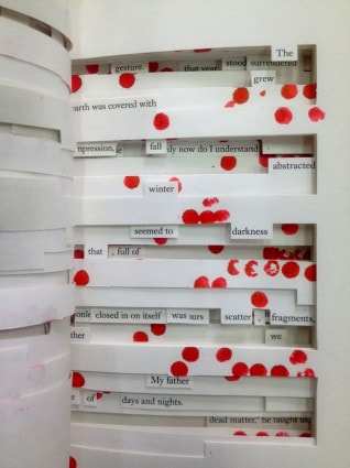
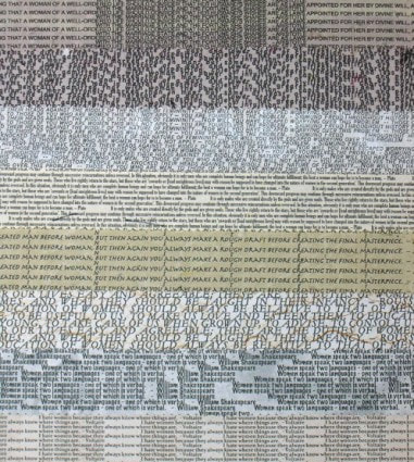
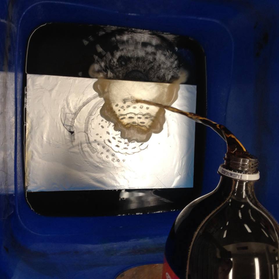
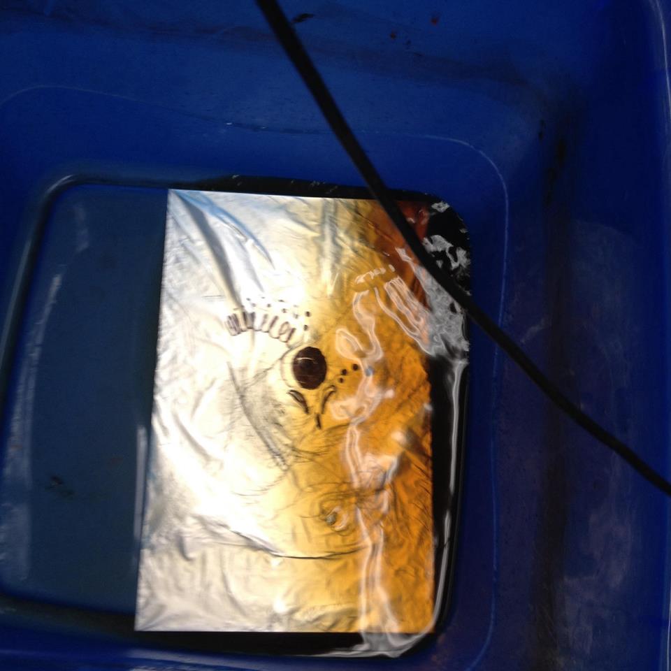
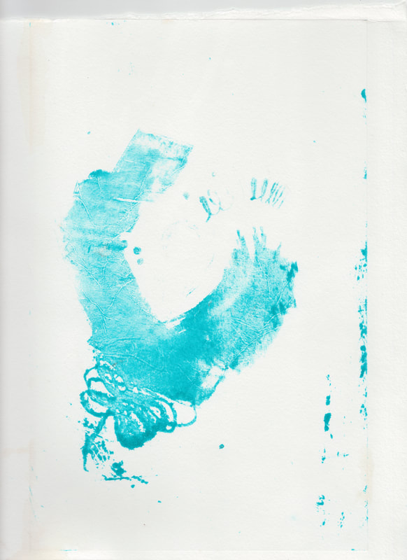
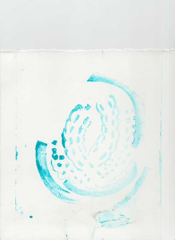
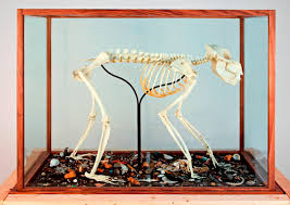
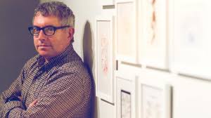
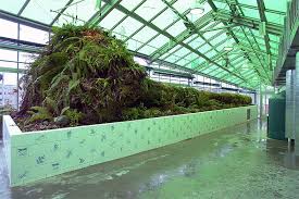
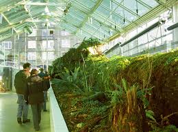
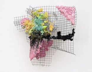
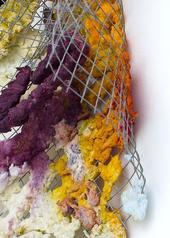
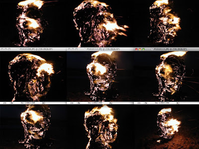
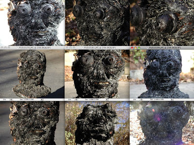
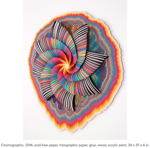

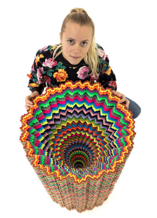
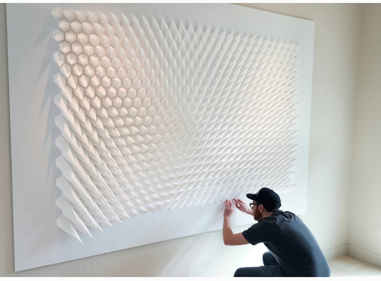
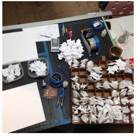

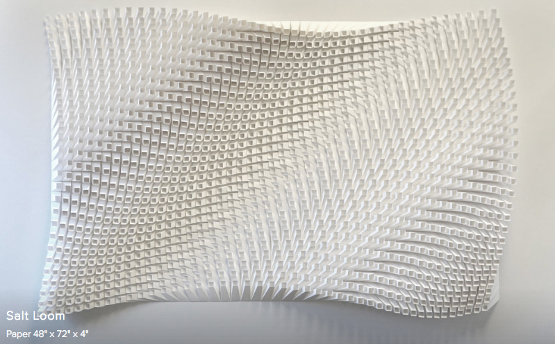

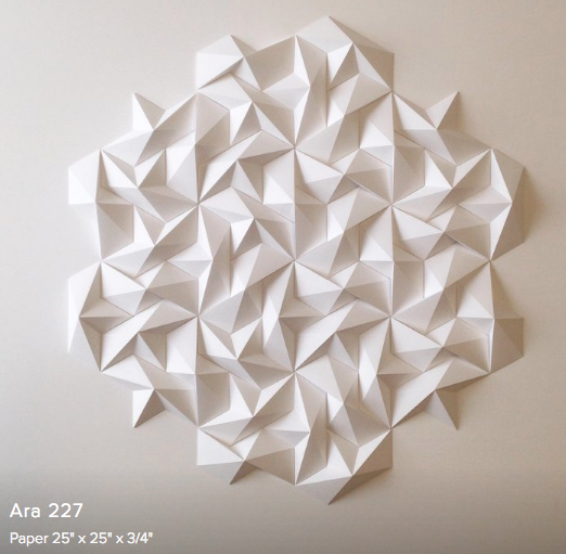
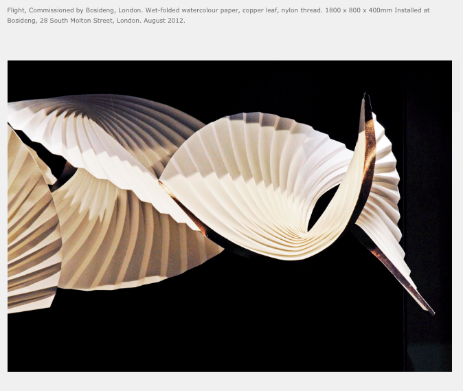
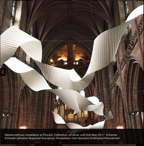
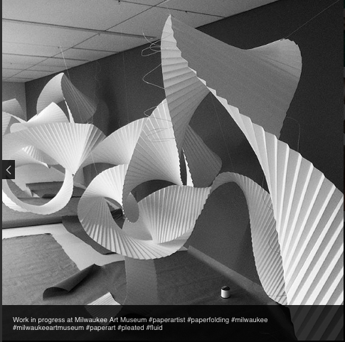
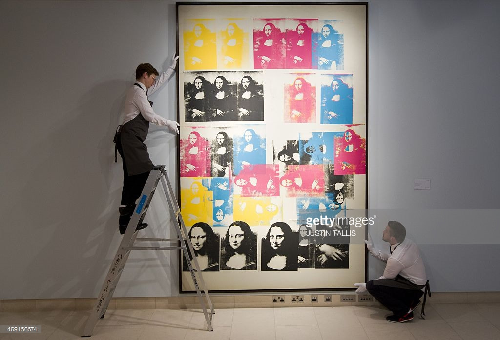
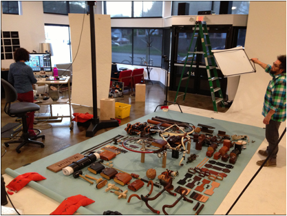
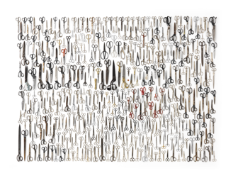
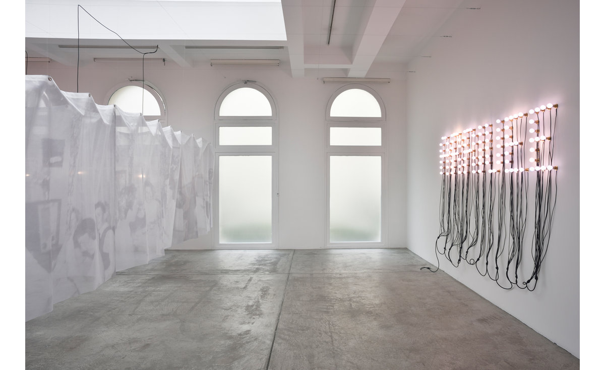
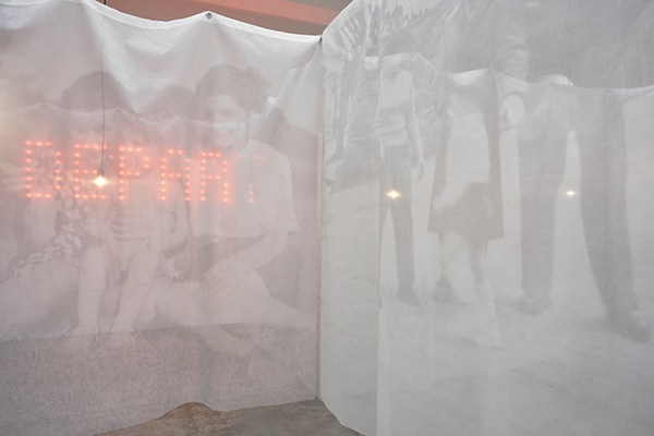

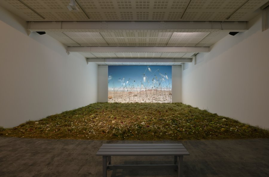


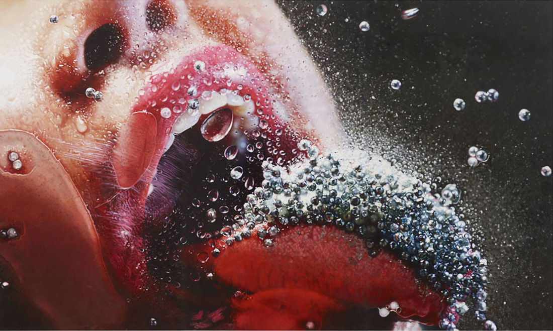
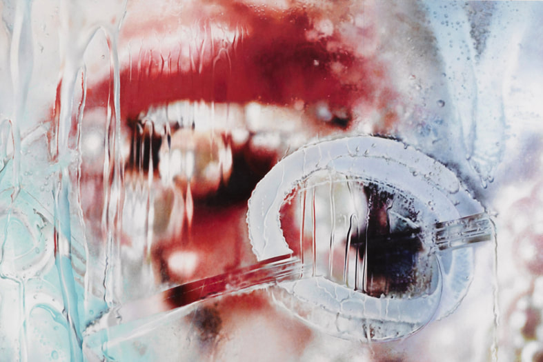

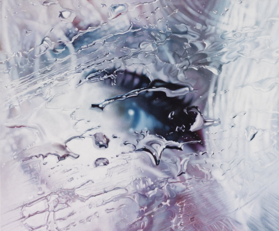


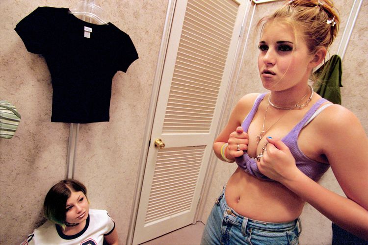


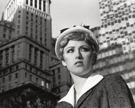
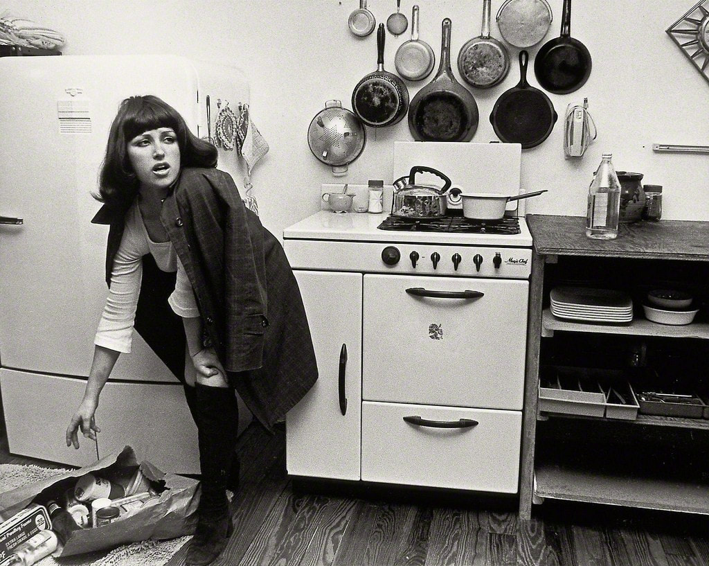

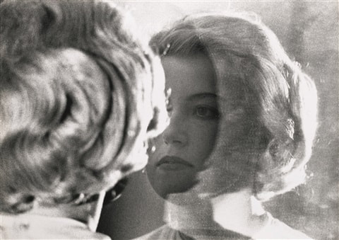
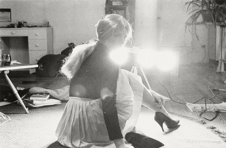
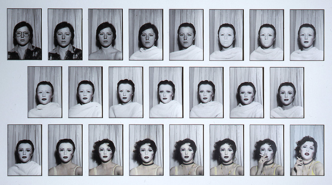
 |  |
The Phoenix Museum of History existed since the 1920s but moved into its 20,000-square-foot space in Heritage Square in 1996, after a city of Phoenix bond granted $8 million for the new building. The museum hosted exhibits about “indigenous cultures, subsequent settlers, and the evolution of modern city life.”[2] When the economic recession hit, the museum’s funding was cut (between $50,000 and $100,000 a year), and in the summer of 2009, the museum closed its doors to the public due to the deadly combination of being under-funded and under-visited.
An AZCentral article from June 2009 stated, “the board [of the Phoenix Museum of History] voted to explore a merger with the nearby Arizona Science Center (emphasis mine).” Science Center CEO Chevy Humphrey was quoted saying the two institutions hope to “explore joint opportunities to enhance our mutual offerings and the overarching mission that we both share.” She also added, we “are excited to explore the tremendous potential and long-term benefits this opportunity presents for us to better serve our Arizona communities.” [3]
It sounded like a beautiful partnership between two educational institutions—a benevolent institution willing to help its unfortunate neighbor for the sake of the public good. But is that what actually happened?
As an Arizona Science Center intern, I set out in the hopes of using my connections with the staff to engage in conversation about the relationship between the Phoenix Museum of History and Arizona Science Center. As it turned out, very few current employees at the Science Center had much information about the almost decade incorporation of collections from the Phoenix Museum of History. One person who did was current Director of Exhibits, Matt Schwartz. [4]
Schwartz confirmed what I suspected upon reading Ms. Humphrey’s words about both museums working together under joint mission statements—Arizona Science Center wanted to purchase the Phoenix Museum of History to have the building, not the collection within it. However, in order to acquire the Phoenix Museum of History’s building, the Science Center had to accept a few stipulations from the city. Because Heritage and Science Park is owned by the city, and the Phoenix Museum of History’s collections belong to the city, the collection had to remain available to the city’s residents. Basically, the Science Center could have the building as long as they agreed to devote a certain amount of space to the Museum of History’s artifacts.
The Arizona Science Center was hungry to expand, and in exchange, became the unwilling stewards of the collection. The closest someone comes to “officially” in charge of the collection is Mr. Schwartz, although he shared they were looking for someone who could better organize, catalogue, and oversee the collection.[5] This, of course, depends on further funding.
For now, most of the collection rests in climate-controlled, locked, archived storage. Only about five percent is on display within the Science Center. While that does sound small, most museums can only display a small percentage of their total collections. To meet the requirements of square footage on display, they’ve been very creative and mostly have enormous decals that provide background historical information to relevant science exhibits.
In some places throughout the Science Center, historical artifacts are placed within exhibits that are thematically related. For example, in an exhibited titled “Many Hands Make a Home,” the theme is construction. Items on display include a bathroom cut in half, so visitors can see the intricacies involved behind simply flushing the toilet. Children are invited to press buttons that show the difference in how hot and cold water flow through a house, and work with blueprints to design their own home. On display from the Phoenix Museum of History is a wood irrigation pipe (shown below).
One cannot blame the Science Center for carefully selecting items from the history collection that are “unique, scientific, and historically important.” Schwartz stated that “it’s great to see the historical context of where we were and how we got here.” It’s also “a unique thing I don’t know if any other science center does.”
Schwartz acknowledges, though, “it’s not what people are coming here for” and “I’d rather have that space” currently being taken up by historical items no one is paying attention to, with exhibits that would engage visitors.
Schwartz acknowledges, though, “it’s not what people are coming here for” and “I’d rather have that space” currently being taken up by historical items no one is paying attention to, with exhibits that would engage visitors.
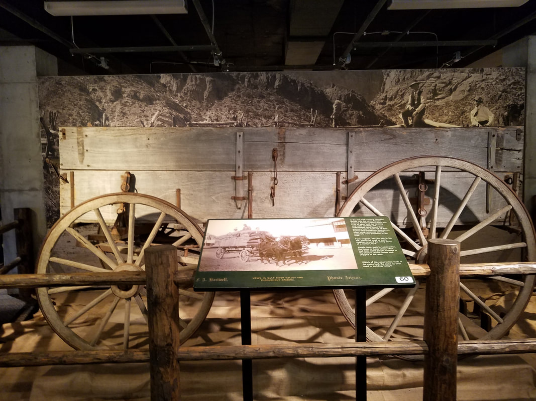
To see how many people interacted with these historical displays, I spent an hour sitting near a large carriage that takes up a space about twenty feet long and ten feet deep, otherwise prime real estate for an interactive exhibit (shown above). In that hour, I tracked fourteen interactions. Most people were using the wooden posts that kept visitors out as a place to rest or lean on. Two people tried to use it to call people over, such as “ooh! Look! A carriage!” (8-year-old girl), but it could not compete with the other activities available. Only one person (a bored chaperone) actually read the sign in front of it.
While the history collections may not be attractions in their own right, at least some are displayed, and they are all kept safe. But for the most part, the Phoenix Museum of History is suffering the fate of too many old items—stashed away in storage. The future of the collection is uncertain. Hopefully, in the coming years, whether inspired by an upgrade to the Science Center’s budget,[6] or a grassroots movement eager to revive a need for history,[7] someone will clear the dust off the shelves and face the task of doing this collection justice.
Footnotes:
[1] In fact, the sign still stands there today, confusing visitors who notice it.
[2] Lynn Trimble. “The City of Phoenix Needs a New History Museum. Here’s Why.” Phoenix New Times. May 23, 2017
[3] Jahna Berry. “Phoenix Museum of History closing June 30.” The Arizona Republic. June 18, 2009.
[4] The Arizona Science Center doesn’t even have anyone with the word “collections” in their title. But being that I’m interested in the nature of how the Science Center has embedded some of the Phoenix Museum of History collections within its existing exhibit halls, Mr. Schwartz seemed to be the man for the job.
[5] They do loan out items from the collection. For example, there is a Wells Fargo Bank Museum and the Phoenix Museum of History has a Medal of Honor once earned by a Wells Fargo employee. The Science Center also receives requests from descendants of residents who once donated objects to the Phoenix Museum of History. This is a topic that will require further research, as it is apparently against tax codes to return a donation.
[6] The Science Center is in the process of applying for a $70 million grant to upgrade their exhibits. Another thing a few have mentioned but no one can explain is this: there seems to be the idea that if in some future, the buildings that host the Science Center and CREATE were to be physically connected, that would somehow dissolve the requirement to have the Phoenix Museum of History sign and its collections within.
[7] There are people who believe that we should resurrect/rebuild a Phoenix History Museum. After all, the cities of Tempe, Chandler, and Mesa all have history museums that help the community see where we’ve been and are meeting places to discuss how to move forward.
Chloe Torri
Like any other artisanal or artistic practice that has stood the test of time, papermaking has expanded and transformed in a multitude of different ways due to changes in the economy, available materials, and social influences (Kinsella). In 2018 papermaking occurs in prestigious studios of thoroughly trained hand-papermakers, in the experimental and innovative blender-beaten studios, and of course it occurs in large-scale mills. The industrialization of paper production is a crucial part of the history of papermaking and should be understood and remain in conversation among contemporary papermakers.
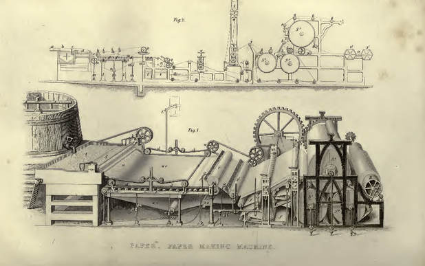
The Fourdrinier machine, Tomlinson’s Cyclopaedia of Useful Arts, 1852
In 1799 France, Louis-Nicolas Robert received a patent for the first machine that could create a continuous roll of paper, the Fourdrinier, which amplified this streamlined industry’s hunger to produce even more paper, faster and cheaper than ever imaginable. During the mid-nineteenth century wood pulp became popularized due to the perceived abundance of trees and the rising trend of deforestation in the second Industrial Revolution. Nowadays we do not see this surplus of trees, we have a growing demand for paper, and we have a need for clearer and more durable paper, which takes bleaching agents, which leaves very few other pulps being used at this high production rate.
While I am not expecting we as a society of artists revolt against the products of the Industrial Revolution, I do hope for artists to be aware of their sourced materials. Aiming for knowledge of where our art materials come from and learning or creating ways in which we can utilize better materials in our practice that do not support wasteful industrial practices that are harmful to the environment is crucial to the arts. While not every artist has the ability to handcraft every material they use, artists can educate themselves about organizations taking bounds and leaps towards sustainability. Industrialized paper production unfortunately illustrates major issues in true sustainability, brushed over in the video posted above. This Georgia- Pacific video states that "dependable paper products don't just grow on trees", but companies like this are continuing to use tree-based paper manufacturing that cuts perfectly healthy trees away, ending their growing cycle, enforcing the idea that they were grown just to be destroyed for paper. Paper is highly integrated into our society and our world of academia. In higher education specifically, I'm sure nearly every art school has students take some sort of foundational drawing classes where hundreds of sketches, blind contour drawings, observational illustrations, and doodles are made within one semester from one classroom of students. What if these students who are already going to art supply stores and hand selecting sheets of paper based on appearance, size, or durability were just as easily able to hand select gorgeous and affordable paper which extended the lifecycle of plant matter and rejected harmful processes. In college I was fortunate enough to have Steve Kostell for a few of my foundations courses who introduced his foundations classes to this kind of paper made by students for students. Steve is a 2003 ASU alumnus who received his MFA in Intermedia and while at ASU, he dove down the rabbit hole into the world of papermaking.
miscanthus prairie grass and beet dye experiment, P.C. Chloe Torri
Steve Kostell and Eric Benson, who in 2006 received an MFA in Design University of Texas at Austin, were Associate Professors in Graphic Design at the University of Illinois. They saw a lot of potential in the possibility of redirecting larger-scale paper and package manufacturing back to the roots of the artisanal craft, in order to ultimately work towards a more sustainable, circular economy.
“A circular economy is an alternative to a traditional linear economy (make, use, dispose) in which we keep resources in use for as long as possible, extract the maximum value from them whilst in use, then recover and regenerate products and materials at the end of each service life.”(WRAP)
WRAP and the Circular Economy, http://www.wrap.org.uk/about-us/about/wrap-and-circular-economy
In 2012 Fresh Press, an Agri-Fiber Paper Lab, was officially created. Affiliated with the University of Illinois in Urbana- Chamapign and located within Research Park in Champaign, IL.
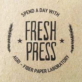 | 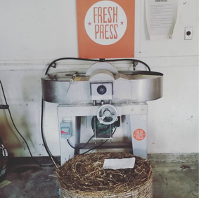 |
mutt prairie grass advertisement (left) P.C. Chloe Torri, dried rye before chipping (right) FreshPressPaper on Instagram
Pulling from Steve’s in-depth passion for the art of papermaking and Eric’s career history revolving around sustainability in the design industry, they began their journey exploring pulp alternatives by taking the production away from forests and towards farms. Working in collaboration with the University of Illinois’ Student Sustainable Farm, as well as local farmers in Champaign County, Fresh Press utilizes the plant residue left over from harvest as their main medium. This unused waste produced from harvest would typically be burned off, so not only does Fresh Press avoid using tree pulp or other imported material with a hearty carbon footprint, they extend the life of the easily accessible plant fibers. The fibers used at Fresh Press certainly varies on what we can get from the farms but the main list includes but is not limited to: corn stalks, sunflower stalks, soybean stalks, pepper vines, tomato vines, and various prairie grasses.
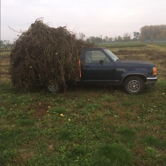 | 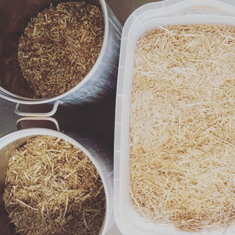 |
harvested tomato vines (left) Student_Sustainable_Farm on Instagram, chipped bell pepper vines, tomato vines, and miscanthus prairie grass(right)
Fresh Press “explores the potential of papermaking to be zero waste, environmentally sustainable, and a catalyst for a thriving local economy” (Eric Benson) not only through traditional Western methods of papermaking but by adopting methods from other fields and lending the knowledge gained from our agri-fiber processes to other areas of research. One ongoing research project adopts the ideas of Community Supported Agriculture (CSA) where community members purchase regularly distributed shares of produce directly from a farm in order to help with cash flow to local farms, build relationships between producers and consumers, and allow produce to be received at their absolute freshest.
Fresh Press adopted this CSA structure via seasonal paper shares, which ranged from simple variety paper packs to pairs of notepads, limited edition prints of local artwork to bookmarks and greeting cards.
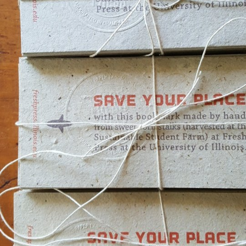 | 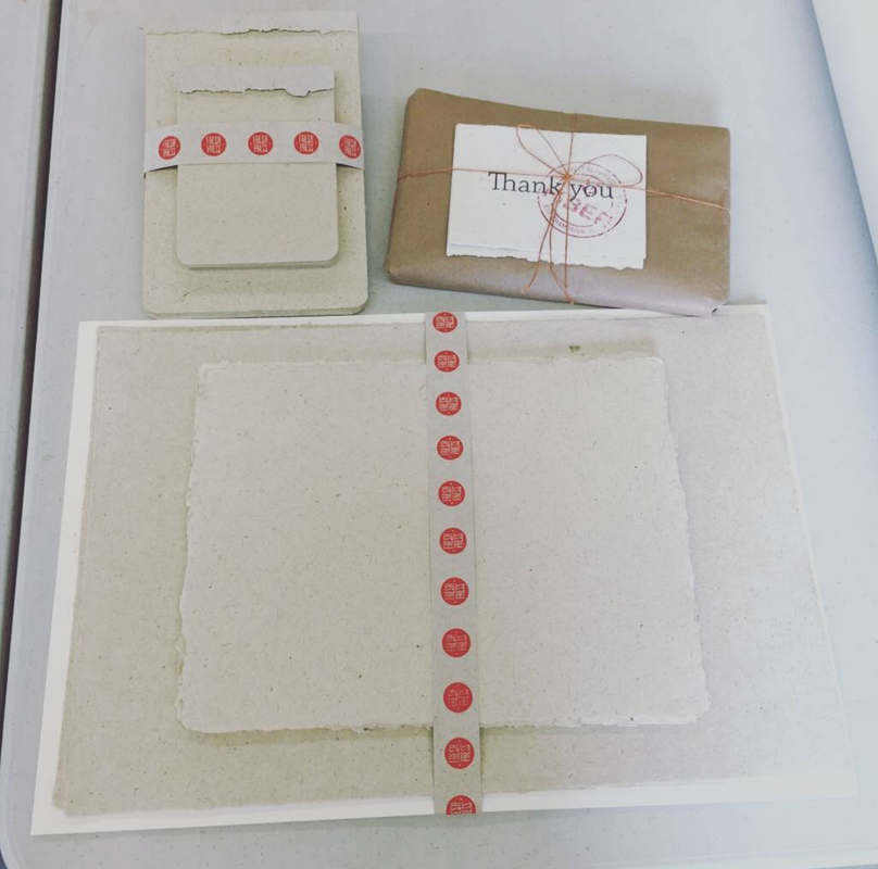 |
Fall 2016 CSA products, FreshPressPaper on Instagram
 | 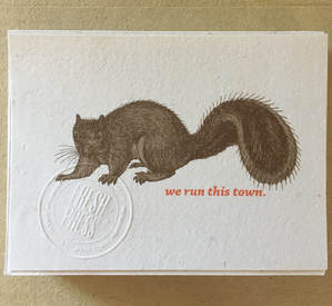 |
Nora Mokate in her studio (left)P.C. Chloe Torri, Summer 2017 greeting card (right) P.C. Chloe Torri
Fresh Press frequently expands its umbrella of resources and has ongoing collaborations with multiple University of Illinois researchers including to architects exploring alternative building materials for homes and mechanical engineers and artists exploring 3D printer and sculpting mediums.
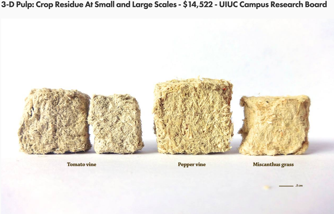
https://freshpress.studio/research/
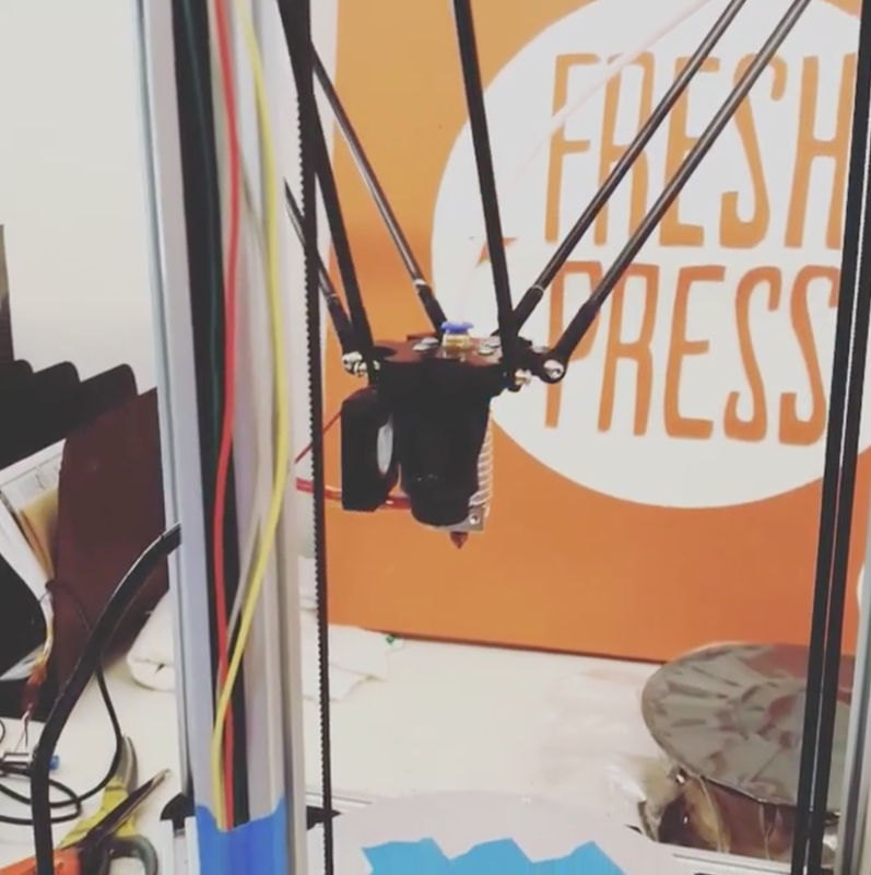 |  |
3D printer ready for fiber filament (left), frozen rain barrel (right) FreshPressPaper on Instagram
Papermaking has a history of being the root to problem solving and Fresh Press is honoring this history and creating interdisciplinary projects among artists, researchers, students, and community members in order to work towards a more circular lifecycle of paper.
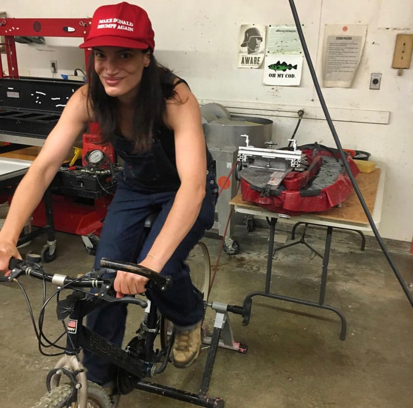
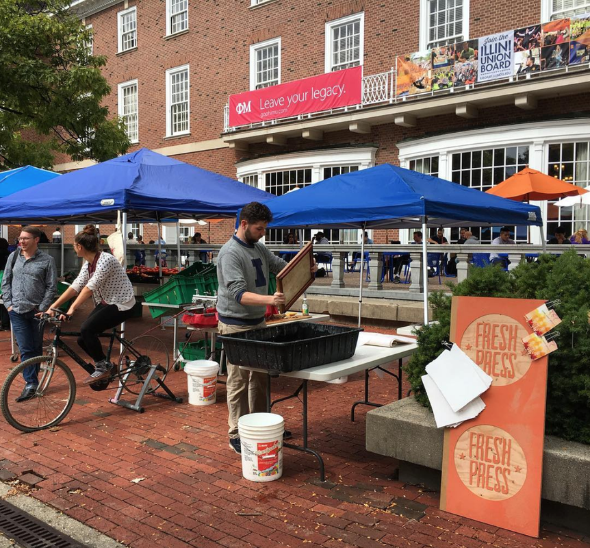


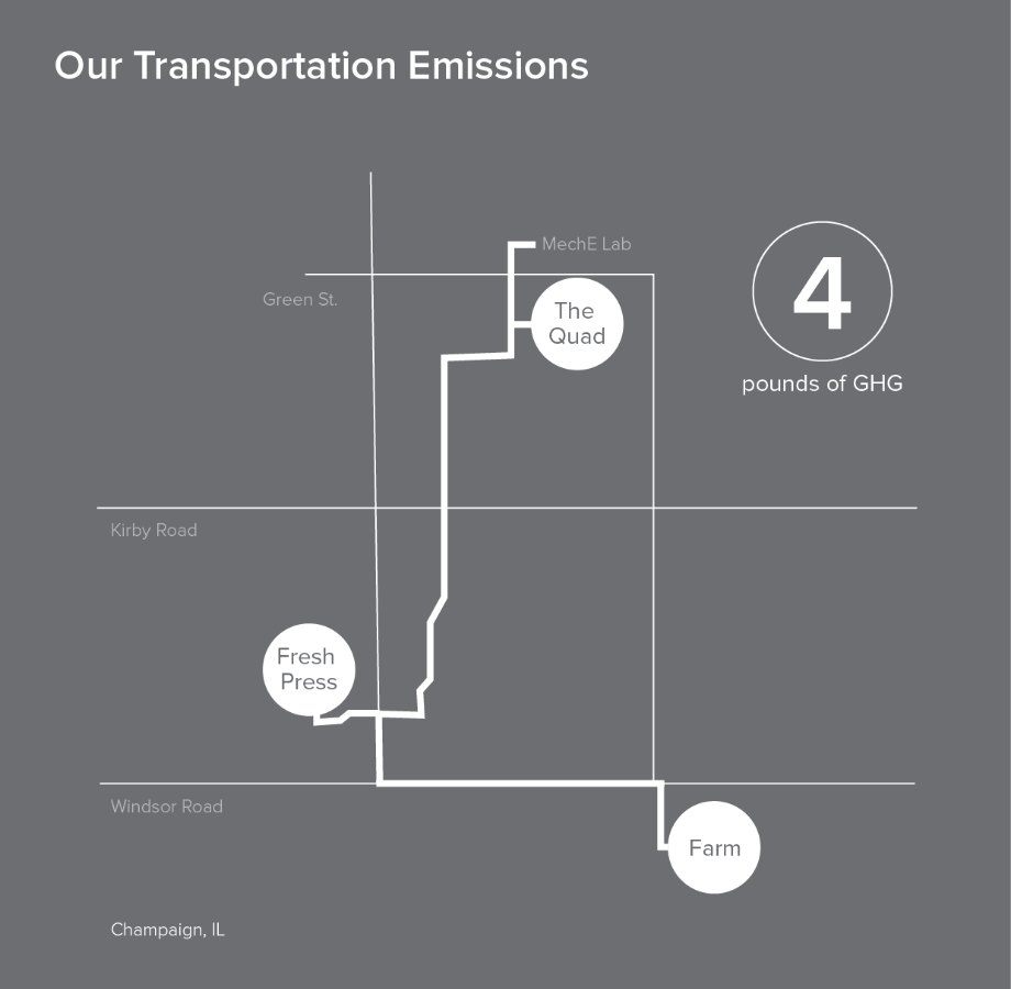
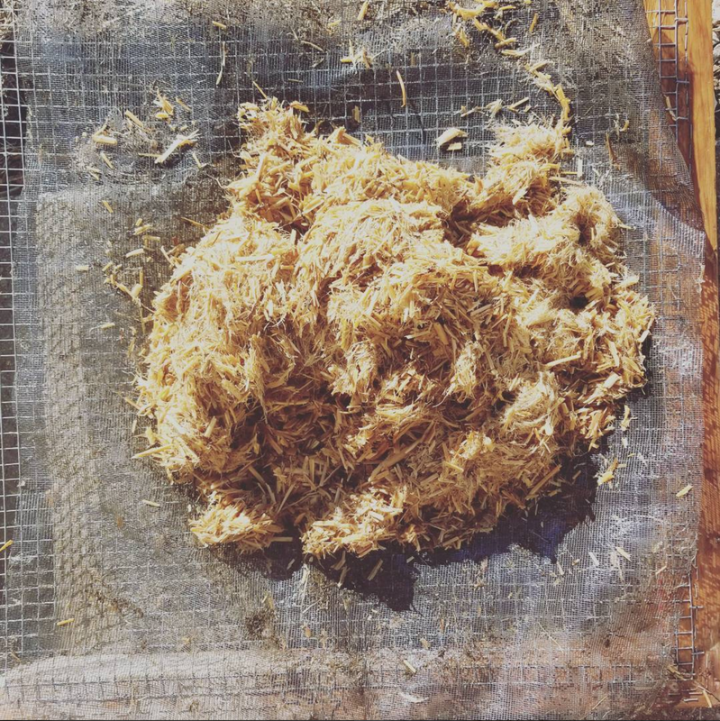
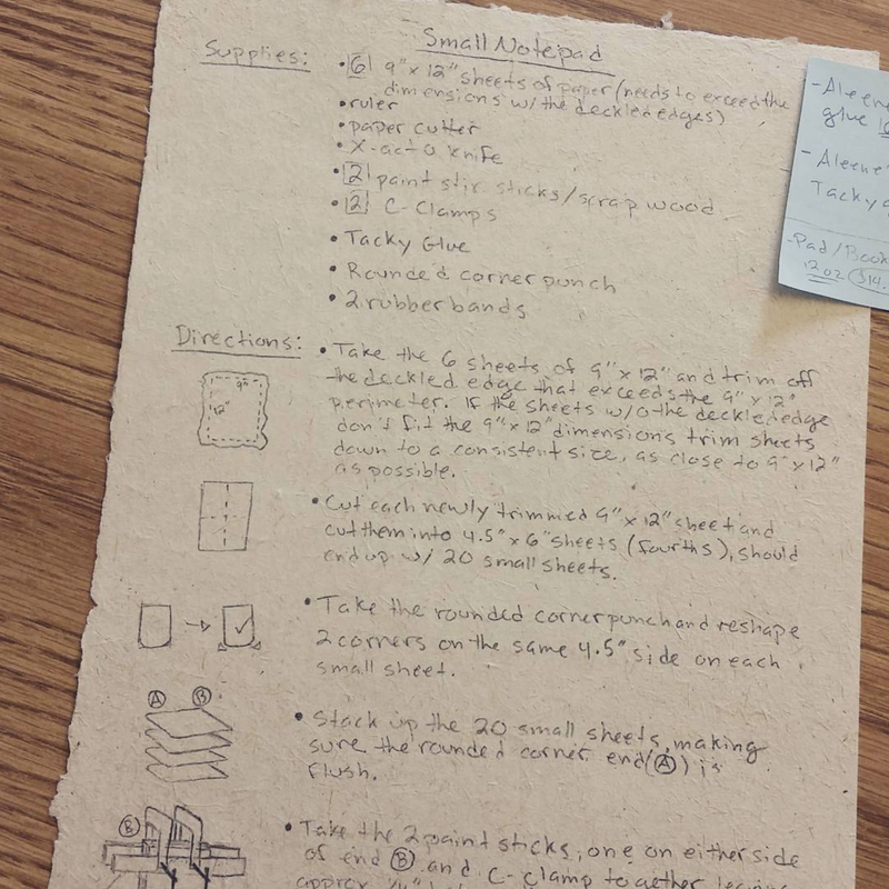


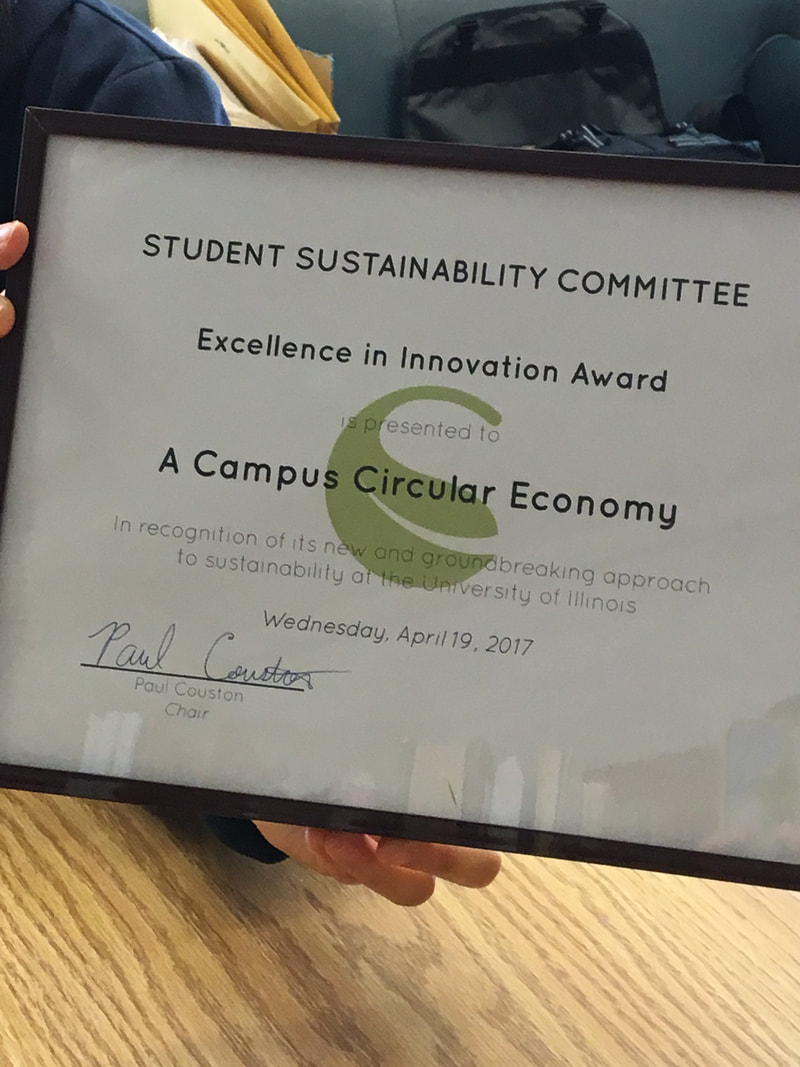
1. Natalie running the pulp beater, collaboration with Peace Paper, nfsmith22 on Instagram
2. Market of the Quad, nfsmith22 on Instagram
3. Fresh Press Studios, P.C. Chloe Torri
4. Process Infographic, P.C. Chloe Torri
5. Transportation Emissions Infographic, FreshPress.Studio website - Impact
6. Rinsing Miscanthus after cooking, FreshPressPaper on Instagram
7. Chloe Torri design for notepads, on display via Pulp as Portal: Socially Engaged Hand Papermaking (Center for Book Arts, New York, NY and Salina Art Center, Salina, KS)
8. Rain barrel in action, P.C. Chloe Torri
9. Rainwater Infographic, FreshPress.Studio website - Impact
10. Couched recycled cotton and coffee grounds, P.C. Chloe Torri
11. Excellence in Innovation Award 2017, FreshPressPaper on Instagram
12. Recycled cotton and beet dyed cardstock experiment, FreshPress.Studio website - Our Studio
For more info on Fresh Press head to:
https://freshpress.studio/
www.instagram.com/freshpresspaper/
www.facebook.com/freshpresspaper/
Works Cited
“Cyclopedia of Useful arts & Manufactures.” Cyclopedia of Useful Arts & Manufactures, by Charles Tomlinson, George Virtue, 1852, p. 398.
Eric Benson. (n.d.) LinkedIn [Profile page]. Viewed 10 Feb. 2018.
https://www.linkedin.com/in/ericbenson/
Fresh Press, freshpress.studio.com
https://freshpress.studio/
Fresh Press Paper. (n.d.) Facebook [Profile page]. Viewed 11 Feb. 2018.
https://www.facebook.com/pg/freshpresspaper/
Fresh Press Paper. (n.d.) Instagram [Profile page]. Viewed 11 Feb. 2018.
https://www.instagram.com/freshpresspaper/
“History of Paper Machines.” History of Paper, History of Paper, 2018,
http://www.historyofpaper.net/paper-history/paper-machine-history/
Kinsella, Susan. “The History of Paper.” Concervatree. Environmental Paper Seminar, 1989, Washington, D.C., National Press Building,
http://www.conservatree.org/learn/Papermaking/History.shtml
Natalie Smith. (n.d.) Instagram [Profile page]. Viewed 11 Feb. 2018.
https://www.instagram.com/nfsmith22/
Steve Kostell. (n.d.) LinkedIn [Profile page]. Viewed 10 Feb. 2018.
https://www.linkedin.com/in/steve-kostell-389b0777/
The Student Sustainable Farm at UIUC. (n.d.) Instagram [Profile page]. Viewed 10 Feb. 2018. https://www.instagram.com/sustainable_student_farm/
“WRAP and the Circular Economy.” WRAP, WRAP UK, 23 Jan. 2013,
http://www.wrap.org.uk/about-us/about/wrap-and-circular-economy