|
Research by Hannah Whitaker Fall 2019 The found object is a device used by many artisits in contemporary works. In 2019 it is common that an artisits may sprawl the streets with eyes peeled for that perfect piece of garbage to turn in to a new piece. As defined by The Tate museum a found object is "a natural or man-made object, or fragment of an object, that is found (or sometimes bought) by an artist and kept because of some intrinsic interest the artist sees in it." While the use of found objects is relatively common in the modern art world it wasn't until after World War 1 that these objects started filling that role. "Suffering a deep malaise...artists sought to break out of traditional or historical modes of creating art, they searched for new ways to innovate by delving into every aspect of their culture and compelling new thought."(Cunha-Lewin) From this philosophy of thought came "readymade" art. Many artisits of this time were throwing out processes originally deemed as proper for something that spoke to them and their concept. The Readymade functioned in this way as "artists choose ordinary found objects from everyday life, and repositioned them as works of art so that their original significance disappeared in light of sparking new points of view."(Cunha-Lewin) This pushed artisits outside of their comfort zone of technique and paved the way for Conceptual art, which emphasized the importance of developing and presenting ideas over a finished "fine-art" piece. Occasionally these objects might not be modified, making the act of presenting the object the art itself, hence the term Readymade. Otherwise, it is common for these objects, or portions of the object to serve as parts of a new whole. These kinds of works are often sculptural and known as "assemblages". "Assemblage is art that is made by assembling disparate elements – often everyday objects – scavenged by the artist...The use of assemblage as an approach to making art goes back to Pablo Picasso’s cubist constructions...An early example is his "Still Life" 1914 which is made from scraps of wood and a length of tablecloth fringing, glued together and painted."(Tate) Interested in the opportunities provided by juxtaposition assemblage became a very effective way of working for many early surrealist,or neo-dada, artisits. A few great examples of this are Jasper Johns and Robert Rauschenberg 's works from the 1950's and 60's which you can see below. “Take an object. Do something to it. Do something else to it.” |
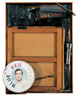 Jasper Johns,Souvenir II, 1964. | 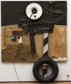 Robert Rauschenberg First Landing Jump. 1961. Cloth, metal, leather, electric fixture, cable, and oil paint on composition board, with automobile tire and wood plank. The Museum of Modern Art, New York. |
We should also take a moment to recognize the influential works of Louise Nevelson. Often overshadowed by the works of her male counterparts Nevelson started creating the monolithic sculptures of forgotten wood bits in the 1940's. Stacking boxes and whatever else she could get her hands on Nevelson created huge black or gold walls and installations that demand the viewers attention.
"I began to see things, almost anything on the street, as art . . . that's why I pick up old wood that had a life, that cars have gone over and the nails have been crushed . . . All [my] objects are retranslated—that's the magic."
Here in Nevelson's quote from a 1988 interview with The Washington Post I believe she truly sums up the wonder of creating through found objects. It is the act of taking a "dead" object that has spoken to you and giving it a new life, presenting it to the public through your own personal lens. Crating beauty from decay.
Another Great clip on Nevelson: Louise Nevelson shares her sculpture studio
For more found object works see: Betye Saar, Leo Sewell, Joseph Cornell, Haim Steinbach, Kurt Schwitters, Sarah Lucas, Damien Hirst ,Jake and Dinos Chapman, Christina Mackie, Mike Nelson and Tomoko Takahashi.
Citations
Jasper Johns: "Take an object. Do something to it. Do something else to it.": Blog: Royal Academy of Arts. (2017, September 7). Retrieved November 18, 2019, from https://www.royalacademy.org.uk/article/magazine-jasper-johns.
Louise Nevelson shares her sculpture studio · SFMOMA. (n.d.). Retrieved November 18, 2019, from https://www.sfmoma.org/watch/louise-nevelson-shares-her-sculpture-studio/.
Louise Nevelson – ‘New York is My Mirror’ . (2016, September 16). Retrieved November 18, 2019, from https://www.youtube.com/watch?v=AnYBR9VAPsI.
Readymade and The Found Object - Modern Art Terms and Concepts. (n.d.). Retrieved from https://www.theartstory.org/definition/readymade-and-found-object/.
Tate. (n.d.). Found object – Art Term. Retrieved November 19, 2019, from https://www.tate.org.uk/art/art-terms/f/found-object.
Tate. (n.d.). Assemblage – Art Term. Retrieved November 18, 2019, from https://www.tate.org.uk/art/art-terms/a/assemblage.
Vigna, F. (2012, November 28). MoMA: Duchamp, Rauschenberg, and Assemblage: A Preview of Fast Forward: Modern Moments 1913 >> 2013. Retrieved November 18, 2019, from https://www.moma.org/explore/inside_out/2012/11/28/duchamp-rauschenberg-and-assemblage-a-preview-of-fast-forward-modern-moments-1913-2013/.
Sam Fresquez
Xu Bing was born in Chongqing China in 1955. His mother was a librarian and his father was the head of the history department at Peking University. In 1975 the Cultural Revolution was coming to an end in China. As a part of Mao Zedong's "re-education" policy he was moved into the countryside and forced to work as a sign painter making propaganda.This experience eventually became the foundation to the work he would make. In 1977 he returned to Beijing and enrolled in the Central Academy of Fine Art to study printmaking. He earned his masters in 1987, and later in 1990, moved to the United States because of the pressure being put on artists after Tiananmen Square. He lived in the States until being appointed the new vice president of the China Central Academy of Fine Arts in 2008.
Xu Bing was born in Chongqing China in 1955. His mother was a librarian and his father was the head of the history department at Peking University. In 1975 the Cultural Revolution was coming to an end in China. As a part of Mao Zedong's "re-education" policy he was moved into the countryside and forced to work as a sign painter making propaganda.This experience eventually became the foundation to the work he would make. In 1977 he returned to Beijing and enrolled in the Central Academy of Fine Art to study printmaking. He earned his masters in 1987, and later in 1990, moved to the United States because of the pressure being put on artists after Tiananmen Square. He lived in the States until being appointed the new vice president of the China Central Academy of Fine Arts in 2008.
Xu Bing often uses calligraphy and sculpture in his work to explore his experiences with communication. He is most known for his piece Tianshu or Book from the Sky. This installation was made of rows of hanging scrolls that filled a room. On these scrolls were over 4,000 character that he had designed to look like like Chinese text but were actually meaningless.
Another piece he is known for is New English Calligraphy, a projected he started after living in the United States for four years. He designed characters that were made to look like Chinese but are actually made out of English words. He then gave lessons on how to write in these characters. When New English Calligraphy is displayed he often uses nursery rhymes to give an example.
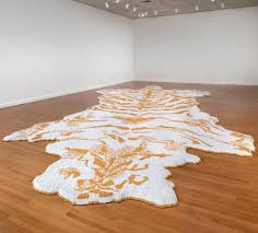
Xu Bing started his tobacco projects when he was invited to be the artist-in-residence at Duke University in 2000. He was interested in the Duke Family history which led him to tobacco. This led to a series of work using cigarettes, and tobacco. The most known of these is a tiger skin rug made from around a half a million cigarettes. Tiger-skin rugs are a symbol go human dominance. “It confirms our superiority by transforming one of nature’s fiercest predators into a lifeless skin beneath our feet.” Xu Bing also compares the way fur and skin rugs can glamorize hunting with the way smoking can often be glamorized. Other projects that were a part of this series included prints on tobacco leaves, a tree with branches made of matches, and a compressed cube of tobacco with the words “light as smoke” on the top o
By Samantha Vo
The digital revolution during the 1970’s provided a platform for the new artist. Practicing non traditional mediums, digitally versed artists gave new meaning to the computer and its advances in culture. Joan Truckenbrod was amongst these pioneers and has been highly influential in the development of not only the digital artist, but the inclusion of women in technology. In a time where the potential of the computer was envisioned to be more transformative than ever imagined, Ruth Leavitt proposed the following from her influential book Artist and Computer (1976): “Computer art challenges our traditional beliefs about art: how art is made, who makes it, and what is the role of the artist in society. The uninitiated artists asks: What can this machine do for me? Really, the question should be: What can I do with this machine? The artist has only to choose what role he/she wishes the computers to play. The computer helps the artist to perceive in a new way. Its features blend with those of its user to form a new type of art” (leavitt 1976, vii).
Joan Truckenbrod is an international exhibited artist based in Chicago, Illinois. Intrigued by the physical sensations of transparent yet palpable phenomena, Truckenbrod translates mathematical formulas from physics into code to create artwork that can materialize this data. Such phenomena includes but is not limited to, light wave reflections off of chaotic surfaces, wind patterns that reshape materials in their pathway or magnetic fields with undulating boundaries. Computer imaging was a vehicle to unify the synthesis of the analytical and physical perception of these experiences. Her work is influential largely because it did not remain in a digital form but often transformed into physical works such as drawings and textiles. Aside from coding, Truckenbrod experimented with unconventional printing methods to translate her code onto paper and other materials.
In 1975 Joan Truckenbrod created her series of line drawings using code she developed in FORTRAN, a computer programming language. The process she described, was long and unpredictable as much of the equipment was not available in the art department leaving her to depend on faculty in the science and geography labs to process her material. Her code was developed from mathematical equations that describe the phenomena of wind and light patterns. Line by line, she translated the formulas onto key punch cards for the computer to read and produce code. Using a pen plotter in the geography department, she was able to feed her code into the machine to draw the embedded coordinates.
 |  |  |
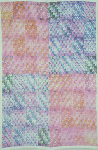
Truckenbrod’s line drawings was an introduction of how she could utilize the computer in her art. However she was unsatisfied with the disconnection between such phenomena and the drawings and desired to create a more symbolic union with the natural world. She received a grant from Apple computers in 1978 to pursue her exploration in textiles. Using an apple IIe, Joan created a series of patterns representing the invisible phenomena in motion. She placed the monitor upside down on a 3M color-in-color copier to create individual pattern frames. Truckenbrod hand ironed the patterns frame by frame using heat transfer xerography onto fabric. By using textiles, Joan felt that it would connect with the natural world by responding radically to light patterns and wind currents in its environment. These electronic patchwork textiles were then exhibited in the IBM Gallery in New York City.
 |  |
After receiving her MFA from the School of the Art Institute of Chicago in 1979, Joan Truckenbrod became the first chair of its newly created art and technology program, a former nondigital school. She is responsible for developing one of the first courses in computer graphics called “creative computer imaging” and helped establish an international reputation for Chicago’s art community. She was a pioneer for women in the digital arts in a time where technology held little to no room for female artists. Joan Truckenbrod reinvented the possibilities of technology within the arts and paved the way for multi-faceted artists. She is a prime example of the way women bring a diverse perception into any field. As described by Dr. Lina Wainwright “Technology is a valuable handmaiden in the advances of culture but only when wielded with a spirit of empathy, collaboration, and care, skills in which women, in my opinion, excel.”
BIBLIOGRAPHY
“An Awesome Page.” , Artist - Video Sculpture Artwork and Exhibit - Nanoscapes, joantruckenbrod.com/joan-truckenbrod.html.
Cox, Donna, et al. New Media Futures The Rise of Women in the Digital Arts. University of Illinois Press, 2018.
Truckenbrod, Joan. “Biography.” Teaching Texture Mapping Visually - Page 9, 2000, www.siggraph.org/artdesign/profile/Truckenbrod/biography.html.
Truckenbrod, Joan, director. Joan Truckenbrod. Vimeo, 13 Nov. 2018, vimeo.com/286992423.
Wenhart, Nina. “Prehysteries of New Media.” 06/25/08, 2008, prehysteries.blogspot.com/2008/07/ruth-leavitt-artist-and-computer-1976.html.
Karen Nazario
Walter Hamady, born in Flint, Michigan, of a Lebanese father and an American mother in 1940, graduated from Wayne State University and Cranbrook Academy. Since 1964, he has run Perishable Press, where he published intricate, inventive small-edition books. He has often referred to books as “the Trojan Horse of art,” thinking of the way they sneak artistic ideas into a familiar format that can be handled with ease.
Hamady is a pivotal figure in book arts; he helped the art world to perceive the book in a new perspective. His books are humorous, inventive and interactive works of art. I will be delving into Walter’s poking entertainment and innovation – specifically in his fifth Gabberjabb; he challenges conventional ideas about the structure and function of books. For this purpose, I further investigated his satirical behavior and ingenious complexity.
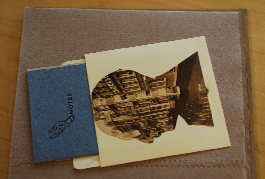
Upon looking through Hamady’s Gabberjabb #5, I was immersed with its personality, this book was given life… he called attention to the art of the book itself having been printed, perforated, drawn, cut, stamped, collaged, taped, embossed, grommeted, signed, notarized, numbered, notched, torn, and bitten. Flipping through pages I noticed the endnotes at the end of words. Any scholar, I would presume, would automatically think, “a source?” Puzzled, I searched for these “sources” to finally stumble upon a manila book pocket with the silhouette of a man’s side profile collaged by a postcard. Inside this pocket, contained a small pamphlet titled,
Walter Hamady, born in Flint, Michigan, of a Lebanese father and an American mother in 1940, graduated from Wayne State University and Cranbrook Academy. Since 1964, he has run Perishable Press, where he published intricate, inventive small-edition books. He has often referred to books as “the Trojan Horse of art,” thinking of the way they sneak artistic ideas into a familiar format that can be handled with ease.
Hamady is a pivotal figure in book arts; he helped the art world to perceive the book in a new perspective. His books are humorous, inventive and interactive works of art. I will be delving into Walter’s poking entertainment and innovation – specifically in his fifth Gabberjabb; he challenges conventional ideas about the structure and function of books. For this purpose, I further investigated his satirical behavior and ingenious complexity.
Upon looking through Hamady’s Gabberjabb #5, I was immersed with its personality, this book was given life… he called attention to the art of the book itself having been printed, perforated, drawn, cut, stamped, collaged, taped, embossed, grommeted, signed, notarized, numbered, notched, torn, and bitten. Flipping through pages I noticed the endnotes at the end of words. Any scholar, I would presume, would automatically think, “a source?” Puzzled, I searched for these “sources” to finally stumble upon a manila book pocket with the silhouette of a man’s side profile collaged by a postcard. Inside this pocket, contained a small pamphlet titled,
I let out a soft chuckle in the reading room realizing the pun Hamady left for his spectators. Footnotes.
I returned to the very beginning of the Gabberjabb while constantly referring to the footnotes at my side. Travelling through, I could not help but laugh or smile a bit. Truthfully, I was having a conversation with this book. These notes reflected his own voice, it was almost like speaking with Walter Hamady himself.
“the Druze call it THE FORCE114” followed with the footnote, “Preceeds Star Wars. See ftN Forty-SiX through Seventy.”
“Copyright 1981 by Walter Samuel Hätoum Hamady” had a finger pointing to his name with the number 103, the note reads as follows: “(SEE: 38, 42, 47 & 95) My father once told me that in the old country, Hamady is a common name and has 5 branches; this one is ours.” Hamady settled in Wisconsin in 1966, he is a midwestern artist with roots in the Levant; hence, Walter Semi-Hittite Hamady or (WshH), one of several phrases of his name – Walter Samuel Hätoum Hamady.
The numbers mentioned are of other footnotes mentioned in the Gabberjabbs; unfortunately, I was incapable of observing his entire six volume series. There is a sense of poking fun and frustration given the reader’s willingness to find these notes Hamady suggests.
He adopted a narrative mode associated with scholarly essays; Hamady loved footnotes so, provided they are, in his view worthwhile. Numerous scholars would presume footnotes to be “offensive” as the notes can be “trivializing the text” and hence, a “waste of time.” Nonetheless, Hamady’s notes are pleasurable to read given that they are fundamentally, another story in themselves.
Along my journey of the Gabberjabb I noticed how he played with text. There were misspellings, fascinating punctuation, bolds, italics, capitalization, and so on and so forth. If one is willing to preserve, there are wonderful discoveries to be made. The mood of the book progresses. Reaching near the end of Gabberjabb #5, I took notice of a small alteration to the word “ibid”. It began with footnote *23, a personal reflection he stated. The play on words proceeded to various modifications: “*25 “ (you bite Maybe , “*28 “ It bit Need period after word me.”, “*29 “ tid Bit ColopHaperPun.”, “*30 “ tit bite.” Inside my head I would respond to each note thinking how much is that, what bit, is this a tid bit, and tit bite? The legibility and illegibility act on the pleasure and instruction of the book. There is an equal distribution between the printer and the writer.
There is a continuous disruption of extensive notes produced in the chronology of the text which generates a positive parallel in Hamady’s view – where the footnote is pushed as far as it can, or perhaps ought to, go, and yet he encourages his reader to follow his footsteps as the series moves forward.
May the dedicated reader, forewarned, wait with interest and some apprehension to see what will emerge from Walter Hamady’s Gabberjabbs.
Intimate qualities flow from Hamady’s worldview, one that necessarily sustains and is shaped by his manner of making art. Many artists cite an “art is life, life is art” philosophy, but Hamady’s output contradicts this otherwise. Whether in multifaceted anatomy of his books, construction of his assemblages or arrangements of his collages. Hamady’s work is intensely personal, bears his aura, and incorporates his experiences. Rather than enclosing out the viewer, these qualities only serve to draw us in, encouraging close looking and contemplation and affecting all the senses.
“The book, is perhaps the most personal form an artist can deal with. It encompasses a multiple and sequential picture plane, it is tactile, and to be understood, it must be handled by the viewer, who then becomes a participant.” - Walter Hamady
“The book, is perhaps the most personal form an artist can deal with. It encompasses a multiple and sequential picture plane, it is tactile, and to be understood, it must be handled by the viewer, who then becomes a participant.” - Walter Hamady
Bibliography
Behrens, Roy. “The Gift of Gabberjabbs.” Print, vol. 51, no. 1, 1997, pp. 64–71
Derrida, Jacques. “Living on.” Deconstruction & Criticism. New York: Continuum, 1979, pp. 75
76.
Hamady, Walter. For the Hundredth Time &Quot;Gaebboerjabb Number (5) Five&Quot; : 12
&Amp; 17 November 1980 : Journal Liftings. Perishable Press, 1981.
Lydon, Mary. "The Trojan Horse of Art: Walter Hamady, the Perishable Press Limited and "Gabberjabbs 1-6"." Visible Language, vol. 25, no. 2, 1991, pp. 151. ProQuest.
Merryn Alaka
Alisa Banks is a full time visual artist whose work confronts memory, tradition, and notions of home, place and self. Growing up as a black woman in the 60’s and 70’s, Banks work often incorporates fibers materials and found objects that reflect on personal experiences, and cross-cultural tones of intolerance during that time period. Banks received her BS from Oklahoma State University and later her MFA from Texas Woman’s University. Her work has been exhibited nationally and internationally, and is in several private and public collections. Currently Banks resides in Dallas, Texas.
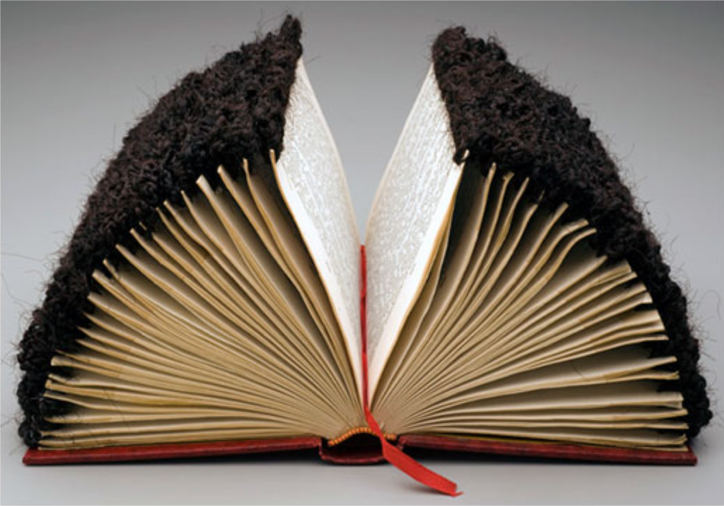
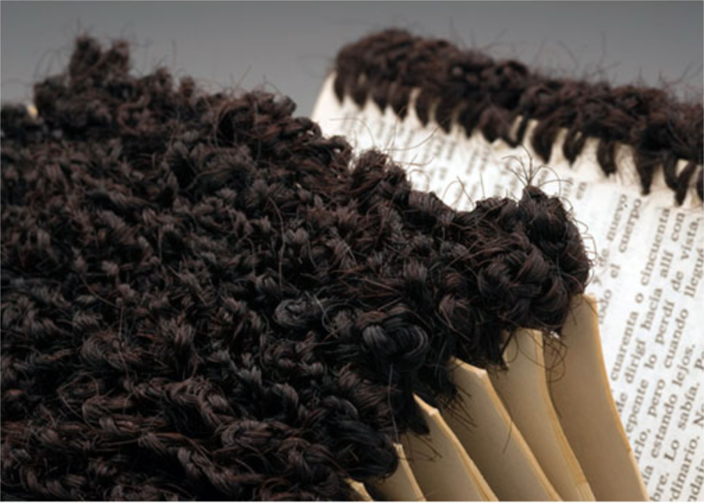
Cotton, doilies, wood, silk and synthetic hair are all materials Alisa Banks interlaces within and throughout books, transforming them into meticulously crafted, intimate sculptural objects. Underlying themes of identity and cultural memories are commonly explored through Banks’ repurposed books. In a series of work titled “Edges”, the artist elaborately crochets synthetic hair to the edges of each page of the book. Presented open faced the transformed book resembles a half circle, embodying a gravity defying, frizz prone, African hairstyle. The series of four books presents four different hairstyles of traditional African braiding techniques. The hair fibers create textures against the pages while simultaneously embellishing the edges of the pages symbolizing “ the marginal, the end, the between, and duality.” Banks states, “the hair treatment symbolizes how much activity, creativity, and life happens at the ‘edges’ of mainstream society, regardless of whether or not it is recognized…” Growing up during a time period of racial integration, Banks edge series captures the tones of intolerance faced during the 60’s and 70’s and even today when regarding immigration status.
Alisa Banks is a full time visual artist whose work confronts memory, tradition, and notions of home, place and self. Growing up as a black woman in the 60’s and 70’s, Banks work often incorporates fibers materials and found objects that reflect on personal experiences, and cross-cultural tones of intolerance during that time period. Banks received her BS from Oklahoma State University and later her MFA from Texas Woman’s University. Her work has been exhibited nationally and internationally, and is in several private and public collections. Currently Banks resides in Dallas, Texas.
Cotton, doilies, wood, silk and synthetic hair are all materials Alisa Banks interlaces within and throughout books, transforming them into meticulously crafted, intimate sculptural objects. Underlying themes of identity and cultural memories are commonly explored through Banks’ repurposed books. In a series of work titled “Edges”, the artist elaborately crochets synthetic hair to the edges of each page of the book. Presented open faced the transformed book resembles a half circle, embodying a gravity defying, frizz prone, African hairstyle. The series of four books presents four different hairstyles of traditional African braiding techniques. The hair fibers create textures against the pages while simultaneously embellishing the edges of the pages symbolizing “ the marginal, the end, the between, and duality.” Banks states, “the hair treatment symbolizes how much activity, creativity, and life happens at the ‘edges’ of mainstream society, regardless of whether or not it is recognized…” Growing up during a time period of racial integration, Banks edge series captures the tones of intolerance faced during the 60’s and 70’s and even today when regarding immigration status.
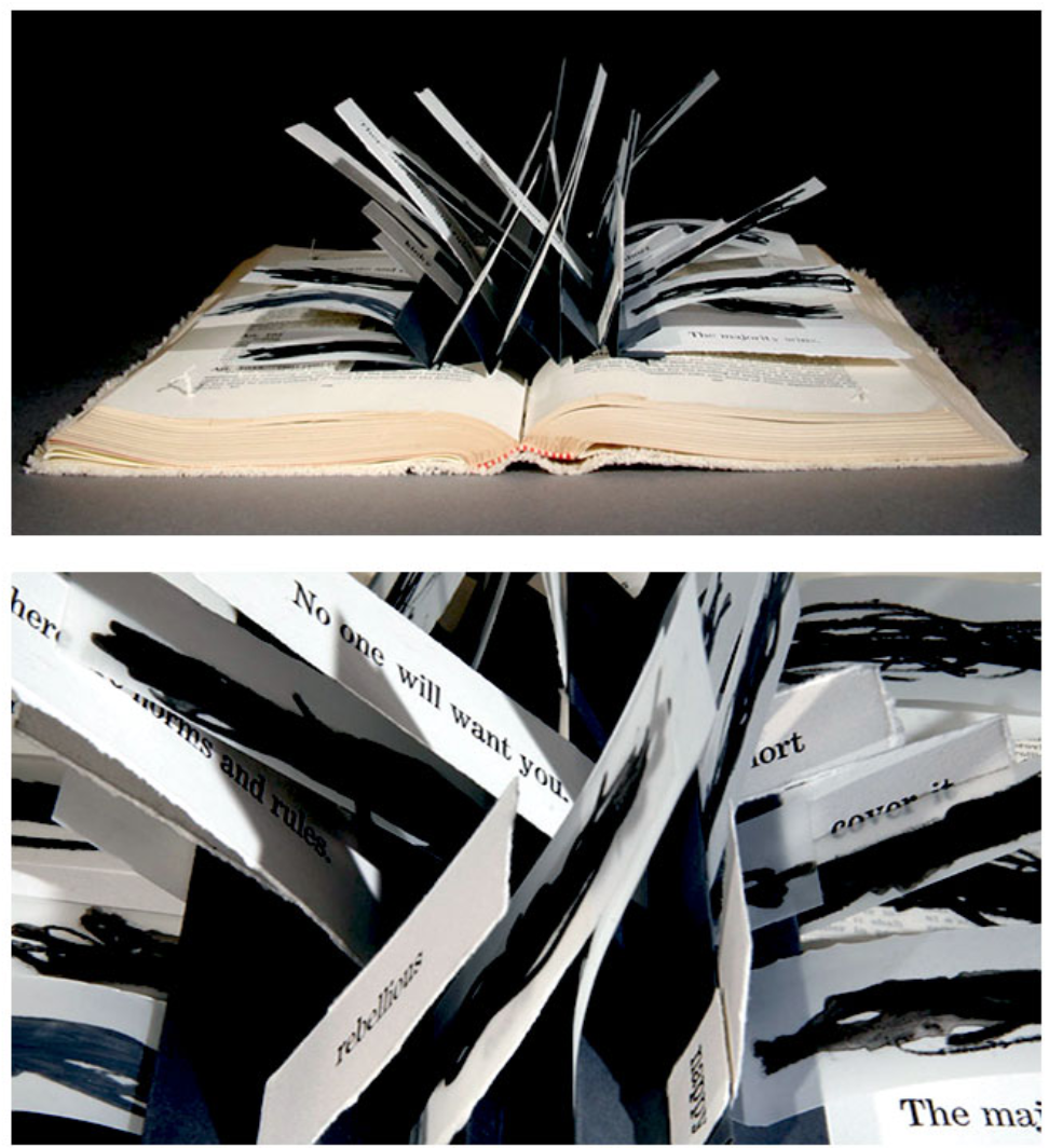
Continuing on her research about the manner in which black hair has been politicized throughout history, Banks creates an altered book entitled “Bad Hair”. She uses an old Texas Law book but alters the interior creating a flag book. Conceptually, the flags mimic locs or braids and their unruly aesthetic as perceived by white dominated workplaces. For many women in the 60’s and 70’s natural African hairstyles were unacceptable for work environments and even regarded as unprofessional. The text within the book was taken from news articles found from research on early struggles black women’s hair.
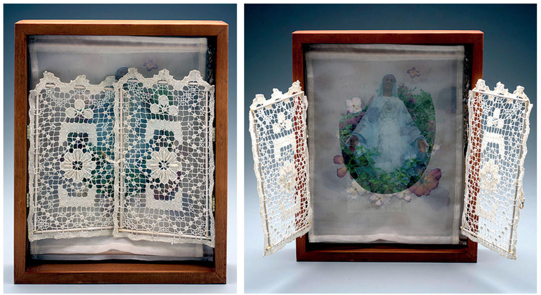
Banks southern Louisiana upbringing influences many of her decisions to use certain materials. One of her sculptural books- “Our Lady of the Lawn”- takes on the form of a homemade shrine and garden that were typical in homes throughout southern Louisiana where Madonna statues adorned many lawns. Banks uses crocheted lace, beaded rosary and medallions throughout the shrine to reference the histories of the shrines and the objects found along them. Inside the shrine is a fragment of a story written by the artist.
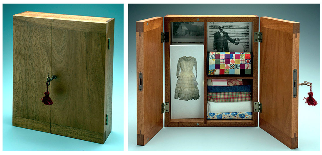
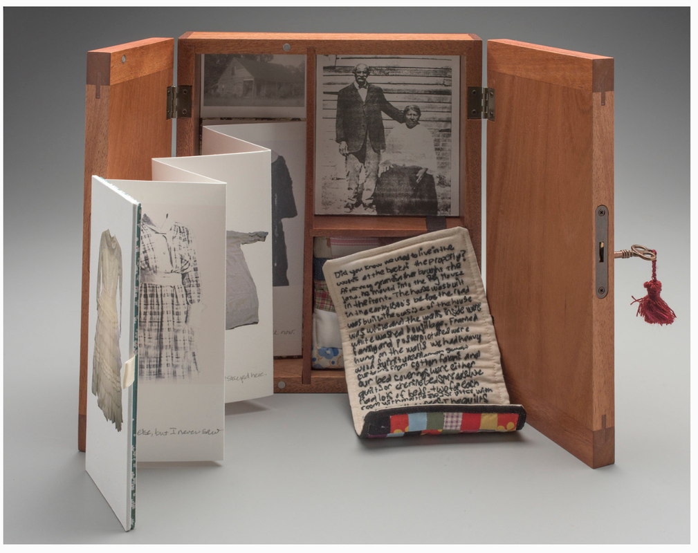
Similar in style is Banks’s book entitled “Armoire”. Here she crafts a small scale Armoire closet using a wooden box containing intimate items like photographs, fragments of texts, and partial clothing materials. Reflecting on her childhood memories Banks recalls the exhilarating feeling of exploring her grandmother’s armoire and learning the stories of the personal objects found inside. Closets in most cases are intimate spaces, commonly off limits, but full of memories while revealing something about its owner. To Banks, the armoire “remains a repository of memory, culture, history, and tradition.”
Bibliography
“A Bee Press- Alisa Banks.” Primrose Press, www.vampandtramp.com/finepress/b/A-Bee-Press.html.
“VCU News.” VCU Forensic Toxicologist's Work in Helping Solve Bizarre Death to Be Featured on National Forensics Television Show, news.vcu.edu/article/More_than_words.
“About Alisa Banks.” Alisa Banks, www.alisabanks.com/about-the-artist/.
"Alisa Banks- The Edge Series." Abecedarian Gallery, abecedariangallery.com/store/reviews/2012/12/14/alisa-banks-the-edge-series/.
ManagedArtwork.com. “Alisa Banks.” Http://Www.seagergray.com/ - Richard Shaw - Artists Detail, www.seagergray.com/Artist-Info.cfm?ArtistsID=521.
William Mark Sommer
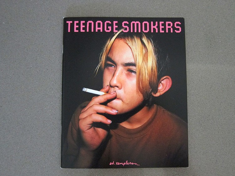
In 1999, Ed Templeton released his first book, Teenage Smokers. The book was a simple design of 30 photographs and 3 illustrations with a small forward by Aurelie Voltz, and an Interview by Jerome Sans. The book was just made for a corresponding photo show at Alleged Gallery, but the show and book took off like a wildfire giving Ed worldwide attention even awarding him $50,000 from the Italian Search For Art competition. From Teenage Smokers he also conceived a direct sequel to the book Teenage Smokers 2, released 2015 by Super Labo, and a sister project Teenage Kissers in 2011 that was produced by Seems. Teenage Smokers has gone on to becoming a classic photo book that has been referenced by many artist and even talked about in Martin Parr and Gerry Badger's "The Photobook: A History Volume III" being called a, “brand new, most handsome example of this contemporary classic.”
Ed Templeton is an artist photographer residing and from Huntington Beach California. Ed’s creation started when he first picked up skateboarding and got into punk music. Pursuing a professional career in skateboarding, he was surrounded by other creative’s shooting photography, making videos and creating board graphics. Within that time he picked up a camera and started documenting the things he saw, the places he would go, and every intimate detail of his life. Though Ed has no formal training in art being surrounded by the likes of Jason Lee, Mark Gonzalez and many other artistic skateboarders, he gained an education most of us could only dream of. Ed started exhibiting his work in 1993, and eventually gained a world following even more than his skateboarding career.
Ed as a creative in book arts has been challenging the way photography is shown in the book form. Ed has a created over 44 books and zines ranging from simple zerox folio, accordion books, to classic perfect bound books that showcase his works in these diverse monographs. More than just the structure of the book, Ed brings a different life to his work by utilizing many different layouts from photos in a collage form, sometimes applying pull out pages, to full layouts of exhibitions with drawings and his hand written type giving a new narrative to the work than the simplicity of single photos. These different methods of structures and layouts help to give his work an even more personal touch and diverge his photographs from the traditional way of showing photos in the book form.
Ed as a creative in book arts has been challenging the way photography is shown in the book form. Ed has a created over 44 books and zines ranging from simple zerox folio, accordion books, to classic perfect bound books that showcase his works in these diverse monographs. More than just the structure of the book, Ed brings a different life to his work by utilizing many different layouts from photos in a collage form, sometimes applying pull out pages, to full layouts of exhibitions with drawings and his hand written type giving a new narrative to the work than the simplicity of single photos. These different methods of structures and layouts help to give his work an even more personal touch and diverge his photographs from the traditional way of showing photos in the book form.
Though Ed Templeton was not the first to many of the methods used in his photo books he has really innovated the whole field of with his ways of stepping beyond the traditional photo book. Traditional photo books have stayed fairly formulaic to the white page on the left photo on the right, until Ed Rusche created his Twentysix Gasoline Stations, this book helped usher a Renaissance to book making all together, but also gave artist like Ed Templeton a new way to experiment with the form. Being close to the punk rock zine creators of the 80s- 90s Ed and many of his contemporary’s have used the ideals of Rusche to make photo books more affordable mass produced art work. This way of creating books has made it more available for people like myself to own a work of art like theirs.
Photos courtesy of :
http://ed-templeton.com/
Information found on:
http://ed-templeton.com/
https://en.wikipedia.org/wiki/Ed_Templeton
https://www.huckmag.com/topics/ed-templeton/
Thrill of it all podcast:
https://www.youtube.com/watch?v=R51VaxuKchI
Epicly Laterd:
https://www.youtube.com/watch?v=_Hei3ti0G3k
Video By:
Gracious Living by Lucas Chemotti,
https://www.youtube.com/watch?v=wlK43Tz8KSY
http://ed-templeton.com/
Information found on:
http://ed-templeton.com/
https://en.wikipedia.org/wiki/Ed_Templeton
https://www.huckmag.com/topics/ed-templeton/
Thrill of it all podcast:
https://www.youtube.com/watch?v=R51VaxuKchI
Epicly Laterd:
https://www.youtube.com/watch?v=_Hei3ti0G3k
Video By:
Gracious Living by Lucas Chemotti,
https://www.youtube.com/watch?v=wlK43Tz8KSY
By: Elizabeth Z Pineda
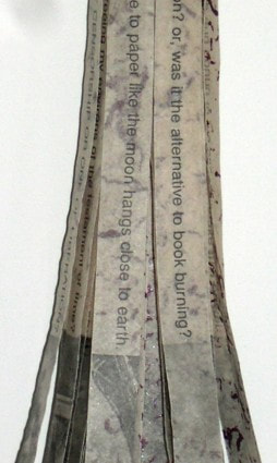
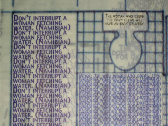
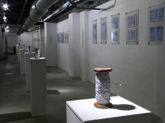
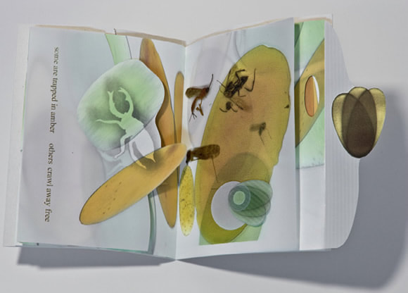
“My interest is interlinearity, this ‘in-between’, the portion of knowledge and the world that we ignore or omit, or consider negative space — the pause in a sentence, the gesture before the act, the twilight between two portions of the day.” Robbin Ami Silverberg
Robbin Amy Silverberg is an artist working in Papermaking, Book Arts, and Installation art. Silverberg is the founding director of Dobbin Mill and Dobbin Books, a hand-made papermaking studio and a collaborative studio working in artists books, respectively. Silverberg has been an instructor for papermaking/artist books at the Center for Book Arts, NYC since 1986, and is Associate Professor for “Art of the Book” at Pratt Art Institute, NYC since 2002.[i]She has published extensively and her work has been exhibited in numerous countries around the world. Dobbin Books publishes 5-10 editions of small artist books yearly. They are either collaborations with artists and/or writers from other countries, as well as from the US and/or solo works by Silverberg.
Conceptually her work focuses on thought and analysis of words and the function of inserted text in lines already written and or printed. This use of text is one of the most visually astonishing things in Silverberg’s work. There is a formality created by the constantly repeating words. An incessant voice telling the viewer a story. The narrative is captivating as it is elusive. The text can either be multiplied over and over, wrapped around objects, and or simply be a single word crafted out of hair and embedded in an object.
However, this is not the only absorbing part of her work. She places equal attention to the entire process of her craft, beginning with the paper she uses and thinks of its function not only as substrate but as an active part of the work.[ii]This is true whether it is her own book or any other work published at Dobbin Books. They are books which explore a wide scope of themes ranging from issues of identity, memory, loss, life, and death. They are also about women’s issues, their voices, and value. Historical themes dealing with war and the Holocaust, literature, and reflections on the self are also present in her work. These themes are approached in an almost obsessive way, with Silverberg deciding with strict detail on every part of the process, from its design, structure, the materials that will be used in the making of the handmade paper, to the final crafting of the book form.
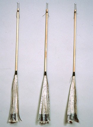
A few titles of books which stood out to me are;Detritus, Home Sweet Home, Proverbial Threads, Testament Patriarch, Dusters, Safer-Code, andJust 30 Words. It was difficult to make selections but I’ve selected these works because I found each moving in a unique way. Detritusis a work about 9/11. The artist states that two weeks after 9/11 she entered “Ground Zero to check if the Ampersand Foundation’s apartment still existed. I walked amongst the abandoned buildings covered in thick layers of dust, with trees covered in paper detritus as if they had genetically altered leaves.I grabbed some of these papers and some handfuls of the powder; much later I made paper with pulp filled with these remains, along with ripped up maps of New York City.” Detritusis a series of five different books in which the artist is trying to understand life in her hometown after the horrific event. Home Sweet Home, Proverbial Threads, and Testament Patriarch are all books that deal with women, how they are viewed, valued, and their perceived roles in society. About Home Sweet Homeshe says that she "'designed' an architectural album of an imaginary middle-class suburban house, filling its plans and layout with the many proverbs I've found about woman in the home.”[iii]Dustersis part of a series of books that was born from the artist’s discovery in Kyoto, Japan of a duster made from a block-printed book. This inspired her to create works in which she is thinking of common objects and how to create text that speaks of the transformation of the object to a book form and the duality which it presents. She has created several works in the form of dusters, dust pans, brushes, hand mirrors, etc. since 1998.[iv]In Safer-Codethe artist cut into a copy of Jonathan Safran Foer’s Tree of Codesillustrating her interest in the “interlinearity” of text, the pause and act of words, the empty space. Just 30 Words is a book with the following description:
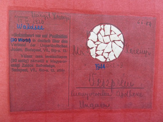
Postcards have been found that were written by deported Hungarian Jews to their relatives from Auschwitz, dictated by SS officers. Rules for responding correspondence can be found on the front: “Answer only on a postcard, (maximum 30 words), in German via the Hungarian Jewish Association. 12 Sip Street, Budapest, VII.”[v]
Silverberg was originally trained as a sculptor in the late 1970’s[vi]and learned bookbinding in Vienna in the early 1980‘s which is when she started making artists books. The way each project is produced and executed vary from one to the other. However, the one thing constant to each work produced by Dobbin Books is the use of the paper made at Dobbin Mill, giving each a unique quality and definitive look to the creation of works by Dobbin Books.
[i]Silverberg, Robbin Amy. Web. 02 October, 2018. http://robbinamisilverberg.com/biocv/
[ii]Silverberg, Robbin Amy. Web. 02 October, 2018. http://robbinamisilverberg.com/dobbin-books-dobbin-mill/
[iii]World Catalogue. 12 November, 2018. Web. http://www.worldcat.org/title/home-sweet-home/oclc/122777513
[iv]Silverberg, Robbin Amy. Web. 12 November, 2018. Artist Statement.
[v]Silverberg, Robbin Amy. Web. 01 November, 2018. http://robbinamisilverberg.com/artwork/editions/just-30-words-interlineary/
[vi]Andrew, Jason. Walt Street Journal. 11 November, 2018. Web. https://www.wsj.com/articles/SB10001424052748704644404575481781993126388
“My interest is interlinearity, this ‘in-between’, the portion of knowledge and the world that we ignore or omit, or consider negative space — the pause in a sentence, the gesture before the act, the twilight between two portions of the day.” Robbin Ami Silverberg
Robbin Amy Silverberg is an artist working in Papermaking, Book Arts, and Installation art. Silverberg is the founding director of Dobbin Mill and Dobbin Books, a hand-made papermaking studio and a collaborative studio working in artists books, respectively. Silverberg has been an instructor for papermaking/artist books at the Center for Book Arts, NYC since 1986, and is Associate Professor for “Art of the Book” at Pratt Art Institute, NYC since 2002.[i]She has published extensively and her work has been exhibited in numerous countries around the world. Dobbin Books publishes 5-10 editions of small artist books yearly. They are either collaborations with artists and/or writers from other countries, as well as from the US and/or solo works by Silverberg.
Conceptually her work focuses on thought and analysis of words and the function of inserted text in lines already written and or printed. This use of text is one of the most visually astonishing things in Silverberg’s work. There is a formality created by the constantly repeating words. An incessant voice telling the viewer a story. The narrative is captivating as it is elusive. The text can either be multiplied over and over, wrapped around objects, and or simply be a single word crafted out of hair and embedded in an object.
However, this is not the only absorbing part of her work. She places equal attention to the entire process of her craft, beginning with the paper she uses and thinks of its function not only as substrate but as an active part of the work.[ii]This is true whether it is her own book or any other work published at Dobbin Books. They are books which explore a wide scope of themes ranging from issues of identity, memory, loss, life, and death. They are also about women’s issues, their voices, and value. Historical themes dealing with war and the Holocaust, literature, and reflections on the self are also present in her work. These themes are approached in an almost obsessive way, with Silverberg deciding with strict detail on every part of the process, from its design, structure, the materials that will be used in the making of the handmade paper, to the final crafting of the book form.
A few titles of books which stood out to me are;Detritus, Home Sweet Home, Proverbial Threads, Testament Patriarch, Dusters, Safer-Code, andJust 30 Words. It was difficult to make selections but I’ve selected these works because I found each moving in a unique way. Detritusis a work about 9/11. The artist states that two weeks after 9/11 she entered “Ground Zero to check if the Ampersand Foundation’s apartment still existed. I walked amongst the abandoned buildings covered in thick layers of dust, with trees covered in paper detritus as if they had genetically altered leaves.I grabbed some of these papers and some handfuls of the powder; much later I made paper with pulp filled with these remains, along with ripped up maps of New York City.” Detritusis a series of five different books in which the artist is trying to understand life in her hometown after the horrific event. Home Sweet Home, Proverbial Threads, and Testament Patriarch are all books that deal with women, how they are viewed, valued, and their perceived roles in society. About Home Sweet Homeshe says that she "'designed' an architectural album of an imaginary middle-class suburban house, filling its plans and layout with the many proverbs I've found about woman in the home.”[iii]Dustersis part of a series of books that was born from the artist’s discovery in Kyoto, Japan of a duster made from a block-printed book. This inspired her to create works in which she is thinking of common objects and how to create text that speaks of the transformation of the object to a book form and the duality which it presents. She has created several works in the form of dusters, dust pans, brushes, hand mirrors, etc. since 1998.[iv]In Safer-Codethe artist cut into a copy of Jonathan Safran Foer’s Tree of Codesillustrating her interest in the “interlinearity” of text, the pause and act of words, the empty space. Just 30 Words is a book with the following description:
Postcards have been found that were written by deported Hungarian Jews to their relatives from Auschwitz, dictated by SS officers. Rules for responding correspondence can be found on the front: “Answer only on a postcard, (maximum 30 words), in German via the Hungarian Jewish Association. 12 Sip Street, Budapest, VII.”[v]
Silverberg was originally trained as a sculptor in the late 1970’s[vi]and learned bookbinding in Vienna in the early 1980‘s which is when she started making artists books. The way each project is produced and executed vary from one to the other. However, the one thing constant to each work produced by Dobbin Books is the use of the paper made at Dobbin Mill, giving each a unique quality and definitive look to the creation of works by Dobbin Books.
[i]Silverberg, Robbin Amy. Web. 02 October, 2018. http://robbinamisilverberg.com/biocv/
[ii]Silverberg, Robbin Amy. Web. 02 October, 2018. http://robbinamisilverberg.com/dobbin-books-dobbin-mill/
[iii]World Catalogue. 12 November, 2018. Web. http://www.worldcat.org/title/home-sweet-home/oclc/122777513
[iv]Silverberg, Robbin Amy. Web. 12 November, 2018. Artist Statement.
[v]Silverberg, Robbin Amy. Web. 01 November, 2018. http://robbinamisilverberg.com/artwork/editions/just-30-words-interlineary/
[vi]Andrew, Jason. Walt Street Journal. 11 November, 2018. Web. https://www.wsj.com/articles/SB10001424052748704644404575481781993126388

Duster 2


Just 30 Words
Merit Eads
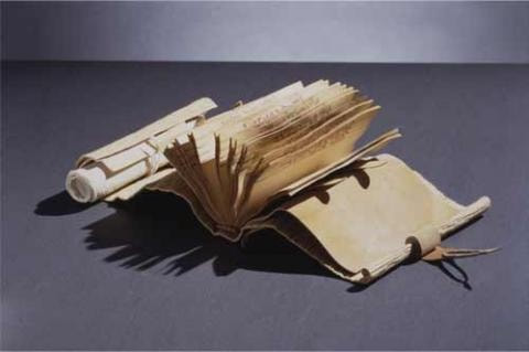
Walter Hamady, born in 1940, attended the Cranbrook Academy of Art in Michigan as an undergraduate and founded his own press - The Perishable Press Limited - in 1964. Two years later he established the Shadwell Papermill and began exploring the creation and usage of handmade paper. Since its inauguration, The Perishable Press name is credited with designing and publishing over 131 titles by numerous authors and visual artists(1). I will be discussing one of Hamady’s personal works, the Interminable Gabberjabbs series.
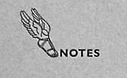
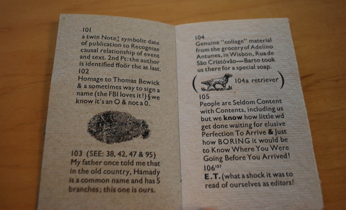
I had the opportunity this past week to visit ASU’s Special Collections and take notes on Hamady’s fifth book in the series, For the Hundredth Time Gabberjabb Number Five. (Due to the signing of an honor agreement, I cannot post the pictures I took. These images were found online.) Hamady is an accomplished poet, creating a sense of flow and unusual softness through his use of syntax and embellishment to even the simple prose that follows along the actual poems in the book. What struck me the most about the Gabberjabb series is how Hamady ignores the traditional rules we as readers have come to expect from codex-form books, particularly in his use of structure and language. Hamady’s Gabberjabbs have been described as a game of “Hunt the Footnote”(2), and upon viewing Gabberjabb Number Five(3) I found this to be more true than I could have anticipated. Housed in the second to last page of the book is a library card folder with a small pamphlet-stitched booklet boasting the title “👣NOTES”(4) that serves as an accompanying reading guide.
Gabberjab Five(6) contains 43 unique footnotes (numbered from “97²” to “140”, which is followed by a letterpressed STOP sign on the backside of the booklet) sprinkled throughout its text that truly embellish the reading experience. In one hand I held the booklet while with the other I flipped the pages of the book itself. Normally when I read text with footnotes - often academic papers of some kind - I read the whole page first and then view the footnotes second, but this book genuinely might have changed the way I read from now on. Hamady’s wild treasure map of a book structure forces the reader to remember that “[p]leasurable mystery of pre-literacy,”(7) that childhood-like experience of trying to make sense of the mess of symbols in front of us. It was refreshing, and having to think through every page that I read made me appreciate the content and Hamady’s artistic vision all the more.
The other aspect of Hamady’s Gabberjabbs that had me enamored from the beginning was the fact that, in these texts, spelling, punctuation, and capitalization follow the rules of prose at their own leisure. When Hamady mentions meeting the “General Sturgeon,” or over the course of ten footnotes makes the slow change from “Ibid.” to “tit bite,” there’s a sense of playfulness that just makes you smile as you’re reading. His dismissal of textual conventions isn’t solely for humor, though; in an odd way, it emphasizes the very specific emotions that his works manage to convey. Capitalizing several Words in a Phrase makes you take just a moment longer to savor each of them, and ov coarse 2 spell a word rong in th 1st place is a very purposeful statement that affects how you pronounce it in your mind as you read. ‘Incorrect’ text is just as important as ‘correct’ text is when it comes to conveying emotions, personal thoughts, and broad concepts, and Hamady’s Gaggerblab Five truly calls to attention how textual forms can affect the content they choose to portray. I had already been inspired by the few images of Hamady’s works that I could find online and the articles in journals praising his unique bookforms, but after seeing it in person, I’m more awed than ever by how he works and by how successful it really is.
(1) “Walter Hamady.” Wikipedia, 30 July 2018, https://en.wikipedia.org/wiki/Walter_Hamady. Accessed 8 Nov. 2018.
(2) Lyndon, Mary. “The Trojan Horse of Art: Walter Hamady, The Perishable Press Limited and ‘Gabberjabbs 1-6’.” Visible Language, vol. 25, iss. 2, 1991, https://search-proquest-com.ezproxy1.lib.asu.edu/docview/1297966346?accountid=4485&rfr_id=info%3Axri%2Fsid%3Aprimo. Accessed 7 Nov. 2018.
(3) A shortened form of the full title previously stated, For the Hundredth Time Gabberjabb Number Five, for purposes of readability and, to be quite honest, as an excuse from the author to continue to use the word “Gabberjab” in an academic report.
(4) Approximated; in the real book, the ftNode(5) booklet is inscribed with a letterpressed symbol of Hermes’ winged sandal, followed by the word NOTES.
(5) [sic]
(6) Apologies; another shortened title. For intents of this report, For the Hundredth Time Gabberjabb Number Five will hereafter be referred to by varying versions of its title, including but not limited to Gabberjab Number Five; Gabberjab Five; Walter Hamady’s fifth Gabberjab; Gabberblab Five the Fifth One, etc. At the reader’s discretion, to what I am referring should be instinctive.
(7) Lyndon, Mary.
Monica Wapaha
Through various forms of art, Contemporary Indigenous Artists have been addressing preconceptions of Eurocentric views of their culture, identity and the isolation of reservation life for decades. The history of Indigenous peoples, including Contemporary Indigenous Art are often left out of the conversation. Through history and popular culture, the image of Native Americans has consisted of monolithic celluloid characters and old images created by Edward S. Curtis. Beautiful, yet these photographs have unfortunately contributed into stereotypes that Indigenous people are artifacts. There are a few artists whom have taken these photos and ideas of the past into their own hands in creating art work revolving these views.
Living in two worlds is often a theme in Indigenous art and is used when confronting the preconceptions of the Eurocentric gaze. This gaze is associate with lack of knowledge on Indigenous people and their culture but only familiar with them through western films, old photos, and stereotypes. They are unaware that there are 562 federally recognized tribes. Today’s Contemporary Indigenous artists are challenging the ways conventional museums depict Indigenous peoples, culture and art. We will be taking a closer look at these artists and how they are able to bring these topics into discussion with performance and photography.
James Luna, is an internationally renowned performance and installation artists who is Puyukitchum, Ipai, and Mexican American Indian (James Luna). His art consists of aspects of Indigenous identity, isolation and misinterpretations of his culture. In his historical The Artifact Piece, he changed Contemporary Native American Art forever. The Artifact Piece performance was created in 1987, when Luna was attending the San Diego State University and at the time, his focus was in art education. The performance allowed the viewer to participate in the reality of the current state of the American Indian in a contemporary setting. Luna displayed his belongings such as; his divorce papers, music he enjoyed, photographs and himself in a display case. Luna has been such an influential artist to Contemporary Native artist.
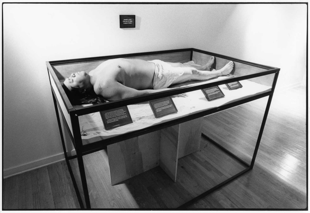
James Luna The Artifact Piece 1987
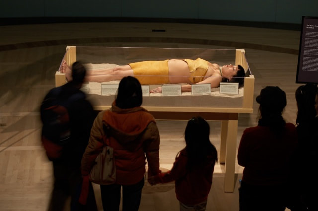
Erica Lord Artifact: Revisited 2008
Artifacts and stereotypes play a huge roll in how the world perceives the identity of Native Americans in society. Another part of the stereotypes is in the perceptions and reality in which they are often considered a mere joke comparison to their ancestors and “all the real Indians died off”. It is often hard for non-natives to believe that Indigenous people are a current living culture. Today Contemporary artists are often said to be “manufacturing artifacts”.
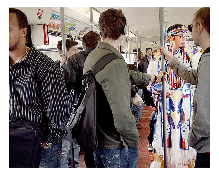
Terrance Houle Urban Indian Series #3 2005
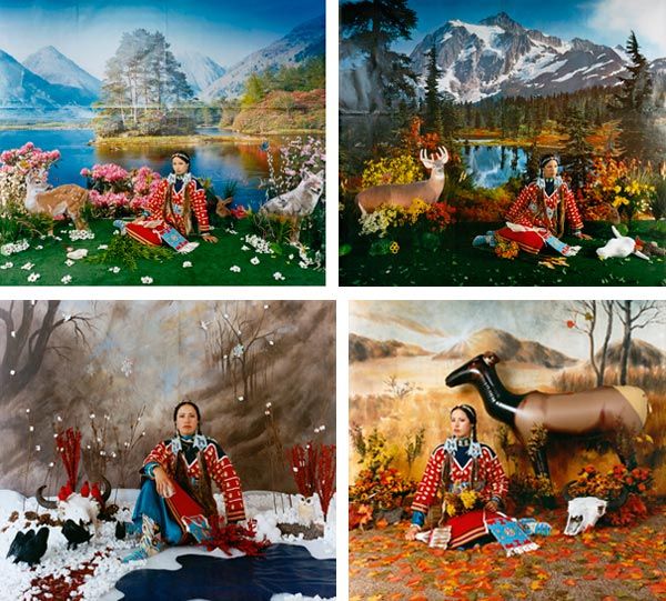
Wendy Redstar Four Seasons 2006
These artists and their work are very important and powerful. Their content and reasons behind the creation is needed in Contemporary Art. Since the time I started this research James Luna unfortunately passed away this year and I was deeply saddened by it. The contribution to of his work to Contemporary Native art has changed it forever. He has inspired a whole new generation of Native Artists. Through different forms of art especially performance, Erica Lord, Terrance Houle and Wendy Redstar have been creating art about their culture, identity and the isolation of reservation life. These Contemporary Indigenous Artists are opening the conversation to these topics. With in the Contemporary Art there is room for Indigenous art.
Citation
Erica Lord. Other Peoples Pixels. 2018. www.ericalord.com . Accessed 20 January 2018.
James Luna: Transforming the ordinary into the extraordinary. James Lune 2017. www.jamesluna.red/artwork . Accessed 2 February 2018.
Selz, Peter. The Art of Engagement, Visual Politics in California and Beyond. Pg 165
Terrance Houle. www.terrancehoule.com . Accessed 18 January 2018
Thompson, Chuck. Cowboys and Indians: Voice. www.cowboysindians.com/2018/01/wendy-red-star-and-the-indigenous-voice . Accessed 6 February 2018
by Ruby Inurriaga
In the spring of 1912, Pablo Picasso created the first collage. This work, Still Life with Chair Caning, is considered the first because it is the earliest known artwork to have taken familiar materials, such as random papers, and deliberately arrange them in a fine art context (Shields). This new direction in modern art was coined papier collé, a French phrase for “glued paper,” by Picasso and Georges Braque, an artist who worked closely with Picasso during the creation of Cubism. Collage was a groundbreaking movement because it was a drastic change from the traditional domain of painting, as the “procedures for laying out, pinning, and gluing papier collés resemble commercial design strategies more than they do the protocol of the fine arts” (Bois, Buchloh, Foster, Joselit, and Krauss, 114). Not only did the collage movement completely shift the entire vocabulary of Cubism, it has inspired art of all different styles and forms throughout the twentieth century and even today.
In the spring of 1912, Pablo Picasso created the first collage. This work, Still Life with Chair Caning, is considered the first because it is the earliest known artwork to have taken familiar materials, such as random papers, and deliberately arrange them in a fine art context (Shields). This new direction in modern art was coined papier collé, a French phrase for “glued paper,” by Picasso and Georges Braque, an artist who worked closely with Picasso during the creation of Cubism. Collage was a groundbreaking movement because it was a drastic change from the traditional domain of painting, as the “procedures for laying out, pinning, and gluing papier collés resemble commercial design strategies more than they do the protocol of the fine arts” (Bois, Buchloh, Foster, Joselit, and Krauss, 114). Not only did the collage movement completely shift the entire vocabulary of Cubism, it has inspired art of all different styles and forms throughout the twentieth century and even today.
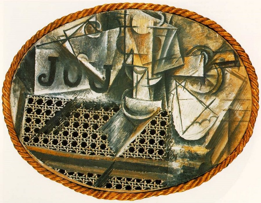
Picasso’s work, Still Life with Chair Caning, was created using oil and pasted oilcloth on canvas, rope, and a chair caning. The artwork depicts a still life and references objects that could be laid on a table in a café. In this piece, Picasso brought in foreign objects, like a chair caning, which could have been found in one’s seat at a coffee shop. The letters incorporated into the artwork could possibly be referencing newspapers that could have been laying on the table. This piece allowed Picasso to explore what would happen when other objects were inserted into a painting. He used pieces from the actual scene he was depicting and arranged them in a new, abstract way. Collage is an art form that accentuates process over product. A collage as a work of art, “consists of the assembly of various fragments of materials, combined in such a way that the composition has a new meaning, not inherent in any of the individual fragments” (Shields). Still Life with Chair Caning can be seen as a reinvention of the still life.
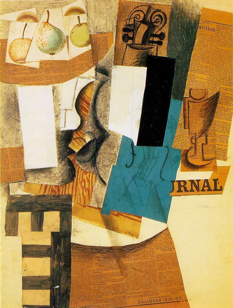
Picasso created many more collage works, one being Bowl with Fruit, Violin and Wineglass, made in 1912-1913 with charcoal, chalk, watercolor, oil paint, and cut papers. This piece also seems to depict a still life inspired by a café scene. In this artwork, separate printed pieces of fruit are placed on top of a paper cut-out shaped like a bowl. Newspaper articles have been cut up and used many times, and some even assume that Picasso was referencing the conversations that happened at the table in a café. Collage works were not driven to accomplish illusionistic representation, but instead relied on various materials and compositional logic.
Papier collé was a revolutionary movement in modern art as it seemed to attain several meanings; “the original identity of the fragment or object and all of the history it brings with it; the new meaning it gains in association with other objects or elements; and the meaning it acquires as the result of its metamorphosis into a new entity” (Shields). Due to the innovative nature of collage, it has served as source of inspiration throughout art history.
Works Cited:
Art, Philadelphia Museum of. “Bowl with Fruit, Violin, and Wineglass.” Philadelphia Museum of Art, www.philamuseum.org/collections/permanent/53855.html.
Foster, Hal, et al. Art Since 1900. Thames and Hudson.
Shields, Jennifer1. "Collage and Architecture." International Journal of the Image, vol. 2, no. 3, Oct. 2012, pp. 85.
Still-Life with Chair Caning, 1912 by Pablo Picasso, www.pablopicasso.org/still-life-with-chair- caning.jsp#prettyPhoto.
by Cheyenne L. Black
Hedi Kyle
Hedi Kyle is a German-American artist who specializes in folded book structures. Her work has become something of a mainstay in the book arts community as she has given artists such structures as the Flag Book, the Blizzard Book, the Spider Book, the Fishbone fold, and many, many more. Some have called Kyle the most influential book artist of her time.
Kyle’s generosity with her craft is perhaps the most endearing element of her work. The readiness with which she has made available instructions, offered of her time, and shared her most creative ideas is nothing short of remarkable.
In art school Kyle studied illustration and graphic design and in an interview with Alastair Johnston at the Fine Press Book Association, Kyle says that she learned book design such as covers and typography in this program but not book craft. From there, she went on to learn advertising and spent some time drawing advertisements as produced through the J. Walter Thompson agency. Her work at the time included such brands as Philadelphia cream cheese and Lux soap.
Also according to her interview with Johnson, Kyle first developed her craft and style with Laura Young in the 70’s in New York and eventually began teaching at the center for book arts in New York, a position she claims to have fallen into by accident.
Over time, she moved on to teach in the book arts program at Philadelphia Arts, but, she says to Johnson, she is prone to overwork as she gets excited about things and when she is teaching this pushes her to take on too much, frequently.
Kyle claims that giving away her work has been satisfying but she would prefer to see some more innovation as the tone in at least this interview implies she is worried for her structures becoming cliche’d.
This may be a valid concern as the Flag Book, created by Kyle in 1979, is referred to by the Guild of Book Workers as “the single most influential structure in the world of contemporary bookmaking.”
Though it may be tempting to focus on the structure of her books, to keep the folds and ingenious innovations center stage, Kyle says she doesn’t want blank books calling it a “missed opportunity.” The structure exists to support the art contained therein, and Kyle emphasizes the work of the book by using her structures to support and showcase the material contained inside.
Kyle is the cofounder of the Paper Book Intensive, the “annual working sabbatical in book arts, papermaking, and conservation” which is the largest gathering of it’s kind in the nation; a professor at the University of Arts in Philadelphia; and has lectured worldwide on her craft. Of her work, Mills College book arts professor Julie Chen says, “She is a rockstar in the book art world,” adding, “The whole book art community is indebted to her for her contributions and for what she has created.”
Hedi Kyle does not merely push the envelope. She folds it first, fills it, and gives it back to you as a book.
A few instruction sheets for her work can be found here:
https://guildofbookworkers.org/sites/guildofbookworkers.org/files/standards/2005-Kyle_Hedi.pdf
More information on Kyle:
http://www.fpba.com/parenthesis/select-articles/p25_hedi_kyle.html
http://www.thecampanil.com/inventor-and-artist-hedi-kyle/
https://guildofbookworkers.org/sites/guildofbookworkers.org/files/exhibits/100anniversary/retro/Kyle.shtml
Information on the intensive mentioned herein:
http://www.paperbookintensive.org/
The program for which Kyle teaches:
http://bookprintmfa.uarts.edu/
Information on ordering a catalog of an exhibit she held can be found here:
https://www.sfcb.org/the-world-of-hedi-kyle
Several structures not seen here can also be seen at:
https://makinghandmadebooks.blogspot.com/2016/04/hedi-kyle-and-sf-center-for-book.html
Hedi Kyle, April Diary
Hedi Kyle, Soap Opera
Hedi Kyle, L'atelier
Spider Book
Hedi Kyle, (Title Unknown)
Papermaking Research on Artist John Babcock
Lizzy Taber
As an emerging papermaker, I find inspiration the most in papermakers who are utilizing paper in a unique way. When looking at artists work online I was in particularly drawn to John Babcock’s work. John Babcock is a California based artist who focuses mainly on paper as his medium. Babcock has shown in over thirty museums in Europe, the US, and Japan.
Babcock uses large scale and small scale works to evoke emotional responses and focuses mainly on color. I was so intrigued by his work I sent him some questions about his technical process and his conceptual process. I’ve included some images from his website but all of the in process shots were photos he sent me in the interview. Anything in quotes are direct responses that I have included from the interview.
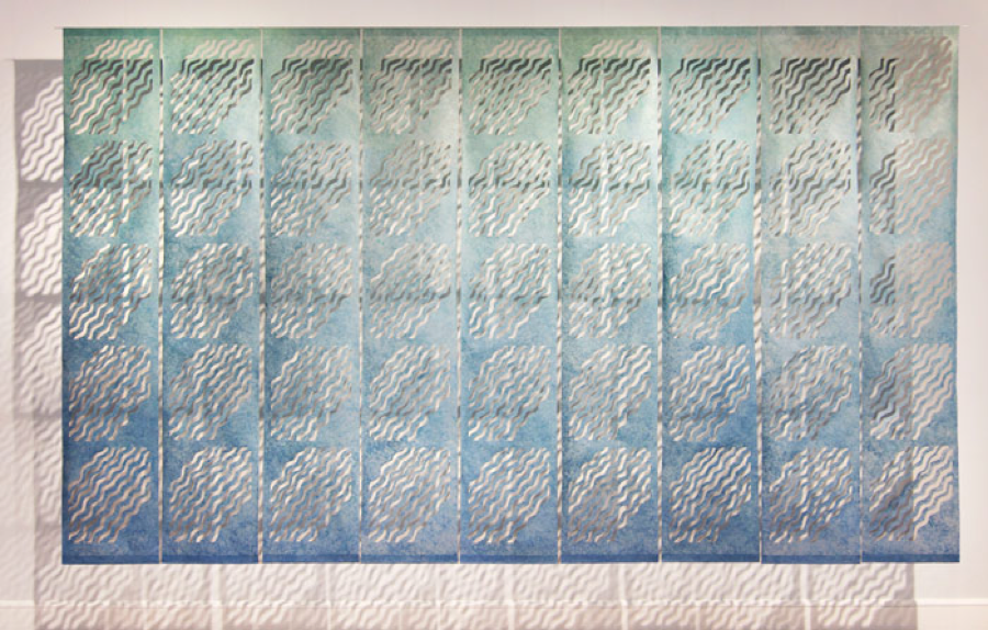
The above image is a work that caught my eye. I was particularly drawn to the cut out negative space within the paper because of it’s repeated pattern and mostly because of the cast shadows behind it.
This is what John Babcock had to say about it when I inquired how it was made.;
“Kozo pulp, beaten by hand, two masters, blue and green. made thin by massaging pulp into a water bath see photo below.”
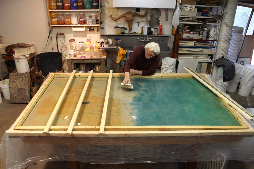
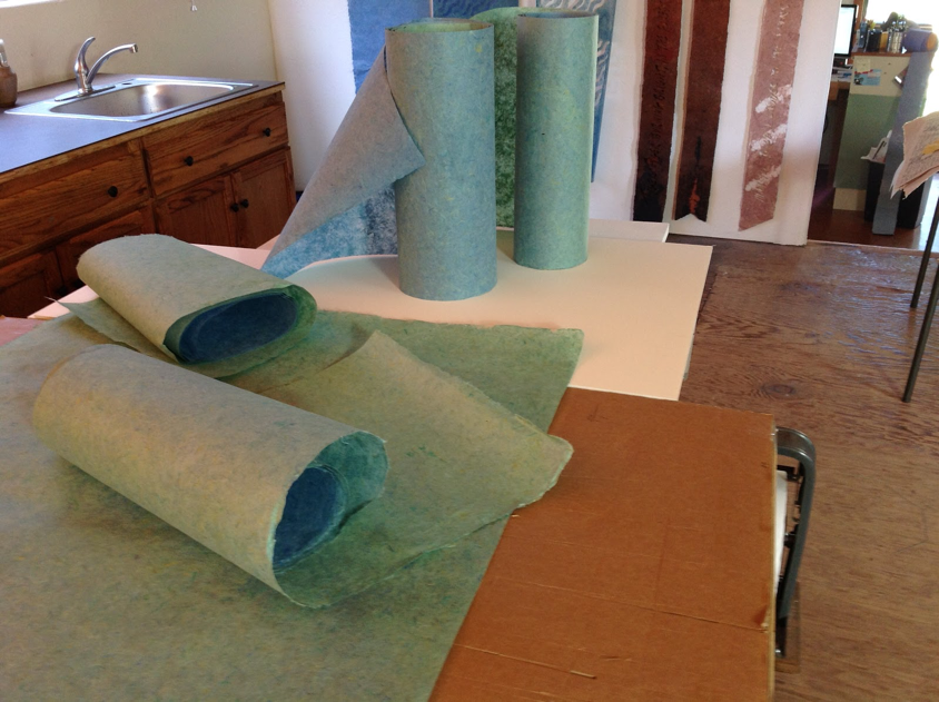
finished kozo sheets ready to be adhered to mylar.
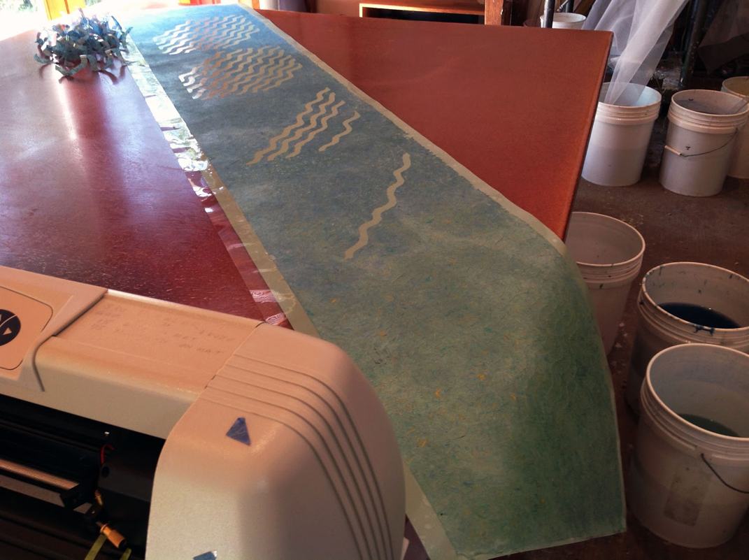
Below: spirit wave image cut on vinyl cutter.
Below: spirit wave image cut on vinyl cutter.
Many of Johns concepts are really interesting to me. He focuses on a wide variety of ideas throughout his work- but still manages to keep his entire body of work cohesive visually. Some concepts he touches on are expressing ideas of love, commemorations, animals, spirituality, and many more.
I was interested in his process of executing ideas. I wanted to know if he went into his studio with a specific concept in mind or if he let the highly technical process of papermaking guide his inspiration.
This was his response;
“I am a builder. I work with the pulp as a sculptor manipulating the fiber into place. Since I have many techniques of working over a span of 40 years, it is difficult to generalize “this is how I work”.
Color Rules. Color is my first decision. Size is next. Sometimes I will sketch out patterns. For commissioned work I might even make up a maquette with collaged papers. Sometimes my concept isn’t clear at all. If it isn’t, I might start making pulp, pigment the pulp and start mixing the colors. In that process of getting involved with the material, usually ideas start to emerge and the ides of form evolve. If I want to make a work based on feeling, I will visualize the feeling with colors in mind.”
I then asked how his process has developed throughout his career;
“The process has developed because I have a lot more tools and techniques available. We didn’t know much about structure of paper fiber when I started. In the nineteen seventies my cotton came from linters mixed in a washing machine or very lightly beaten in a hollander. The pulp when spread out on a large plastic surface invited manipulation. In the archive click on “statement” in Faults and Fissures http://www.babcockart.com/faults-fissures/
When abaca was introduced to paper artists in the very early eighties I discovered a translucent shiny fiber that transmitted light differently. I was fascinated that by working cotton and abaca side by side I could make the abaca match or contrast with the cotton thus developing hidden images and color fields that changed as the viewer changed position or as the light changed during the day. http://www.babcockart.com/collage/”
FREE CASTING
John works with a lot of free casting. One of his bodies of work I am inspired by is his Ladder series.
“ The ladder has a special significance for me. It is a path to higher ground or a higher plain. I have climbed ladders all my life both physically and metaphysically, as perhaps you have. In this series I have enjoyed exploring the chemistry of color and the color of aspiration.” – John Babcock
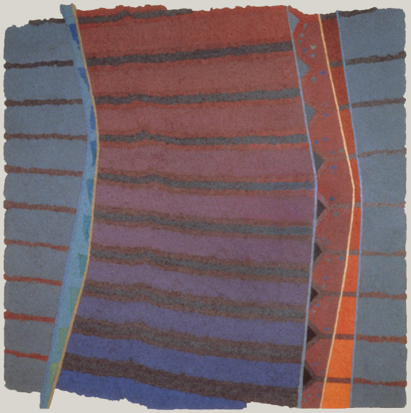
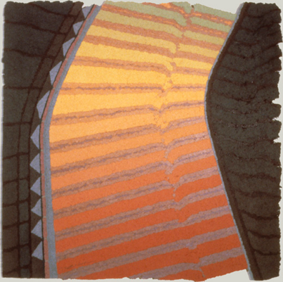
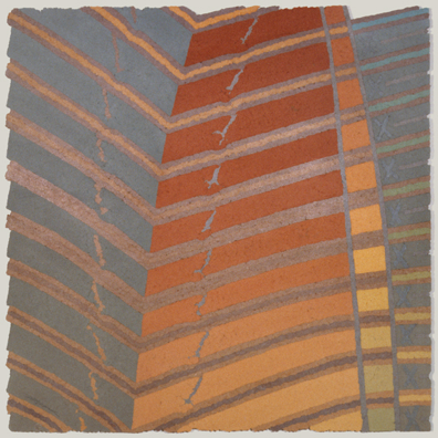
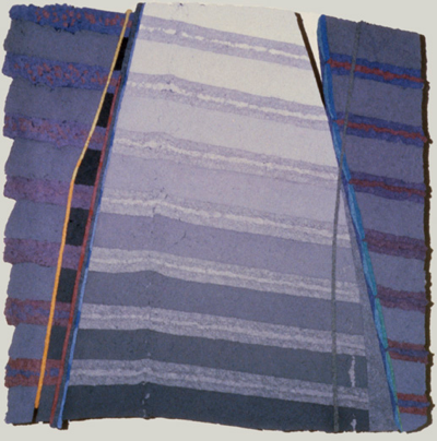

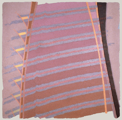
“I mix 15 gallons of a master color pulp. I will make from 2-4 master batches. from 30 - 60 gallons. I intermix these pulps to make a gradation in 10-20 buckets five gallon buckets partially full. I call this building the color and it will take a few days to get the blending correct to my eye. I will then repeat the process for abaca.
Free Cast: I concentrate the pulp like cottage cheese and place it on a waxed plastic surface and manipulate the pulp about a ¼” thick to the desired shape. I can make sharp edges if I want. I work blind. Face side is down. 1991 late ladder series photo below.”
Free Cast: I concentrate the pulp like cottage cheese and place it on a waxed plastic surface and manipulate the pulp about a ¼” thick to the desired shape. I can make sharp edges if I want. I work blind. Face side is down. 1991 late ladder series photo below.”
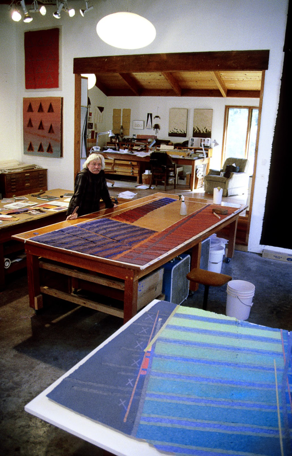
“April 2000 Soquel Studio
The cotton fiber is in place, abaca pulp will be placed in and over the top of the cotton to hold it all together, working blind.
So “free cast pulp” is casting without a mold.”
The cotton fiber is in place, abaca pulp will be placed in and over the top of the cotton to hold it all together, working blind.
So “free cast pulp” is casting without a mold.”
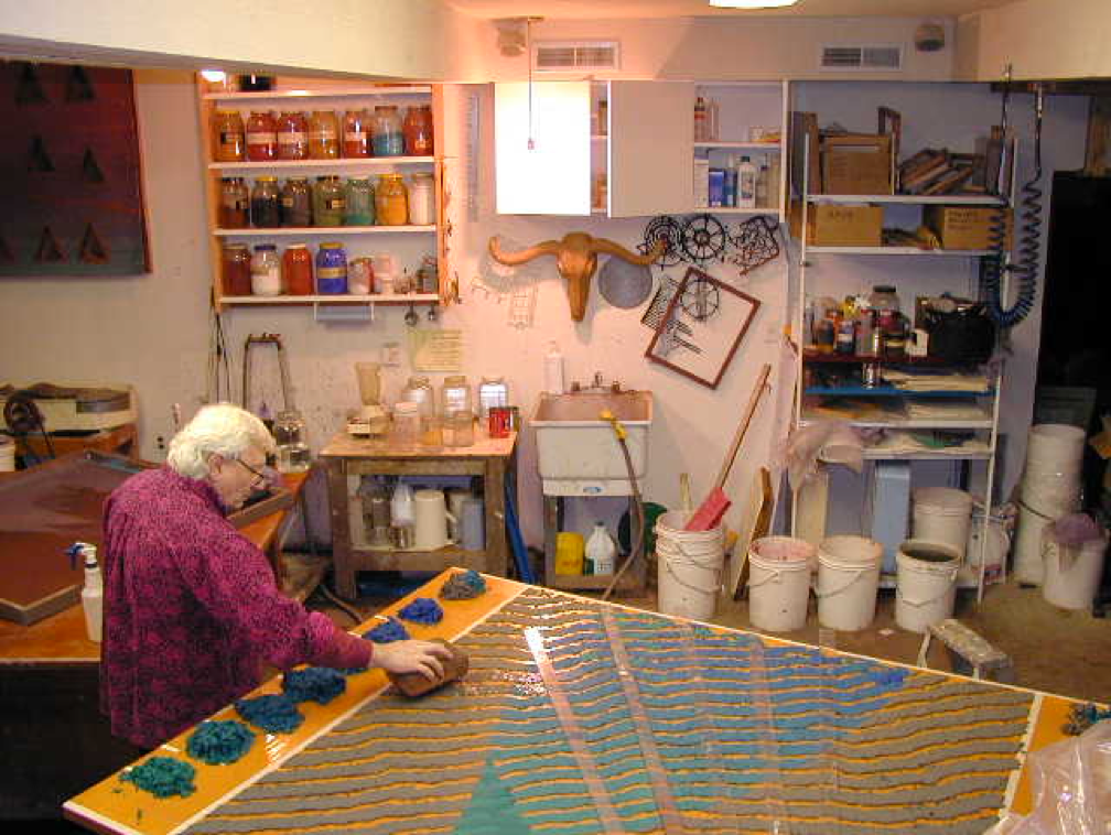
Some more of John Babcock’s free casted paper; (my favorite series)
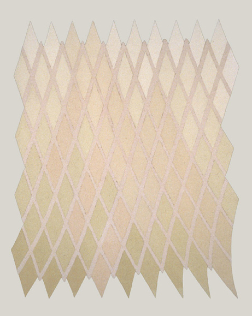
Perceptor 1984 71” x 56”
Perceptor is a spirit piece that for me is an overlord of the gallery space it lives in. It was one of the first explorations of a changing color and fiber gradation, which creates a shifting pattern from different views.
free-cast cotton and abaca fiber pigmented in the pulp
Perceptor is a spirit piece that for me is an overlord of the gallery space it lives in. It was one of the first explorations of a changing color and fiber gradation, which creates a shifting pattern from different views.
free-cast cotton and abaca fiber pigmented in the pulp
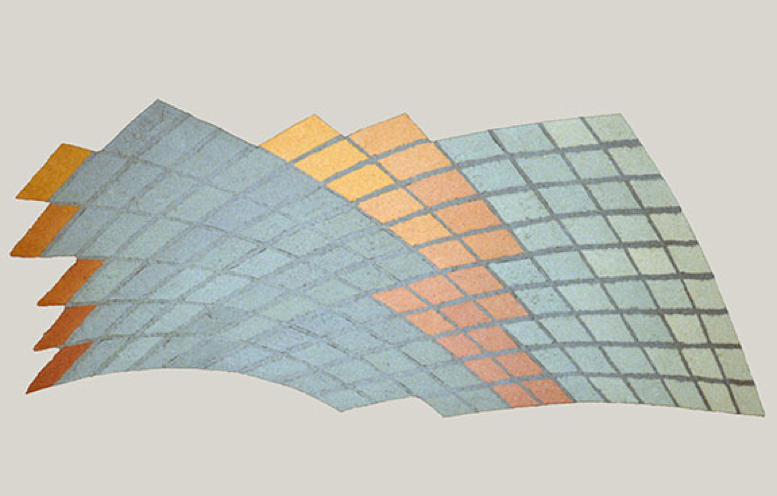
Messenger 1984 44”x 112”
Secret messages within. The tiles are made from from varying combinations of abaca and cotton pulp creating subtle patterns that are only seen in a certain light.
free-cast cotton and abaca fiber paper
Secret messages within. The tiles are made from from varying combinations of abaca and cotton pulp creating subtle patterns that are only seen in a certain light.
free-cast cotton and abaca fiber paper
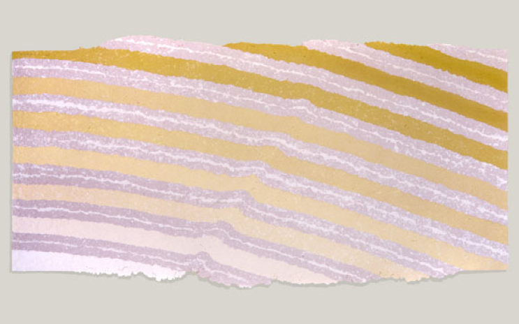
Lastly, a sculptural piece that I find very interesting – which was inspired by Arizona;
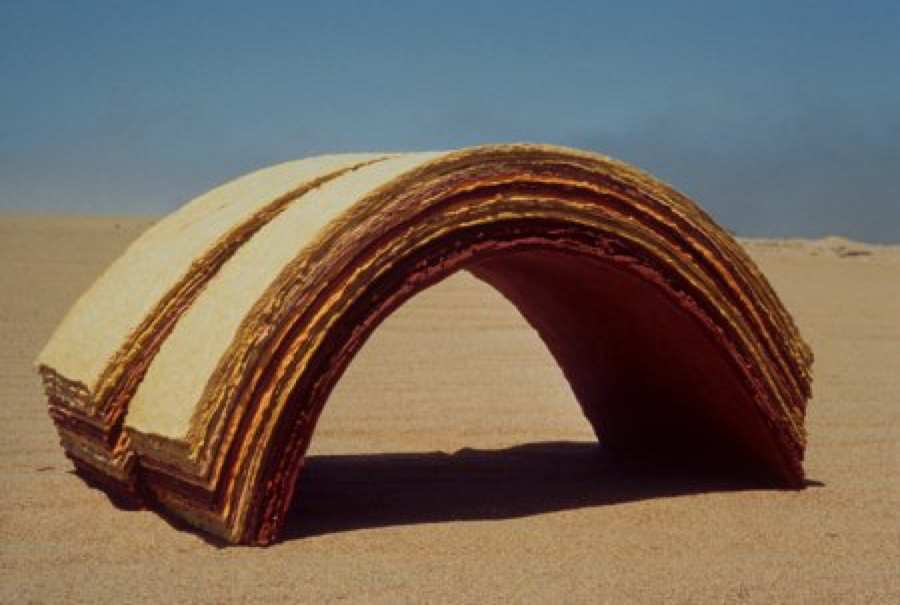
Faulted Arch 1979 16”x 16”x 32”
This is one of a series of sculptural works dealing with topography and landscape. It is about what we don’t see usually, but get to see for instance, when visiting an Arizona canyon where erosion gives us a glimpse of times past. Collection : International Paper Company. Exhibited in “Paper/Art – A Survey of the Work of Fifteen Northern California Paper Artists” at the Crocker Art Museum, Sacramento CA. January, 1981
sheets of laminated earth pigmented cotton fiber paper
by Erin Thomas
Although it is fascinating to learn about professional print makers, what they produce, and how they got to where they are, I find it interesting to understand how letterpress and other forms of print making are put into practice by those who do it as a hobby. These individuals have pursued careers in other fields that maybe allow for more substantial salaries capable of supporting families, or careers that simply fulfill a different interest of theirs.
I met Joe Mildenhall at church and came to learn that as a working professional in the education sector, he enjoys print making as a hobby.
“I was introduced to letterpress in high school. It was still an active form of printing for small jobs like business cards, menus, etc. back in the late 1960's. In college I usually took one "fun" class in addition to the required course work. One semester I took a class called industrial communication or something. It provided instruction on several printing techniques including silk screen, rubber stamps, lithograph and letterpress. Later I had a student job at the university press where they were still printing books using lead typesetting and printing equipment. I didn't operate that equipment but did operate other presses so I learned the fundamentals of printing.”
Although he has worked in software development and technology management his entire career, he has found a lot of enjoyment in art and design. He says “[he has] always enjoyed the intersection of mechanical devices and art.” Print making appeals to many who sit in the crosshairs of the more rigid right side of the brain, and the creative, loose left side.
“I dabbled in photography and silk screening so several years later when I saw that letterpress greeting cards, etc. were becoming popular I decided to see what was involved in producing them myself. My initial motivation was the idea of producing our own Christmas cards rather than buying them. I think I have reasonable design and layout skills and our oldest daughter has some really good drawing skills so I thought we could join forces.”
And this was how Joe became more involved in his practice. He started with a small table top press and, through buying and selling four different presses, has settled on his current Chandler and Price Pilot 6"x10" tabletop press. He has printed several Christmas cards and some miscellaneous Thank You and birthday cards.
His style shifts back and forth between vintage and modern styles, but mainly looking for opportunities to use crisp lines that will highlight the letterpress effect.
Where some may find the tedious intricacies of print making, and letter press in particular, to be exhausting, he really enjoys the manual process of layout and printing with letterpress. The physical part of the process gives him more personal satisfaction than running something out of a modern printer. However, Joe is not exempt from the frustration that comes with setting the press and printing—his experience is that “the only part of letterpress printing that can become taxing is when things like inking, roller height and positioning aren't quite dialed in. [He doesn’t] print frequently enough to quickly and easily resolve issues so it takes some trial and error.”
Ultimately, Joe has enjoyed having letterpress as an occasional outlet. He doesn’t have very much time to spend on it, but gets a lot of satisfaction when he does. I think these experiences and this perspective is such for many who practice as a hobby. Creating, in whatever form, grants substantial satisfaction and fulfillment. It is always exciting and interesting to me when I find characters like Joe who understand the importance and beauty of creating, and do so in a way that fits into their careers, lifestyles, and schedules.

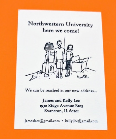
Interview conducted personally with Joe Mildenhall
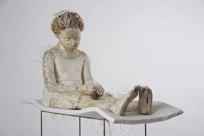
Vally Nomidou creates life-size figurative sculptures out of paper that may be haunting at first glance, and yet become gorgeous throughout the contemplation of her process and content. Nomidou is an artist from Athens, Greece and a Graduate of the Athens School of Fine Arts, and of the Saint Martin’s School of Art of London. The body of work I have researched centers on Nomidou’s exhibition “Let it Bleed” which occurred in 2010 at the Fizz Gallery in Athens, Greece as a part of Art Athina, a yearly international art fair hosted in Athens.
In this exhibition Nomidou presented seven sculptures of female figures including adult women and young girls. The sculptures offer an immediate sense of recognition given by their extremely life-like presence, attention to detail, and naturalistic gestures. To start her process Nomidou plaster casts body parts from her sitters and goes through an extensive method of documentation taking several photographs of her models. After this Nomidou sorts through her collection of substrates including printed materials, newspapers, paper towels, handmade paper, and cardboard while consciously deciding on a color palatte attributed to the natural materials. She starts with an internal framework made of cardboard as an armature and works from the inside out. After this, the artists attaches the plaster cast pieces and then builds layers of the paper material using wood glue, acrylic medium, and often sewing and stitching which then reflect a surface reminiscent of skin. Further some of the surface is rubbed, sanded, and polished to evoke sensuality and play with the viewer’s visual perception activating their sense of touch. Many of the sculptures make great use of negative space as they are exposed in areas where the figure is incomplete possibly creating a sense of emptiness, but also giving the figures a light quality. This openness is a direct invitation for the viewer to contemplate the relationship between exterior and interior surfaces.
In this exhibition Nomidou presented seven sculptures of female figures including adult women and young girls. The sculptures offer an immediate sense of recognition given by their extremely life-like presence, attention to detail, and naturalistic gestures. To start her process Nomidou plaster casts body parts from her sitters and goes through an extensive method of documentation taking several photographs of her models. After this Nomidou sorts through her collection of substrates including printed materials, newspapers, paper towels, handmade paper, and cardboard while consciously deciding on a color palatte attributed to the natural materials. She starts with an internal framework made of cardboard as an armature and works from the inside out. After this, the artists attaches the plaster cast pieces and then builds layers of the paper material using wood glue, acrylic medium, and often sewing and stitching which then reflect a surface reminiscent of skin. Further some of the surface is rubbed, sanded, and polished to evoke sensuality and play with the viewer’s visual perception activating their sense of touch. Many of the sculptures make great use of negative space as they are exposed in areas where the figure is incomplete possibly creating a sense of emptiness, but also giving the figures a light quality. This openness is a direct invitation for the viewer to contemplate the relationship between exterior and interior surfaces.
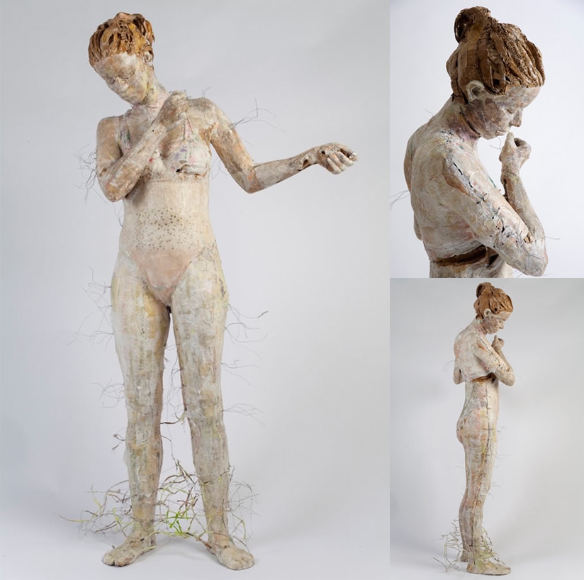
The message I believe Nomidou suggests is that her material is used to venerate that which is vulnerable, available, and temporary. Because she chooses not to use anything else she fully exposes the viewer to her process and materials leaving almost nothing to the imagination. Although there is a grand sense of naturalistic illusion the transparent content of the piece is best reflected by the translucent layers of paper built up on the surface. It’s a strange mixture that prompts the viewer to struggle between the thought of witnessing something pleasant or possibly vile. Her methods may also suggest feelings of loss and possibly suffering as Nomidou is very fond of the haphazard assembly of the works in reference to the stitching and sewing which is indicative of wounds, and scars, and effects on the body. After all one of the main themes in her work is fragility as the artist states: “…I work out my figures spontaneously with the intention to show the mental state of ‘’between’. Between different trends, orientations, routes, decisions. The situation to be between and to do connections, fragile connections with a variety of possibilities, with uncertainty. Without a final decision. With tyranny. The difficulty, the sensitivity, the contrary emotions that coexist, the agony, the empathy, the cowardice, the fear. The game and the pleasure to express all these situations sometimes gently and sometimes hard...All these are a fragile world written on the female body which I build… People I know, anonymous people, simple people, children, (my son, a refugee girl, a lonely girl with a famous family) an abnormal dancer…All of them have something vulnerable. They are personalities under formation, defenseless against their fate.”
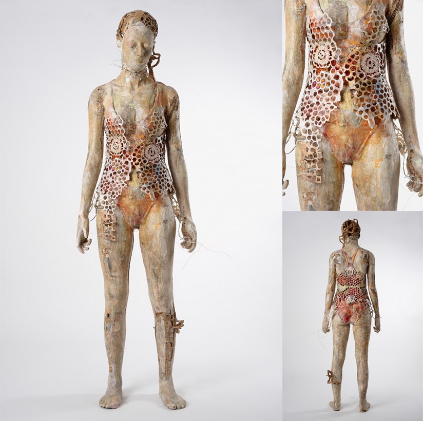
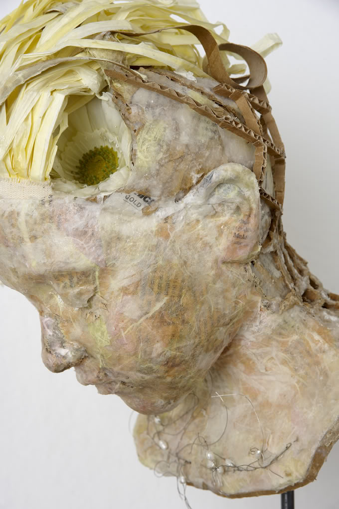
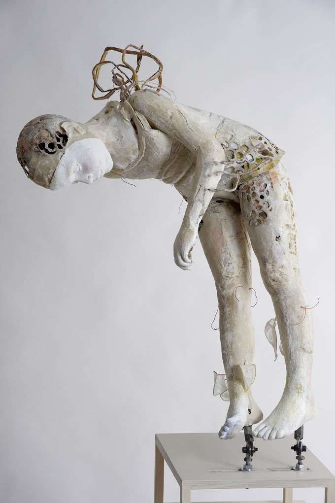
David Hockney is a Britain born artist who moved to Los Angeles and became famous shortly after…Proving that moving to Los Angeles will actually make you famous. Hockney fell in love with art at a young age and began exploring his artistic side all through college. He attended Bradford College of Art, then moved on to study at Royal College of Art in London. A short 2 year intermittence working at hospitals to complete national service requirements between 1957-1959 gave him some experiences and other grown up things to contemplate before diving back into his art. Once in graduate school, he began experimenting with different techniques and matters of subject. His main medium throughout his early career was painting, stating, “I prefer living in color.” his material was acrylic and his style was expressionism, similar to that of Francis Bacon. In 1962, the RCA would not let him graduate so he protested, refusing to write the required essay for the final exam. The school recognized his reputation and talent had a second thought over its regulations, awarding him the diploma. How rad is that!
Lithographic Water Made of Lines, Crayon and Two Blue Washes Without Green Wash. -David Hockney print from series of LA Pools
A visit to California revitalized his hopes and aspirations of his art. He fell in love with the style, architecture, and culture. His first series in LA involved paintings of swimming pools as the subject matter. These beauties are minimalistic and the color pallet is pleasing to the eye. He later began a series of paintings of living rooms in LA and whilst doing so, photographed them for reference. One living room was documented using a string of polaroids. Once taken, he put them all together for a reference but then realized that the photo collage itself was art. This would inevitably become his claim to fame. He called these pieces "Joiners".
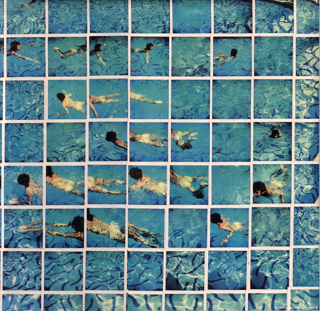
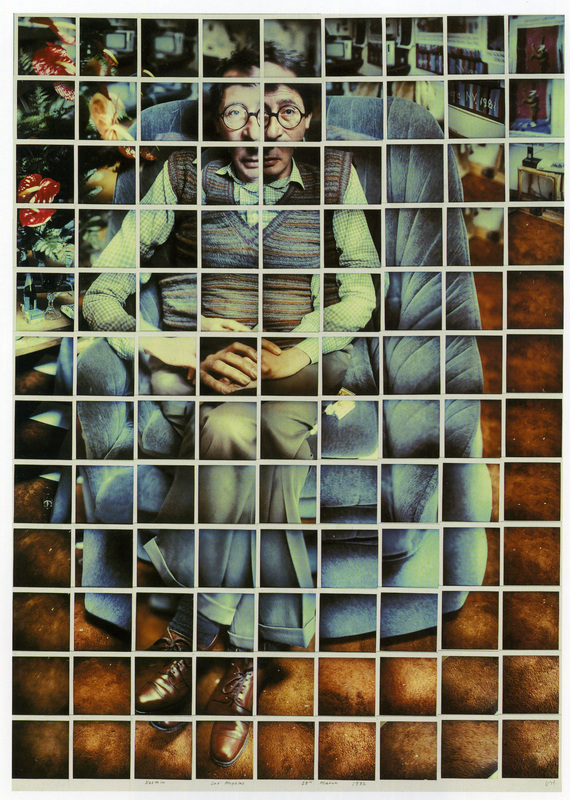
Hockney was introduced to printmaking while he was attending Royal College of the Art. He gained recognition by the college for his work and they wanted to publish his Rakes Progress series as a book. He had to expand the collection from 8 to 16 by acid etching fifty plates. In 1976, Hockney created a portfolio of 20 etchings titled, The Blue Guitar: Etchings by David Hockney Who was Inspired By Wallace Stevens Who was Inspired by Pablo Picasso. In 1985 he was commissioned to design the cover of Vogue. After experimenting with Polaroids, they became his main medium of focus. Photo collage and lithography fueled his art for the next ten years. David Hockney has a vast collection of works, most of them being prints and multiples. mainly working through etching and lithography. His subjects range from portraits to architecture to abstract expressionism. He is an openly gay artist and he was never shy in displaying it within his works.
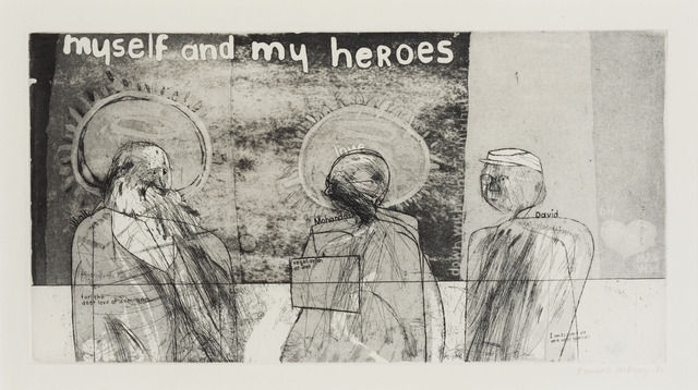
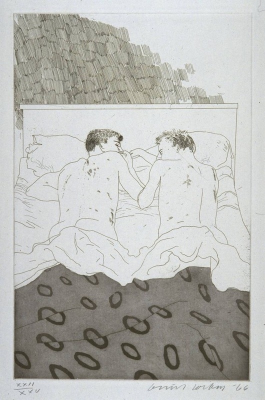
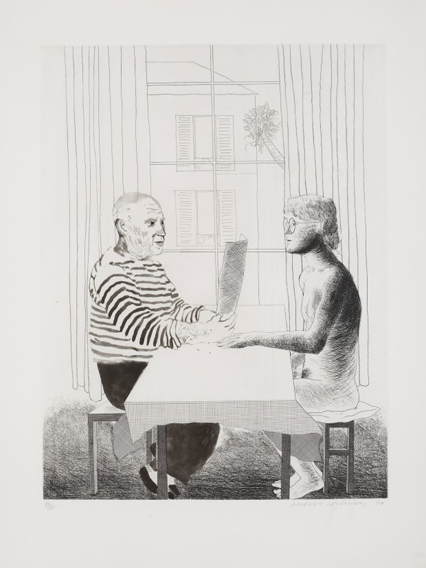
From left to right- Myself and My heroes. Two Boys Aged 23 or 24. Artist and Model
WORK CITED
- http://www.artnet.com/artists/david-hockney/
- http://www.biography.com/people/david-hockney-9340738#early-work
- https://www.theguardian.com/artanddesign/2013/nov/14/david-hockney-printmaking-genius
- http://medlibrary.org/medwiki/David_Hockney
- https://www.jacksonsart.com/blog/2014/04/05/can-learn-david-hockney-printmaker/
By Elayne Drury
Alison Bechdel (b. September 10, 1960) is a contemporary comic artist and graphic novelist, most known for her long-running comic strip Dykes to Watch Out For (which ran from 1983 until it's indefinite hiatus in 2008) and her graphic memoirs Fun Home (which was recently turned into a Broadway musical that received the Tony award for Best Musical in 2015) and Are You My Mother?. Bechdel describes her work as being “preoccupied with the overlap of the political and the personal spheres, the relationship of the self to the world outside”. A lot of the overlap of the political and personal spheres manifests as issues pertaining to being a lesbian.
Her first major work was a comic strip called Dykes to Watch Out For. The name originates from a drawing Bechdel did in the margin of a letter to a friend depicting a naked woman holding a coffee pot with the caption “Marianne, dissatisfied with the breakfast brew. Dykes to Watch Out For, Plate no. 27”. Eventually, Bechdel submitted the single-panel drawings to a feminist magazine for which she worked. The strip continued as single-panel drawings with a caption before eventually expanding into a multi-panel strip with story arcs and a cast of mostly lesbian recurring characters.
Dykes to Watch Out For is also the originator of the Bechdel-Wallace test (also known simply as the Bechdel test). In one 1985 strip of the comic, two unnamed characters consider seeing a movie. One of the characters states that she does not see a movie unless it meets three requirements; that there are at least two women (one) who talk to each other (two), and that what they talk about is something other than a man (three). The test originated from Bechdel's friend, Liz Wallace, and has since been adapted in many feminist circles as a judgment of media's depiction of women.
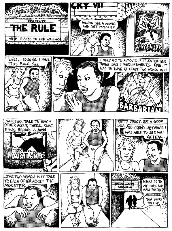
The pages from which the Bechdel-Wallace test is derived.
Besides Dykes to Watch Out For, Bechdel is also known for her “tragicomic” memoirs. Fun Home, published in 2006, is an autobiographical memoir about Bechdel's relationship with her father and deals with themes relating to sexuality, both his and her own. Bechdel's second autobiographical memoir, titled Are You My Mother?: A Comic Drama (published in 2012), is a companion piece to Fun Home, and focuses on her relationship with her mother. It is described by Bechdel as being about “the self, subjectivity, desire, the nature of reality, that sort of thing”. Both Fun Home and Are You My Mother? offer an emotional insight into relationships and the self through smart, witty, and heartbreaking commentary.
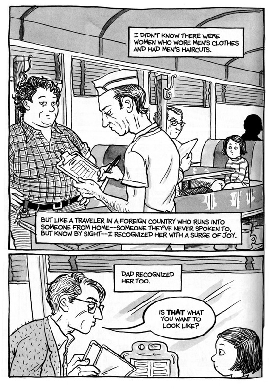
A page from Fun Home.
Bechdel's work has been a source of inspiration for my own. I remember first picking up Fun Home in high school, both being disgusted by it due to homophobia from being a closeted lesbian myself, and intrigued, as I hadn't read anything written by a lesbian before. A few months later, I found out that she had come up with the Bechdel-Wallace test. I had heard of the Bechdel test from some article or another, but it took a while for me to find out the test had originated from a lesbian, and for some reason that really effected me. Something that wide-spread and influential having been created by a lesbian was almost unimaginable to me at the time. As a both a lesbian and an aspiring graphic novelist, Bechdel's work has been monumentally influential, from a little comic strip that blew up into a test that academics use to judge media's treatment of women, to emotional labyrinths depicting the relationship between the people we are and the people others want us to be.
Works Cited
Bechdel, Alison. Are You My Mother?: A Comic Drama. Boston: Houghton Mifflin Harcourt, 2012. Print.
Bechdel, Alison. Fun Home: A Family Tragicomic. Boston: Houghton Mifflin, 2006. Print.
http://dykestowatchoutfor.com/about
http://dykestowatchoutfor.com/frivolous-aimless-queries
http://www.newyorker.com/magazine/2012/04/23/drawn-from-life
http://artsbeat.blogs.nytimes.com//2007/07/20/stray-questions-for-alison-bechdel/