 Karen Nazario Walter Hamady, born in Flint, Michigan, of a Lebanese father and an American mother in 1940, graduated from Wayne State University and Cranbrook Academy. Since 1964, he has run Perishable Press, where he published intricate, inventive small-edition books. He has often referred to books as “the Trojan Horse of art,” thinking of the way they sneak artistic ideas into a familiar format that can be handled with ease. Hamady is a pivotal figure in book arts; he helped the art world to perceive the book in a new perspective. His books are humorous, inventive and interactive works of art. I will be delving into Walter’s poking entertainment and innovation – specifically in his fifth Gabberjabb; he challenges conventional ideas about the structure and function of books. For this purpose, I further investigated his satirical behavior and ingenious complexity. Upon looking through Hamady’s Gabberjabb #5, I was immersed with its personality, this book was given life… he called attention to the art of the book itself having been printed, perforated, drawn, cut, stamped, collaged, taped, embossed, grommeted, signed, notarized, numbered, notched, torn, and bitten. Flipping through pages I noticed the endnotes at the end of words. Any scholar, I would presume, would automatically think, “a source?” Puzzled, I searched for these “sources” to finally stumble upon a manila book pocket with the silhouette of a man’s side profile collaged by a postcard. Inside this pocket, contained a small pamphlet titled, 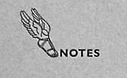 I let out a soft chuckle in the reading room realizing the pun Hamady left for his spectators. Footnotes. I returned to the very beginning of the Gabberjabb while constantly referring to the footnotes at my side. Travelling through, I could not help but laugh or smile a bit. Truthfully, I was having a conversation with this book. These notes reflected his own voice, it was almost like speaking with Walter Hamady himself. “the Druze call it THE FORCE114” followed with the footnote, “Preceeds Star Wars. See ftN Forty-SiX through Seventy.” “Copyright 1981 by Walter Samuel Hätoum Hamady” had a finger pointing to his name with the number 103, the note reads as follows: “(SEE: 38, 42, 47 & 95) My father once told me that in the old country, Hamady is a common name and has 5 branches; this one is ours.” Hamady settled in Wisconsin in 1966, he is a midwestern artist with roots in the Levant; hence, Walter Semi-Hittite Hamady or (WshH), one of several phrases of his name – Walter Samuel Hätoum Hamady. The numbers mentioned are of other footnotes mentioned in the Gabberjabbs; unfortunately, I was incapable of observing his entire six volume series. There is a sense of poking fun and frustration given the reader’s willingness to find these notes Hamady suggests. He adopted a narrative mode associated with scholarly essays; Hamady loved footnotes so, provided they are, in his view worthwhile. Numerous scholars would presume footnotes to be “offensive” as the notes can be “trivializing the text” and hence, a “waste of time.” Nonetheless, Hamady’s notes are pleasurable to read given that they are fundamentally, another story in themselves. Along my journey of the Gabberjabb I noticed how he played with text. There were misspellings, fascinating punctuation, bolds, italics, capitalization, and so on and so forth. If one is willing to preserve, there are wonderful discoveries to be made. The mood of the book progresses. Reaching near the end of Gabberjabb #5, I took notice of a small alteration to the word “ibid”. It began with footnote *23, a personal reflection he stated. The play on words proceeded to various modifications: “*25 “ (you bite Maybe , “*28 “ It bit Need period after word me.”, “*29 “ tid Bit ColopHaperPun.”, “*30 “ tit bite.” Inside my head I would respond to each note thinking how much is that, what bit, is this a tid bit, and tit bite? The legibility and illegibility act on the pleasure and instruction of the book. There is an equal distribution between the printer and the writer. There is a continuous disruption of extensive notes produced in the chronology of the text which generates a positive parallel in Hamady’s view – where the footnote is pushed as far as it can, or perhaps ought to, go, and yet he encourages his reader to follow his footsteps as the series moves forward. May the dedicated reader, forewarned, wait with interest and some apprehension to see what will emerge from Walter Hamady’s Gabberjabbs. 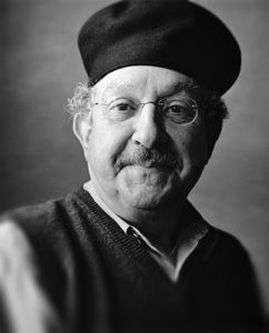 Intimate qualities flow from Hamady’s worldview, one that necessarily sustains and is shaped by his manner of making art. Many artists cite an “art is life, life is art” philosophy, but Hamady’s output contradicts this otherwise. Whether in multifaceted anatomy of his books, construction of his assemblages or arrangements of his collages. Hamady’s work is intensely personal, bears his aura, and incorporates his experiences. Rather than enclosing out the viewer, these qualities only serve to draw us in, encouraging close looking and contemplation and affecting all the senses. “The book, is perhaps the most personal form an artist can deal with. It encompasses a multiple and sequential picture plane, it is tactile, and to be understood, it must be handled by the viewer, who then becomes a participant.” - Walter Hamady Bibliography
Behrens, Roy. “The Gift of Gabberjabbs.” Print, vol. 51, no. 1, 1997, pp. 64–71 Derrida, Jacques. “Living on.” Deconstruction & Criticism. New York: Continuum, 1979, pp. 75 76. Hamady, Walter. For the Hundredth Time &Quot;Gaebboerjabb Number (5) Five&Quot; : 12 &Amp; 17 November 1980 : Journal Liftings. Perishable Press, 1981. Lydon, Mary. "The Trojan Horse of Art: Walter Hamady, the Perishable Press Limited and "Gabberjabbs 1-6"." Visible Language, vol. 25, no. 2, 1991, pp. 151. ProQuest.
Samuel Rosenzweig
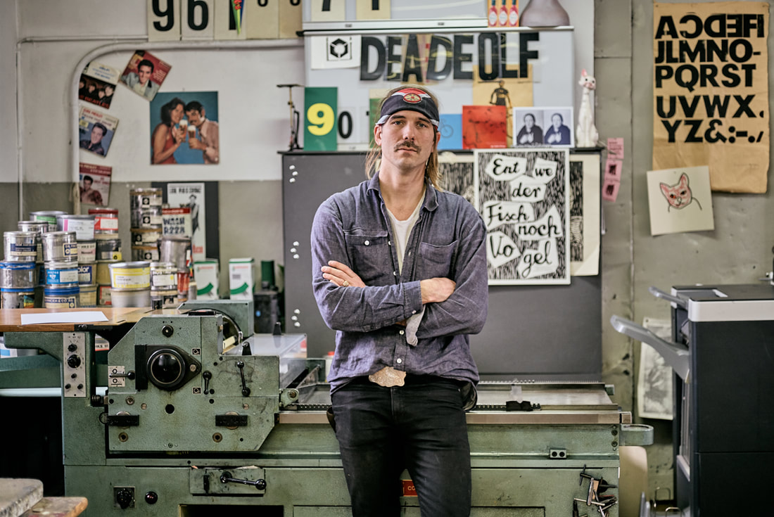
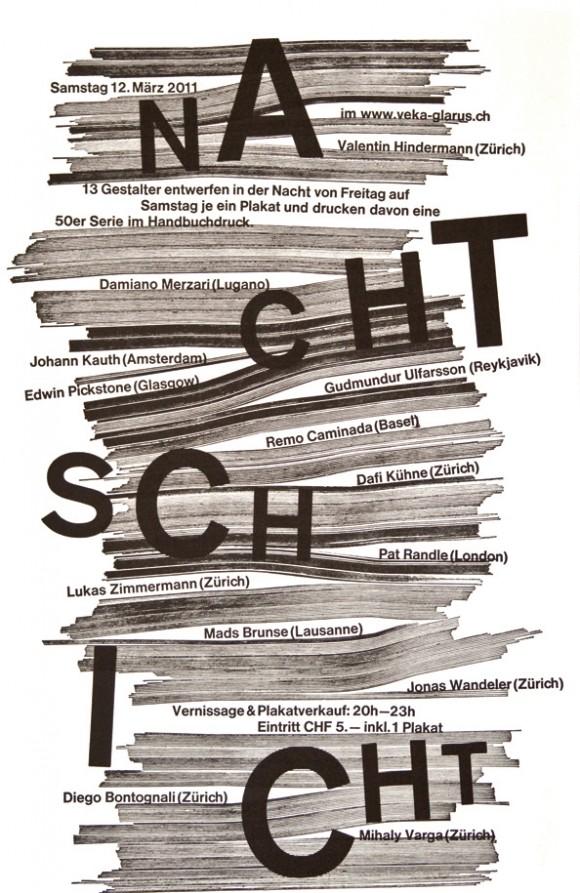
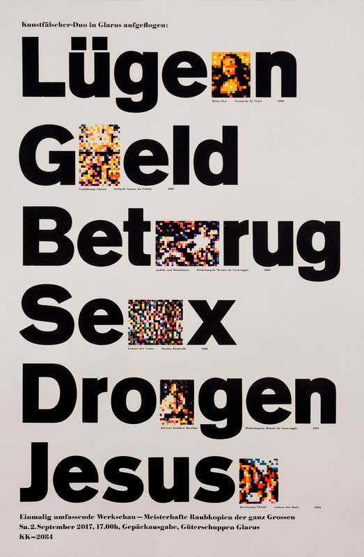
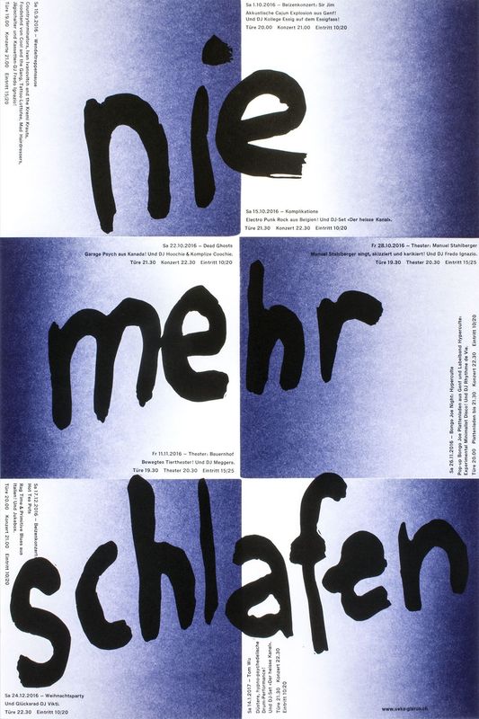
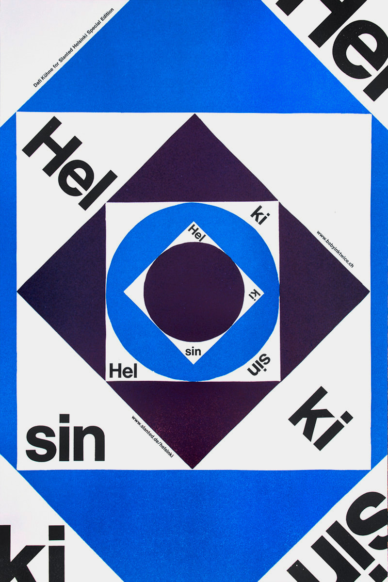
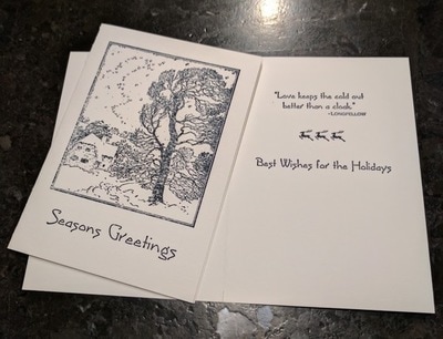
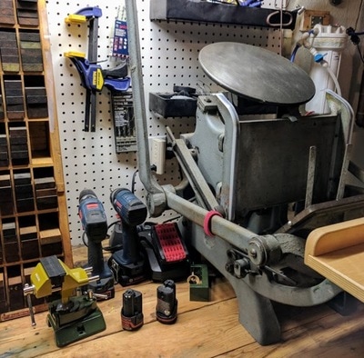
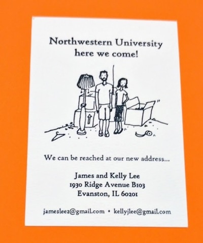
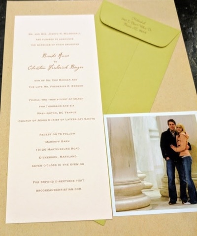
Dafi Kühne is a Swiss designer and letterpress artist who combines contemporary graphic design approaches with the art of letterpress printing. Based in Glarus, Switzerland, Kühne has been working full-time as a letterpress printmaker for over a decade, producing a wide range of artifacts including posters, brochures, and invitations for the world of music, art, theater, and film. Kühne prides himself on his ability to combine contemporary graphic design with printmaking techniques no longer practiced by the vast majority of designers. As a “no-digital-only” designer, Kühne cites his favorite tools as letterpress printing presses from the 1960s, traditional metal and wood type, pantograph cut wood blocks, laser cut blocks, polymer plates and handcuff lino and chip board. In addition to his computer, which is also an integral part of his process. In his Swiss studio, Kühne has collected over twenty tons of equipment. Kükne’s studio set-up includes three FAG Control 405 machines and a massive German Frontex loaded with seemingly endless dials and knobs. How the floor resists caving in remains a globally disputed mystery. To many designers, working exclusively in letterpress may seem tedious, unsustainable, crazy, or all of the above. For Kühne, the draw of letterpress comes from his ability to assert total control over the design and production process. Kühne states, “I am not a luddite or a romantic retro fanatic…it’s just about finding the right tool for producing my design.” For Kühne the printing presses are an important tool in the process of design, not just the final step. When you send a digital file to print, there’s no telling what will come back in the form of paper and ink. The designer relinquishes control after they send or upload a digital file. Kühne remedies this by being hands on from the start. “When it comes to printing I want to have full control over the whole process and the power to make all the decisions, such as choosing the colors and the paper, mixing the ink, setting the about of pressure and ink, according to my design concept.” Before taking on a client’s project, Kühne must make sure the concept and messaging are strong. Typography plays the leading role in the formation of the communication but color and texture are equally important. Kühne’s over 600 cases of type include favorites such as Caslon and Helvetica, along with more obscure typefaces such as Normal Grotesk. Perhaps Kühne’s biggest contribution to the world of contemporary letterpress, other than his work, are his informative and engaging videos, which explore alternative printing techniques. His video on casting plastic resin type explains how he made additional letterforms from a pre-existing metal typeface because he didn’t have enough type specimens to print a text-heavy poster. Other topics that Kühne covers include working with magnetic wood type, indirect printing, vinyl sticker type, and torn structures. Kühne’s work is appealing because it balances graphic design traditions with contemporary approaches. The hand-made quality can be felt not only in the aesthetics but also in the concept. As each step takes much longer on letterpress than it doesn’t on a computer, decisions are carefully calculated, leading to better choices, and better design. In a n era when designers can create hundreds of sketches on a computer in an hour or two, having an awareness of the image making roots of the letterpress are more important than ever. Setting type by hand allows for a sort of embodied cognition to take place, as a designer learns the classical components of typography. Hopefully more designers in the future will have an opportunity to discover the letterpress and incorporate traditional techniques in their own contemporary designs. Posters.Video.Sources: Owen Pritchard, December 9 2016 True Print: the work of Swiss designer Dafi Kühne catalogued in fantastic new monograph https://www.itsnicethat.com/articles/dafi-kuhne-true-print-publication-091216 Luc Benyon, April 2018 A Look Inside Dafi Kühne’s Swiss Alps-based, Mindblowingly Vast Letterpress Studio https://eyeondesign.aiga.org/a-look-inside-dafi-kuhnes-swiss-alps-based-mindblowingly-vast-letterpress-studio/ Dafi Kuhne’s Vimeo Channel https://vimeo.com/dafi by Erin Thomas Although it is fascinating to learn about professional print makers, what they produce, and how they got to where they are, I find it interesting to understand how letterpress and other forms of print making are put into practice by those who do it as a hobby. These individuals have pursued careers in other fields that maybe allow for more substantial salaries capable of supporting families, or careers that simply fulfill a different interest of theirs. I met Joe Mildenhall at church and came to learn that as a working professional in the education sector, he enjoys print making as a hobby. “I was introduced to letterpress in high school. It was still an active form of printing for small jobs like business cards, menus, etc. back in the late 1960's. In college I usually took one "fun" class in addition to the required course work. One semester I took a class called industrial communication or something. It provided instruction on several printing techniques including silk screen, rubber stamps, lithograph and letterpress. Later I had a student job at the university press where they were still printing books using lead typesetting and printing equipment. I didn't operate that equipment but did operate other presses so I learned the fundamentals of printing.” Although he has worked in software development and technology management his entire career, he has found a lot of enjoyment in art and design. He says “[he has] always enjoyed the intersection of mechanical devices and art.” Print making appeals to many who sit in the crosshairs of the more rigid right side of the brain, and the creative, loose left side. “I dabbled in photography and silk screening so several years later when I saw that letterpress greeting cards, etc. were becoming popular I decided to see what was involved in producing them myself. My initial motivation was the idea of producing our own Christmas cards rather than buying them. I think I have reasonable design and layout skills and our oldest daughter has some really good drawing skills so I thought we could join forces.” And this was how Joe became more involved in his practice. He started with a small table top press and, through buying and selling four different presses, has settled on his current Chandler and Price Pilot 6"x10" tabletop press. He has printed several Christmas cards and some miscellaneous Thank You and birthday cards. His style shifts back and forth between vintage and modern styles, but mainly looking for opportunities to use crisp lines that will highlight the letterpress effect. Where some may find the tedious intricacies of print making, and letter press in particular, to be exhausting, he really enjoys the manual process of layout and printing with letterpress. The physical part of the process gives him more personal satisfaction than running something out of a modern printer. However, Joe is not exempt from the frustration that comes with setting the press and printing—his experience is that “the only part of letterpress printing that can become taxing is when things like inking, roller height and positioning aren't quite dialed in. [He doesn’t] print frequently enough to quickly and easily resolve issues so it takes some trial and error.” Ultimately, Joe has enjoyed having letterpress as an occasional outlet. He doesn’t have very much time to spend on it, but gets a lot of satisfaction when he does. I think these experiences and this perspective is such for many who practice as a hobby. Creating, in whatever form, grants substantial satisfaction and fulfillment. It is always exciting and interesting to me when I find characters like Joe who understand the importance and beauty of creating, and do so in a way that fits into their careers, lifestyles, and schedules. Interview conducted personally with Joe Mildenhall
A printing press is a machine for applying pressure to an inked surface that rests upon a surface to be printed on (such as paper or cloth), transferring the ink. Typically used for texts, the invention and spread of the printing press was one of the most influential events in the second millennium revolutionizing the way people understand and explain the world they live in, and ushering in the modern era.
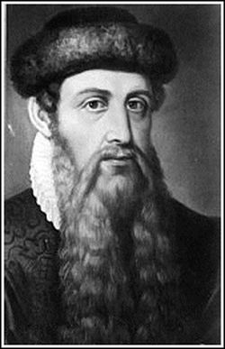
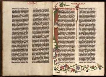
The printing press was invented in the Holy Roman Empire Johannes Gutenberg of Germany around 1440. Gutenberg, a goldsmith by profession, developed a complete printing system, which perfected the printing process through all of its stages by adapting existing technologies to the printing purposes, as well as making groundbreaking inventions of his own. His newly devised hand mould made for the first time possible the precise and rapid creation of metal movable type in large quantities, a key element in the lucrativeness of the whole printing enterprise. Upon further investigation, I found that a “hand mould” or “matrix” was used in hot metal typesetting, a matrix is a mold for casting a letter, known as a sort, used in letterpress printing. However, in printmaking the matrix is whatever is used, with ink, to hold the image that makes up the print, whether a plate in etching and engraving or a woodblock in woodcut. In the Fall of 1909, Robert Vandercook founded Vandercook & Sons in Chicago, Illinois. His first press was made with a geared cylinder. Before the development of his press, all proofs were made on a roller press, a hand-operated crank press that relied on gravity to make an impression, or on a Washington Hand Press, which was pre-ink-rolling—you had to hand ink each print, and could only do 4 prints at a time, on the large press bed. The press in the Petko studio that we visited looks to be a Washington Hand Press. Here’s a video demo: https://vimeo.com/67678996 Over the next half-century, Vandercook introduced 60 different press models—29 before World War II, 17 of which were still being manufactured for years after the war. Manufacturing was halted during the war, as Vandercook was greatly involved in making things for the war effort, for which they received the E Award. The President's “E” Award was created by Executive Order of the President to afford suitable recognition to persons, firms, or organizations which contribute significantly in the effort to increase United States exports. With a couple exceptions that were gravity presses, all of Vandercook’s presses were geared cylinders. The SP’s or Simple Precision presses and the Universal series were the last designed. The SP15 was the most popular of all of the Vandercook presses. Take a look at this demo: https://youtu.be/jxwRlQib1EQ Although the company has changed hands a couple of times, it still operates under the name NA Graphics out of Silber City Colorado—making parts and supplies for many Vandercook models. Without the efforts of Mr. Vandercook and his sons, we may still be using gravity to create prints. 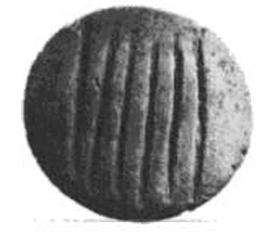 By: Nikki Villatoro The history of writing was created to express emotions, imagination and language by letters or any other mark, Through writing, we had the ability to transfer complex information, ideas etc from one individual to another, because of this we were able to grow and learn from one another. Since 25,000 – 30,000 BP, humans were painting pictures on cave walls. Through this, we learned stories from one another. Learning how to write taught us how to express ourselves– whether it was a way to represent our tribe, our emotions or our experiences. The writing system started to become more of a representation of hunter-gatherer societies. People's property were solely relied on their 'mark'– food, land, animals. We saw this on their 'tokens.' The history of writing was created to express emotions, imagination and language by letters or any other mark, Through writing, we had the ability to transfer complex information, ideas etc from one individual to another, because of this we were able to grow and learn from one another. Since 25,000– 30,000 BP, humans were painting pictures on cave walls. Through this, we learned stories from one another. Learning how to write taught us how to express ourselves–whether it was a way to represent our tribe, our emotions or our experiences. The writing system started to become more of a representation of hunter-gatherer societies. People's property were solely relied on their 'mark'– food, land, animals. We saw this on their 'tokens.' The tokens began to be symbols, then they started to transition into being used as an impression or inscribed in clay. First they were pictographs but started to become more, certain pictures representing an idea or concept, ideographs and then sounds. We have grown much more since then. From glyphs, to Greek/Trajan/Roman, alphabets to Gothic lettering, to Letterpress. Gutenberg was in 1439 was the first European to use printing press and movable type in Europe. Along with the many experimental things that create the printing– the invention of movable type, the machinery, oil-based ink, wooden print press etc. Through his invention of all these elements, he was able to make a system which we all know as today as Letterpressing. Thanks to Gutenberg, the use of movable type was marked as such a magnificent improvement in on handwritten manuscripts. Gutenberg has changed the printing world, this rapidly started to spread around Europe and soon, the world. Mankind is known for is evolution: in its self and it's inventions– although we have not forgotten about Letterpressing, it's now as easy as clicking a letter on a keyboard. Letterpress is making its comeback since we have founded the 'computer' but, there will always be something unique of the process of letterpress, and the outcome of the work itself. Having to gather the ink, going through drawers to find the typeface and manually having to put the work into it. Every step of it is so beautiful and different each time. We have grown so much but will never forget where it all started from. REFERENCES:
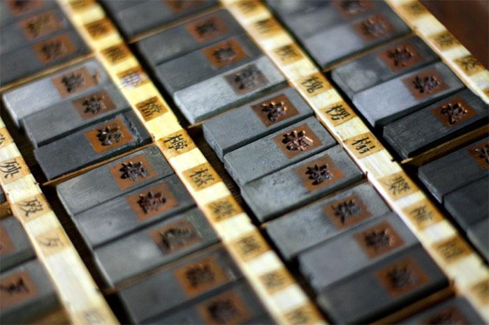
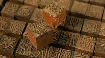
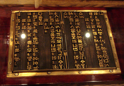
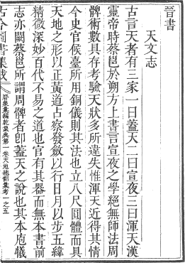
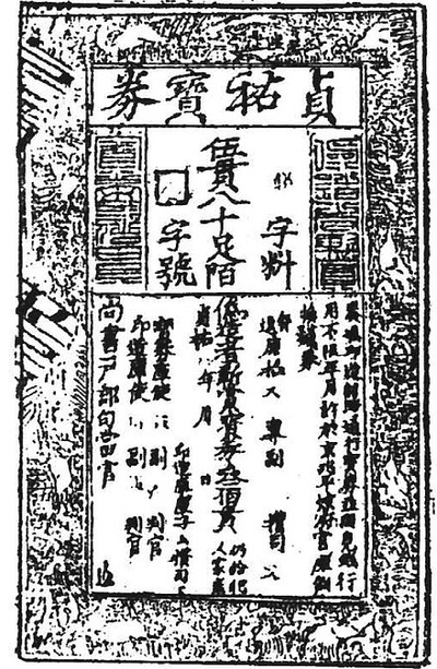
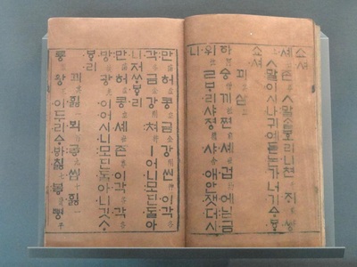
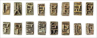
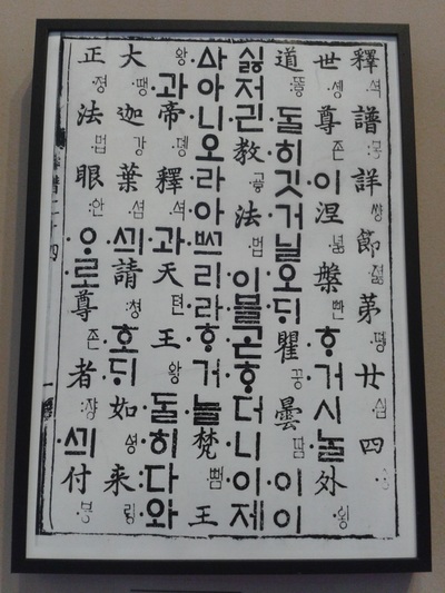
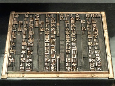
http://www.historyofinformation.com/expanded.php?id=344 https://en.wikipedia.org/wiki/History_of_writing https://en.wikipedia.org/wiki/Gutenberg_Bible By Yiao Zhang Introduction Letterpress printing could simply described as " Pressing paper onto wood and metal letters and hand-carved images, with ink in between." , according to <HISTORY OF LETTERPRESS PRINTING>. After a German named Johannes Gutenberg of Mainz, became the first one to invent a metal movable-type printing system in Europe. At middle of 1400's, Letterpress revolutionized printing and possible mass communication in the western world. Get back to Far-East, a Chinese called Bi Sheng from Northern Song Dynasty used baked clay to create the earliest movable type printing It is about 400 years earlier than European. History About 202 BC, a people called Cai Lun from Western Han Dynasty, created one of the most important materials for printing---Paper, people in China started to use paper to replace the bamboos. After Cai Lun, at the end of Eastern Han Dynasty, a writer named Zuo Bo improved the way to make paper and about 751 AD, paper had been introduced to Korea. After People in China and Korea got their new Invention --- Paper, they found out the way to achieve the massive production of books, paper money and something else. In China, after Sheng Bi created the clay movable types. At Yuan Dynasty, Wang zhen---an official, invented the wooden type to replace the clay type in 1297. Also, Chinese attempted to use tin to create the type, but chinese water-based ink is very hard to be griped on tin character. Because of this, tin characters only appeared for a very short time. In Korea, Dharani sutra was the oldest surviving wood block-printed text. Koreans first began to work with movable type was at Goryeo Dynasty. During that time the text called Tripitaka---the Buddhist religious text, which included sutras, treatises and law. By printing two complete sets, it required more than 8,000 different wood blocks. During the time, when Mongolian forces invaded Korea, many Korean documents were destroyed by war. Lucky, about four decades ago, Korea already used bronze types to replace the wooden types. That allowed types surviving from the war and allowed Koreans to replace their documents. Present Facts for Chinese Movable Type Now, Movable types in Asian countries are slowly disappearing. It is not only because Asian type characters are hard to make. but also because most Asian countries' languages have over thousands characters. They are hard to analyze and collect. For example, in China, not like in English, it only need 26 letters. If people want to have just a single font with all characters in Chinese. It will need over 80,000 unique types, even if people only need the most commonly used characters, people will still need 3500 types. Those will still be very huge collections. Also, there will have at least 8 commonly font in Chinese. Just according to this, Chinese movable types will be have to survive from the modern life, As the video shows, the ways to create the wooden movable types are very complex that makes young people very hard to learn from the elders. Some Same Facts with English Movable Type Not only the Asian movable type suffering the similar problem with Chinese, English movable type also have the same trouble. Such as more and more letterpress companies closed because the hi-tech products. Digital prints are much faster than letterpress, online newspaper are much easier to carry than paper-based news, Here is the video about Helvetica. Hope this will bring you some more interests about letterpress. Reference:
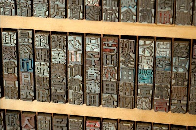
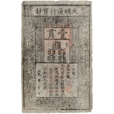
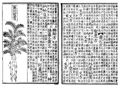
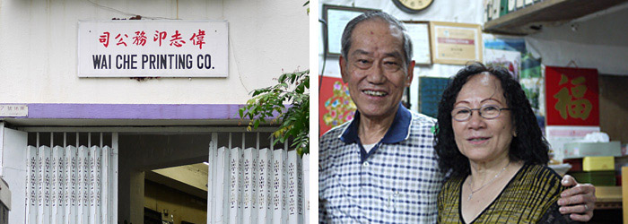
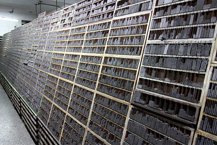
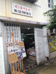
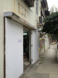
Asia for Educators. “The Song Dynasty in China.” Columbia University. 2008. Web. Accessed 23 July 2012. Christensen, Thomas. “Gutenberg and the Koreans: Did East Asian Printing Traditions Influence the European Renaissance?” 2006. Web. Accessed 23 July 2012. Steins, John. “Wood Block Printing.” John Steins Printmaking Journal. 19 Jan 2010. Web. Accessed 23 July 2012. Elation Press Co. "Short History of Asia’s Influence on Type and Printing". HISTORY OF LETTERPRESS PRINTING. "What is letterpress printing?". 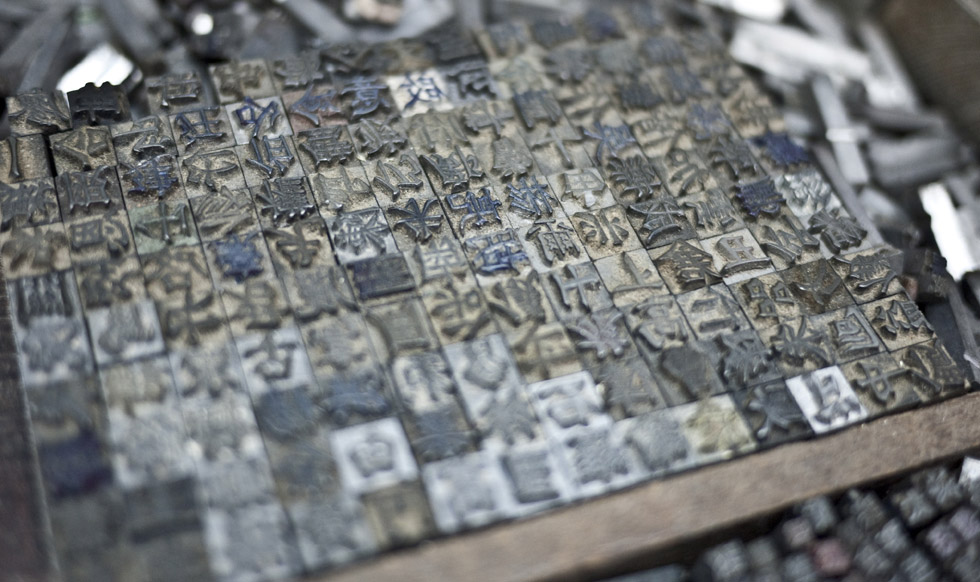 Wai Che Printing Company One of the Last Remaining Letterpress Shop in Hong Kong By Jessica Chhou As trends tend to resurface ever so few years, it appears letterpress printing has made its comeback within the art and design community. While the Western letterpress printing has made a revival, what was once considered one of the Four Great Inventions of Ancient China is no longer a sustainable practice. Although many are unaware, the earliest origins of letterpress were actually conducted in the land of the Far East. During the Song Dynasty (960-1279), Bi Sheng invented the Movable Type. He carved individual characters on identical pieces of fine clay that would eventually be fired to be durable for printing. This concept of mass-producing literature developed very quickly. The introduction of printing in China dramatically lowered the price of books, thus aiding the spread of literacy. It also gave a boost to the development of drama and other forms of popular culture as the scripts became inexpensive to produce. Eventually, the art became popular, and advancements lead movable type to being composed from wood, lead, tin, and copper. From copper type, became a very influencing concept to the great Johannes Gutenberg.. As Movable Type was one of the greatest technological advances defining typography, it is upsetting to see Wai Che Printing Company being the last remaining letterpress shop in Hong Kong in 2012. From Central to Sheung Wan, the streets used to be filled with printers, print shops, and other paper-related storefronts. The shop’s 81-year old owner Lee Chak Yu has preserved its bilingual lead type collection and original Heidelberg Cylinder machine for over 50 years. Upon entering the Chinese letterpress shop, there are rows of shelves of type. Instead of using a type drawer, the Chinese characters were typically stored in cube shelving with the type stacked into a column. They face outward for easy identification and access. However, with the vast language, it became very difficult to create a system to categorize the type. They had no alphabet, and with new words evolving, there were endless Chinese characters. In practice, it would be difficult to work with more than 45,000 unique characters. Typesetting in Chinese was a challenge and the accuracy needed was on a whole different level especially when the characters were made of many radicals and ideograms. Running a Chinese letterpress shop would require an enormous storage space and at least 4,000 commonly used characters. Many businesses were affected when they were unable to source new characters when needed. Little by little, the print shops in Hong Kong shut down, including the last one standing, Wai Che Printing Company. The space where Wai Che lies was under high demand due to development and gentrification. Similar to the shops around, the government wanted to take over to use it for redevelopment. However, the owner wanted to turn his shop into a museum. Lee Chak Yu wanted to spread the knowledge of movable type and engage the visitors into hands-on activities of letterpress. He wanted to show the visitors the history of the neighborhood of Sheung Wan and educate the ways things were before the digital age. Sadly, his idea did not catch on and on one winter day, the shop was all packed up and moved to a different location. It appears Lee Chak Yu would not have his shop as a historic museum. He left with optimism as one day he can share his stories of the past. Resources:
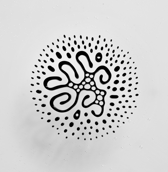
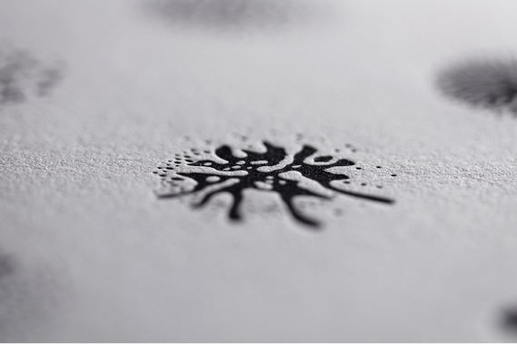
 by Stephanie McNicol Craig Ward is a British-born designer and art director. Now located in New York City, Craig has been recognized with multiple awards for his designs and art direction which include: ADC Young Gun (2008), recipient of the Type Directors Club Certificate of Typographic Excellence (2009, 2014) and the Communication Arts Award of Excellence (2014, 2015). He is known for his often creative and scientific approaches to design solutions. Ward has worn many hats in his career, including artist, author, art director, photographer, designer and contributor to several design journals. However, he is best known for this pioneering typographic works. He currently works out of his studio in North Brooklyn named. Word are Pictures. It also happens to be the name of his portfolio website that he originally used to showcase his experimental typographic and letterpress works. His studio space offers a unique space for him to experiment with photo and video shoots, and installation that features many of his typographic expressive works. 2003 to 2007 were considered Craig's "letterpress years". He was inspired by constructivist type assemblages of words and type. He often works using the letterpress which included type that reflective his own narrative. These experiments evolved into creating pieces such as the typographic map of New York City and a map of London. He enjoyed the printing process, as he was able to produce unexpected results. He believed that these distortions were difficult to control and allowed the elements to play on the page in unexpected way. It was his love of letterpress that lead to his involvement in creating a custom typeface for Christian Dior to celebrate the first release of their first new perfume in ten years. He named it NM Serif and created a poster with the typeface to send to his clients, so they could have a tangible feel for the elegance and structure of the typeface. In recent months, Ward has collaborated with biochemist and photographer Linden Gledhill to create something truly unique when it comes to experimental art and bringing it to letterpress. Craig and Linden have developed a set of glyphs using magnetic fluid ink. The “typeface” is called Fe2O3 (Iron III Oxide) Glyphs. Iron III Oxide is a main component found in ferrofluid. Ferrofluid is a liquid that becomes strongly magnetized in the presence of a magnetic field. The results create a very unique form, or glyph, that can be manipulated and then vectorized on the computer. The process is beautifully simple: first ferrofluid is placed between two glass plates. The ferrofluid is then subjected to a magnet that spins horizontally and vertically. The results are as Ward explains, “a library of complex hieroglyphics – each one as unique as a snowflake – that call to mind both indigenous markings and symbols from science fiction.” Once the glyphs have been finalized, Ward creates a vector of the shape to convert to a working OpenType (.oft) typeface, as well as, a polymer plate. The ink for these prints have been made using a mix of black pantone ink, and ferrofluid. The reasoning behind this says Ward, is that “the printing medium dictates the form of the glyphs, as opposed to the other way around.” A genius way to bring the project full circle and a testament to the detail in which Craig Ward puts into his work. The juxtaposition: the old system of letterpress with a mix of modern, scientific technology makes this project one that stands out as far as experimental type is concerned. Craig Ward is certainly a designer that brings the fine arts back into design with his personal projects, and is a true pioneer in experimental typography. For a look into the collection of his work I encourage you to visit his website at wordsarepictures.co.uk. Works Cited: |
Categories
All
|
