Samuel Rosenzweig
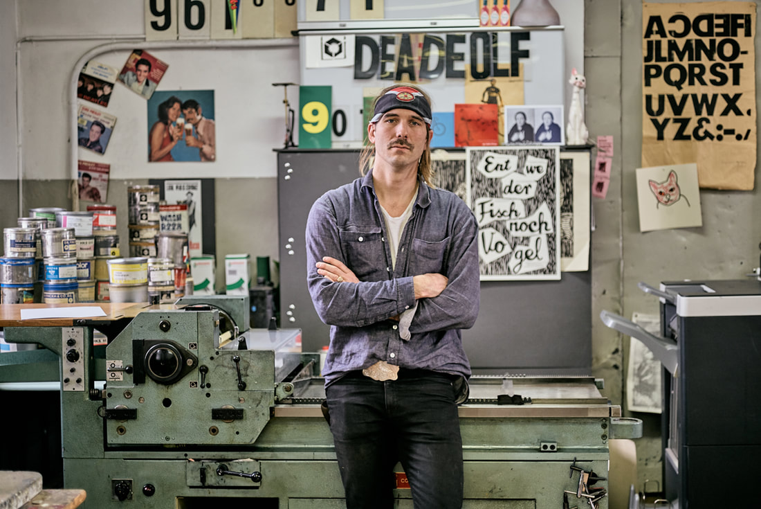
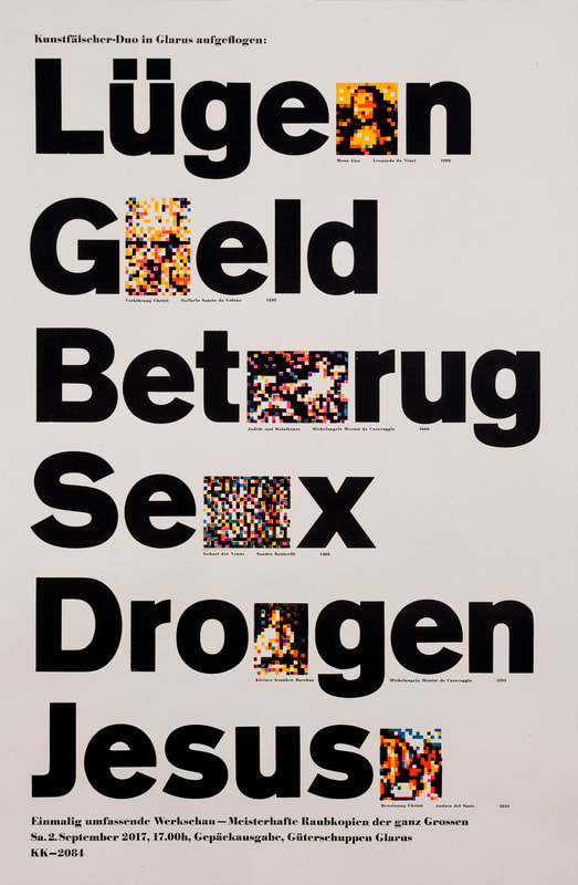
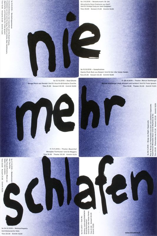
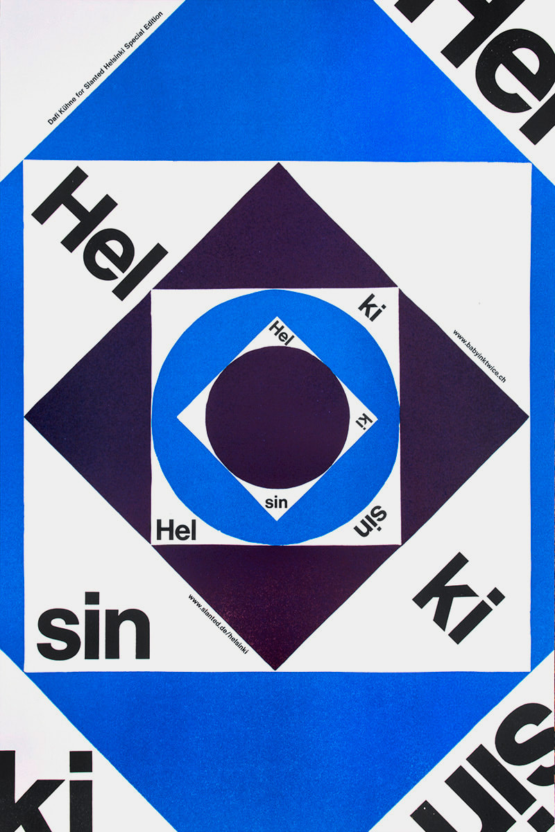
Dafi Kühne is a Swiss designer and letterpress artist who combines contemporary graphic design approaches with the art of letterpress printing. Based in Glarus, Switzerland, Kühne has been working full-time as a letterpress printmaker for over a decade, producing a wide range of artifacts including posters, brochures, and invitations for the world of music, art, theater, and film. Kühne prides himself on his ability to combine contemporary graphic design with printmaking techniques no longer practiced by the vast majority of designers. As a “no-digital-only” designer, Kühne cites his favorite tools as letterpress printing presses from the 1960s, traditional metal and wood type, pantograph cut wood blocks, laser cut blocks, polymer plates and handcuff lino and chip board. In addition to his computer, which is also an integral part of his process. In his Swiss studio, Kühne has collected over twenty tons of equipment. Kükne’s studio set-up includes three FAG Control 405 machines and a massive German Frontex loaded with seemingly endless dials and knobs. How the floor resists caving in remains a globally disputed mystery. To many designers, working exclusively in letterpress may seem tedious, unsustainable, crazy, or all of the above. For Kühne, the draw of letterpress comes from his ability to assert total control over the design and production process. Kühne states, “I am not a luddite or a romantic retro fanatic…it’s just about finding the right tool for producing my design.” For Kühne the printing presses are an important tool in the process of design, not just the final step. When you send a digital file to print, there’s no telling what will come back in the form of paper and ink. The designer relinquishes control after they send or upload a digital file. Kühne remedies this by being hands on from the start. “When it comes to printing I want to have full control over the whole process and the power to make all the decisions, such as choosing the colors and the paper, mixing the ink, setting the about of pressure and ink, according to my design concept.” Before taking on a client’s project, Kühne must make sure the concept and messaging are strong. Typography plays the leading role in the formation of the communication but color and texture are equally important. Kühne’s over 600 cases of type include favorites such as Caslon and Helvetica, along with more obscure typefaces such as Normal Grotesk. Perhaps Kühne’s biggest contribution to the world of contemporary letterpress, other than his work, are his informative and engaging videos, which explore alternative printing techniques. His video on casting plastic resin type explains how he made additional letterforms from a pre-existing metal typeface because he didn’t have enough type specimens to print a text-heavy poster. Other topics that Kühne covers include working with magnetic wood type, indirect printing, vinyl sticker type, and torn structures. Kühne’s work is appealing because it balances graphic design traditions with contemporary approaches. The hand-made quality can be felt not only in the aesthetics but also in the concept. As each step takes much longer on letterpress than it doesn’t on a computer, decisions are carefully calculated, leading to better choices, and better design. In a n era when designers can create hundreds of sketches on a computer in an hour or two, having an awareness of the image making roots of the letterpress are more important than ever. Setting type by hand allows for a sort of embodied cognition to take place, as a designer learns the classical components of typography. Hopefully more designers in the future will have an opportunity to discover the letterpress and incorporate traditional techniques in their own contemporary designs. Posters.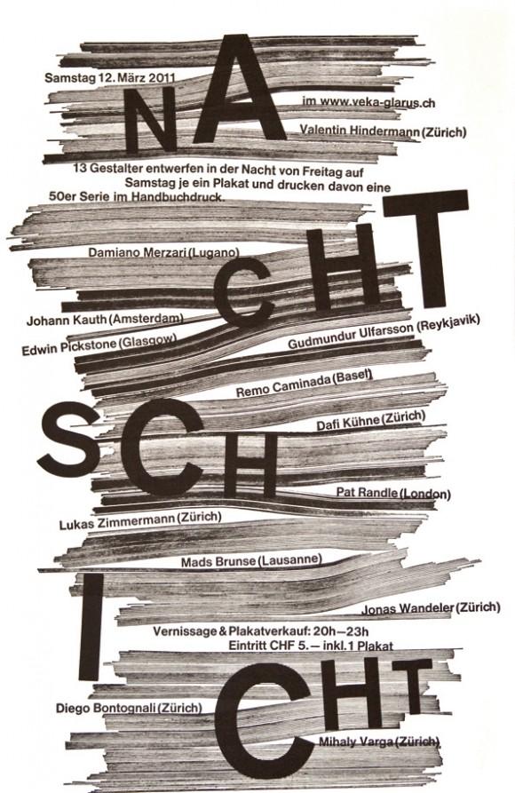
Video.Sources: Owen Pritchard, December 9 2016 True Print: the work of Swiss designer Dafi Kühne catalogued in fantastic new monograph https://www.itsnicethat.com/articles/dafi-kuhne-true-print-publication-091216 Luc Benyon, April 2018 A Look Inside Dafi Kühne’s Swiss Alps-based, Mindblowingly Vast Letterpress Studio https://eyeondesign.aiga.org/a-look-inside-dafi-kuhnes-swiss-alps-based-mindblowingly-vast-letterpress-studio/ Dafi Kuhne’s Vimeo Channel https://vimeo.com/dafi
Jamie Gibson
11/9/2018 02:03:51 pm
Very cool artist you chose to write about. I love his style and can see how his work inspires yours, combining graphic design with letterpress. Comments are closed.
|