|
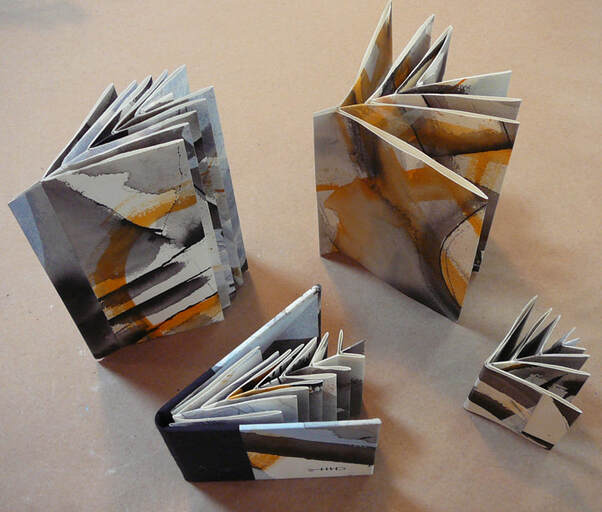
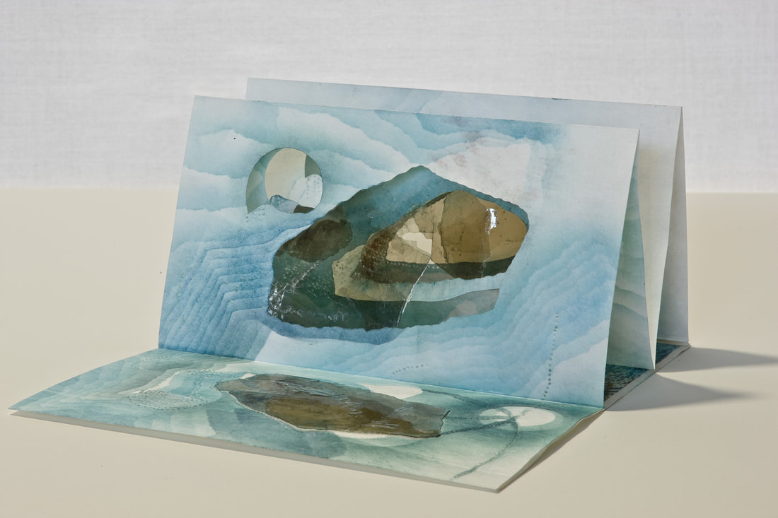
Liz Batronis- One individual that has brought innovative and different ideas into the artist book community is Hedi Kyle. She is a German-American artist that specializes in folded book structures, as well as the pioneer for new structures. Kyle is the reason the book arts community have new structures like: The Accordion Book, the Flag Book, the Blizzard Book, the Fishbone Fold, the Spider Book, as well as many others. These book structures are complex, useful, and creative. With Kyle's contribution to the growing book arts community, the ways to create new ideas has become that much easier. This can be seen in her Fishbone Fold book structure. The Fishbone Fold structure is an interesting one, because its layouts decrease in size to the tip, like how an actual fish’s structure goes smaller towards the tail. This structure would allow for someone to tell a story with smaller and smaller pages. Overall, the best part of her new structures is that she makes tutorials along with them. This allows for someone else to use her original designs for their own original book idea. This idea allows for the creative community to grow together, instead of leaving others behind. As an artist, I think this is huge because not many artists are this open about how they create something new. Her love of these books and the community for them is very evident in her work, as well as her words. Kyle’s mind seems to be able to create many new forms to fit the ever-growing list of new ideas. Kyle has been creating book structures that allow for the book to be alive as an object of extraordinary diversity. Her love of new structures can be easily seen in the book that she and her daughter, Ulla Warchol, created called The Art of the Fold. Within this book they go through a large number of different book structures and how to create them. One of the books she has created, Mica Lakes, has been a great inspiration to myself. Hedi Kyle created Mica Lakes in an accordion book structure with shapes cut out and covered with thin plastic for windows. The cut outs are there to represent the geological look of a lake. While open or closed, this book allows for an individual to see through it creating a different space and area. This book is interesting to me because the way she makes every line look intentional. From the cut outs to the echoes of blue, create movement throughout each layout. This gives a viewer a sense of water moving through, as well as a sense of awareness of the world we live in. I believe that the reason, or idea, behind this work could be connected to how her father was a marine biologist, along with the water problem in our world right now. Having ways to help someone see into your world as a whole, without even speaking a single word, is an artist’s true dream. To allow for a view to be immersed into a different plane of existence. This outlook can be seen in everything Hedi Kyle does, the want to create new life and to be able to tell stories in extraordinary ways. Citations:
Samuel Rosenzweig
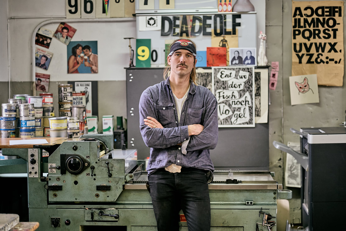
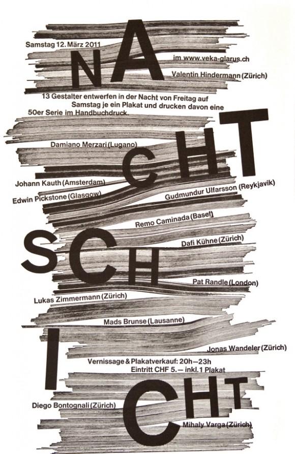
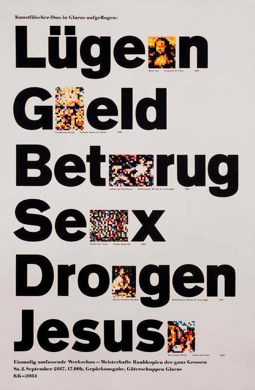
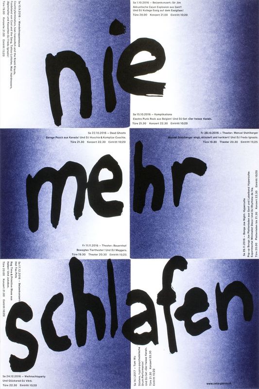
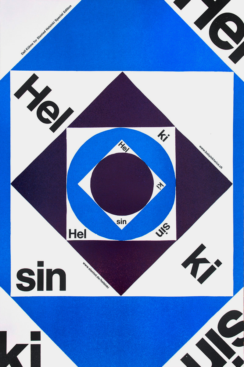
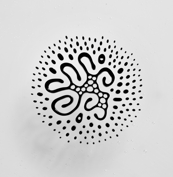
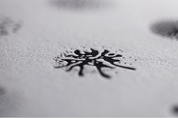
Dafi Kühne is a Swiss designer and letterpress artist who combines contemporary graphic design approaches with the art of letterpress printing. Based in Glarus, Switzerland, Kühne has been working full-time as a letterpress printmaker for over a decade, producing a wide range of artifacts including posters, brochures, and invitations for the world of music, art, theater, and film. Kühne prides himself on his ability to combine contemporary graphic design with printmaking techniques no longer practiced by the vast majority of designers. As a “no-digital-only” designer, Kühne cites his favorite tools as letterpress printing presses from the 1960s, traditional metal and wood type, pantograph cut wood blocks, laser cut blocks, polymer plates and handcuff lino and chip board. In addition to his computer, which is also an integral part of his process. In his Swiss studio, Kühne has collected over twenty tons of equipment. Kükne’s studio set-up includes three FAG Control 405 machines and a massive German Frontex loaded with seemingly endless dials and knobs. How the floor resists caving in remains a globally disputed mystery. To many designers, working exclusively in letterpress may seem tedious, unsustainable, crazy, or all of the above. For Kühne, the draw of letterpress comes from his ability to assert total control over the design and production process. Kühne states, “I am not a luddite or a romantic retro fanatic…it’s just about finding the right tool for producing my design.” For Kühne the printing presses are an important tool in the process of design, not just the final step. When you send a digital file to print, there’s no telling what will come back in the form of paper and ink. The designer relinquishes control after they send or upload a digital file. Kühne remedies this by being hands on from the start. “When it comes to printing I want to have full control over the whole process and the power to make all the decisions, such as choosing the colors and the paper, mixing the ink, setting the about of pressure and ink, according to my design concept.” Before taking on a client’s project, Kühne must make sure the concept and messaging are strong. Typography plays the leading role in the formation of the communication but color and texture are equally important. Kühne’s over 600 cases of type include favorites such as Caslon and Helvetica, along with more obscure typefaces such as Normal Grotesk. Perhaps Kühne’s biggest contribution to the world of contemporary letterpress, other than his work, are his informative and engaging videos, which explore alternative printing techniques. His video on casting plastic resin type explains how he made additional letterforms from a pre-existing metal typeface because he didn’t have enough type specimens to print a text-heavy poster. Other topics that Kühne covers include working with magnetic wood type, indirect printing, vinyl sticker type, and torn structures. Kühne’s work is appealing because it balances graphic design traditions with contemporary approaches. The hand-made quality can be felt not only in the aesthetics but also in the concept. As each step takes much longer on letterpress than it doesn’t on a computer, decisions are carefully calculated, leading to better choices, and better design. In a n era when designers can create hundreds of sketches on a computer in an hour or two, having an awareness of the image making roots of the letterpress are more important than ever. Setting type by hand allows for a sort of embodied cognition to take place, as a designer learns the classical components of typography. Hopefully more designers in the future will have an opportunity to discover the letterpress and incorporate traditional techniques in their own contemporary designs. Posters.Video.Sources: Owen Pritchard, December 9 2016 True Print: the work of Swiss designer Dafi Kühne catalogued in fantastic new monograph https://www.itsnicethat.com/articles/dafi-kuhne-true-print-publication-091216 Luc Benyon, April 2018 A Look Inside Dafi Kühne’s Swiss Alps-based, Mindblowingly Vast Letterpress Studio https://eyeondesign.aiga.org/a-look-inside-dafi-kuhnes-swiss-alps-based-mindblowingly-vast-letterpress-studio/ Dafi Kuhne’s Vimeo Channel https://vimeo.com/dafi 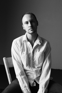 by Stephanie McNicol Craig Ward is a British-born designer and art director. Now located in New York City, Craig has been recognized with multiple awards for his designs and art direction which include: ADC Young Gun (2008), recipient of the Type Directors Club Certificate of Typographic Excellence (2009, 2014) and the Communication Arts Award of Excellence (2014, 2015). He is known for his often creative and scientific approaches to design solutions. Ward has worn many hats in his career, including artist, author, art director, photographer, designer and contributor to several design journals. However, he is best known for this pioneering typographic works. He currently works out of his studio in North Brooklyn named. Word are Pictures. It also happens to be the name of his portfolio website that he originally used to showcase his experimental typographic and letterpress works. His studio space offers a unique space for him to experiment with photo and video shoots, and installation that features many of his typographic expressive works. 2003 to 2007 were considered Craig's "letterpress years". He was inspired by constructivist type assemblages of words and type. He often works using the letterpress which included type that reflective his own narrative. These experiments evolved into creating pieces such as the typographic map of New York City and a map of London. He enjoyed the printing process, as he was able to produce unexpected results. He believed that these distortions were difficult to control and allowed the elements to play on the page in unexpected way. It was his love of letterpress that lead to his involvement in creating a custom typeface for Christian Dior to celebrate the first release of their first new perfume in ten years. He named it NM Serif and created a poster with the typeface to send to his clients, so they could have a tangible feel for the elegance and structure of the typeface. In recent months, Ward has collaborated with biochemist and photographer Linden Gledhill to create something truly unique when it comes to experimental art and bringing it to letterpress. Craig and Linden have developed a set of glyphs using magnetic fluid ink. The “typeface” is called Fe2O3 (Iron III Oxide) Glyphs. Iron III Oxide is a main component found in ferrofluid. Ferrofluid is a liquid that becomes strongly magnetized in the presence of a magnetic field. The results create a very unique form, or glyph, that can be manipulated and then vectorized on the computer. The process is beautifully simple: first ferrofluid is placed between two glass plates. The ferrofluid is then subjected to a magnet that spins horizontally and vertically. The results are as Ward explains, “a library of complex hieroglyphics – each one as unique as a snowflake – that call to mind both indigenous markings and symbols from science fiction.” Once the glyphs have been finalized, Ward creates a vector of the shape to convert to a working OpenType (.oft) typeface, as well as, a polymer plate. The ink for these prints have been made using a mix of black pantone ink, and ferrofluid. The reasoning behind this says Ward, is that “the printing medium dictates the form of the glyphs, as opposed to the other way around.” A genius way to bring the project full circle and a testament to the detail in which Craig Ward puts into his work. The juxtaposition: the old system of letterpress with a mix of modern, scientific technology makes this project one that stands out as far as experimental type is concerned. Craig Ward is certainly a designer that brings the fine arts back into design with his personal projects, and is a true pioneer in experimental typography. For a look into the collection of his work I encourage you to visit his website at wordsarepictures.co.uk. Works Cited: |
Categories
All
|
