|
By Amber Mongelluzzo Typography and art have gone hand-in-hand since 3100 BC, first used by the Egyptians in their architecture and writing (designbro). Since then, the evolution of computers and graphic design has utilized typography to expand the visual arts. I use typography in my art all the time. I start by writing out a poem or a statement and then I translate it into code. Different codes are used based on what fits with the theme of the writing. One artist that uses typography in their art is Ralph Ueltzhoeffer. Born in 1966 in Mannheim, Germany, Ralph Ueltzhoeffer started his text portrait in 1984 (Yazter). Most of his portraits were public installations, being on billboards and such. He creates portraits out of the biographies of famous people. Which reminded me of a research project I did. Once, I wrote a report about Samuel Morse and translated that paper into morse code, then created a portrait of Samuel Morse from the coded words. Ueltzhoeffer quotes, “typography is an art form in itself that combines carefully chosen and arranged fonts with visual elements, sometimes as a relatively straightforward communication device and sometimes as artistic expression” (Hosmer, Katie). This could not be more true. Although my artwork is not always as clear as using codes, it is still a form of communication and artistic expression. With typography, there is an extra layer of communication, allowing the viewer to either understand more about the art or challenge their train of thought. Using typography also adds to the story telling. Each word is carefully chosen to express the mood of the story. The type of type chosen for art is important to convey mood as well. While Ueltzhoeffer stays consistent with his type, using smooth and rounded lettering, he varies in capital and lowercase. For example, his biographies are exact word for word, down to the punctuation. One of his portraits is just the word manchester over and over again in all caps, but others have both lowercase and capital. Most of his portraits are in grayscale, but some are in color. Either way, he utilizes value in his art by changing individual letters' hue and shade or tint. This is also shown in the negative space. Each word seems like it is carefully placed, leaving the negative space to be either in line with each other or at random, depending on the type and word choice used. The photographs by Ralph Ueltzhoffer are truly stunning and an inspiration to me to create with typography. Ueltzhoffer utilizes words, value, and color in a creative way by always using a black background. This makes the words pop more and add an extra layer of dimension to the photographs. Ueltzhoffer is able to be realism shading based on words, that is something that I struggle with especially when working traditionally. After studying Ueltzhoffer, I think I have a better understanding on how to gain more value in my work. Ralph Ueltzhoffer is truly a master at his artwork with gaining fine detail Works Cited
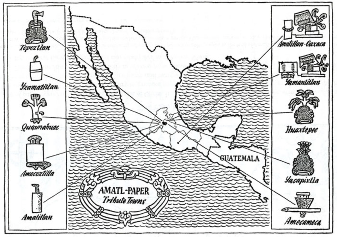
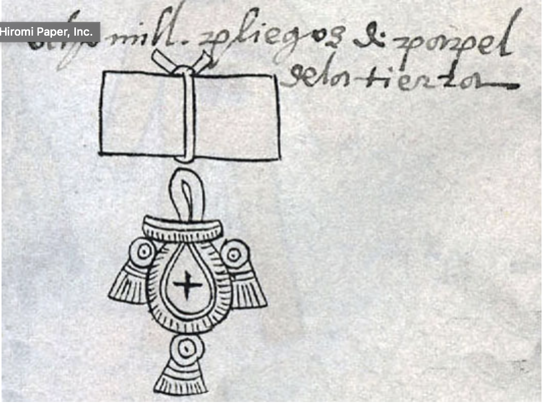
“Design Is to Share.” Yatzer, https://www.yatzer.com/. Hosmer, Katie. “Famous Portraits Built from Thousands of Words.” My Modern Met, 16 June 2016, https://mymodernmet.com/ralph-ueltzhoeffer-textportraits/. “Ralph Ueltzhoeffer: Art Concepts London.” AC/LDN, https://www.artconcepts.london/ralphueltzhoefferartconceptslondon. “Typography.” Encyclopædia Britannica, Encyclopædia Britannica, Inc., https://www.britannica.com/technology/typography Elizabeth Z. Pineda Papermaking in Mexico has a rich history. In the Far East, papermaking dates back to China and Egypt. In the Americas, paper originates with the Maya and the Aztecs. Yet, the papers from the two sides of the world were different. True paper, as we know it, was invented by the Chinese, and the Egyptians had papyrus. In Meso America, people made paper out of bark. The Mayans’ called their paper Huun, the Aztec’s Amatl. Amatl is know as Amate or Bark paper. The uses of the bark paper were varied. It was used for record-keeping, to record stories, for use in healing and spiritual rituals, clothing, and for folded manuscripts to form sacred books. Despite their extensive use of paper, little recorded history remains about these Meso-American narratives. Nearly all of the manuscripts were destroyed by the Spaniards during the conquest. However, a few significant codices from these civilizations remain. Two magnificent examples are the Codex Dresdensis from the Maya and the Codex Mendoza from the Aztecs. An entry in the Codex Mendoza states that 24,000 resmas of (bark) paper were to be provided annually to Tenochtitlan’s ruler Moctezuma II (480,000 sheets) giving insight into how important the material was to these early civilizations. 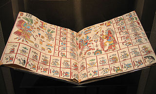 A spread from the Codex Mendoza The tradition of bark papermaking nearly disappeared after the conquest. However, the Otomí people in the small town of San Pablito in northern Puebla, México, continued the practice in secret. The Otomí people were one of the producers of paper for the Aztec court. They continued making paper for their use and ritual for several centuries. The Otomí’s Amate paper became known when it was introduced to native artists from Guerrero, a nearby state, in the 1960s by architect Max Kerlow and painter Felipe Ehrenberg. Kerlow and Ehrenberg gifted sheets of Amate to clay artists renowned for their elaborate paintings in pottery. The clay artisans welcomed the new material as they often lost much of their pottery because it broke during transit when they traveled to sell their wares. The intricate paintings they created on the Amate paper were a great success that eventually leads to a bark paper exhibition in Mexico City in 1963, the first of its kind. The demand for bark paper paintings swelled and become one of the most sought-after kinds of folk art from Mexico. The bark paper paintings on Amate are exports to markets in many countries around the world. Initially, the bark paintings were made by artists from Guerrero, but a local painter from Pahuatlán, near San Pablito, Rafael Lechuga, taught the Otomí how to paint on their Amate. A practice they continue to this day. The Otomí of San Pablito remains one of the sole producers of the bark paper. 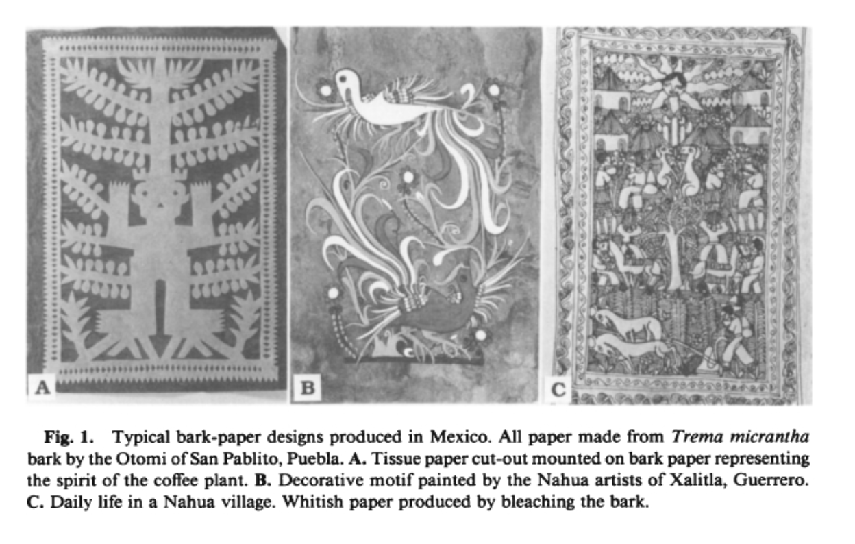 Bark paper is prepared similarly to other hand-made papers. The difference with Amate paper is that the sheets are not pulled, or formed with water. For this reason, Amatl is sometimes not considered a true paper. When making Amate, the fiber is processed the same way. The fibers are peeled, separated from the bark, cooked, soaked, and bleached or dyed. For the final step, instead of beating the fibers into a pulp and submerging the pulp in water, and pulling or forming it, the bark fibers are separated into strips and pounded with a volcanic stone on a flat surface to form/make the sheets of paper. Traditionally bark papers are made from the bark of fig trees but the fig groves near San Pablito have been exhausted. Nowadays, their Amate is made from the Jonote tree bark which, due to the great demand and large removal of bark the Jonotes around San Pablito have also died. To produce the necessary quantities of paper in demand the bark is now brought from Jonote groves in neighboring states like Veracruz In San Pablito, papermaking and bark paintings are a family affair. Everyone contributes to this craft, including the children. Children help carry the bundles of peeled fiber, and they lay out the fibers in the patterns to be pounded. In this way, they learn a sustaining and culturally rich practice, one based on traditions passed on from a long ancestral legacy. Currently, papermaking practices in Mexico include water-forming methods. Two places that incorporate this practice are Taller Leñateros in Chiapas, and Taller de Arte Papel in Oaxaca. Taller Leñateros is a Maya collective of artists founded by poet Ámbar Past. Taller Leñateros has published several books recounting the history and voices of Maya women. Likewise, Taller Arte de Papel Oaxaca was founded by Artist Francisco Toledo. At the taller, they implement local materials and sustainable practices in their papermaking and art studios. Some of the fibers used in papermaking at Taller Arte de Papel include local plants and fibers from Oaxaca like: Ixtle (Agave or Yucca,) Algodón de Pochote (Pochote cotton,) Algodón de Coyuche (native brown cotton) Majagua, Jonotes, Chichicastle (nettle,) Bagazo de Mezcal (Mezcal pulp waste,) Carrizo (reeds,) and Totomoztle (corn husks - maíz.) Algodón de Coyuche is considered El Oro Blanco (white gold.) Coyuche is a Zapotec word meaning coyote. The cotton is called Coyuche because of its color. Coyuche is also used to make finely crafted garments. At Taller Arte Papel all of the water used in the papermaking process goes back into the environment. For this reason, everything used, the fibers, dyes, and materials, must be safe and environmentally friendly because it goes back into the water table the community uses. 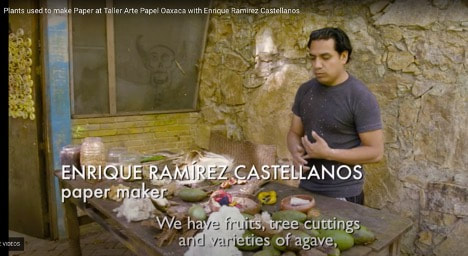 Taller Arte Papel in Oaxaca, Mexico - Plants Used to Make Paper www.craftinamerica.org/short/enrique-ramirez-castellanos-on-the-plants-used-to-make-paper-at-taller-arte-papel Regardless of the type of paper made, the inscriptions, motifs, and cultural iconography hold the same values. Paper remains as significant today as it was in Pre-Columbian times. Its history as a sacred material to the Aztecs and its meticulous craft traditions continue to be practiced to this day. The rich legacies and history of the people who humbly keep the tradition alive are indelible and hold as much breath as the early documents made on Amate centuries ago. Otomí Bark Paper in Mexico: Commercialization of a Pre-Hispanic Technology. https://www-jstor-org.ezproxy1.lib.asu.edu/stable/4254995?sid=primo&seq=2#metadata_info_tab_contents Craft in America: Taller Arte de Papel Oaxaca. https://www.craftinamerica.org/artist/taller-arte-papel-oaxaca Elaboracion del Papel Amate. https://www.youtube.com/watch?v=sV6xOIfxPqM Mexican Bark Paper: Evidence of History of Tree Species Used and Their Fiber Characteristics. https://www.jstor.org/stable/pdf/41494197.pdf?refreqid=excelsior%3A6330991cdc8831460f294acbd9082607 On Otomí Magic and Paper Making. https://utsalibrariestopshelf.wordpress.com/2016/10/17/on-otomi-magic-and-paper-making/ Paper Ties to Land: Indigenous and Colonial Material Orientations to the Valley of Mexico http://ezproxy.library.arizona.edu/login?url=https://www.jstor.org/stable/1063009 Paper: A Sacred Material in Aztec Ritual http://ezproxy.library.arizona.edu/login?url=https://www.jstor.org/stable/1061935 An additional video, it's a little longer, but it is great - Sadly, without English captions
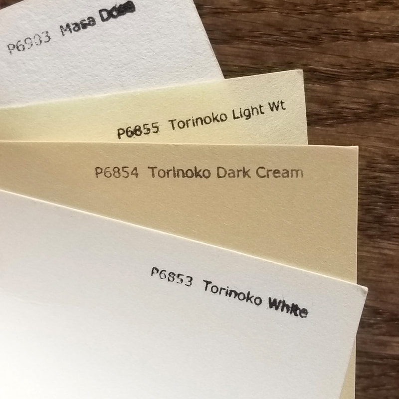
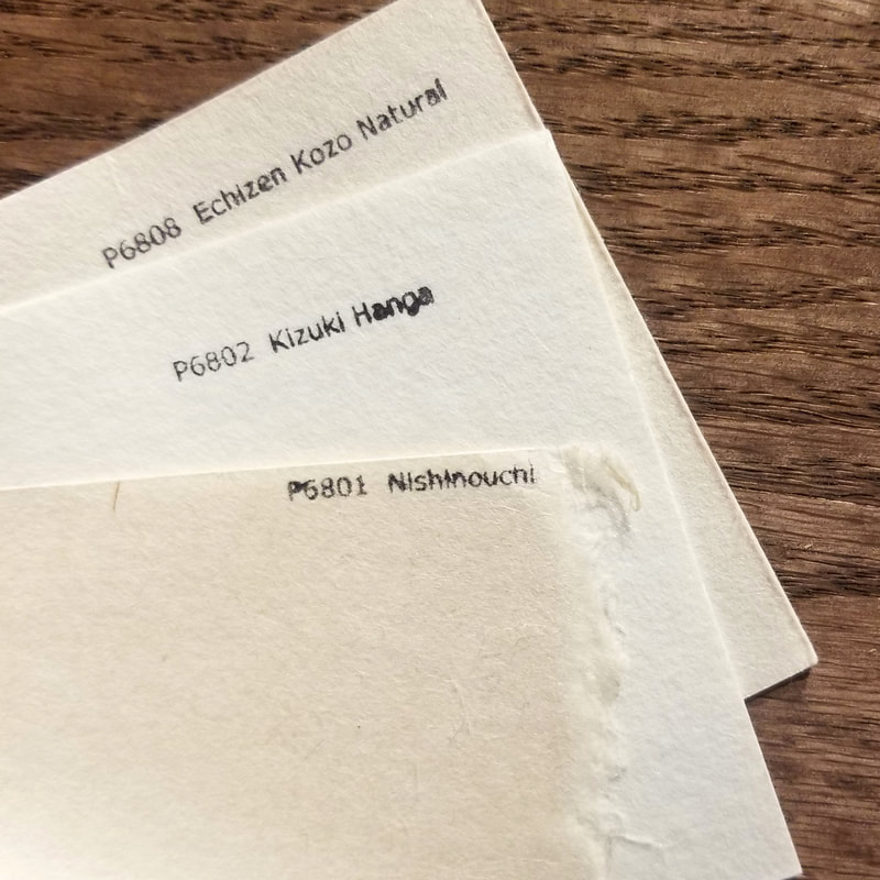
Maggie Pierce April, 2021 Labor Defender was a monthly magazine publication which ran from 1926-1937 and was based out of New York City. It was published by the International Labor Defense (ILD), a legal advocacy organization which acted on behalf of the Communist Party of the United States. Formed in 1925, it was created mainly to support workers and those on strike who were imprisoned. However, they also extended their legal services to anarchists, such as Nicola Sacco and Bartolomeo Vanzetti, and played a significant role in many civil rights cases. It was especially known for helping to provide legal defense for the Scottsboro Boys in the 1930s and publicizing their case. By 1928, Labor Defender was reaching a large audience, especially considering its radical viewpoint, with a total circulation of 22,000 copies. The assistant secretary of the ILD claimed that it had a larger circulation than many other communist publications combined. The magazine was known for its elaborate design, combining text, image, and illustration. It often utilized collage as a method of assembling images, a tool taken from Bauhaus and Russian Constructivists, accommodated by shaped text. The covers, which began as black and white lithographs but eventually moved to color, usually depicted provocative imagery which laid bare oppressive realities. In 2015, selected covers, designed by J. Louis Engdahl, were featured in the exhibition “Art as Activism” at the Museum of the City of New York. Labor Defender’s content reflected a marxist ideology, usually focusing on labor workers and the steps required for their liberation. Each issue usually included a comic strip, an update on the ILD’s activities, events relevant to their message, and a segment which gave voice to prisoners. This is immediately apparent while flipping through Labor Defender’s archives. It is clear that every page’s layout was carefully considered and meant to be engaging, especially compared to its contemporaries such as The Daily Worker. This is especially surprising considering its low price and that it began just four years after the term graphic design was coined. What is even more surprising is how little information is currently available about the publication. While blurbs describing its general content and background are scattered across the internet, there is hardly any specific information, and it seems that no one has written about the methods used to print it or the motivations for its lavish design. Looking at the technology that was commonly used to print magazines during the time period, there are a few possibilities as to how it was printed. The linotype, which came about in the 1880s, was the first automated typesetter. One year later, the monotype came about which allowed users to simultaneously compose text with a keyboard while casting type from hot metal. Then in 1890, flexography, a modernized letterpress technique similar to photopolymer, emerged. However, considering the creative placement of text in Labor Defender, hand-set type cannot be ruled out as a plausible, even likely, method. It is possible that Labor Defender’s layout could simply be attributed to its creators personal preferences for creative design. However, its visuals seem to foreshadow the design methods used by American leftist magazines today. While most leftist publications in the past have tended toward text-dense, academic layouts, a trend has emerged in the last decade. Like the Labor Defender, these current magazines see white space on each page as an opportunity for illustration. Beginning with Jacobin magazine, publications such as The Baffler and Current Affairs have embraced tight, colorful, and bold graphics. These design efforts have led to a surge in their popularity, placing radical leftist politics in newstands alongside mainstream publications such as The New Yorker and The Atlantic. While achieving the same level of design as these major names, these leftist magazines still set themselves apart. Each magazine has a distinct, meticulously created aesthetic which balances illustration with text. Rachel Hawley of Eye on Design credits contemporary leftist magazines’ ability to distinguish themselves from more centrist publications by pointing out their “ability to recognize and embrace the fact of the inherent politicization of design.” Seeing how these current magazines utilize design to push their politics forward, it becomes easy to speculate that Labor Defender's creators may have also used design as a tool to disseminate their political ideology to a wider audience. A complete archive of scanned original issues of Labor Defender can be viewed and downloaded at https://www.marxists.org/history/usa/pubs/labordefender/index.htm. Sources: https://www.marxists.org/history/usa/pubs/labordefender/index.htm https://www.pbs.org/wgbh/americanexperience/features/scottsboro-international-labor-defense/ https://en.wikipedia.org/wiki/Labor_Defender https://www.prepressure.com/printing/history/1900-1949 https://printinghistory.org/timeline/ https://www.nytimes.com/2015/07/31/arts/design/seeing-the-power-of-political-posters.html https://letterpresscommons.com/linotypeandintertype/ https://www.lifewire.com/flexography-printing-technique-1074610 https://eyeondesign.aiga.org/how-leftist-magazines-exploit-slick-editorial-design-for-the-mainstream-newsstand/ Benjamin Selby Choosing which papers to start with can be a frustrating task for artists just beginning to learn mokuhanga. There are countless vendors, offering countless papers, but often their papers are inadequate and misleading in description to the untrained artist. Some western papers can be used for mokuhanga if there are no other options, but for the most part they are unsuitable for mokuhanga. Most are too weak due to their short fibers and they expand and contract too much to keep accurate registration. Due to its durability and stability, washi is typically the only choice for experienced printmakers. Washi is a general term that refers to handmade Japanese papers. While any washi can potentially work each has its own characteristics, ways it must be treated before printing, and certain limitations. When considering which washi to try, a few of the most important factors to consider are sizing, thickness, fibers used, and what you want to get out of your paper. One of the first things to look for when searching for mokuhanga paper is whether or not it is sized. Sizing, typically animal glue and alum, prevents colors from bleeding into each other when printing multiple layers. Too much sizing can also block pigment from absorbing into the paper. Most washi made specifically for mokuhanga has a light coating of sizing applied to one side of the paper. It is usually easy to tell which side by feeling or looking for the smooth side of the paper. Much of the washi available outside of Japan is unsized and meant for other artistic practices than mokuhanga. With unsized paper it is possible to print single colors or allow the colors to bleed as an aesthetic choice, but typically is not what most artists starting out learning mokuhanga are looking for. Although unsized washi is not immediately suitable for mokuhanga, many artists do still use them by sizing them themselves. Often artists choose to add their own sizing to alter absorption rates for certain effects or even to adjust for changes in climate or temperature. Another consideration when choosing paper is the thickness of the paper. Too thin of paper, like much of the washi available at art supply stores in the US, can be hard to handle when damp and will tear much more easily. Thin paper also can easily become oversaturated with pigment, not allowing for many impressions. Too thick of paper can be hard to get rich and even impressions. Many artists today use much thicker and more heavily sized papers than in the past leading to the highly textural images iconic to contemporary mokuhanga. The type and percentage of fibers used also makes a significant difference in the functionality of washi. The majority of washi made for mokuhanga is made of kozo, while mitsumata and gampi are also sometimes used. The two main kozo fiber types used are either Japanese or Thai kozo. Kozo grown in warmer regions outside of Japan grown at a much more rapid rate, leading to a weaker and coarser fiber. Japanese kozo creates a stronger and more stable paper. (Vollmer 121) Having a stable paper that does not expand or contract much is crucial to maintain proper registration. The high-quality Japanese kozo used in most Kizuki, 100% kozo washi, makes it an incredibly stable paper, leading to it being one of the most popular papers for traditional craftsman and artists. The next most popular are blended papers made of kozo and pure cellulose wood pulp. Many artists in Japan order their paper directly from mills in a blend that works best for their process. Adding pulp increases absorbency, makes the paper softer, and adds bulk. (McClain) While handmade papers are usually most sought after, there are also many machine-made papers that work well for mokuhanga. Often machine-made paper is used for initial proofing and then the final edition is printed on washi. Mokuhanga being such a niche, traditional, craft intensive process, editioning on machine-made paper is often not even considered as an option, but as the artistic practice has progressed it is becoming more and more common. Machine-made papers used for mokuhanga usually contain typical western paper fibers or sometimes a combination of western and Japanese fibers. The use of western fibers can cause issues with expansion and contraction through printing, but is often minor compared to some other western papers not used for mokuhanga. One major benefit to machine-made papers is having an extremely smooth surface making it easy to print flat and even colors. Ultimately, which papers you choose to use is a personal choice and takes many trials and errors to learn what works for you. Thinner and more absorbent papers allow for easy printing of smooth, large areas of color, but limit the amount of pigment the paper can hold. Thick papers hold a lot of moisture and pigment, but can be difficult to print large and smooth areas. Thicker papers also create nice embossments unlike thinner papers. Heavily sized, coarse papers are easier to create goma-zuri and other effects. Lightly sided papers can be used to bleed colors intentionally. Below I have included papers from some of the best suppliers around the world and have noted some of the most commonly used ones. Common Papers from US Distributors: - Prices do not include shipping. - As materials become scarcer and less people have interest in traditional papermaking some of these papers will change price and possible disappear. These prices were recorded in 2021. - Japanese paper mills often just list “Pulp” as a component of their paper. This typically means an acid-free pure cellulose wood pulp. - Many of these companies offer sample books or even sample packs of paper, which is a great way to search for papers without committing to a large purchase. - Outside of Japan it can be challenging knowing exactly what paper you are getting. Many papers are named after the town or region they are from. They also often include specialized descriptors that a not easily translated. Additionally, many distributors outside of Japan tend changing the names of some papers further confusing the situation. - Some of the most popular choices have a star next to their name. - Another excellent paper distributor not included is Hiromi Paper. 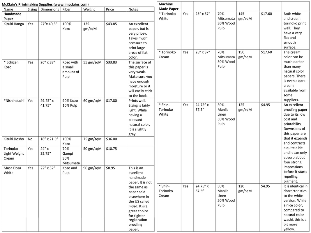 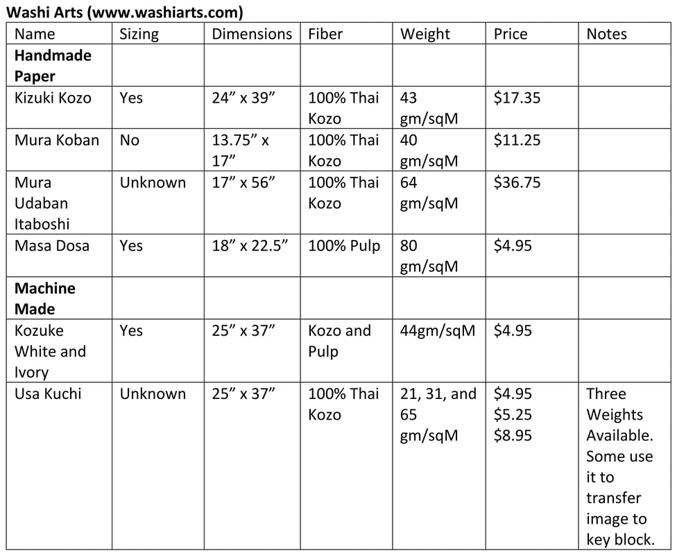 Papers Available to Ship to the US: 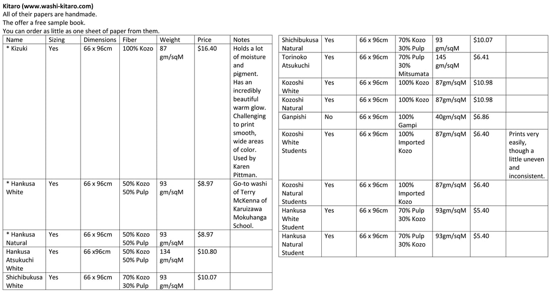  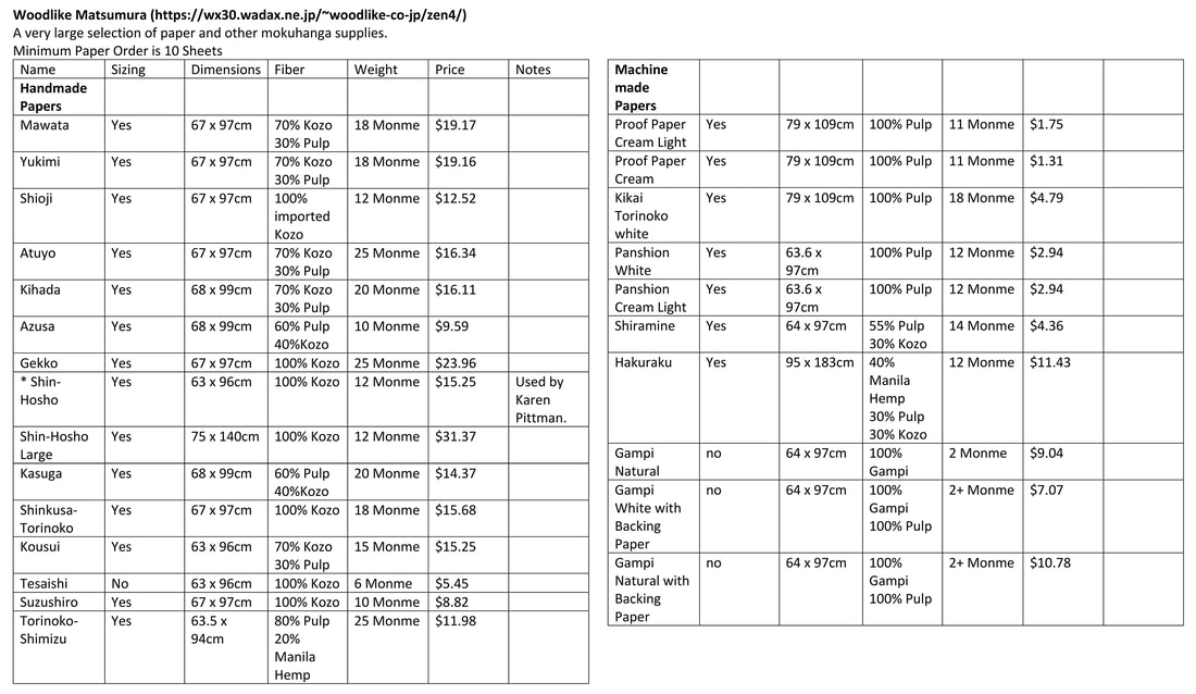 Citations
Vollmer, April. Japanese Woodblock Print Workshop: A Modern Guide to the Ancient Art of Mokuhanga. Berkeley: Watson-Guptill Publications, 2015. McClain, Robert. Tigard, Oregon: McClain's Printmaking Supplies, 1981. Bull, David. “Encyclopedia of Woodblock Printmaking.” Accessed April 1, 2021. http://www.woodblock.com/encyclopedia/. Kitaro. Accessed April 1, 2021. https://www.washi-kitaro.com/english-1/. Hiratsuka, Moku-Hanga How to make Japanese woodblock prints. Moore, Keiko. Washington, D.C.: Acropolis Books LTD, 1973. “Japanese Washi Paper for Art Design Print Bookbinding Conservation · Washi Arts.” Washi Arts. Accessed April 8, 2021. https://www.washiarts.com/. Matsumura. “2020 - 2021 Woodblock Print Supplies.” Woodlike Matsumura. Accessed April 1, 2021. https://wx30.wadax.ne.jp/~woodlike-co-jp/zen4/index.php?main_page=contact_us. “McClain's Printmaking Supplies.” Accessed April 1, 2021. https://www.imcclains.com/catalog/paper/index.html. Yoshida, Hiroshi. Japanese Woodblock Printing. Tokyo: The Sanseido Company, 1939.
Gloria Martinez-Granados
“Ink is an age-old medium, yet it’s keeping up with changing times. It’s long been used in pens, of course, and more recently in printed cartridges, but now it’s also being mixed to print lightweight circuit, sensors and switches”. Anne Eisenberg
Within growing technologies there are new materials for artist to add to their creative tools. I enjoy using different mediums to create artwork and experiment. A material that I recently learned about and would like to create artwork with is conductive ink. With this medium I want to create electrical circuits to make interactive artworks.
Conductive ink is made up of electrical conducers, such as graphene and silver flakes, that allow for electrical circuits to be drawn and connected. It's liquid form allows the material to be applied on a variety of surfaces. The downside is that it is not water resistant and can wash off. On the other hand, it is a more cost effective method than to building traditional circuits made by using copper. There are different types of inks, one of the most main stream is Bare Conductive Ink. It was created as a research project by a group of students from the Royal College of Art and Imperial College in London. However, you don't have to buy the ink. You can also make it yourself as shown in this DIY tutorial with the use of a few low cost and easy to get ingredients.
In these videos we see the ways that ink is applied to projects. By creating interactive systems this book comes to life with the direction of the user. Lumobok is an interactive book that uses conductive ink for its analog triggers.
[DT2140@KTH] Lumobok from Nadia on Vimeo.
"Awake" An Interactive Painting by Sofia Aronov allows the viewer to interact with the canvas.
Finally, this blog shows a DIY inspired guide to recreate an interactive painting like the one by artist Sofia Aronov. And now that we have some instruction on making our inks as well as inspiration from examples made by other creators we can make our own.
Works Cited
(n.d.). Retrieved from https://en.wikipedia.org/wiki/Conductive_ink. Aronov, S. (n.d.). https://www.sofiaaronov.com/awake. Retrieved from https://www.sofiaaronov.com/awake Eisenberg, A. (2012, June 30). Retrieved from https://www.nytimes.com/2012/07/01/business/electronic-ink-is-replacing-bulky-wiring-in-products.html: https://www.nytimes.com/2012/07/01/business/electronic-ink-is-replacing-bulky-wiring-in-products.html Gerard, C. (2018, April 17). Retrieved from Medium.com: https://medium.com/@devdevcharlie/how-to-make-an-interactive-canvas-with-conductive-ink-and-animated-projections-d3f6abf73655 Things, B. M. (2017, September 12). YouTube. Retrieved from YouTube.com: https://youtu.be/phEke_LZJlk Rebecca Snow 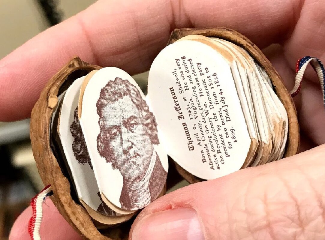 The United States History and Presidents in a Nutshell c. 1904 It was in the early 1920s that Princess Marie Louise suggested to her friend, Queen Mary, the idea to build a doll house. Queen Mary, a lover of “tiny craft,” received the idea well, and the house was built between 1921 and 1924. Many craftsmen were able to showcase their talents in the building of this miniature house, and at its completion was given to Queen Mary as a sign of respect from the whole nation. Complete with working lifts, electricity, running water, a fully stocked wine cellar and kitchen, the small work of art also holds another treasure: a library full of 200 miniature books. Authors such as Rudyard Kipling, JM Barrie, and Sir Arthur Conan Dyle were asked to contribute to the collection. Each book is hand-bound and features a tiny bookplate drawn by EH Shepherd. 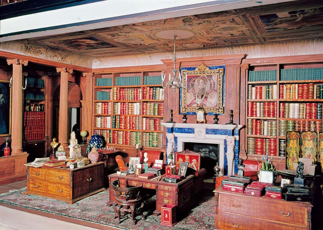 Library of Miniature Books in Queen Mary's Dolls' House One such book by Vita Sackville-West, written specifically for the doll house library, was recently discovered in 2017 to have never been published. Bound in white leather and described as “an absolute gem”, the little book is a testament to how miniature books remain a constant source of fascination. 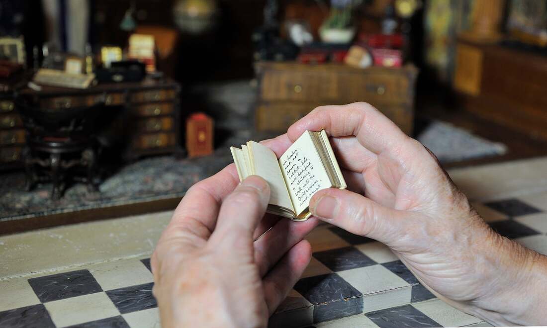 A book recently discovered in the library by Vita Sackville-West "A Note of Explanation" According to the Miniature Book Society, a miniature book is “no more than three inches in height, width, or thickness”. Though some say the earliest miniature books were Sumarian clay tablets dating back to 2500 BC, the earliest miniature book as we would know it—bound and printed—came into being in the 16th century. For some reason humans just have an affinity for creating small things, whether for convenince, or just to show that it can be done. And it’s true, many of the first miniature books in the middle ages and later were created for convenience—in order to keep a religious text (like the bible) close to you at all times, for example, or miniature books of etiquette for ladies to keep in their pockets just in case one forgot how to be proper. As time wore on, the convenience meter went down, and the “for show” meter went up. 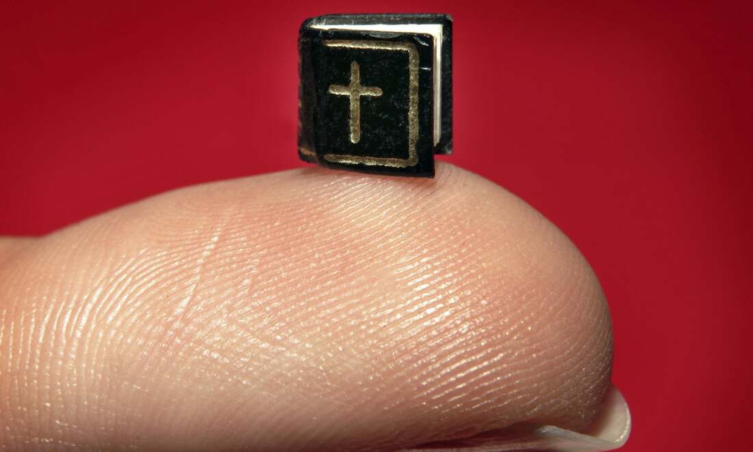 Five-by-five millimeter edition of the Lord's Prayer in six different languages Limits began to be pushed in the 19th century, and have continued to be into the present. In 1878, a copy of Dante’s Divine Comedy was finished after what is said to have been an 11 year endeavor. The book, called the “fly’s eye Dante” is a mere 1.25 by 1.75 inches. It is bound in red leather, embossed with gold, and is the world’s smallest edition of the Divine Comedy. Complete with magnifying glass, the world’s smallest authorized Bible was crafted by David Bryce in 1896. Only an inch in width, the book received “many a scoff and jeer as to the absurdity of the production”. In 1952, a five-by-five millimeter edition of the Lord’s Prayer in six languages was made by Munich publisher. A Russian scientist has recently created what is said to be the tiniest book in the world, measuring 70-by-90 micrometers, and requires a sharpened metal needle to turn the pages. 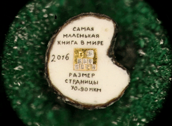 the world's smallest book, made by Russian scientist, Vladimir Aniskin 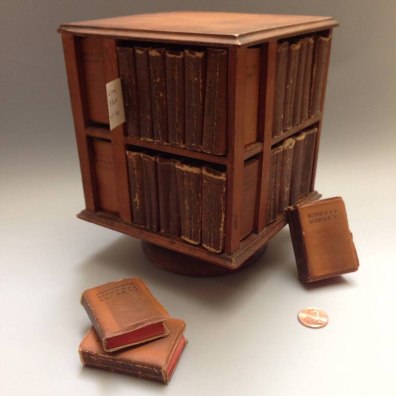 the smallest edition of the complete works of Shakespeare, Albert and Shirley Small Special Collections Without a doubt, miniature books are special. As stated by Garcia-Onteveros, “It’s the feeling that you can hold the entire works of Shakespeare in your hands.” There’s nothing like it. Though not seen all the time as serious books, they hold you captive like nothing else can. It takes exceptional skill to make and yet can be held in the palm of a hand. It causes you to look closer and closer until you can’t look anymore.
https://www.mbs.org/ Why Are We Fascinated By Miniature Books https://www.theguardian.com/books/2019/jan/03/why-we-are-fascinated-by-miniature-books https://www.biblio.com/book-collecting/what-to-collect/a-brief-history-of-miniature-books/ https://www.theguardian.com/childrens-books-site/gallery/2014/nov/16/sherlock-holmes-book-queen-marys-dolls-house https://www.mentalfloss.com/article/534951/vita-sackville-west-book-discovered-queen-mary-dollhouse Kat Dietz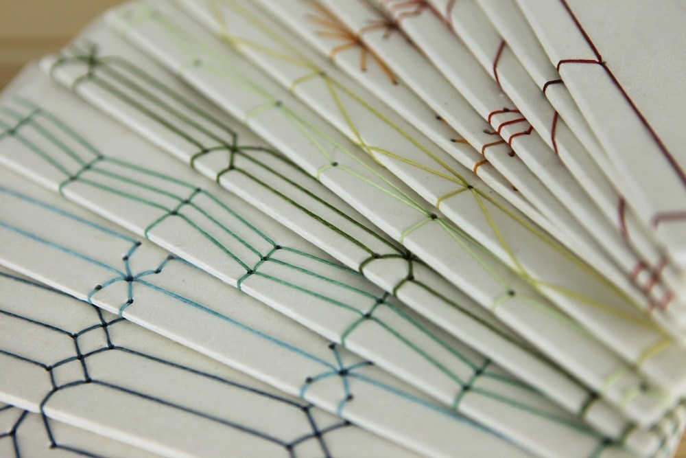 Most western bookmaking styles originate from Egypt such as the Coptic stitch, but in the more eastern part of the world, styles are more linked with India. “Religious sutras were copied onto palm leaves, which were split down the middle, dried, and rubbed with ink. These finished leaves were numbered and bound with twine” (Masters). This and the Buddhist development of the accordion style for their sutras all influenced the design of Japanese Stab Binding, an ancient and traditional technique still used today. Japan is the most known version of this technique known as Yotsume Toji [四つ目綴じ], “which roughly translates to ‘four holes’” (blog.paperblanks.com). During the Tokugawa / Edo period (1603-1867), the form Yotsume Toji [四つ目綴じ] became widely used after the system of book trading was established. “Practised in China early as the Tang period, widespread by the Ming dynasty period (1368-1644), and transmitted to Japan in the Muromachi period (1392-1573), by end of which, in the late 16th century, it had become the standard form for printed books.” Pages were designed to have printed or handwritten text on only one side and placed on top of eachother. The assembled pages were then sewn together, its “stitches passing through the blank margins next to the loose edges, so the sewn edges form the spine and folds form the edges of pages. This stringbound style continued through the Meiji period.” (bookbindersmuseum.org) The technique is fairly simple, but it can get more complex depending on the design aesthetic desired. A tutorial video is below of the basic technique:
while others decorate the edge with intricate patterns which require more holes. Yotsume Toji (Four-Hole Binding), as previously mentioned, is the most common and straightforward style known for its Japanese origin, but there are other types known as Koki Toji (Noble Binding), Asa-No-Ha Toji (Hemp Leaf Binding), and Kikko Toji (Tortoise Shell Binding). Koki Toji is a “Chinese variant, also known as Kangxi, which has two extra holes near the corners for additional strength and decoration.” Asa-No-Ha Toji is “a variation of Kangxi with more holes, including corner stitching, creating a more elaborate and durable binding” as shown in the images to the right . Lastly, Kikko Toji is “similar to Asa-No-Ha Toji, without stitching around the corners” (blog.paperblanks.com).
I find this technique quite lovely and simple to do. I understand why it is so popular in scrapbooking and photo albums. For me, this topic is fascinating because of my love of Japanese culture. Since taking this class on book arts, I began to wonder how the development of book styles were affected by location. Plus, I love the intricate and ornate designs of open spine books like the Coptic stitch. ___________________________________________________________________________________ Works Cited http://blog.paperblanks.com/2016/02/stab-binding-5-things-to-know-about-this-classic-bookbinding-technique/ https://bookbindersmuseum.org/japanese-bookbinding/ https://blog.bookstellyouwhy.com/bid/230074/a-quick-history-of-book-binding https://eastern-old-books.com/about-a-wasoubon/ When it comes to artwork I will admit that I do not enjoy art pieces that take something that wasn't created by the artist and only add minor changes. For example, there is the Fountain by Marcel Duchamp, this sculpture is a urinal that Duchamp bought and signed himself before sending it to a museum to be displayed. There is also the statue which was also not made by the artist, all the artist did was dump it in an ocean and then brought it back to the surface to be properly displayed. While I do understand the point of these particular artworks is to reverse your expectations of an artist and an artwork, I still personally do not enjoy these types of work. However, I did come across a wonderful artist that does something similar to these classical works, but she adds more of a creative flare that makes her pieces stand out among the rest. Su Blackwell is a book artist who takes pre-existing book works and cuts through the pages in order to recreate a scene from the book. It seems like a simple concept but there is much more to it than that. She only uses pages from the book to create the sculptural piece. It is like bringing a scene from the book to life. This craft can take up at least two to three months. Before Blackwell begins this process, she must start off by reading the chosen book first and foremost. She will read through the entire book, there will be a scene that stands out the most in her mind. That will be the scene that is recreated and brought to life. In order to create her images, she uses trace paper to sketch out an image onto the book before carefully cutting the piece out with an scalpel and a cutting mat under the page. Then she carefully removes the cut image, not all the way so that the page is still attached to the book. She will use a card or wire to keep the silhouette up in place, this way these wonderful precised images can be displayed in a more sculptural light. Her interest in this particular craft didn't come around until she had a trip to Asia in 2003. There she saw that paper was burned in use for spiritual ceremonies and rituals. "Paper has been used for communication since its invention; either between humans or in an attempt to communicate with the spirit world. Su employs this delicate, accessible medium and uses irreversible, destructive processes to reflect on the precariousness of the world we inhabit and the fragility of our life, dreams and ambitions," (Blackwell Profile.) Out of all the books she has read, the book she is drawn to the most is Alice and Wonderland. Going though her gallery, I found many wonderful pieces of artwork she had created. My personal favorites are The Velveteen Rabbit and The Observer Book of Butterflies. I love the glass dome containing all the beautifully crafted butterflies. It puts in perspective that we are the observers, watching over these beautiful butterflies as they leave the book. In The Velveteen Rabbit, I can see a lot of incredible craftsmanship. I can imagine how tricky it must have been to carefully cut out all those little pieces of grass and trees. The velveteen rabbit looks absolutely adorable and I love the subtle glow of the flower. Sources used: https://www.sublackwell.co.uk/fineartportfolio/#nav https://youtu.be/BfnqQKmNWKY https://www.sublackwell.co.uk/profile/ 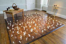 Plumlines at Croome Court, 2016 - 2017 Commissioned by The National Trust 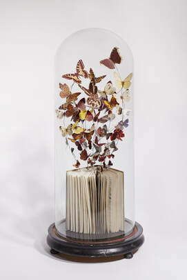 The Observer Book of Butterflies, 2018 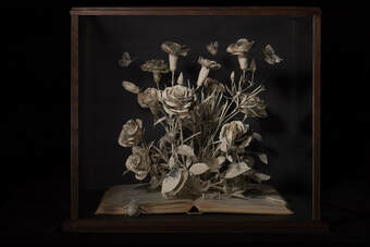 Roses and Carnations, 2018 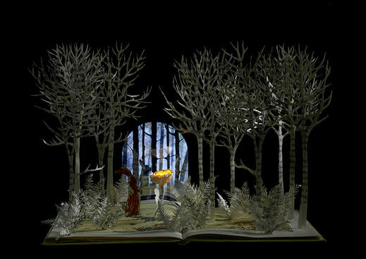 The Velveteen Rabbit, 2019 Private Commission
Tate Peak  A Darning Stitch, Sue Carrie Drummond 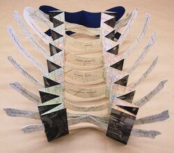 The City Within, Natalie Diaz 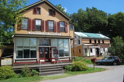 Women's Studio Workshops today. Citations:
“A Darning Stitch.” Women's Studio Workshop, https://wsworkshop.org/collection/a-darning-stitch/. “The City Within.” Women's Studio Workshop, https://wsworkshop.org/collection/the-city-within/. “The History of Women's Studio Workshop.” Women's Studio Workshop, https://wsworkshop.org/about/history-detail/. Varissa Washington The bone folder is known as one of the essential tools a person would need to successfully create an aesthetically pleasing and structured book. Before the bone folder, people folded paper with their hands and hoped for the best. Other material that could have damaged expensive papers where used as well. Eventually, the bone folder did develop into the tool we now know. It evolved from similar, yet bigger tools hunters made and used in the past. But what makes a bone folder so great and why is it so important to the book binding process? A bone folder is efficient because it can do many things, with different materials. People use it of course for working with paper. However, it can also be used with leather, clay, fabric, and relative craft materials. Like we’ve done in class, we use the bone folder to crease, fold, score, and smooth a paper. The thing that makes the tool most innovative though is it is not harmful to the paper, thick or thin. This is because of the material. As stated in it’s name, it is traditionally made out of bone from the a deer, cow or elk; particularly from the leg bone. It is also made from ivory, a material found in tusks of various mammals. Bone folders can be bought in art stores, Walmart, and online. People also make their own traditional bone folders as well. Below is an example from a student at West Dean College in the UK making his own from an antler an antler he found on a trip. You can see more about his process here if you in case you wanted to make you own. 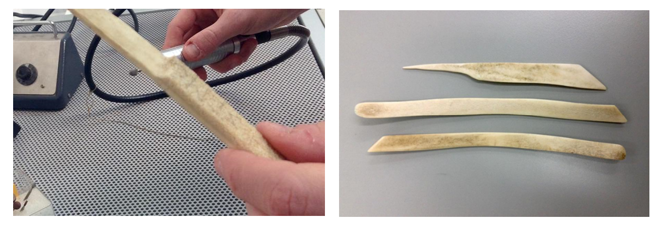 Though the 6" bone folder is the perfect size for most everything, they do come in different sizes allows for an easier time with specific techniques. Some are pointier for getting into tighter spaces, while some are curved at the ends for easier scoring. Try the different shapes of bone folders to see what you like! 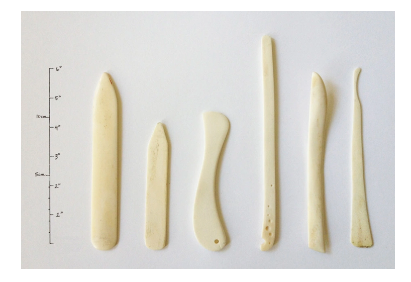 Though the material of the bone folder is traditionally bone, these days there are many different materials to choose from. While bone is great for most people, it eventually gets dirty, gluey, and a little run down. Other materials for bone folders were created with the goal to combat this problem. The first material that is the main alternative to bone is a fancy Teflon bone folder. Despite being an unnatural material, the polytetrafluoroethylene ‘bone’ folder is non-stick and non-contaminating. This material is therefore resistant to glue and it allows for easier cleanup and a long-lasting folder. This bone folder is also great at not leaving marks on where you use it. Because of this, sensitive paper or book cloth will less likely be harmed during the creative process. The flaw with the Teflon is that it is a bit slippery and bendy, which could be harder to handle overall. With this there is then Delrin. It is also a plastic, commonly used to replace metal when used. This makes this plastic almost twice as hard when compared to Teflon. These two materials are great because they offer a vegan option for those who wish to have one. These alternatives are just a couple ways that a bone folder can be made. Nowadays, people are finding many interesting ways to make them themselves. Other common ways include using wood as the material for a bone folder. Wood is cheap and with good pace many bone folders can be made if you have adequate carving skills and a band saw. 3-D printing is also a method. Once you buy or create the design you can make as many nylon bone folders as one would need. In my research, there was also a blogger who stated that they used part of a milk jug to create bone folders! 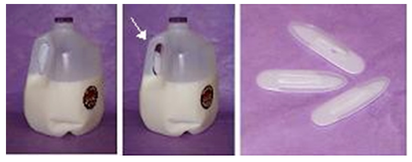 Knowing how to make your own tools specific for specific projects is a necessary skill needed for an artist. Using the bone folder, artists can continue making great books. References:
i. https://bigjumppress.wordpress.com/2012/09/12/tool-porn-where-did-they-come-from-and-how-much-did-they-cost/ ii. https://www.origami-resource-center.com/folding-bones.html iii. https://jeffpeachey.com/2014/09/30/delrin-folders/ ix. https://hollanders.com/collections/bookbinding-supplies Timothea Haider Marginalia is an umbrella term for anything written, painted or drawn in a book that was not originally intended to be main text. This includes everything from the life-saving notes scrawled in a rented biology textbook to lewd doodles in Leonardo da Vinci’s journals left by a cheeky apprentice to the painstakingly painted miniature tableau of a knight losing a fight with a snail in a medieval manuscript. 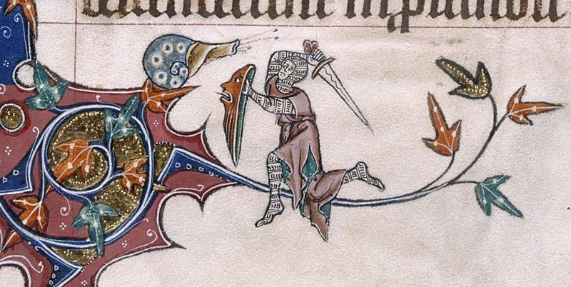 While there is rising interest in what famous writers and thinkers scrawled in their favorite books as it gives us greater insight into what influences their thinking and how their minds worked, the marginal paintings left by medieval scribes have been largely disregarded simple jokes. After all, it is much harder to find meaning behind drawings of rabbits riding lions than it is to simply go through Nabokov’s personal copy of “Fifty-five Short Stories from The New Yorker” and see how he graded them. But just because something might look like nonsense doesn’t mean it is. The reason why these paintings exist is obvious. Illuminated manuscripts required decoration on every single page, but after a few hundred pages of rich foliage and exotic animals any artist would inevitably run out of ideas. But why the scribes of old would choose to draw so many variations on poop jokes and snails in combat isn’t entirely understood to this day. The snails in particular have fascinated and baffled scholars for centuries. Some hypothesize that they illustrate the everyday struggles of the artists who were constantly defending their gardens from pests. Others say that they were references to current events and the context has been lost to time, the snails representing a Germanic people who had moved into the area around the same time that the snail motif became prevalent. There’s also a theory that they are scathing commentary on the idea of chivalry, as the knights seem to always be losing to the snails. 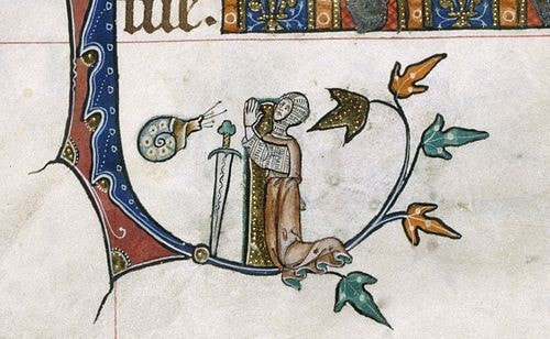 All these theories seem equally likely as each are incredibly difficult to verify because the original artists never saw any reason to explain themselves. They would leave notes in the margins, but they were mostly complaints about the long work hours or poor materials. Perhaps they assumed that the meaning behind their drawings were so inherently obvious as to not need explanation. Or maybe they hoped whoever read the manuscript would be so focused on the main text, they wouldn’t notice the fart jokes until it was too late to ask for a revision. Whether these doodles were intended to offer tongue in cheek commentary on the political conflicts of their day, express the personal frustrations of the hard-working scribes or simply offer some commentary relief between the dense pages of scripture, there’s no doubt that they still have value today. These drawings still intrigue modern audiences even when completely removed from their original context. 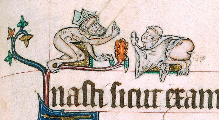 https://www.newyorker.com/books/page-turner/the-marginal-obsession-with-marginalia
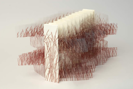
https://www.collectorsweekly.com/articles/naughty-nuns-flatulent-monks-and-other-surprises-of-sacred-medieval-manuscripts/ https://justhistoryposts.com/2017/11/13/medieval-marginalia-why-are-there-so-many-snails-in-medieval-manuscripts/ Liz Batronis- One individual that has brought innovative and different ideas into the artist book community is Hedi Kyle. She is a German-American artist that specializes in folded book structures, as well as the pioneer for new structures. Kyle is the reason the book arts community have new structures like: The Accordion Book, the Flag Book, the Blizzard Book, the Fishbone Fold, the Spider Book, as well as many others. These book structures are complex, useful, and creative. With Kyle's contribution to the growing book arts community, the ways to create new ideas has become that much easier. This can be seen in her Fishbone Fold book structure.  Hedi Kyle, Fishbone Fold The Fishbone Fold structure is an interesting one, because its layouts decrease in size to the tip, like how an actual fish’s structure goes smaller towards the tail. This structure would allow for someone to tell a story with smaller and smaller pages. Overall, the best part of her new structures is that she makes tutorials along with them. This allows for someone else to use her original designs for their own original book idea. This idea allows for the creative community to grow together, instead of leaving others behind. As an artist, I think this is huge because not many artists are this open about how they create something new. Her love of these books and the community for them is very evident in her work, as well as her words. Kyle’s mind seems to be able to create many new forms to fit the ever-growing list of new ideas. Kyle has been creating book structures that allow for the book to be alive as an object of extraordinary diversity. Her love of new structures can be easily seen in the book that she and her daughter, Ulla Warchol, created called The Art of the Fold. Within this book they go through a large number of different book structures and how to create them. One of the books she has created, Mica Lakes, has been a great inspiration to myself.  Hedi Kyle, Mica Lakes Hedi Kyle created Mica Lakes in an accordion book structure with shapes cut out and covered with thin plastic for windows. The cut outs are there to represent the geological look of a lake. While open or closed, this book allows for an individual to see through it creating a different space and area. This book is interesting to me because the way she makes every line look intentional. From the cut outs to the echoes of blue, create movement throughout each layout. This gives a viewer a sense of water moving through, as well as a sense of awareness of the world we live in. I believe that the reason, or idea, behind this work could be connected to how her father was a marine biologist, along with the water problem in our world right now. Having ways to help someone see into your world as a whole, without even speaking a single word, is an artist’s true dream. To allow for a view to be immersed into a different plane of existence. This outlook can be seen in everything Hedi Kyle does, the want to create new life and to be able to tell stories in extraordinary ways. Citations:
Daniella Napolitano, Fall 2019
Field guide, noun. An illustrated manual for identifying natural objects, flora, or fauna in nature (Merriam-Webster Dictionary)
It seems almost impossible to discuss field guides without mentioning John James Audubon and his Birds of America. An achievement of its time, Birds of America was one of the first attempts to catalog every species of bird in North America. While an inspiration to many naturalists and ornithologists, one could consider Birds of America as a predecessor to the modern field guide rather than a field guide itself. 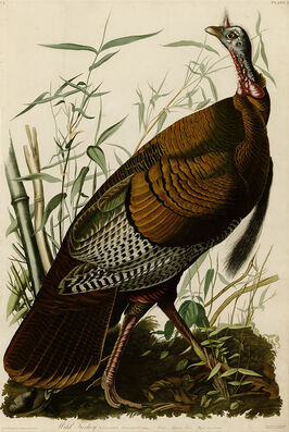
Audubon, Wild turkey, (Meleagris gallopavo) from Birds of America
Audubon was born in what is now Haiti and moved to France when he was young (National Audubon Society). As a child he liked to wonder the woods, collecting bird eggs and nests (Streshinky). He later moved to family land in America to avoid conscription into the French Army. On his family land, he hunted and studied birds, and “conducted the first known bird banding experiment in North America” (National Audubon Society). However, before he became the dominant wildlife artist of his time, Audubon was a businessman. It was not until his businesses failed that he decided to depict all of America’s birds (National Audubon Society).
Despite being best known for his Birds of America, Audubon was not the first person to endeavor to document all the birds in North America. Ornithologist Alexander Wilson published his nine-volume American Ornithology between 1808 and 1814 (Burtt and Davis), 19 years before Audubon published the first set of Birds of America prints in 1827. Wilson’s “work was a model for field guides and an inspiration for Audubon.” At the time, the most common method of illustrating a species was to hunt, stuff, pose, and then draw the animal. Wilson also drew birds in “poses meant to facilitate identification” (Burtt and Davis). In contrast, Audubon’s bird portraits were “highly dramatic” and were paired with “embellished descriptions of wilderness life” (National Audubon Society). Skilled at taxidermy, Audubon would use small pins and fine wire to pose his specimens, depicting lifelike movement and narrative. It is to be noted that while Audubon was “avid hunter… he also had a deep appreciation and concern for conservation” and “in his later writings he sounded the alarm about destruction of birds and habitats” (National Audubon Society). 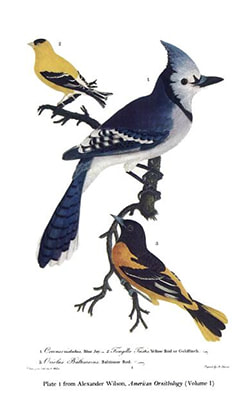
Wilson’s American Ornithology, Vol. 1, Plate 1
The original edition of Birds of America is a feat of printing. Audubon collaborated with accomplished engravers Robert Havell Jr., and his father, Robert Havell Sr. to oversee the project. Using a combination of copperplate etching, engraving and aquatint, Audubon’s illustrations were printed on handmade paper “assembly line” style with more than 50 people assigned for each color (Rhodes). In order to fund the costly production of prints, Audubon sold “pay-as-you-go” subscriptions where subscribers would get five prints a month (Rhodes). After the first edition, Audubon produced a smaller, more affordable second edition of lithographs. Birds of America was met with great praise. His dramatic style appealed to Romantic era England, where he gained the most financial support for Birds of America (National Audubon Society). Subscribers of the editions included both England’s King George IV and France’s King Charles X (Rhodes). 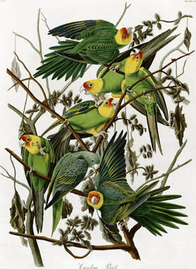
Audubon Carolina parakeet (Conuropsis carolinensis) from Birds of America
However, as beautiful and detailed as Birds of America was, it is difficult to classify the book as a field guide. The book is far too large and would be impractical to take into the field. The original folio was 39 ½ inches tall by 28 ½ inches wide (minniesland.com, LLC) and was distributed as unbound prints. Birds of America was also very expensive. The full edition of plates and accompanying text cost subscribers around $1000 (about $27,672 in 2019) and only about 200 full sets were ever completed. In fact, the first modern field guide Birds Through an Opera-Glass, was published in 1899, and is attributed to Florence Merriam Bailey, an ornithologist and nature writer (Martinez).
Florence Merriam Bailey preferred to study living birds in the field rather than study dead, stuffed specimens like Audubon, Wilson, and naturalists of her time. At 26 years old, Bailey published Birds Through an Opera-Glass, encouraging beginning bird enthusiasts to look no further than their own backyards. “The book…suggested that the best way to view birds was through the lenses of opera glasses, not a shotgun sight. Her approach, now commonly practiced with binoculars, helped form the basis of modern bird-watching” (Wolfe). Bailey’s passion for protecting birds extended to grass-roots efforts in ending the fashion industry’s use of birds in hats. She and hundreds of other women’s protests helped lead to the passage of the Lacey Act, “which prohibited trade in illegally acquired wildlife,” and the Federal Migratory Bird Treaty Act of 1918, “which protects migratory birds” (Wolfe). 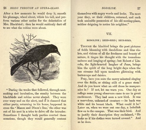
Pages from Bailey’s Birds Through an Opera-Glass
A few years after Bailey published Birds Through an Opera-Glass, Ralph Hoffman published the first “true” field guide in 1904. In his book, A Guide to the Birds of New England and Eastern New York, Hoffman focused on describing markings, habitat, and behavior to identify species of birds. These identifiers “set the standard” for field guides today (Martinez). 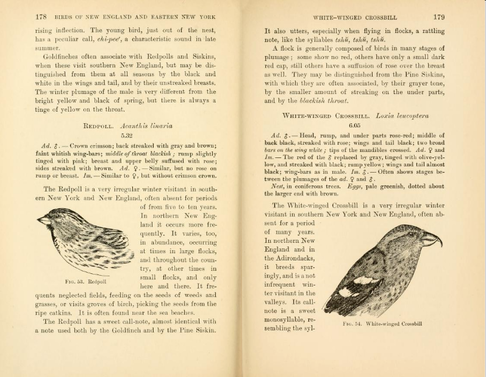
Pages from Hoffman’s A Guide to the Birds of New England and Eastern New York
Today, field guides are more and more being replaced by applications and websites. Many bird enthusiasts enjoy the ability to view multiple photographs of birds, as well as video and sound recordings from their cell phones. Like Audubon and Bailey, organizations like the National Audubon Society and The Cornell Lab of Ornithology not only share information for identifying birds but also advocate for bird and habitat conservation. 
Screenshots from The Cornell Lab of Ornithology’s Merlin Bird ID mobile application
Today’s bird guides owe a lot to Wilson, Bailey, and Hoffman, however John James Audubon remains the most well known for Birds of America. While not a true field guide, the Audubon prints are “considered to be the archetype of wildlife illustration.” Following with modern times, each print is available online for free as a high-resolution download so that they may continue to inspire others for years to come. Audubon’s full set of prints can be found at https://www.audubon.org/birds-of-america. 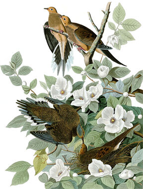
Audubon, Carolina pigeon (Zenaida macroura), now known as a mourning dove, from Birds of America
Citations
Burtt, Edward H., Jr.; Davis, William E., Jr. (2013). Alexander Wilson: The Scot Who Founded American Ornithology. Cambridge, Mass.: Harvard University Press.
Martinez, Timothy, Jr. (2014). A Brief Look at the History of Field Guides, Retrieved November 17, 2019, from https//www.backyardchirper.com/blog/a-brief-look-at-the-history-of-field-guides/ minniesland.com, LLC (2009). Havell Edition, Retrieved November 17, 2019 from https://web.archive.org/web/20100619135214/http://www.minniesland.com/study_Havell_Edition.html National Audubon Society (n.d.). Retrieved November 17, 2019, from https://www.audubon.org/content/john-james-audubon Rhodes, Richard (2004). John James Audubon: The Making of an American. New York: Alfred A. Knopf. ISBN 0-375-41412-6 Streshinky, Shirley (1993). Audubon: Life and Art in the American Wilderness. New York: Villard Books, ISBN 0-679-40859-2 Wolfe, Jonathan (2019). Overlooked No More: Florence Merriam Bailey, Who Defined Modern Bird-Watching, Retrieved November 17, 2019, from https://www.nytimes.com/2019/07/17/obituaries/florence-merriam-bailey-overlooked.html Research by Hannah Whitaker Fall 2019 The found object is a device used by many artisits in contemporary works. In 2019 it is common that an artisits may sprawl the streets with eyes peeled for that perfect piece of garbage to turn in to a new piece. As defined by The Tate museum a found object is "a natural or man-made object, or fragment of an object, that is found (or sometimes bought) by an artist and kept because of some intrinsic interest the artist sees in it." While the use of found objects is relatively common in the modern art world it wasn't until after World War 1 that these objects started filling that role. "Suffering a deep malaise...artists sought to break out of traditional or historical modes of creating art, they searched for new ways to innovate by delving into every aspect of their culture and compelling new thought."(Cunha-Lewin) From this philosophy of thought came "readymade" art. Many artisits of this time were throwing out processes originally deemed as proper for something that spoke to them and their concept. The Readymade functioned in this way as "artists choose ordinary found objects from everyday life, and repositioned them as works of art so that their original significance disappeared in light of sparking new points of view."(Cunha-Lewin) This pushed artisits outside of their comfort zone of technique and paved the way for Conceptual art, which emphasized the importance of developing and presenting ideas over a finished "fine-art" piece. Occasionally these objects might not be modified, making the act of presenting the object the art itself, hence the term Readymade. Otherwise, it is common for these objects, or portions of the object to serve as parts of a new whole. These kinds of works are often sculptural and known as "assemblages". "Assemblage is art that is made by assembling disparate elements – often everyday objects – scavenged by the artist...The use of assemblage as an approach to making art goes back to Pablo Picasso’s cubist constructions...An early example is his "Still Life" 1914 which is made from scraps of wood and a length of tablecloth fringing, glued together and painted."(Tate) Interested in the opportunities provided by juxtaposition assemblage became a very effective way of working for many early surrealist,or neo-dada, artisits. A few great examples of this are Jasper Johns and Robert Rauschenberg 's works from the 1950's and 60's which you can see below. “Take an object. Do something to it. Do something else to it.” |

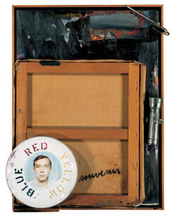 Jasper Johns,Souvenir II, 1964. | 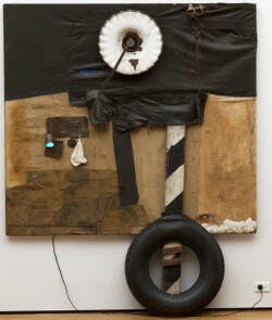 Robert Rauschenberg First Landing Jump. 1961. Cloth, metal, leather, electric fixture, cable, and oil paint on composition board, with automobile tire and wood plank. The Museum of Modern Art, New York. |
We should also take a moment to recognize the influential works of Louise Nevelson. Often overshadowed by the works of her male counterparts Nevelson started creating the monolithic sculptures of forgotten wood bits in the 1940's. Stacking boxes and whatever else she could get her hands on Nevelson created huge black or gold walls and installations that demand the viewers attention.
"I began to see things, almost anything on the street, as art . . . that's why I pick up old wood that had a life, that cars have gone over and the nails have been crushed . . . All [my] objects are retranslated—that's the magic."
Here in Nevelson's quote from a 1988 interview with The Washington Post I believe she truly sums up the wonder of creating through found objects. It is the act of taking a "dead" object that has spoken to you and giving it a new life, presenting it to the public through your own personal lens. Crating beauty from decay.
Another Great clip on Nevelson: Louise Nevelson shares her sculpture studio
For more found object works see: Betye Saar, Leo Sewell, Joseph Cornell, Haim Steinbach, Kurt Schwitters, Sarah Lucas, Damien Hirst ,Jake and Dinos Chapman, Christina Mackie, Mike Nelson and Tomoko Takahashi.
Citations
Jasper Johns: "Take an object. Do something to it. Do something else to it.": Blog: Royal Academy of Arts. (2017, September 7). Retrieved November 18, 2019, from https://www.royalacademy.org.uk/article/magazine-jasper-johns.
Louise Nevelson shares her sculpture studio · SFMOMA. (n.d.). Retrieved November 18, 2019, from https://www.sfmoma.org/watch/louise-nevelson-shares-her-sculpture-studio/.
Louise Nevelson – ‘New York is My Mirror’ . (2016, September 16). Retrieved November 18, 2019, from https://www.youtube.com/watch?v=AnYBR9VAPsI.
Readymade and The Found Object - Modern Art Terms and Concepts. (n.d.). Retrieved from https://www.theartstory.org/definition/readymade-and-found-object/.
Tate. (n.d.). Found object – Art Term. Retrieved November 19, 2019, from https://www.tate.org.uk/art/art-terms/f/found-object.
Tate. (n.d.). Assemblage – Art Term. Retrieved November 18, 2019, from https://www.tate.org.uk/art/art-terms/a/assemblage.
Vigna, F. (2012, November 28). MoMA: Duchamp, Rauschenberg, and Assemblage: A Preview of Fast Forward: Modern Moments 1913 >> 2013. Retrieved November 18, 2019, from https://www.moma.org/explore/inside_out/2012/11/28/duchamp-rauschenberg-and-assemblage-a-preview-of-fast-forward-modern-moments-1913-2013/.
By Dannielle Lange
`Since the beginning of this class, I have always wanted to try to incorporate sculpture with bookbinding. Upon looking, I have found that the works done by Louisa Boyd were exactly what I was looking for and have decided to study her further into getting her intake on how she designs and makes these wonderful sculptural pieces.
Louisa studied art and embroidery at the Manchester Metropolitan University.
Ever since she graduated, she has always been making intricate paper structures with different bookbinding techniques that she would use to incorporate into her pieces, as well as using these types of forms for her final show pieces even after she graduated. These techniques range from accordion type books to single leaf. One of my favorite pieces shown would be Catography 1. This piece is a collaboration of an accordion style book with elements from squeeze box binding.
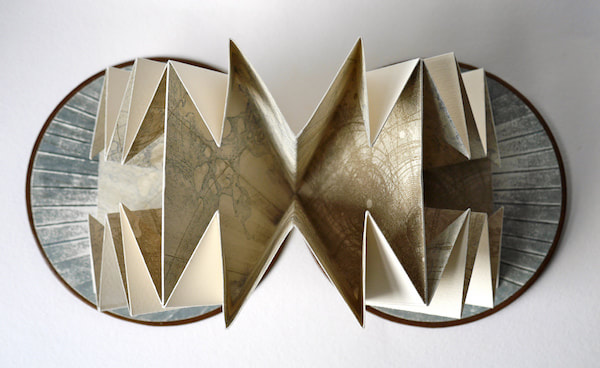
`She had also moved to more solid book structures or even went as to foregoing the structure of the book all together for a more single page outlook towards her art. I also really appreciate that her work relies more on the act of nature and the thought of connecting oneself towards that plane in a way of self reflection and discovery.
She focuses more on using abstraction and imagery to harness her range of techniques onto different types of materials. In some of her works she uses technology to capture movement in order to stimulate the sense of the audience as well. For this I would have to bring Aether in orde for herr to show an exam for this use of medium materials.
She focuses more on using abstraction and imagery to harness her range of techniques onto different types of materials. In some of her works she uses technology to capture movement in order to stimulate the sense of the audience as well. For this I would have to bring Aether in orde for herr to show an exam for this use of medium materials.
Citations
Elizabeth Z Pineda
“I use a combination of photography and painting to visualize the subconscious nature of humanity. I am fascinated by choice making and the paradoxes of consciousness. Choices ripple out to affect our lives in ways that are not always clear or understood, but are often felt intrinsically. I turn to the beasts, forms, and textures of the natural world in my work, and use these symbols to reveal secret dramas and dichotomies, and illuminate the natures that position humanity within the microcosm and macrocosm of the universe.” --Benjamin Timpson
Benjamin Timpson is currently the Studio Coordinator, Photography and New Media at AndersonRanch Arts Center in Colorado. Ben has an ability to work across several mediums adding to the depth of his work. The topics he works with, specifically in his Metamorphosis, About Face, and Human Transplant projects have a profundity that is not only important, it is imperative to be exposed to artists whose voices talk about themes that people turn a blind eye to. I feel strongly that artists and students have much to gain from his influence, voice and unique perspective. This is why I’ve decided to do my research project on Ben Timpson.
In his “End of the Roll” series, Ben has created a body of work that speaks to the transformation of photography from analog to the digital format and wonders if one is better than the other. He states, “Photography is consumed faster than any other medium. Thanks to technology, we are exposed to hundreds upon hundreds of photographs every day. Photography is now a language and a survival tool for communication. My photographic series explores and symbolizes the transformation of analog photography to digital photography. A tearing and ripping effect, the sun and the moon, polar opposites and one who needs another. A balance through chaos is formed. Using analog slides (Ektachrome), and natural detritus I form compositions on a light table 1” x 2” with glass slides that are then photographed and enlarged.” (i)
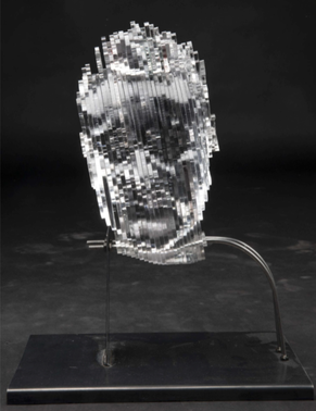
“Daily Head Transplant” delves into social and perhaps political issues. The work begins with Ben making a self-portrait, a head-shot image. Using available software and laser tools, Ben takes his likeness, and makes a laser etched “head” out of acrylic. He then slices, his head, and imprints photographic stills that he has taken from media sources that speak to the vast volume of imprinted information one receives from the media. This work questions the effect that the abundance of information one sees through television, and other devices, specifically news derived, that intrinsically delivers one-sided messages, and their effect on the self. Ben is currently working with his students and teaching them the process of constructing their own heads. The information the students will imprint on the head "slices" will be of their own choosing. However, this time the stills that get etched onto the slices will also be transferred onto plates that can be printed using printmaking techniques. The prints will add another layer of information to the work as they will be displayed alongside the "head" structures.
“I use a combination of photography and painting to visualize the subconscious nature of humanity. I am fascinated by choice making and the paradoxes of consciousness. Choices ripple out to affect our lives in ways that are not always clear or understood, but are often felt intrinsically. I turn to the beasts, forms, and textures of the natural world in my work, and use these symbols to reveal secret dramas and dichotomies, and illuminate the natures that position humanity within the microcosm and macrocosm of the universe.” --Benjamin Timpson
Benjamin Timpson is currently the Studio Coordinator, Photography and New Media at AndersonRanch Arts Center in Colorado. Ben has an ability to work across several mediums adding to the depth of his work. The topics he works with, specifically in his Metamorphosis, About Face, and Human Transplant projects have a profundity that is not only important, it is imperative to be exposed to artists whose voices talk about themes that people turn a blind eye to. I feel strongly that artists and students have much to gain from his influence, voice and unique perspective. This is why I’ve decided to do my research project on Ben Timpson.
In his “End of the Roll” series, Ben has created a body of work that speaks to the transformation of photography from analog to the digital format and wonders if one is better than the other. He states, “Photography is consumed faster than any other medium. Thanks to technology, we are exposed to hundreds upon hundreds of photographs every day. Photography is now a language and a survival tool for communication. My photographic series explores and symbolizes the transformation of analog photography to digital photography. A tearing and ripping effect, the sun and the moon, polar opposites and one who needs another. A balance through chaos is formed. Using analog slides (Ektachrome), and natural detritus I form compositions on a light table 1” x 2” with glass slides that are then photographed and enlarged.” (i)
“Daily Head Transplant” delves into social and perhaps political issues. The work begins with Ben making a self-portrait, a head-shot image. Using available software and laser tools, Ben takes his likeness, and makes a laser etched “head” out of acrylic. He then slices, his head, and imprints photographic stills that he has taken from media sources that speak to the vast volume of imprinted information one receives from the media. This work questions the effect that the abundance of information one sees through television, and other devices, specifically news derived, that intrinsically delivers one-sided messages, and their effect on the self. Ben is currently working with his students and teaching them the process of constructing their own heads. The information the students will imprint on the head "slices" will be of their own choosing. However, this time the stills that get etched onto the slices will also be transferred onto plates that can be printed using printmaking techniques. The prints will add another layer of information to the work as they will be displayed alongside the "head" structures.
Ben Timpson, “Profile of an Idea,” Transfer, Resin, Aluminium, 62 x 32 in
Daily Head Transplant 3T3A2158
Daily Head Transplant 3T3A2168
In “About Face” an impressive body of work, that once again embraces digital technology, yet is rooted in the medium’s historical beginnings brings over 300 16x20 large format negative portraits that Ben made with a camera he constructed himself. The intent of the work is to embrace people’s humanity by removing clues of ethnicity and or race in the images by leaving them in the negative state. These images engage the viewer directly, since they have to actively participate using their phone devices in order to “see” the likeness of the sitter. “This intentional requirement directly engages the viewer with the work. Looking becomes an active experience. The phone acts like a photographer’s loupe, a tool for exploring the negative print and decoding the portrait. The installation of negative prints functions as a collective of presences, each one in dialogue with the other. However, it is not possible to see all the work at once through a smartphone. This is another intentional aspect of the work, one that forces an exploration of each individual alone and separate. It requires the viewer to scan the surface of the print incrementally, like an investigator moving through the woods in the dark of the night, flashlight in hand. The work becomes an opportunity to explore the topography of the human face with the intent of uniting humans through portraiture and allowing the viewer an opportunity to really “see”. (ii)
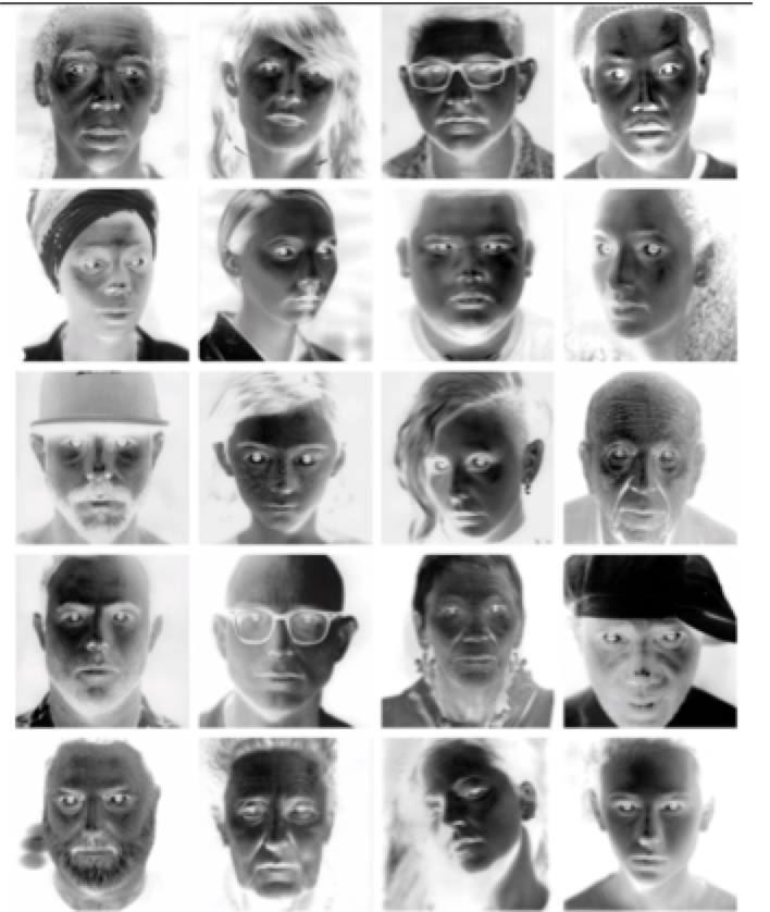 About Face installation detail
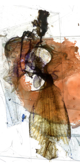
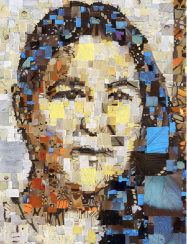
 Ben’s “Metamorphosis” work addresses Native American Women abuse, which is a topic with staggering numbers, yet few people know about it. Ben’s work is an intricate, almost reverent gathering of (safe-sourced) butterfly wings, of which he carefully takes small squares, resembling the pixels in a digital photographic image, and with which, he constructs the likeness of women who have suffered abuses, sexual and domestic, and in some cases, women who have lost their lives. This work is truly inspiring, because he is dealing with much heavier issues and working on an intensely personal level by turning the lens on his own personal culture and background. The symbolism, attention to detail, and reverence with which he approaches this issue is beyond moving. Ben carefully selects each small piece of butterfly wing and one by one lays them on a piece of glass that is 4 x 5 inches long. This size he chooses to once point to the traditional photographic medium, and a size that is important since it references medium format cameras, and it was also one widely used to make portraits. Of the work Timpson states, "I am inspired by nature and feel compelled to tell the story of these women through the symbolic nature of the butterfly wing. The butterfly is a representation of metamorphosis, fragility, and hope. In tribes of the American Southwest, the butterfly is revered and respected. Conceptually, I use the butterfly as a catalyst. It is my hope that this series brings awareness to a very important issue through beauty and change.” (iii)
After witnessing Benjamin Timpson’s work I felt deeply moved and wanted to share it with everyone else I knew. I feel even more grateful that I had the incredible opportunity to meet this amazing artist.
After witnessing Benjamin Timpson’s work I felt deeply moved and wanted to share it with everyone else I knew. I feel even more grateful that I had the incredible opportunity to meet this amazing artist.
 Rosetta Peters | 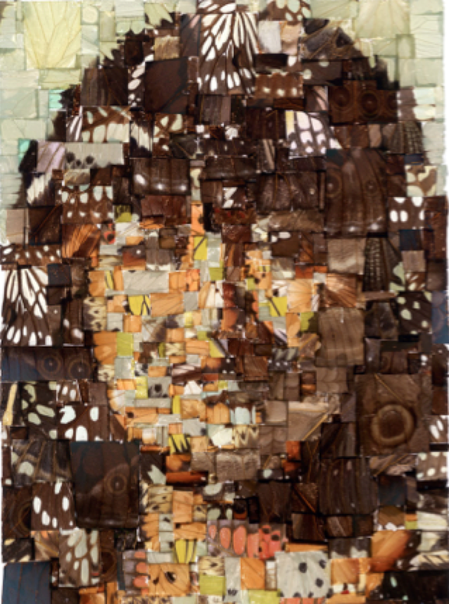 Caroline Felicity Antone |
Timothea Haider
The future library is a project started in Norway which won’t reach fruition for one hundred years. It starts with a plot of a hundred trees planted in 2014 which, once they’ve grown, will become paper for a series of a hundred books. A manuscript from one of the most influential writers is chosen once a year to be sealed and left unread until the year 2114.
This idea of slowing down the insemination of information to match the growth of the trees used to distribute them puts into question the modern ideals of mass acceleration and asks us to consider consumption and creation on a wider scale. The books written for this library will not be read in the lifetimes of authors, many of the people currently following the progress of the project or even the original creators of the project. In a time where the future of books, trees and civilized society are not guaranteed, this website and a hundred saplings in Norway has people considering a brighter future even though they might not be able to see it themselves.
While this library is considered the most secretive library, most of that title is earned because it simply doesn’t exist yet. The Archivum Secretum Apostolicum Vaticanum might possibly be the most secretive library which currently exists. Being the private archives of the Vatican, the secrecy surrounding them is greatly exaggerated by conspiracy theorists but not entirely unfounded. Much of the archives are private, aren’t properly indexed and are technically only fully available to the pope, there are reading rooms available to visiting scholars and guided tours for visitors. The process for accessing the archives are rather difficult to navigate. Only accredited researchers are allowed to read anything from the archives and even they are only three articles which they must read under supervision and a time limit. The archives are said to contain over 75,000 codices from over twelves centuries.
Though some libraries are held secret by those who are either concerned by conservation or are waiting until the right moment, others are simply lost and rediscovered. The Dunhuang library on the edge of the gobi desert had been sitting in a cave for possibly over 900 years when it was discovered in the 1900’s. It holds paintings and manuscripts from over seventeen languages, many of which are now rare or entirely lost. Currently, the British museum is executing the International Dunhuang Project to digitally archive the entire collection, making the ancient scripts available to scholars and linguists worldwide.

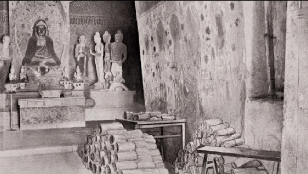
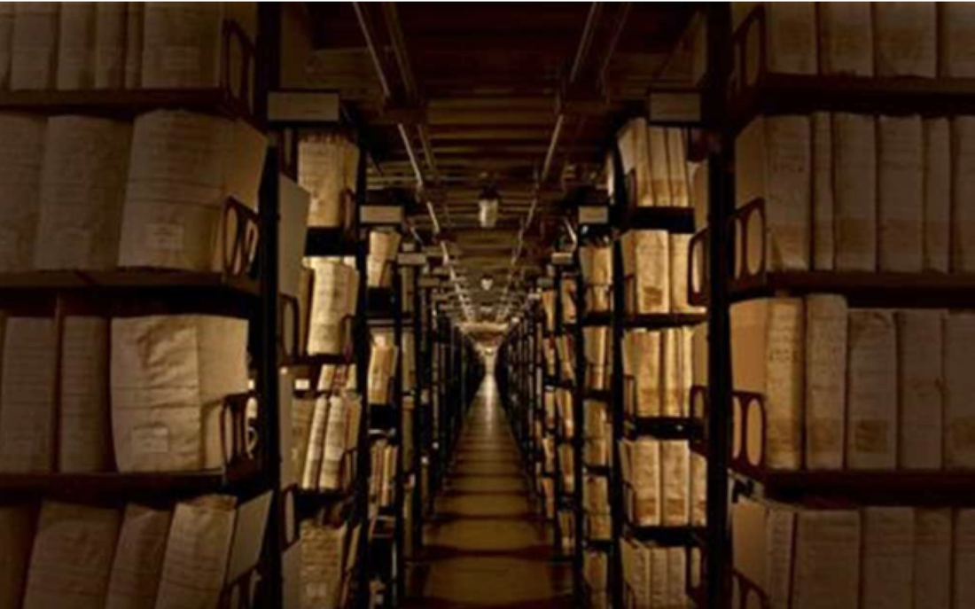
By: Alison Sigala
Since long before the invention of the printing press, bookmakers have used the techniques of illumination and rubrication to add artistic embellishment to a text. Both practices added beauty to a book and clarity to its meaning. Especially after printed books became prominent, rubrication and illumination provided uniqueness to each copy of a text. Rubrication indicates important points and guides a reader with headings, and chapter indicators. Illumination illustrates the ideas and beautifies the page.
Rubrication comes from the Latin word rubrico, meaning “to color red”. It is the art of emphasizing certain ideas by using red ink for those specific phrases, words, or letters. This design choice effectively makes those words stand out from the rest of the page, letting the readers know what they should pay attention to. Before printed books, a scribe would hand write pages of text, leaving out spaces for a rubricator to fill in later. Scribes would scribble notes for the rubricator in the margins. Sometimes the scribe would rubricate their own texts, in which case notes were not necessary. After 1440, when books began being printed, spaces were left in the typesetting for rubrication, which then could be done either by print or by hand. Often it was easier to have someone write in the rubrication. The Gutenberg Bible employed both methods of rubrication. Earlier editions of it had the red words printed, but that technique was dropped in favor of rubrication by hand.
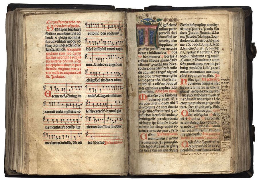
Looks like a page of liturgy. You can see the red and black verses on the left, likely call and response,
Rubrication was especially common in religious texts like Bibles, and liturgy for mass. Key verses were written in red, and large red calligraphic initials were drawn at the start of chapters. In liturgy, red was often used to distinguish the clergy’s part from the congregation’s part in the mass or church service. The start of a new chapter or section or subject was also commonly signaled by a red header. Some mass-produced Bibles now still use the visual cues of rubrication, emphasizing Jesus’s words, or theological notes, or chapter numbers in red. The extensive use of rubrication as a means of organization and headings eventually led to “rubric” being associated with headers in general, and “rubrication” of text in colors other than red.
An example of a modern-day rubricated text, all print.
Illumination goes above and beyond rubrication. While it does embellish text at times, it usually covers the whole page with detailed colorful images. The drawings, or Illuminations, can be an elaborate initial or a full page picture, or simply floral designs in the margins. The label “illumination” specifically refers to the reflective shiny quality of illustrations containing gold or silver leaf, but even works lacking in precious metal leaf can fall under the “illuminated” category. Like rubrication, the use of gold leaf was very prominent in Bibles. Both illumination and rubrication are used to add emphasis to the first word of a chapter or section, but an illuminated letter typically contains far more detail than a rubricated one, and can contain any colors, preferably in conjunction with gold leaf. Illuminations often serve to illustrate a text, depicting its meaning with figurative and abstract imagery.
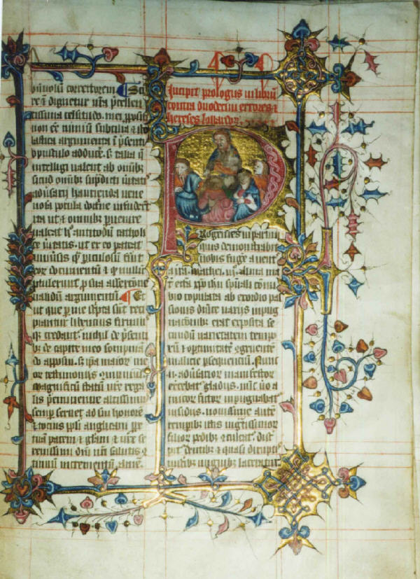
A rubricated AND illuminated page
Works Cited:
“Illuminations and Rubrications” Harry Ransom Center, The University of Texas at Austin, Educator Programs. https://www.hrc.utexas.edu/educator/modules/gutenberg/invention/illuminations/
“Rubrication” Wikipedia, the Free Encyclopedia. https://en.wikipedia.org/wiki/Rubrication
“Rubrication” History Graphic Design, Graphic Renaissance. http://www.historygraphicdesign.com/a-graphic-renaissance/printing-comes-to-europe/12-rubrication
“Gutenberg Bible” Wikipedia, the Free Encyclopedia. https://en.wikipedia.org/wiki/Gutenberg_Bible
“Rubrication, calligraphy” J.E. Luebering, Encyclopedia Britannica. https://www.britannica.com/topic/rubrication
Sam Fresquez
Cyanotypes were invented in 1842 by astronomer, photographer and chemist John Hershel. It was said that he “could have invented photography” if he had bothered to. A majority of the photo processes used during this time were silver based processes, the cyanotype however is not. The process uses a mix of Ammonium Iron Citrate and potassium ferricyanide to create a photosensitive solution that can be applied to anything capable of absorbing it. Then exposing this to ultraviolet light with a negative image with create a positive image, after this exposure the object will need to be washed with water. Anna Atkins is credited as the first person to ever make photo books when using cyanotypes to document botanicals entitled British Algae Vol.1. She is also most likely the first woman to ever make a photograph. She was born in 1799, and is recognized as important to both the history of botany as well as photography. In the 1840s the process is rarely used outside of botanicals. Cyanotypes later started to be used by engineers and architects to make blueprints. Before the cyanotype these sketches were copied by hand. In the mid 20th century, zenographic prints finally replaced blueprints, and now digital prints have become most common.
I became interested in this process because of the artist Annie Lopez Rogers who is also based in Phoenix. Her family has been in Arizona since 1871, and like my family, her’s was a part of the population who the border crossed over after the Mexican American war. Her work focuses a lot on that and the history of Mexicans in Phoenix. She oftentimes uses cyanotypes on tamale wrapping paper. After SB1070 she constructed a both men and women's underwear out of cyanotypes made from her birth certificate and other documents from her childhood entitled I’ll Show You My Papers If You Show Me Yours.
I expected that I would find a large amount of contemporary artists who use cyanotypes in their work, but I had a hard time finding any others. I brought this up to photography students, who said that it is hard to use cyanotypes without being overly nostalgic or romanticizing a different time.I find myself agreeing with this, but I think that Annie Rogers uses the process in a way that is aware of the effect that the process carries with it. I think then when we’re talking about the darker parts of our history that it can be smart to use a medium with a nostalgic tie to it. It reminds me a bit of Mia Adams’ current work, where she tends to use almost over patriotic language and symbols to point towards the history of the United States.
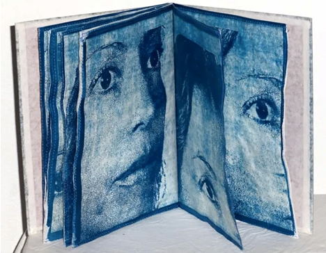
Annie Lopez Rogers
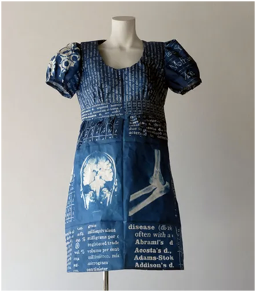
Annie Lopez Rogers
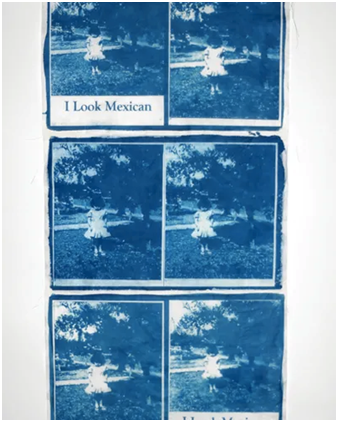
Annie Lopez Rogers
Anna Atkins
Savannah Lane
Judith Scott was a fibers artist and was actively producing art from 1988 to 2005. She was born with Down Syndrome and became deaf through an illness in early childhood. She was institutionalized as a result of failing verbal aptitude tests and being disruptive in traditional classrooms. Scott's twin brought her home after the death of their parents and helped enroll her in her first formal art training in the mid-1980s when she enrolled at the Creative Growth Art Center. Scott quickly found her place in fibers and was a prolific artist producing over 200 works before her death in 2005.
Her early work explored two objects wrapped together, and later works became larger scale -- working with everyday objects and large totems. She never repeated a color scheme exactly and used a large range of colored and textured threads in her work. The wrapped fibers around the work create meaningful patterns and both visual and physical texture. In this way, she is able to elevate the objects. She transformed some objects by wrapping them with multiple layers and changing the form and other objects she celebrated the existing shape and structure.
She was labeled an outsider artist because she did not ever receive formal training and was only taught fibers late in her life. People have rejected that label because of the stigma that that title carries, but it is intended to celebrate the barriers that Scott had to overcome to work in a fine art environment. Scott's first exhibition was in 1999. Her works have been in installations all over the world and stay in permanent collections in the Brooklyn Art Museum, Museum of Modern Art, the American Visionary Art Museum, Museum of American Folk Art, Intuit: The Center for Intuitive and Outsider Art, Irish Museum of Modern Art, The Oakland Museum, L’Aracine Musee D’Art Brut, Art Brut Connaissance & Diffusion Collection, Collection de L'art Brut. She continued to work five days a week until she passed in 2005.
Artists website: http://www.creativegrowth.org/artists/judith-scott/
Works from: https://www.artsy.net/artist/judith-scott
Extra information: https://fraenkelgallery.com/artists/judith-scott
Judith Scott and context: http://strabic.fr/Judith-Scott-Quelques-objets-secrets
Movies: “What’s Under Your Hat?”
“Outsider: The Life and Art of Judith Scott”
Works from: https://www.artsy.net/artist/judith-scott
Extra information: https://fraenkelgallery.com/artists/judith-scott
Judith Scott and context: http://strabic.fr/Judith-Scott-Quelques-objets-secrets
Movies: “What’s Under Your Hat?”
“Outsider: The Life and Art of Judith Scott”

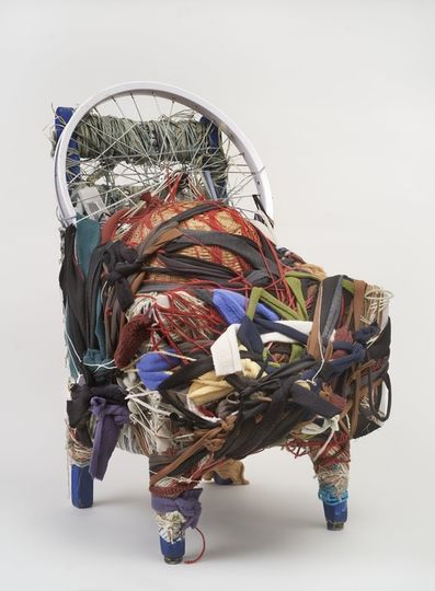
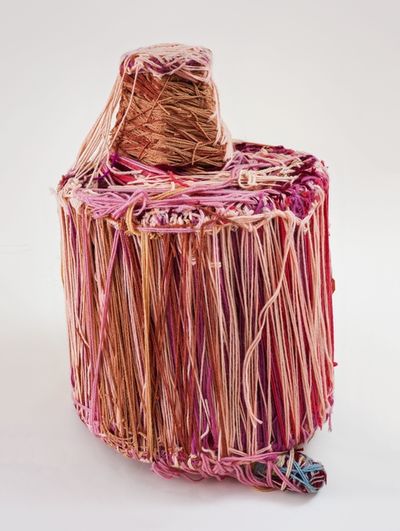
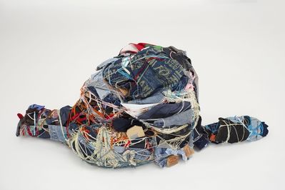

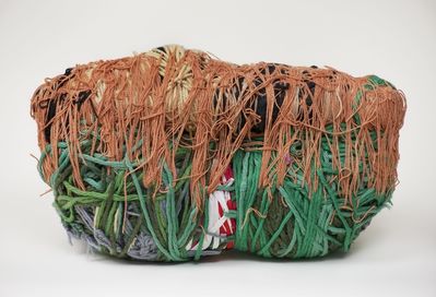

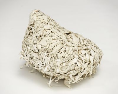
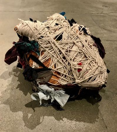
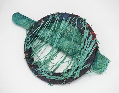
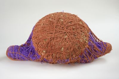
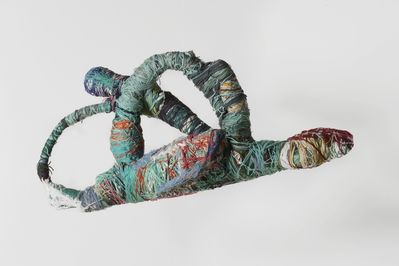
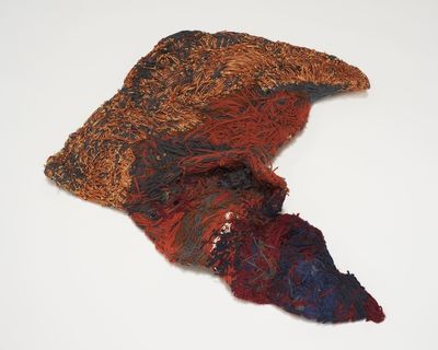
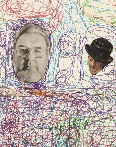
By Hao Jiang
China's long feudal society has unprecedented persecution and repression against the personality psychology of people, especially women. This repressed mentality has become the best breeding ground for the birth of the "Fox Immortal" culture. In the feudal society, the fox was first loved by women and used it as a god to please the spouse. The fox's beautiful fur, small and lovely body and sly spleen are in the eyes of the ancients, and only a charming woman can compare with it. The fox also seems to represent a certain secretive spirit, especially the character psychology involving women.
The fox is most respected in the pre-Qin and Han dynasties, and is one of the four auspicious squads along with the dragon, unicorn and phoenix. In the stone carvings and brick paintings of the Han Dynasty, there are often nine-tailed foxes and white rabbits, dragonflies and bluebirds juxtaposed next to the Western Queen’s seat to show auspicious omen. Others concluded that the fox has three virtues: the color of the coat is soft, in line with the doctrine of the mean; the body is small and large, in line with the order of honor and humility; when you die, head toward your own cave, it is not forgetting the root. It can be inferred that the fox was very moisturized in the days of the summer solstice for more than two thousand years.
After the Han Dynasty, the status of Fox as auspicious descended sharply. The previous good words about the fox were gone, and the rest were all indecent words, such as suspicion, fox, and body odor, which soon became the base of the sinister word. In the long run, fox has become synonymous with the problem of life style, and has become a famous kinky beast.
Because of the decline of Taoism in the right way, there is a fascinating belief in the north of China, in order to beg the fox to bless the food year after year. There are also many folks who say that the fox is dismounting, that is, after the seven-year-old person is possessed by the fox, it can be predicted to be fierce.
The fox demon is suitable for being a human figure. There is a flaw in the characteristic place to limit her identity. The most recognizable symbol of the reincarnation of the fox is the three cockroaches on the body.
Regardless of men and women, there will be a very obvious sputum on the right clavicle, the right back is symmetrical with the front clavicle, and the most concealed one is the one on the right. These three skeletons will roughly form an equilateral triangle.
This is one of the most important features of the fox, but this feature is easy to identify, but it is very difficult to see clearly.
Fox reincarnation as a physical feature I found
1. The face is small and pointed, the eyes are big, and the gestures between the hands will make people feel very charming. With superb acting, it is difficult for you to understand what she is like, and the skin is white and not too thin.
2. The eyes are small, but very aura, and the eyelids are very bright, you will be attracted to her eyes in the first time. Very smart and good at expressing my own thinking.
3. Because the fox is born with an odor, so after becoming a person there will still be a taste. But this body odor is very fragrant, especially at the end of the limbs, this scent is emitted from the body.
4. The ear is also a little different from the average person, there will be a downward fold on the ear's ear. Because the fox originally became a human figure with long ears, it needs to be further cultivated to be the same as ordinary people, but it will leave some traces, so there will be a small fold.
The character of the fox fairy reincarnation I found
1. It's very convinced of Buddhism, the heart is very religious, but because of nature, so I like meat.
2. It's very like dogs, because the relationship between dogs and foxes is very good, so they will get along well with the dog, and will feed some stray dogs and give goodwill.
3. It's very familiar with other animals, get along well with the animals. But in addition to cats, cats and foxes are a pair of deadly enemies, and they instinctively resent each other.
4. It's very sleepy, because the fox likes to sleep, a little lazy feeling. Most of the time it is mysterious, you seem to never know her thoughts.
Charles Mathews
When I do art projects I tend to try and relay a message within my artwork. I do this for the most part because I’m usually a quiet person and often don’t connect with people about my feelings. I usually gravitate towards political artwork because there is a lot of things I learned as a adult about my culture I wish I knew before. Conceptually I tend to like political artist with backgrounds similar to me. One thing that I wish I could do more as a artist is put more effort into learning about the artist who I think share a connection with me. I want to learn about artist who are in my range of style like printmaking and artist who share my subject matter. I’ve found three new artist I’m learning about and want to research their topic and method of work.
First I really have grew interest in the artist Sandile Goje whom I can’t find a image on. Goje is a South African artist who uses relief printing for his art. Goje in his prints seemed to be about the intermingling of white and black Africans in South Cape. Or possibly the prints tells of modernism brought into the town. Technically the markings on Goje prints are outstanding as the only colors used are black and white. Two colors accomplish so much on the page like depth and line weight. I look further in to learning more about Sandile Goje.
The second artist I want to talk about is Amos P Kennedy. Amos is a African American poster and letterpress artist who I came to like. Amos work consist of phrases, proverbs and sayings. Amos uses post and posters from handset wood and metal type for his work which is then hand pressed. The posters are very colorful and sends a bright and clear message. I often try to do something of similar topic and when I see Amos prints I get inspired again. Amos method of overly printing text is a method I want to use someday in letterpress because it looks very promotional. The reason why I like this type of Printmaking is because you can do multiple prints and put them up all over your local area.
Lastly another artist that got my attention is Daniel Pressely from South Carolina. Coming from a tragic background Pressely art in contrast depicts people singing and dancing. His work consist of wood carving and painting. However looking at his carving I can only imagine what they would look like if printing onto a book or print. His work is fascinating and beautiful and leaves me with a impression of learning how to be more detailed in my work. His composition is something I should sought after also as I believe that something I neglect in my work.
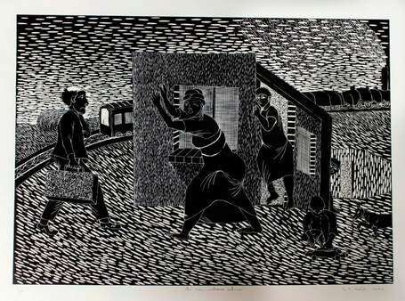
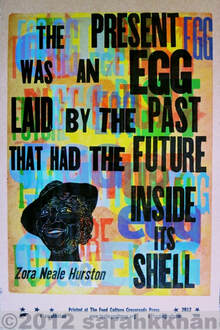
Sandile Goje above
<Amos P Kennedy
below
Daniel Pressley.
<Amos P Kennedy
below
Daniel Pressley.

Heather Weiler
I chose to do my research on the Gutenberg Bible; a book that revolutionized how the books we know and love today would be printed. An inventor by the name of Johann Gutenberg, born around 1398 in Mainz, Germany is credited with inventing and revolutionizing a new way of printing that would set future technology in motion. At this time in history, books were painstakingly being printed by hand.
Most large books were being hand written and smaller books and images were were carved into
wooden blocks and inked; both of which took upwards of months to years to create even the most
simple books. While not much is known about Johann Gutenberg’s early life or occupations, it is known that he moved in around the early 1430’s to Strasburg, Germany working as an inventor and learning new processes for polishing gemstones and making mirrors. He remained there for about a decade before returning to Mainz after running out of money. It was during this time in Mainz that Gutenberg approached a rich goldsmith and lawyer who would become very interested and fund his work. It is believed that this is the time when Gutenberg started experimenting with creating movable wood type. Individual letters that were hand carved into small wooden blocks that could be set up to print, taken down, and set up again to print in any arrangement desired. This, however proved to not be as reliable and Gutenberg soon moved to working with metal; a
skill that he undoubtedly fine tuned during his time in Strasburg. While areas such as Asia were already working with moveable type, this was an entirely new process in the Western Hemisphere.
In 1455, Gutenberg created the first book in Europe with moveable type, the Gutenberg Bible. During
this time, the majority of books printed were religious in nature, with the Latin Bible being the most
popular. The book was premiered and sold at the Frankfurt Book Fair with high recognition for their
incredible technical qualities. Around three-hundred different pieces of type are used in the first copies of the Gutenberg Bible and still utilized hand-painted ornaments to give the appearance of a traditional illuminated page. Only fourth-eight copies are known to still exist, twenty of which are complete.
This book undoubtedly encouraged much speculation and eventually led to his former business partner, Johann Faust, to sue Gutenberg for return of the money that was loaned to him to create his moveable type. Gutenberg lost the suit and it is believed that he was required to turn over most to all of his printing equipment to Faust. Not much about his life is known after this time other than that Gutenberg received a pension from the Archbishop of Mainz and lived the remainder of his life In his hometown of Mainz, Germany until his death in 1468. Though Gutenberg may not have reaped the financial benefits from his invention at the time, the moveable type and printing press led to the instrumental groundwork for future knowledge, education and technology.
Works Cited:
“History of the Gutenberg Bible .” Gutenberg Bible History, Great Site Marketing , 2008,
www.gutenberg-bible.com/history.html.
Giges, Nancy. “Johannes Gutenberg.” ASME.org, May 2012, www.asme.org/engineering-
topics/articles/history-of-mechanical-engineering/johannes-gutenberg.
“Gutenberg Bible.” The British Library, The British Library, 16 Jan. 2015, www.bl.uk/collection-
items/gutenberg-bible.
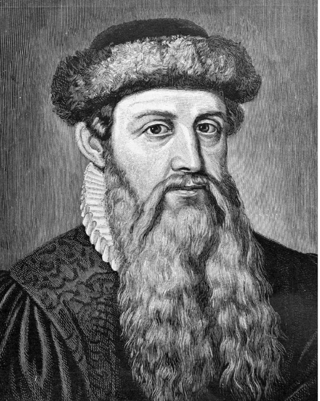
Merit Eads
The comic, by its definition and common concept, is an art form that is bound by tangible, specific limits. When we think of the word comic, the most defining trait of the genre that comes to mind is the panel: “a separate or distinct part of a surface[,] such as [a] comic strip,” or “a frame of a comic strip”. However, just because a story is portrayed in a medium with strict rules, this doesn’t mean that artists haven’t found inventive and thematically enriching ways to break these rules, shifting them to their advantage.
The comic, by its definition and common concept, is an art form that is bound by tangible, specific limits. When we think of the word comic, the most defining trait of the genre that comes to mind is the panel: “a separate or distinct part of a surface[,] such as [a] comic strip,” or “a frame of a comic strip”. However, just because a story is portrayed in a medium with strict rules, this doesn’t mean that artists haven’t found inventive and thematically enriching ways to break these rules, shifting them to their advantage.
Osamu Tezuka, a prolific Japanese manga artist who authored many influential and renowned titles such as Astro Boy, Black Jack, and Phoenix during his lifetime, experiments heavily with the panels in his work. Tezuka often relies on a pattern in which the more thin, elongated panels reflect a shorter span of time; in this way, a scene with very quick changes in movement can be portrayed with a single page filled with numerous “snapshot” panels. Take, for example, this page from Tezuka’s The Book of Human Insects (read right to left):
 | Each panel takes up the entire width of the page, and with minimal text in each panel, this is the perfect set-up for the reader’s eye to move, essentially, straight down from the very top to the very bottom of the page. With a single sweep of our eyes downward, we take in each panel for a length of time mirrored by its height. The second and third panels are so thin that they can be “read” visually almost simultaneously. The rest of the panels are slightly taller, giving them more substance and allowing them to “last” longer, but they each reflect a moment in this dance performed by the two women. They are red not necessarily as specific steps in the dance, but more as snapshots of a continuous movement, which we are meant to read once again in a “sweeping” motion, flowing downward without any stops. |
| Using the same technique with different results, the first panel in this page from Tezuka’s Black Jack (read right to left) is set up to mirror a cinematic downward pan as might be used in a film. The large amount of text demands our attention for a decent amount of time, and then our eyes must scan over the titular Black Jack’s frame and the patient he is working on. Tezuka then reverts back to the “short panels as short moments of time” pattern that we explored above, having the rest of the page be taken up by two panels that show short, clipped images of Black Jack’s hands laying the final touches on his patients’ prosthetic body. Tezuka also innovates his own patterns, using them in new ways with the same basis, such as in this example below from Hi no Tori (read right to left): |  |
Still relying on the iconography we have come to expect from his work, Tezuka now creates a two-page spread that forces the reader to slow down and take in the scope of this moment. Each panel, rotated from the short-and-wide shape we are used to, extends from the top to the bottom of the page, signalling that this page portrays a slow, still moment instead of a quick scene heavy with movement. Each panel shows the reflection of a pagoda in the water, and the scene changes only slightly from each image to the next. As readers, we are given plenty of time to observe and absorb not only the serene imagery and how it is disrupted, but the accompanying dialogue as well.
Tezuka is a master at his craft, visually enriching his works with many aspects not discussed here, such as the shape, placement, and weight in his panels, but his creation of time through each panel as a "scene" one might see in a film acts as a firm base on which his other exploratory techniques can shine through.
*Note: Due to differences in publisher translation, some examples are read from left to right.
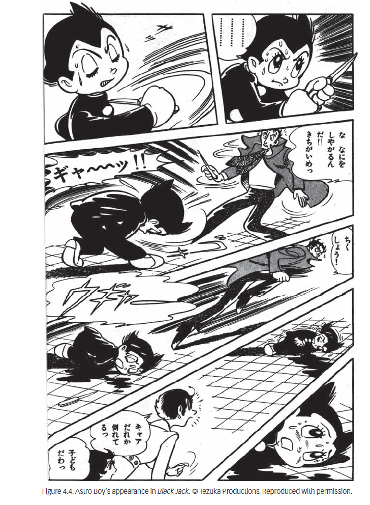
Estebany Mejia del Valle
Johannes Gensfleisch zur Laden zum Gutenberg not only introduced Europe to movable type but to the printing press. Originally, Gutenberg was a gem cutter and a blacksmith which gave him the tools to move onto a more ambitious process of inventing the printing print. It was created in the Holy Roman Empire in 1436, later completed in 1440.
Andreas Dritzehn had been a gem cutting disciple of Gutenberg, partnered with him in the making of the printing press and was owner of a paper mill. Later, Gutenberg would lose the printing press under lawsuit related to a similar partnership of the press.
Regardless, his invention was not short of the printing press as he introduced oil-based ink in printing and a uniformity of type within the press. He was the first European to use movable type and was able to manifest a mass production systematical practice in printing based off of his creations.
This system of the printing press, oil-based ink, the introduction of moveable type and his mold for large, rapid production of metal type allowed for accessibility of the printing press. The printing press quickly became revolutionary and spread across Europe like wild fire.
The Printing Revolution happened shortly after which evoked a boom of fast, effective and accurate information being distributed across Europe via Gutenberg’s intention. This in turn led to the mass production of high-quality books that allowed for authors to become best sellers in all across Europe.
The press altered European society with its effectiveness in mass communication. Ultimately, it created a new form of media, the press and allowed for new social waves of nationalism to flow in.
Scientists were more readily able to distribute their breakthroughs able to spread these discoveries to the wider audience and amongst their own communities of scientists that began a scientific revolution.
Credibility was more valued within written works and press, who said what or whom discovered what became something of importance and it profited the individual.
By far the arguably most impactful is the increase in literacy, due to the more readily available, books it allowed for lower class citizens to reach higher education and literacy then before.
Gutenberg’s invention allowed for wide spread change across many communities of Europe and pushed breakthroughs into the society with communication and knowledge.
References
- McLean, John. “Western Civilization.” The Printing Revolution | Western Civilization, courses.lumenlearning.com/suny-hccc-worldhistory/chapter/the-printing-revolution/.
- Lehmann-Haupt, Hellmut E. “Johannes Gutenberg.” Encyclopædia Britannica, Encyclopædia Britannica, Inc., 20 Feb. 2019, www.britannica.com/biography/Johannes-Gutenberg.
- “Biography: Johann Gutenberg: Adventure and Art.” Vision, www.vision.org/johann-gutenberg-adventure-and-art-490.
- “Harry Ransom CenterThe University of Texas at Austin.” Harry Ransom Center, www.hrc.utexas.edu/exhibitions/permanent/gutenbergbible/process/#top.