|
Sam Fresquez Cyanotypes were invented in 1842 by astronomer, photographer and chemist John Hershel. It was said that he “could have invented photography” if he had bothered to. A majority of the photo processes used during this time were silver based processes, the cyanotype however is not. The process uses a mix of Ammonium Iron Citrate and potassium ferricyanide to create a photosensitive solution that can be applied to anything capable of absorbing it. Then exposing this to ultraviolet light with a negative image with create a positive image, after this exposure the object will need to be washed with water. Anna Atkins is credited as the first person to ever make photo books when using cyanotypes to document botanicals entitled British Algae Vol.1. She is also most likely the first woman to ever make a photograph. She was born in 1799, and is recognized as important to both the history of botany as well as photography. In the 1840s the process is rarely used outside of botanicals. Cyanotypes later started to be used by engineers and architects to make blueprints. Before the cyanotype these sketches were copied by hand. In the mid 20th century, zenographic prints finally replaced blueprints, and now digital prints have become most common. I became interested in this process because of the artist Annie Lopez Rogers who is also based in Phoenix. Her family has been in Arizona since 1871, and like my family, her’s was a part of the population who the border crossed over after the Mexican American war. Her work focuses a lot on that and the history of Mexicans in Phoenix. She oftentimes uses cyanotypes on tamale wrapping paper. After SB1070 she constructed a both men and women's underwear out of cyanotypes made from her birth certificate and other documents from her childhood entitled I’ll Show You My Papers If You Show Me Yours. I expected that I would find a large amount of contemporary artists who use cyanotypes in their work, but I had a hard time finding any others. I brought this up to photography students, who said that it is hard to use cyanotypes without being overly nostalgic or romanticizing a different time.I find myself agreeing with this, but I think that Annie Rogers uses the process in a way that is aware of the effect that the process carries with it. I think then when we’re talking about the darker parts of our history that it can be smart to use a medium with a nostalgic tie to it. It reminds me a bit of Mia Adams’ current work, where she tends to use almost over patriotic language and symbols to point towards the history of the United States. 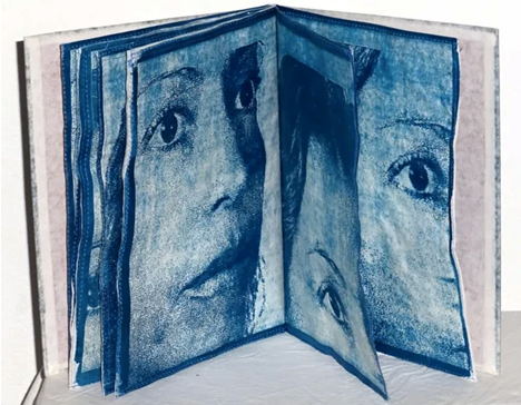 Annie Lopez Rogers 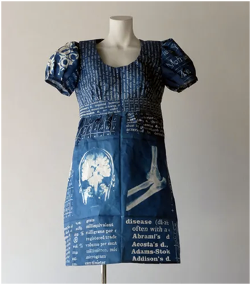 Annie Lopez Rogers 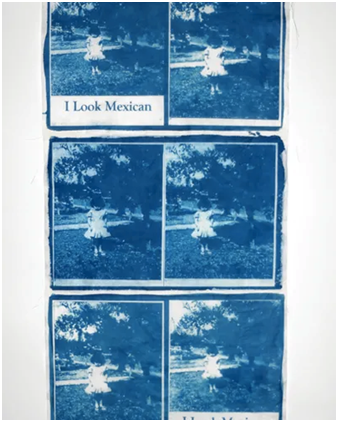 Annie Lopez Rogers 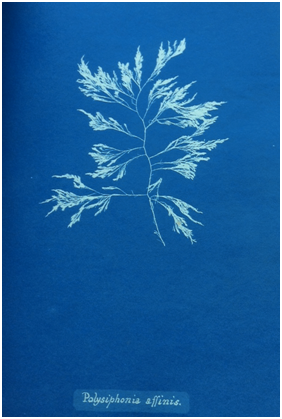 Anna Atkins
William Mark Sommer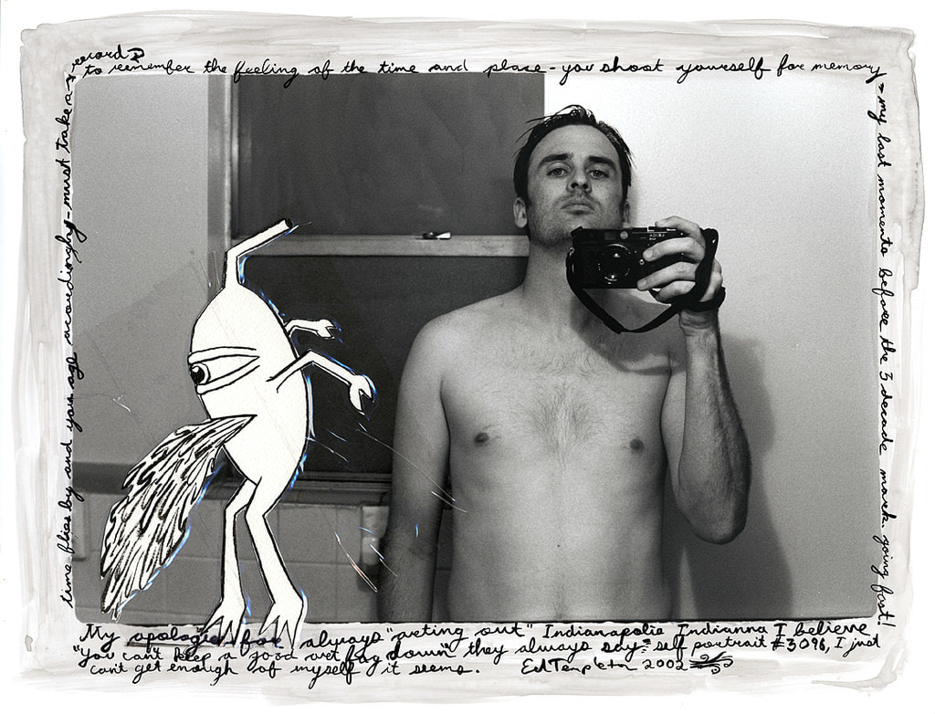
In 1999, Ed Templeton released his first book, Teenage Smokers. The book was a simple design of 30 photographs and 3 illustrations with a small forward by Aurelie Voltz, and an Interview by Jerome Sans. The book was just made for a corresponding photo show at Alleged Gallery, but the show and book took off like a wildfire giving Ed worldwide attention even awarding him $50,000 from the Italian Search For Art competition. From Teenage Smokers he also conceived a direct sequel to the book Teenage Smokers 2, released 2015 by Super Labo, and a sister project Teenage Kissers in 2011 that was produced by Seems. Teenage Smokers has gone on to becoming a classic photo book that has been referenced by many artist and even talked about in Martin Parr and Gerry Badger's "The Photobook: A History Volume III" being called a, “brand new, most handsome example of this contemporary classic.”

Ed Templeton is an artist photographer residing and from Huntington Beach California. Ed’s creation started when he first picked up skateboarding and got into punk music. Pursuing a professional career in skateboarding, he was surrounded by other creative’s shooting photography, making videos and creating board graphics. Within that time he picked up a camera and started documenting the things he saw, the places he would go, and every intimate detail of his life. Though Ed has no formal training in art being surrounded by the likes of Jason Lee, Mark Gonzalez and many other artistic skateboarders, he gained an education most of us could only dream of. Ed started exhibiting his work in 1993, and eventually gained a world following even more than his skateboarding career.
Ed as a creative in book arts has been challenging the way photography is shown in the book form. Ed has a created over 44 books and zines ranging from simple zerox folio, accordion books, to classic perfect bound books that showcase his works in these diverse monographs. More than just the structure of the book, Ed brings a different life to his work by utilizing many different layouts from photos in a collage form, sometimes applying pull out pages, to full layouts of exhibitions with drawings and his hand written type giving a new narrative to the work than the simplicity of single photos. These different methods of structures and layouts help to give his work an even more personal touch and diverge his photographs from the traditional way of showing photos in the book form.
Though Ed Templeton was not the first to many of the methods used in his photo books he has really innovated the whole field of with his ways of stepping beyond the traditional photo book. Traditional photo books have stayed fairly formulaic to the white page on the left photo on the right, until Ed Rusche created his Twentysix Gasoline Stations, this book helped usher a Renaissance to book making all together, but also gave artist like Ed Templeton a new way to experiment with the form. Being close to the punk rock zine creators of the 80s- 90s Ed and many of his contemporary’s have used the ideals of Rusche to make photo books more affordable mass produced art work. This way of creating books has made it more available for people like myself to own a work of art like theirs.
Photos courtesy of :
http://ed-templeton.com/ Information found on: http://ed-templeton.com/ https://en.wikipedia.org/wiki/Ed_Templeton https://www.huckmag.com/topics/ed-templeton/ Thrill of it all podcast: https://www.youtube.com/watch?v=R51VaxuKchI Epicly Laterd: https://www.youtube.com/watch?v=_Hei3ti0G3k Video By: Gracious Living by Lucas Chemotti, https://www.youtube.com/watch?v=wlK43Tz8KSY Matthew Jessie The world of photo books is changing. Over the past several years a shift has occurred from viewing a photo book as simply a vessel for photographs to be displayed to the idea of a photo book not only functioning as a vessel, but also as a complete object that balances the importance of its contained images with concerns more associated with artist’s books. This is in part due to technological advances within printing that have allowed smaller publishers to not only break through the larger market, but to also reshape it. This newer trend in photo book publishing now allows small publishers to focus more on the photo book as an object, creating both large and small editions of beautiful book-objects. Roma Publications is a small photo book publisher based in the Netherlands. They describe themselves on their website by saying,” Roma Publications is an Amsterdam based art publisher, founded in 1998 by graphic designer Roger Willems, and artists Mark Manders and Marc Nagtzaam. It is used as a platform to produce and distribute autonomous publications made in close collaboration with a growing number of artists, institutions, writers and designers. Related to the content, every issue has its own rule of appearance and distribution, varying from house to house papers to exclusive books. The publications so far are in editions between 2 and 150,000 copies. Occasionally, Roma also curates exhibitions.” I initially learned of Roma Publications through their working with Belgian photographer Geert Goiris. His work and subsequent book Proliferation from 2014 is described by the publisher as,” Published to coincide with the exhibition of a series of photographs by Geert Goiris at the Mauvoisin Dam (Valais, Switzerland), this sublime series of 30 images suggests a timelessness and contained restlessness through its potential narratives of place and collective memory. Labyrinthine trees, strange rock formations, contemplative figures, man-made objects and wide mountain landscapes work together to instill a sense of serenity on the observer, yet one that evokes a certain tension, a primal longing generated by the environments Goiris portrays.” The book helps to convey narrative through its attention to such ideas as sequencing, image layout, variety of treatment, conceptual consideration, and its beauty as a book-object. As opposed to exhibitions of the work, the book form helps to accentuate the feeling of being lead on a journey through what could be seen as incoherent places and subject matter, but by being constrained to seeing only one to two images at a time and in a very specific sequence, the images are unified, offering a sort of juxtaposition of fact and fiction. Something I really appreciate about this book is that it initially offers only images, allowing the viewer space to formulate their own interpretations of the work, but at the end is an essay as well as an index of all included images with titles and Goiris’ own descriptions of various lengths. Published in a small edition of three hundred and including a signed Lambda print, Proliferation has been out of print since I first learned of it a few years ago. Initially valued at around sixty-two US dollars, the few remaining new copies being sold on the Internet now fetch upwards of four hundred. Below are selected spreads from within the book, the included Lambda print, and a view of Goiris' exhibition of Proliferation at the Mauvoisin Dam in Valais, Switzerland. |