|
Samuel Rosenzweig
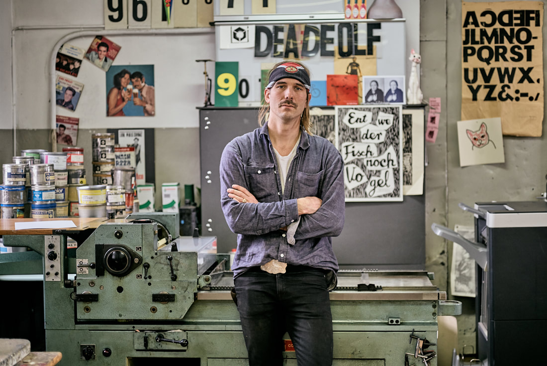
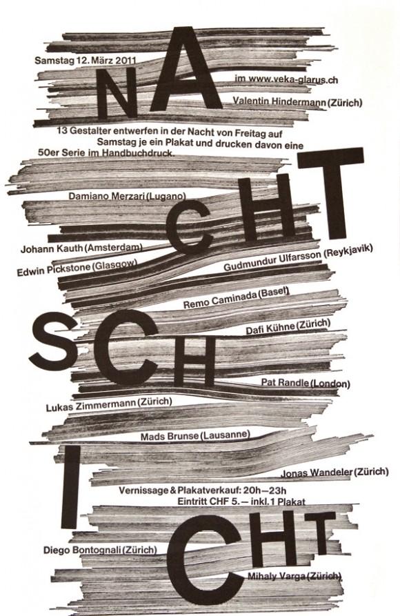
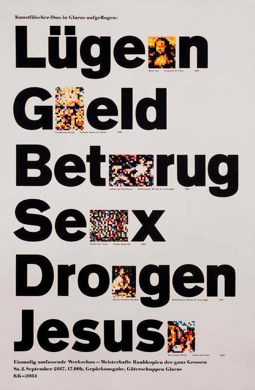
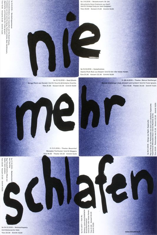
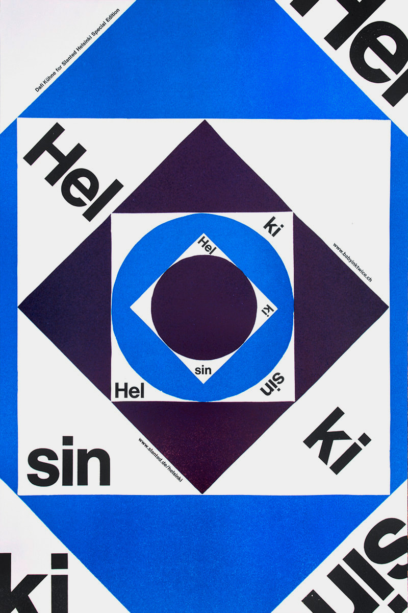
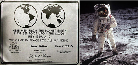
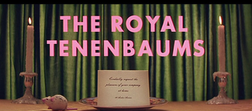
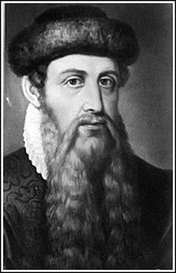
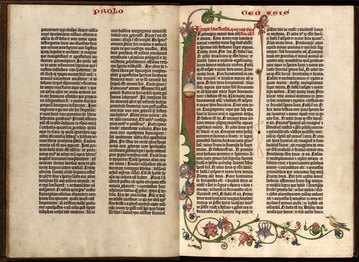
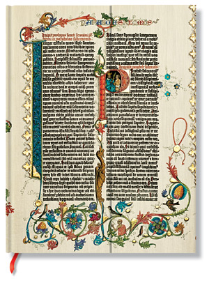
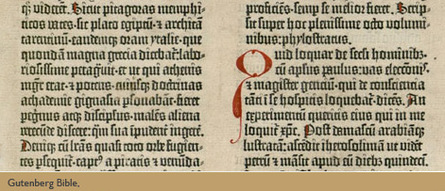
Dafi Kühne is a Swiss designer and letterpress artist who combines contemporary graphic design approaches with the art of letterpress printing. Based in Glarus, Switzerland, Kühne has been working full-time as a letterpress printmaker for over a decade, producing a wide range of artifacts including posters, brochures, and invitations for the world of music, art, theater, and film. Kühne prides himself on his ability to combine contemporary graphic design with printmaking techniques no longer practiced by the vast majority of designers. As a “no-digital-only” designer, Kühne cites his favorite tools as letterpress printing presses from the 1960s, traditional metal and wood type, pantograph cut wood blocks, laser cut blocks, polymer plates and handcuff lino and chip board. In addition to his computer, which is also an integral part of his process. In his Swiss studio, Kühne has collected over twenty tons of equipment. Kükne’s studio set-up includes three FAG Control 405 machines and a massive German Frontex loaded with seemingly endless dials and knobs. How the floor resists caving in remains a globally disputed mystery. To many designers, working exclusively in letterpress may seem tedious, unsustainable, crazy, or all of the above. For Kühne, the draw of letterpress comes from his ability to assert total control over the design and production process. Kühne states, “I am not a luddite or a romantic retro fanatic…it’s just about finding the right tool for producing my design.” For Kühne the printing presses are an important tool in the process of design, not just the final step. When you send a digital file to print, there’s no telling what will come back in the form of paper and ink. The designer relinquishes control after they send or upload a digital file. Kühne remedies this by being hands on from the start. “When it comes to printing I want to have full control over the whole process and the power to make all the decisions, such as choosing the colors and the paper, mixing the ink, setting the about of pressure and ink, according to my design concept.” Before taking on a client’s project, Kühne must make sure the concept and messaging are strong. Typography plays the leading role in the formation of the communication but color and texture are equally important. Kühne’s over 600 cases of type include favorites such as Caslon and Helvetica, along with more obscure typefaces such as Normal Grotesk. Perhaps Kühne’s biggest contribution to the world of contemporary letterpress, other than his work, are his informative and engaging videos, which explore alternative printing techniques. His video on casting plastic resin type explains how he made additional letterforms from a pre-existing metal typeface because he didn’t have enough type specimens to print a text-heavy poster. Other topics that Kühne covers include working with magnetic wood type, indirect printing, vinyl sticker type, and torn structures. Kühne’s work is appealing because it balances graphic design traditions with contemporary approaches. The hand-made quality can be felt not only in the aesthetics but also in the concept. As each step takes much longer on letterpress than it doesn’t on a computer, decisions are carefully calculated, leading to better choices, and better design. In a n era when designers can create hundreds of sketches on a computer in an hour or two, having an awareness of the image making roots of the letterpress are more important than ever. Setting type by hand allows for a sort of embodied cognition to take place, as a designer learns the classical components of typography. Hopefully more designers in the future will have an opportunity to discover the letterpress and incorporate traditional techniques in their own contemporary designs. Posters.Video.Sources: Owen Pritchard, December 9 2016 True Print: the work of Swiss designer Dafi Kühne catalogued in fantastic new monograph https://www.itsnicethat.com/articles/dafi-kuhne-true-print-publication-091216 Luc Benyon, April 2018 A Look Inside Dafi Kühne’s Swiss Alps-based, Mindblowingly Vast Letterpress Studio https://eyeondesign.aiga.org/a-look-inside-dafi-kuhnes-swiss-alps-based-mindblowingly-vast-letterpress-studio/ Dafi Kuhne’s Vimeo Channel https://vimeo.com/dafi By Ashlyn Harrop 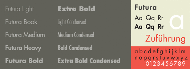 When thinking of the vast amount of typefaces that have been produced over the last century, we often first recall the ones that have remained timeless even amidst the different design movements. For many designers and people alike, Futura, a sans serif typeface, is first on the list when choosing a typeface for a design. The most common characteristics of Futura include it’s low crossbar, pointed apex, ascenders that rise above the ascender line, mono-weight strokes, crossbars that have an extended width, circular counter-space, center of the letters that extend to the baseline, and terminals that cut-off. Futura has remained popular over the past century because of it’s modern look and readability. Created by German type designer, Paul Renner, in 1924, Futura was the first typeface of its time to combine geometric and old style figures into one face. This was a typographic style many type designers was striving to achieve during this time. Although Renner didn’t attend the Bauhaus School of Design like many other prominent designers, Futura was greatly inspired by the modern design style of the Bauhaus movement. After a few years of meticulously altering the letterforms of this typeface, Renner commissioned the Bauer type foundry in 1927. The face was commercially released in light, regular, and bold weights. It wasn’t until 1930 that the type family grew to include semi-bold, bold condensed, light oblique, and regular oblique, with a book weight added in 1932. As of current, the Futura family now includes over 20 faces in total. Interestingly enough, the face was originally intended only to be used for the body text in books. Today was see Futura highly used in advertising. In 1969, Futura was chosen as the typeface to be on the commemorative plaque that was left on the moon by the astronauts of Apollo 11. Since then, Futura has been most popularly connected to brands such as Volkswagen, Ikea, Dominos Pizza, Absolut Vodka, Louis Vuitton, Best Buy, Red Bull, Union Pacific, Costco, and films by Wes Anderson and Stanley Kubrick.  By: Nikki Villatoro The history of writing was created to express emotions, imagination and language by letters or any other mark, Through writing, we had the ability to transfer complex information, ideas etc from one individual to another, because of this we were able to grow and learn from one another. Since 25,000 – 30,000 BP, humans were painting pictures on cave walls. Through this, we learned stories from one another. Learning how to write taught us how to express ourselves– whether it was a way to represent our tribe, our emotions or our experiences. The writing system started to become more of a representation of hunter-gatherer societies. People's property were solely relied on their 'mark'– food, land, animals. We saw this on their 'tokens.' The history of writing was created to express emotions, imagination and language by letters or any other mark, Through writing, we had the ability to transfer complex information, ideas etc from one individual to another, because of this we were able to grow and learn from one another. Since 25,000– 30,000 BP, humans were painting pictures on cave walls. Through this, we learned stories from one another. Learning how to write taught us how to express ourselves–whether it was a way to represent our tribe, our emotions or our experiences. The writing system started to become more of a representation of hunter-gatherer societies. People's property were solely relied on their 'mark'– food, land, animals. We saw this on their 'tokens.' The tokens began to be symbols, then they started to transition into being used as an impression or inscribed in clay. First they were pictographs but started to become more, certain pictures representing an idea or concept, ideographs and then sounds. We have grown much more since then. From glyphs, to Greek/Trajan/Roman, alphabets to Gothic lettering, to Letterpress. Gutenberg was in 1439 was the first European to use printing press and movable type in Europe. Along with the many experimental things that create the printing– the invention of movable type, the machinery, oil-based ink, wooden print press etc. Through his invention of all these elements, he was able to make a system which we all know as today as Letterpressing. Thanks to Gutenberg, the use of movable type was marked as such a magnificent improvement in on handwritten manuscripts. Gutenberg has changed the printing world, this rapidly started to spread around Europe and soon, the world. Mankind is known for is evolution: in its self and it's inventions– although we have not forgotten about Letterpressing, it's now as easy as clicking a letter on a keyboard. Letterpress is making its comeback since we have founded the 'computer' but, there will always be something unique of the process of letterpress, and the outcome of the work itself. Having to gather the ink, going through drawers to find the typeface and manually having to put the work into it. Every step of it is so beautiful and different each time. We have grown so much but will never forget where it all started from. REFERENCES:
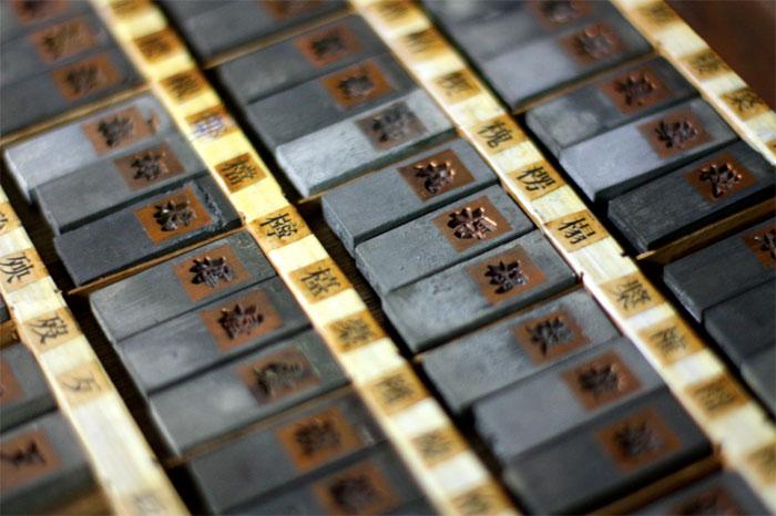
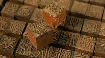
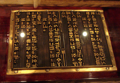
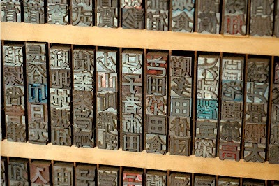
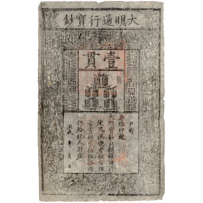
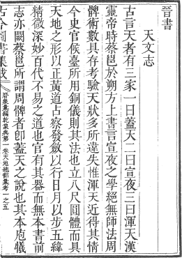
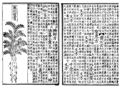
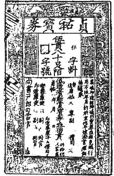
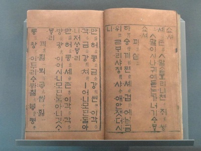
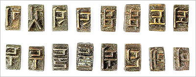
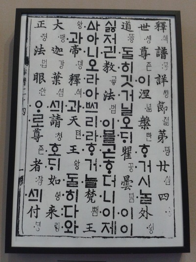
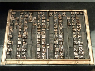
http://www.historyofinformation.com/expanded.php?id=344 https://en.wikipedia.org/wiki/History_of_writing https://en.wikipedia.org/wiki/Gutenberg_Bible By Yiao Zhang Introduction Letterpress printing could simply described as " Pressing paper onto wood and metal letters and hand-carved images, with ink in between." , according to <HISTORY OF LETTERPRESS PRINTING>. After a German named Johannes Gutenberg of Mainz, became the first one to invent a metal movable-type printing system in Europe. At middle of 1400's, Letterpress revolutionized printing and possible mass communication in the western world. Get back to Far-East, a Chinese called Bi Sheng from Northern Song Dynasty used baked clay to create the earliest movable type printing It is about 400 years earlier than European. History About 202 BC, a people called Cai Lun from Western Han Dynasty, created one of the most important materials for printing---Paper, people in China started to use paper to replace the bamboos. After Cai Lun, at the end of Eastern Han Dynasty, a writer named Zuo Bo improved the way to make paper and about 751 AD, paper had been introduced to Korea. After People in China and Korea got their new Invention --- Paper, they found out the way to achieve the massive production of books, paper money and something else. In China, after Sheng Bi created the clay movable types. At Yuan Dynasty, Wang zhen---an official, invented the wooden type to replace the clay type in 1297. Also, Chinese attempted to use tin to create the type, but chinese water-based ink is very hard to be griped on tin character. Because of this, tin characters only appeared for a very short time. In Korea, Dharani sutra was the oldest surviving wood block-printed text. Koreans first began to work with movable type was at Goryeo Dynasty. During that time the text called Tripitaka---the Buddhist religious text, which included sutras, treatises and law. By printing two complete sets, it required more than 8,000 different wood blocks. During the time, when Mongolian forces invaded Korea, many Korean documents were destroyed by war. Lucky, about four decades ago, Korea already used bronze types to replace the wooden types. That allowed types surviving from the war and allowed Koreans to replace their documents. Present Facts for Chinese Movable Type Now, Movable types in Asian countries are slowly disappearing. It is not only because Asian type characters are hard to make. but also because most Asian countries' languages have over thousands characters. They are hard to analyze and collect. For example, in China, not like in English, it only need 26 letters. If people want to have just a single font with all characters in Chinese. It will need over 80,000 unique types, even if people only need the most commonly used characters, people will still need 3500 types. Those will still be very huge collections. Also, there will have at least 8 commonly font in Chinese. Just according to this, Chinese movable types will be have to survive from the modern life, As the video shows, the ways to create the wooden movable types are very complex that makes young people very hard to learn from the elders. Some Same Facts with English Movable Type Not only the Asian movable type suffering the similar problem with Chinese, English movable type also have the same trouble. Such as more and more letterpress companies closed because the hi-tech products. Digital prints are much faster than letterpress, online newspaper are much easier to carry than paper-based news, Here is the video about Helvetica. Hope this will bring you some more interests about letterpress. Reference:
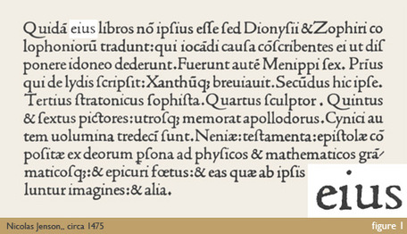
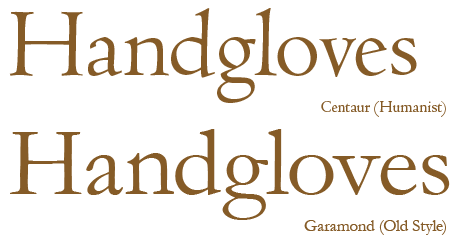
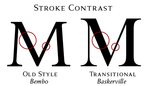
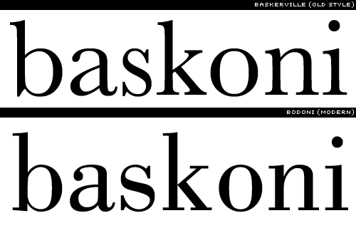
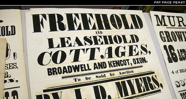
Asia for Educators. “The Song Dynasty in China.” Columbia University. 2008. Web. Accessed 23 July 2012. Christensen, Thomas. “Gutenberg and the Koreans: Did East Asian Printing Traditions Influence the European Renaissance?” 2006. Web. Accessed 23 July 2012. Steins, John. “Wood Block Printing.” John Steins Printmaking Journal. 19 Jan 2010. Web. Accessed 23 July 2012. Elation Press Co. "Short History of Asia’s Influence on Type and Printing". HISTORY OF LETTERPRESS PRINTING. "What is letterpress printing?". By Meaghan Socaciu Over time, many things see change, and typography is no exception. For my research project, I decided to look at the history of type. During my research, I found that there were eras of type that had evolved from the beginning of the written language. The first styles of movable types were called Blackletter, also known as Old English to many. Blackletter is easily distinguishable by it’s heavy, dark, and old appearance, made to simulate the handwriting of the time. In the 1500’s, a more legible type style called Humanist was developed. Humanist type was much lighter in appearance, and generally and a lower contrast between thick and thin strokes. Most type designed in this style was to mimic handwriting of early Italian scholars and scribes. A popular typeface in the Humanist style that we use today is Centaur. After Humanist type, Old Style type was developed. In Old Style type, due to the improving skills of punch cutters, we start to see a greater refinement in letterforms, and consequently more thick and thin strokes. Old Style type generally looks neater, and is more upright than the Humanist type. During 1501, the first italic typeface was developed as well. Some popular Old Style faces include Garamond, Goudy Old Style, and Palatino. The Transitional Era followed the Old Style Era. During the 18th century, type made an even further departure from the appearance of handwritten type. The contrast between thick and thin strokes became even greater, head serifs became more horizontal, and the axis of circular forms moved to a 12 o’clock angle (versus the Humanist 11 o’clock angle). Possibly one of the most famous Transitional style typefaces is Baskerville, but there are many others such as Bookman, Clearface, and Slimbach. Next up is the Modern Era of Type. These typefaces have increased contrast from the thick and thin strokes of the Transitional Era, unbracketed serifs, a vertical axis, and a small aperture. The forms of the Modern Era are sharp, clean, and possess a great amount of contrast. Examples of this style of type are Bodoni, Caledonia, and Didot. In the 1800’s the slab serif was born. Also called Egyptian due to the popularization of Egypt during this time period, this type style was inspired by a new wave of advertising during Industrialization, and could be seen on advertisements and posters everywhere. These slab serif faces had very thick serifs, and most had an abrupt serif (meaning it meets the stem at a 90 degree angle), although some had bracketed serifs as well. Some popular faces from the Slab Serif Era include Clarendon, Normande, and Bodoni Extra Bold. With Industrialization also came the ability to distribute many new typefaces. Type foundries were formed, and type was manufactured more easily than in previous years. 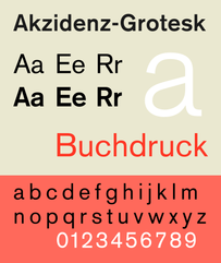 In the late 19th century, type designers decided to create type without serifs. This style of type varies greatly in boldness, but most sans-serifs are very balanced, do not vary in thickness within the actual forms, and stand upright. These faces were used purely as titles up until WWII, when they became used as body text. Sans—serif type can very greatly from type based on classical proportions to Modernist and Avant Garde styles. Some famous sans-serif faces include Akzidenz-Grotesk and Gill Sans (Classical), as well as Futura and universal (Modernist/Avant Garde). It’s interesting to see how type has developed over time, and how much things have changed since the birth of type. I wonder what type will continue to evolve into in the future. Will it continue to change into simpler forms? Or will we see a resurgence of the beautiful and complicated forms of earlier eras? Only time will tell!
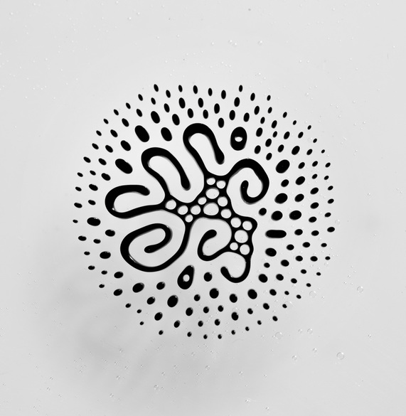
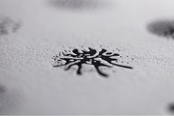
Sources: http://www.aiga.org/theyre-not-fonts/ http://www.designhistory.org/Type_milestones_pages/SansSerif.html http://ilovetypography.com/2007/11/06/type-terminology-humanist-2/ http://ilovetypography.com/2007/11/21/type-terminology-old-style/ http://ilovetypography.com/2008/01/17/type-terms-transitional-type/ http://ilovetypography.com/2008/06/20/a-brief-history-of-type-part-5/  by Stephanie McNicol Craig Ward is a British-born designer and art director. Now located in New York City, Craig has been recognized with multiple awards for his designs and art direction which include: ADC Young Gun (2008), recipient of the Type Directors Club Certificate of Typographic Excellence (2009, 2014) and the Communication Arts Award of Excellence (2014, 2015). He is known for his often creative and scientific approaches to design solutions. Ward has worn many hats in his career, including artist, author, art director, photographer, designer and contributor to several design journals. However, he is best known for this pioneering typographic works. He currently works out of his studio in North Brooklyn named. Word are Pictures. It also happens to be the name of his portfolio website that he originally used to showcase his experimental typographic and letterpress works. His studio space offers a unique space for him to experiment with photo and video shoots, and installation that features many of his typographic expressive works. 2003 to 2007 were considered Craig's "letterpress years". He was inspired by constructivist type assemblages of words and type. He often works using the letterpress which included type that reflective his own narrative. These experiments evolved into creating pieces such as the typographic map of New York City and a map of London. He enjoyed the printing process, as he was able to produce unexpected results. He believed that these distortions were difficult to control and allowed the elements to play on the page in unexpected way. It was his love of letterpress that lead to his involvement in creating a custom typeface for Christian Dior to celebrate the first release of their first new perfume in ten years. He named it NM Serif and created a poster with the typeface to send to his clients, so they could have a tangible feel for the elegance and structure of the typeface. In recent months, Ward has collaborated with biochemist and photographer Linden Gledhill to create something truly unique when it comes to experimental art and bringing it to letterpress. Craig and Linden have developed a set of glyphs using magnetic fluid ink. The “typeface” is called Fe2O3 (Iron III Oxide) Glyphs. Iron III Oxide is a main component found in ferrofluid. Ferrofluid is a liquid that becomes strongly magnetized in the presence of a magnetic field. The results create a very unique form, or glyph, that can be manipulated and then vectorized on the computer. The process is beautifully simple: first ferrofluid is placed between two glass plates. The ferrofluid is then subjected to a magnet that spins horizontally and vertically. The results are as Ward explains, “a library of complex hieroglyphics – each one as unique as a snowflake – that call to mind both indigenous markings and symbols from science fiction.” Once the glyphs have been finalized, Ward creates a vector of the shape to convert to a working OpenType (.oft) typeface, as well as, a polymer plate. The ink for these prints have been made using a mix of black pantone ink, and ferrofluid. The reasoning behind this says Ward, is that “the printing medium dictates the form of the glyphs, as opposed to the other way around.” A genius way to bring the project full circle and a testament to the detail in which Craig Ward puts into his work. The juxtaposition: the old system of letterpress with a mix of modern, scientific technology makes this project one that stands out as far as experimental type is concerned. Craig Ward is certainly a designer that brings the fine arts back into design with his personal projects, and is a true pioneer in experimental typography. For a look into the collection of his work I encourage you to visit his website at wordsarepictures.co.uk. Works Cited: |
Categories
All
|
