|
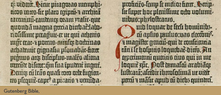
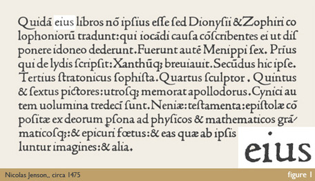
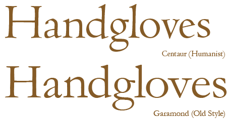
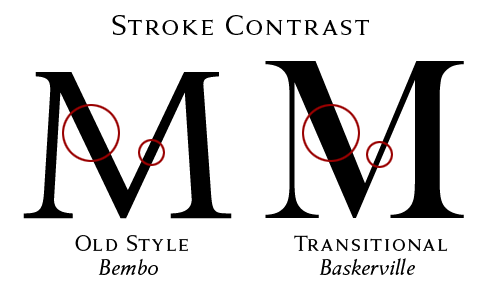
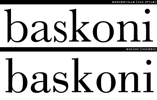
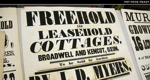
By Meaghan Socaciu Over time, many things see change, and typography is no exception. For my research project, I decided to look at the history of type. During my research, I found that there were eras of type that had evolved from the beginning of the written language. The first styles of movable types were called Blackletter, also known as Old English to many. Blackletter is easily distinguishable by it’s heavy, dark, and old appearance, made to simulate the handwriting of the time. In the 1500’s, a more legible type style called Humanist was developed. Humanist type was much lighter in appearance, and generally and a lower contrast between thick and thin strokes. Most type designed in this style was to mimic handwriting of early Italian scholars and scribes. A popular typeface in the Humanist style that we use today is Centaur. After Humanist type, Old Style type was developed. In Old Style type, due to the improving skills of punch cutters, we start to see a greater refinement in letterforms, and consequently more thick and thin strokes. Old Style type generally looks neater, and is more upright than the Humanist type. During 1501, the first italic typeface was developed as well. Some popular Old Style faces include Garamond, Goudy Old Style, and Palatino. The Transitional Era followed the Old Style Era. During the 18th century, type made an even further departure from the appearance of handwritten type. The contrast between thick and thin strokes became even greater, head serifs became more horizontal, and the axis of circular forms moved to a 12 o’clock angle (versus the Humanist 11 o’clock angle). Possibly one of the most famous Transitional style typefaces is Baskerville, but there are many others such as Bookman, Clearface, and Slimbach. Next up is the Modern Era of Type. These typefaces have increased contrast from the thick and thin strokes of the Transitional Era, unbracketed serifs, a vertical axis, and a small aperture. The forms of the Modern Era are sharp, clean, and possess a great amount of contrast. Examples of this style of type are Bodoni, Caledonia, and Didot. In the 1800’s the slab serif was born. Also called Egyptian due to the popularization of Egypt during this time period, this type style was inspired by a new wave of advertising during Industrialization, and could be seen on advertisements and posters everywhere. These slab serif faces had very thick serifs, and most had an abrupt serif (meaning it meets the stem at a 90 degree angle), although some had bracketed serifs as well. Some popular faces from the Slab Serif Era include Clarendon, Normande, and Bodoni Extra Bold. With Industrialization also came the ability to distribute many new typefaces. Type foundries were formed, and type was manufactured more easily than in previous years. 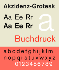 In the late 19th century, type designers decided to create type without serifs. This style of type varies greatly in boldness, but most sans-serifs are very balanced, do not vary in thickness within the actual forms, and stand upright. These faces were used purely as titles up until WWII, when they became used as body text. Sans—serif type can very greatly from type based on classical proportions to Modernist and Avant Garde styles. Some famous sans-serif faces include Akzidenz-Grotesk and Gill Sans (Classical), as well as Futura and universal (Modernist/Avant Garde). It’s interesting to see how type has developed over time, and how much things have changed since the birth of type. I wonder what type will continue to evolve into in the future. Will it continue to change into simpler forms? Or will we see a resurgence of the beautiful and complicated forms of earlier eras? Only time will tell!
Sources: http://www.aiga.org/theyre-not-fonts/ http://www.designhistory.org/Type_milestones_pages/SansSerif.html http://ilovetypography.com/2007/11/06/type-terminology-humanist-2/ http://ilovetypography.com/2007/11/21/type-terminology-old-style/ http://ilovetypography.com/2008/01/17/type-terms-transitional-type/ http://ilovetypography.com/2008/06/20/a-brief-history-of-type-part-5/
2 Comments
Valerie Bullock
11/30/2015 10:09:10 pm
A general history of type was something I was really looking forward to learning about in this course and I am happy to read what you had to say about it. It is interesting to note that as type evolved, it has become less ornamental, with a hand-written inspiration, and has shifted to a more utilitarian look and feel. Type is in every way a technology and it evolves and changes just like all human innovations. It is really cool how it has adapted in out contemporary lives.
Reply
Stephanie McNicol
12/1/2015 05:01:13 pm
Interesting research post! I enjoyed reading the history of type, mainly, the historical groups and how they evolved from each other. Even though I've taken history to graphic design I still learned some things from this article. Such as, I never knew Humanistic typefaces were developed so soon after the invention of the printing press. It makes sense however since type back in the 1500s couldn't have a lot of contrast due to the way the metal type was produced.
Reply
Your comment will be posted after it is approved.
Leave a Reply. |
Categories
All
|
