|
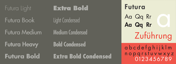
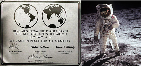
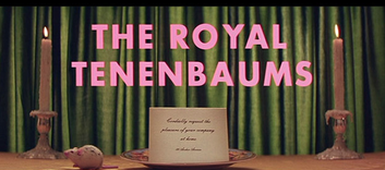
By Ashlyn Harrop  When thinking of the vast amount of typefaces that have been produced over the last century, we often first recall the ones that have remained timeless even amidst the different design movements. For many designers and people alike, Futura, a sans serif typeface, is first on the list when choosing a typeface for a design. The most common characteristics of Futura include it’s low crossbar, pointed apex, ascenders that rise above the ascender line, mono-weight strokes, crossbars that have an extended width, circular counter-space, center of the letters that extend to the baseline, and terminals that cut-off. Futura has remained popular over the past century because of it’s modern look and readability. Created by German type designer, Paul Renner, in 1924, Futura was the first typeface of its time to combine geometric and old style figures into one face. This was a typographic style many type designers was striving to achieve during this time. Although Renner didn’t attend the Bauhaus School of Design like many other prominent designers, Futura was greatly inspired by the modern design style of the Bauhaus movement. After a few years of meticulously altering the letterforms of this typeface, Renner commissioned the Bauer type foundry in 1927. The face was commercially released in light, regular, and bold weights. It wasn’t until 1930 that the type family grew to include semi-bold, bold condensed, light oblique, and regular oblique, with a book weight added in 1932. As of current, the Futura family now includes over 20 faces in total. Interestingly enough, the face was originally intended only to be used for the body text in books. Today was see Futura highly used in advertising. In 1969, Futura was chosen as the typeface to be on the commemorative plaque that was left on the moon by the astronauts of Apollo 11. Since then, Futura has been most popularly connected to brands such as Volkswagen, Ikea, Dominos Pizza, Absolut Vodka, Louis Vuitton, Best Buy, Red Bull, Union Pacific, Costco, and films by Wes Anderson and Stanley Kubrick.
3 Comments
Yiao Zhang
12/3/2015 07:21:57 pm
I love Futura so much, it always be first choice while I need type some thing even though sometime they are not very work when the type size gets smaller, but I still like its structure and static position. I learned a lot about its history and have a better understanding about this typeface .
Reply
Isabel Cervantes
12/3/2015 09:41:15 pm
This was a very interesting post. I didn't think of typefaces as something that has a history and was developed carefully. I think its interesting the importance placed on who chooses to use the typeface. I imagine that if something I designed was chosen to be on a place like the moon that would be a pretty big deal but I had just ever imagined that before!
Reply
Meaghan
12/3/2015 09:41:53 pm
Hi Ashlyn!
Reply
Your comment will be posted after it is approved.
Leave a Reply. |
Categories
All
|

