|
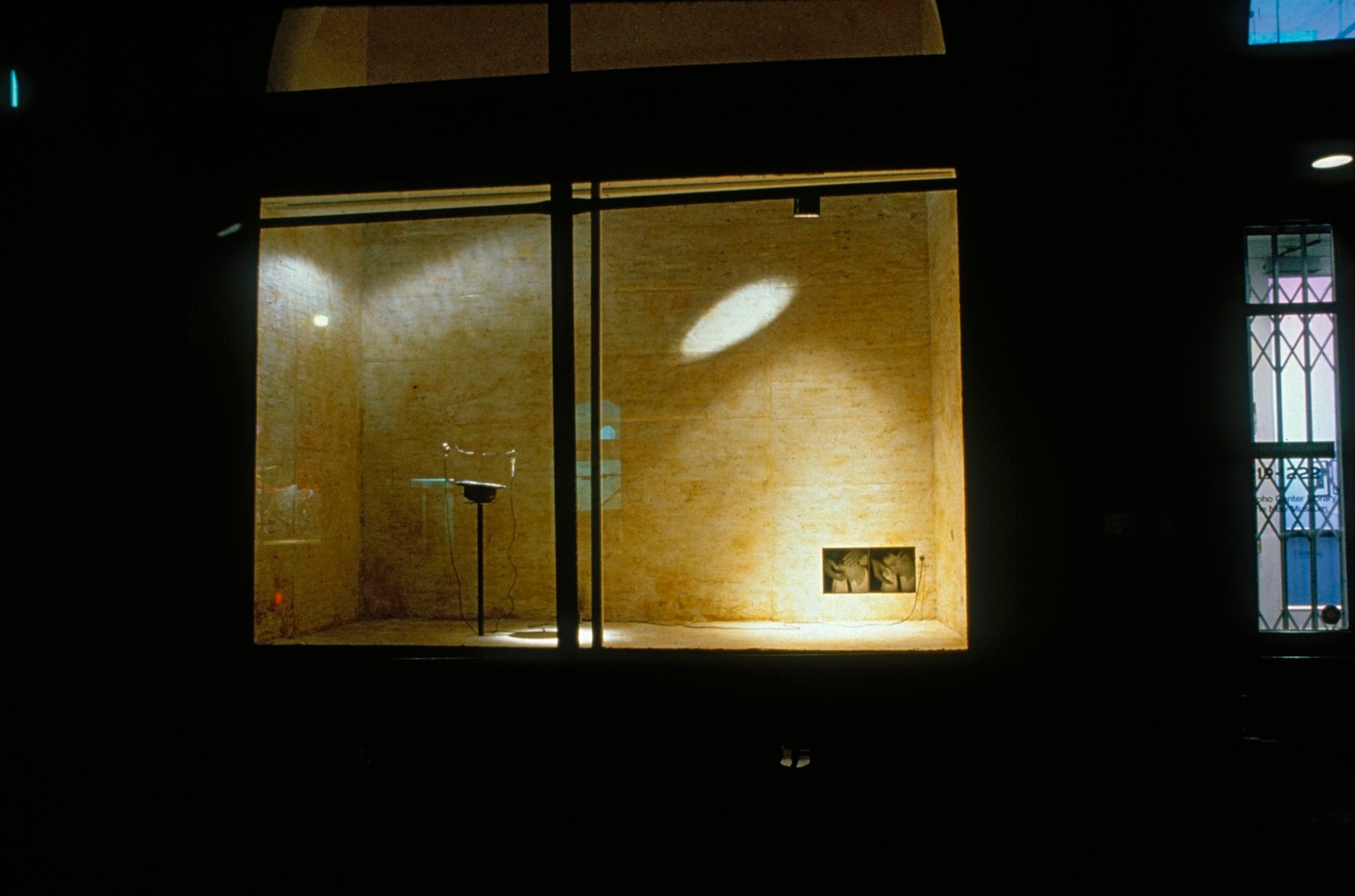
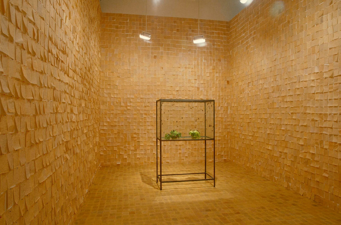
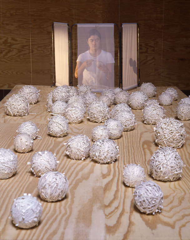
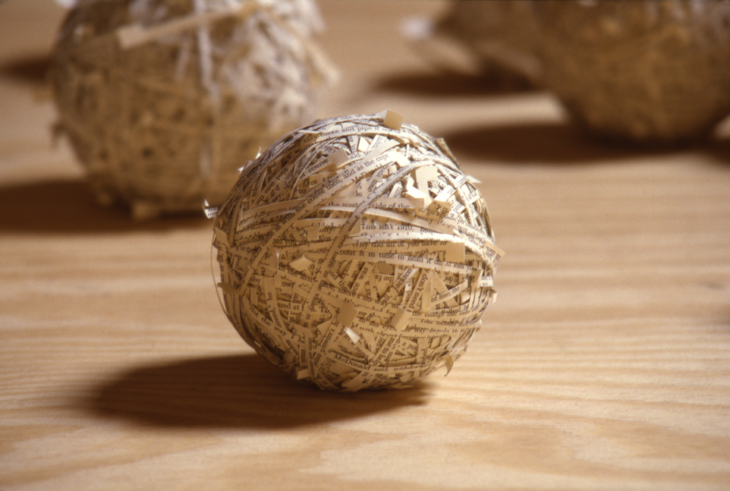
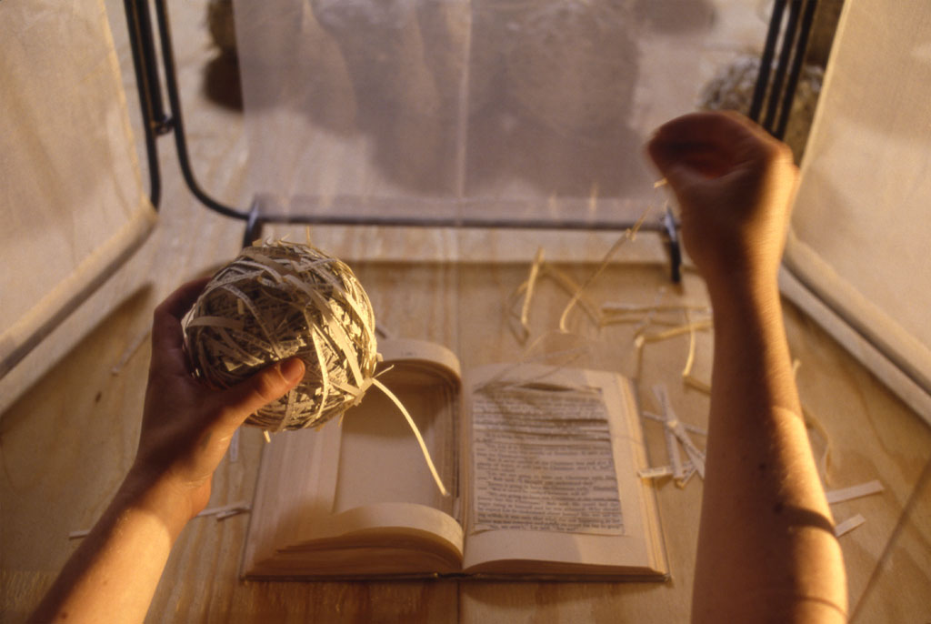
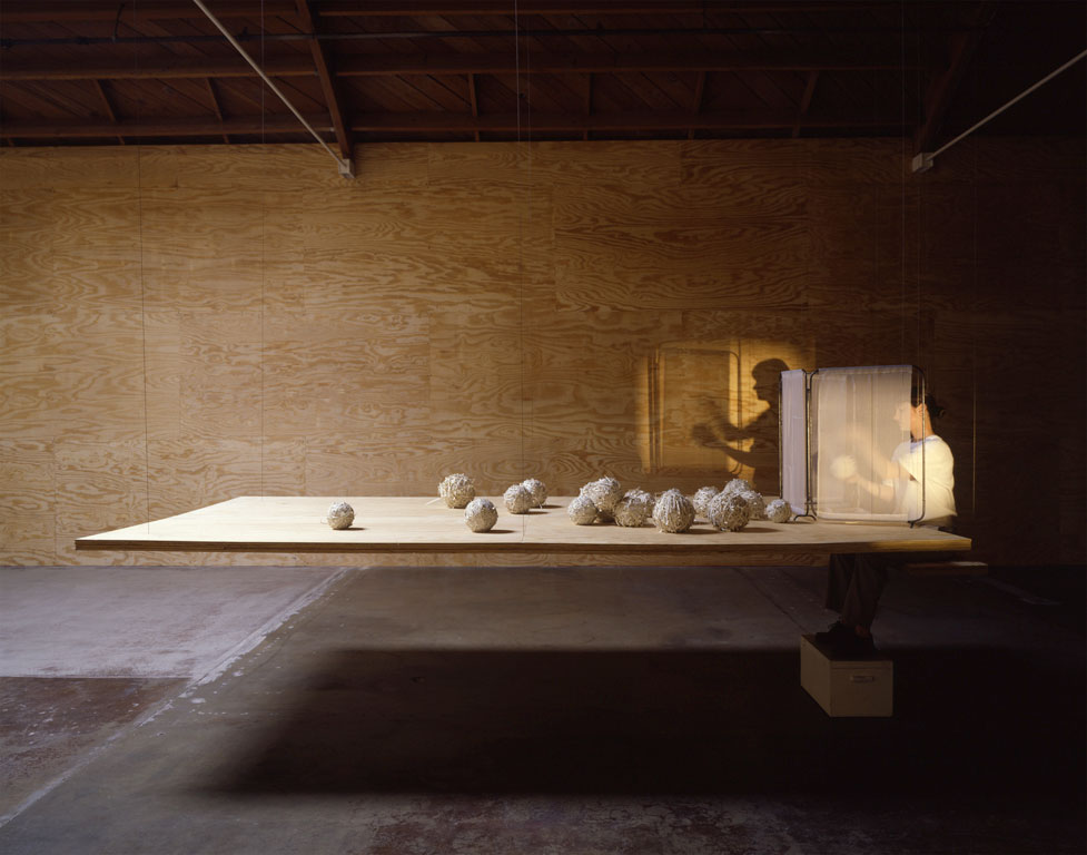
Isabelle Walek On June 22, 1956 Ann Hamilton was born. She was raised in Ohio and still lives there today with her husband, Michael Mercil, who is an artist as well. She graduated with a degree in textile design at the University of Kansas and an MFA in sculpture at Yale. She began to grow as a visual artist in the 1980’s and is known for her large-scale multimedia installations. She has also taught in the art department in California and in Ohio. Through her life she became fascinated with reading, the relationship between things, photography, and performance. "I read a lot of books. The reading is not only to gather information but looking for the way a thing is said. I don't have a studio. Reading is my main process when I'm not on site on a project” Ann Hamilton told Hunter Drohojowska-Philp. These elements that struck her interest, along with the talents from her degree, made her the wide ranged artist she is today. In 1989, Ann Hamilton collaborated with Kathryn Clark for an installation called palimpsest, which was part of the larger exhibition “Strange Attractors: Signs of Chaos." The installation was created in two part, in two different rooms in the exhibition. In a display window facing outside The New Museum of Contemporary Art, the first display of palimpsest was shown. The walls were covered with block-printed texts that used shoe polish as ink. In the center, a tall stool was placed under a broken wire and a felt hat sat on the stool covered in beeswax and graphite. In the second room inside, the air was turned on high and the smell of the beeswax filled up the room. Covering the walls were small pieces of newsprint with memories written on them. With the air on high, these pieces of paper shook and fluttered. In the center of the room was a display case with 2 cabbages inside, slowing being eaten by snails. This installation was intended to show the visitors the loss of memory and the memories we experience. In the summer of 1994, at the Ruth Bloom Gallery in Santa Monica, California, Ann Hamilton came out with a book series. Her performance piece, lineament, consisted only of plywood walls, a seat, table, light projector, and a woman cutting strips of text out of a prepared book and winding them, creating a ball of text. In front of the woman lays all of the balls of text on the table and the book she is cutting from. These balls turned into unfinished letters. “The piece aimed to link the process of breaking text and making it into a textile” (Drohojowska-Philp). This shows the process of an artist and the visitor can see the process through her silhouette on the wall from the projector. Before the installation, Ann Hamilton pre-cut the pages of the books into strips so they can just be torn out and balled together more easily during the installation. The act of destroying about 40 books to create something new is a bold statement; watching her do this over and over again enhances the meaning of it into something much greater. Today, Ann Hamilton continues to share her talents today. Her most recent project, Side by Side, was shown at the Contemporary Textile Art Biennial in Guimarães, Portugal in 2018. Not only does she live for telling stories, but she aches to hear the stories of those that she crosses paths with. Bibliographies:
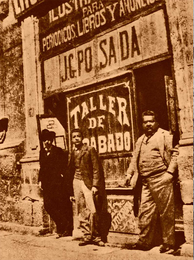
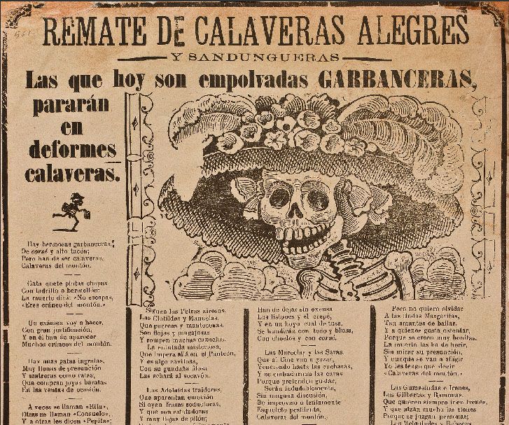
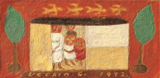
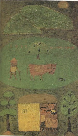
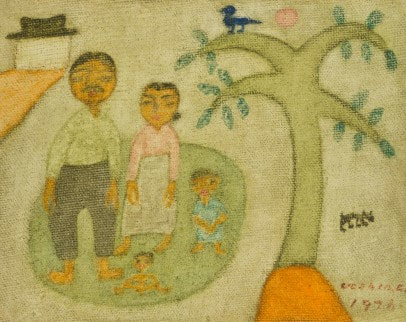
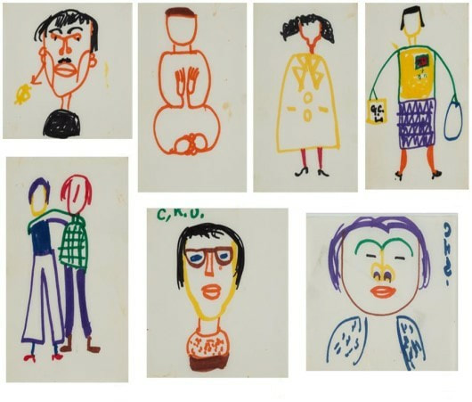
Ann Hamilton studio. Web. 8 April 2019. https://www.annhamiltonstudio.com/projects/projects.html "Ann Hamilton and Kathryn Clark: palimpsest." New Museum, 1989. Web. 8 April 2019. https://archive.newmuseum.org/exhibitions/2323 "Ann Hamilton." Art21. Web. 8 April 2019. https://art21.org/artist/ann-hamilton/ Drohojowska-Philp, Hunter. "ART : It Ain't Needlepoint : Ann Hamilton does old-fashioned women's work--ironing, weaving and knitting. But, if you're expecting Home Ec 101 from her installations, you'd better get out of the gallery." Los Angeles Times, 19 June 1994. Web. 8 April 2019. https://www.latimes.com/archives/la-xpm-1994-06-19-ca-5936-story.html Francisco Garcia José Guadalupe Posada Aguilar was a Mexican political printmaker, engraver and a cartoonist when photo-mechanical technology was at its beginning stages. He was born in Aguascalientes Mexico, February 2, 1852 and died in January 20, 1913. His life can be divided into three stages: Aguascalientes 1852-1872; León 1872-1889 (with 1888 as a year of transition), Mexico City 1889-1913. His work has influenced many Latin American artist because of his political messages and social engagement. He created art work with skulls also known as “calaveras”, and bones to make political and cultural critiques. Amongst his famous works one that is well known is the infamous “La Catrina”. Some of the Artist and muralist that he influenced amongst Mexico were Diego Rivera, Alfaro Siqueiros, Jose Clemente Orozco, Frida Kahlo and Jean Charlot. In 1925 Charlot wrote a “Revista de Revistas” article. Charlot thought the art of José Posada, was connective to Mexico’s history and influential to the modern Mexican art movement. Charlot had a working relationship with one of the most important muralist in Mexico which was Diego Rivera. I believe it is worth mentioning that Jean Charot painted a mural in the administration building at the time (1951), at Arizona State College (ASU) named “Hopi Snare Dance and Preparing Anti-Venom Serum”it measures 25 x 25 feet. One of the key publications that highlighted Jose Posada was “Mexican Folkways” which was a Mexico City based magazine published from 1925-1937. The magazine was in Spanish and English and founder/publisher was Frances Toor. Jean Charlot was also her art editor from 1924-1926 and Diego Rivera, became the magazine's art editor in 1926. In the 1928 edition, with cover art by Rivera, the first significant article about José Guadalupe Posada appeared to have been written by Frances Toor. Another great legacy that Jose Posada left was the inspiration to the creation of the “Taller Editorial de Gráfica” (Popularthe Printmaking workshop) which was founded in 1937 by a group of artists who had supported the goals of the Mexican Revolution. Its founders built off a rich tradition of printmaking in Mexico, particularly the legacy of Jose Posada.Additionally, the community of artists in which they associated and collaborated would have an influence on Posada’s growing notoriety thus, begins the resurrection of Posada in the 1920s after his death. Many of the Mexican Muralist that rose out of the Mexican Revolution were inspired by the works of Posada. Some of the muralist traveled to different parts of the world such as Europe, South America, and America and created works with the same revolutionary spirit. During the Franklin Roosevelt the New Deal was made to cultivate the U.S. economic health and one of the important pieces was to promote arts and culture. Diego Rivera and Frida Kahlo were amongst the first artist from Mexico to be invited and create art works in the country. Diego Rivera created murals for the Rockefeller Center in New York, The Art Institute in San Francisco, and Detroit Institute of Arts Museum in Michigan to name a few. Alfaro Siqueiros was also invited also created political murals in California in what we know as the “Placita Olvera” on Olvera St in Downtown Los Angeles. The mural he created was named “America Tropicana” which was controversial at the time and was white washed. That mural was one of the murals that inspired muralist during the Chicano Renaissance in the 1960’s. Leading the biggest Mexican American art movements in U.S. history. Many of the artist that came from the Chicano Art movement were creating printmaking, public artwork, paintings, sculptures, photographs, political posters, for social justice. It is amazing to me to see the influence and impact that someone's art can have generations to come. Work cite: https://www.posada-art-foundation.com/about-posada https://www.writework.com/essay/jose-guadalupe-posada https://jeancharlot.org/writings-on-jc/1990_karen-thompson_jc-artist-scholar.html 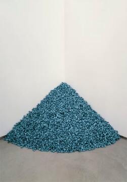 Neya Salazar Felix González-Torres was a Cuban gay visual artist often working with minimalism and audience participation for installations. Themes within his work include the passing of time, time’s effects on human relationships, and overall his lived experience as a gay man during the AIDS crisis. Living with AIDS at the time was seen as a guaranteed death, and Torres successfully captured the feeling of fleeting time and death in his work. In his untitled candy portrait series, Torres displays a mound of candy pieces that is the weight of loved ones. Two of which are of his lover, Ross Laycock. The purpose is for museum goers to pass by and take candy, until the pile dwindles to nothing. This can be read as the slow, steady effects of AIDS perishing the body, and the absence of one’s body and memories over time. Additionally, the act of being able to enjoy the candy and throw it away is representative of the queer community during AIDS crisis. Being aware and ignoring the issue led to death; the audience has responsibility of this when taking the candy. Torres had another piece inspired by his lover Ross. “Untitled (Perfect Lovers)” (1991) features two standard clocks next to each other, eventually ticking out of sync, with one’s batteries eventually dying first. This again is a reflection of death and the passage of time. The clocks are in sync at first and for a while, but malfunction (death) is inevitable. As much as Felix González-Torres’ work can be seen as reminders of death, it may also be reminders of life. Ideas of regeneration and the cycle of life come into play when these pieces that “die” are given life again; the candy is replenished, the clocks are fixed, etc. 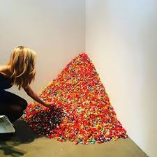 One of his most notable pieces was “Untitled” (1991), which were billboards installed across New York City. It featured a black and white photo of an empty bed, impressions of someone who lied in it still present. This was a visual representation of the loss of his partner. The choice to make public art makes the art world more accessible, by not limiting it by class and who can afford to see it. It was placed throughout places like Manhattan, Brooklyn, and Queens, ultimately reaching a diverse audience.It also brings to light the issues surrounding the image and prompt questions to the viewer. Its lack of text and color forces it to stand out among advertisements usually seen on billboards. Whose bed is this? Why is it here? Why is it empty? Its quiet, minimalist nature feels foreign in a bustling city. It is a screenshot of intimacy. To conclude, Felix González-Torres work varies across mediums but remains simple, clean, and thoughtful. He documents time and the human relationship with life and death in his work. His pieces hold narratives that were culturally relevant at the time and even today. Discussing and documenting his experience as a gay man during the AIDS epidemic successfully through minimalistic measures rightfully has given him a place in the modern art world. González-Torres died in 1996 due to AIDS, but his memory lives on through clocks, candy, paper stacks, and more. by Miru Kim The word 'family' is so close to most people's lives. When people think their family, their heart become warm. Sometimes people feel a sense of incomprehensibility, but there are special feeling that only through family members can feel. It is a love that can not be felt by others, even though it is love, pain, or conflict. When people watch family movies, they are touched by the movies as if they're seeing their own stories. Like the same as family movies, when people see family paintings, they are thinking and imaging the painting as their own family paintings. The family-themed painting reminds us of human affection that can not be felt in historical paintings, still-life paintings, and landscape paintings. Ucchin Chang is regarded as a painter who painted a lot of family motifs in modern Korea. The theme of the family is a work created by contemporary Korean painters who worked with Ucchin. As a result of the Korean War, there was a social atmosphere in which the centrality of the family spread, but for some painters, the family itself was a force that led to life and art. It is also related to this social background that his theme is family. The family was the source of life and the source of creative inspiration for him. In view of the amount of work and the contents of the work, it is rare for painters to express family paintings close to life as much as him. While there are many pictures of his paintings remaining untitled, there are still some works named "A Family Portrait" (family tree), which shows his unmistakable affection for his family. Ucchin Chang, A Family Portrait, 7.5x14.8cm, 1972 The theme of the family is also seen in the painting of Ucchin's <Village> painted in 1957. Most of the material that Ucchin liked to appear in this painting which corresponds to the early works. The sun, mountains, trees, birds, cows, and dogs were portrayed as a family. The man with a mustache who looks like an artist himself and the family living in a crowded house in the lower part of the house are living peacefully and peacefully with animals expressing intimately. Ucchin Chang, Village, 40.5×27.5cm, 1957 In 1976, "The Family" painted the family members outside the house. This painting features a screen composition and a simple expressive technique. It is a work of simplicity that comes from an unconventional composition rather than a formative inquiry that pursues a strong color contrast or a simple screen composition. Above all, on a special occasion, a composition makes a nostalgia, just like taking a memorial photo away from home. Ucchin Chang, The Family, 13.7x17cm, 1976 In addition to the oil paintings that are considered as representative works of the family series, there are drawings that can find the love of Urchin's family. It is freehand drawing regardless of forms and materials. In 1972, when people see simple drawings of a family member drawn by a magic marker, people can feel the unfamiliar appearance of him. The drawing shows his view toward his family as a father rather than a painter. These drawings show simple, candid and warm wit for his family. Ucchin Chang, drawings, 1972 Although the drawing took a short time to draw, it expresses only the characteristics of family members with a simple and clear line. It is a drawing that shows the intuition and painting characteristics of him. Freedom that is not tied to a particular material has transformed the magic marker into a material that expresses rich colors and vibrant paintings. The work attitude of Ucchin, who was alert to fixation in a certain frame when painting, overlaps with the attitude of life that has tried to have a more flexible and free mind. Whenever I see Ucchin's family series, I think of my father who died seven years ago. Father always showed mercy and infinite love to his family, but he always had responsibility. I can not feel my father's love directly from him now, but I am comforted by the words and paintings that Ucchin did. Ucchin Chang, a painter, said, "I love my family more than anyone else. The fact that love is understood through painting is different from the others. " But now I know that Jang 's family love is not different from our family love. His painting is a language of love that anyone can understand. References:
- Chang Ucchin Museum of Art Yangju City (2014), Chang Ucchin, p.66, p.67, p.75 - http://www.yangju.go.kr/changucchin/ - https://terms.naver.com/entry.nhn?docId=3576993&cid=58862&categoryId=58878 By Cassandra Contreras The 16th century was known as the century of great herbals when the dedicated study of herbalism flourished. This allowed for many books to be created based on fieldwork and scientific fact. At around 1507, a German physician and botanist, Leonhart Fuchs, began his greatest work, unbeknownst at the time, that would take 35 years to make and it would make him known as “The Third of the German Fathers of Botany (Glasgow, 2002).” During his 35-year span of research, he studied about 497 plants, jotting down their uses, descriptions, and medicinal purposes as well as borrowing research from previous herbals. During this time, Fuchs also grew all of these plants in his own garden, which allowed him to first-hand observe them. This let him create the most accurate drawings of these plants that anyone had ever seen before. Before his first-hand observation, a lot of illustrations of plants in herbals were inaccurate due to people using the same images for various plants or mislabeling them since a lot of people had never actually seen them. In 1542, Fuchs research was published in Basel, Switzerland by Michael Isingrin as the Historia Stirpium Commentarii Insignes (Notable Commentaries on the History of Plants). An herbal of 896 pages which contained over 511 woodcut illustrations that were illustrated by Albercht Meyer, the illustrations were transferred to woodblocks by Heinrich Füllmaurer, and they were cut and printed by Rudolph Speckle. The book was first published in Latin and Greek, but it was quickly published to German. “During Fuchs' lifetime, the herbal and its various abridgments went through 39 printings in Latin, German, French, Spanish, and Dutch (Stanford University Press, n.d).” It wasn’t until 20 years after he died that it was finally published in English. All of the plants in all editions are organized alphabetically by their Greek names. This book brought a lot of firsts for its time. It became known as the best-illustrated book of all time by the Stanford University Press, it is regarded as the most beautiful of all printed herbals, and it is the most accurate for identification purposes. It is the very first book to ever publish about plants from the Americas like pumpkin, maize, marigold, potatoes, tobacco, and chili peppers were described for the first time in this book. It is also the very first book to illustrate over 100 species of plants for the first time and the first to include portraits of both the author and the illustrators. Later on, a smaller pocket-sized version of this book was created to improve on the identification of plants out in the field. As of today, there are only 150 surviving copies, where 54 of them are hand-colored copies of the first edition and 2 of them are a handsome boxed set. The last recorded book to be sold was in 1997 and it was sold for $17,000. Both the University of Cambridge’s Digital Library and the Smithsonian Library provide a digital copy of this book to the public. These digital copies show the beauty of both books in two forms. The University of Cambridge’s copy is a hand painted copy of the book that was donated by King George I, while the Smithsonian’s copy is a regular copy that has not been hand painted.
References
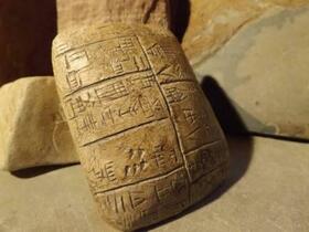
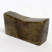
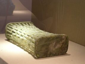
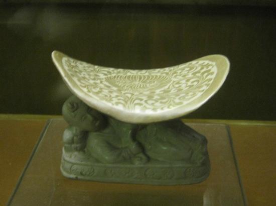
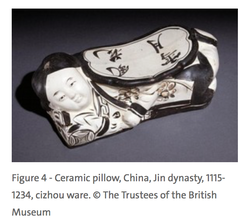
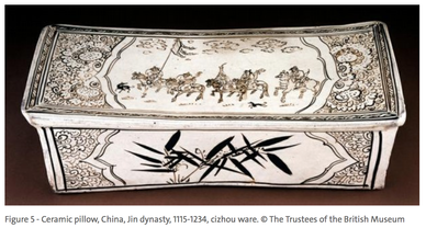
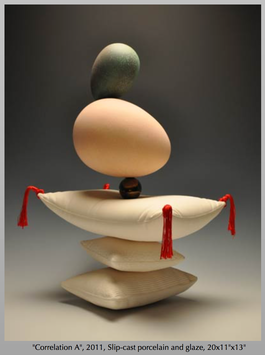
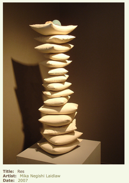
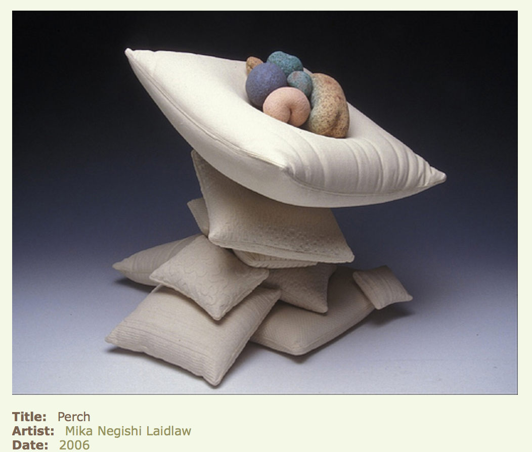
Erin Kuhn This research is formulated around the narration of pillows, the historical materials used in it’s aesthetic make-up, and how it has been conceptualized in the contemporary art world today. Though the pillow is used as a universal comforting object, the history of pillows and its cultural differences may shock you. We can find the oldest pillows date back to around 7,000 BC in ancient Mesopotamia. Made of stone the pillow becomes anything, but comforting compared to our fluffy pillows today (inspired after the Greeks and Romans). Though they might have kept the bugs away, the idea of sleeping on a cold stone seems torturous, depending on how tired you are. In Egypt they were made out of wood, carved with hieroglyphics, and illustrated with depictions of gods to keep away bad spirits. In China they used many different materials from wood, jade bamboo and ceramic. The different materials were believed to hold some healing effect upon the sleeper. Jade’s hard surface was used to heighten the sleepers intellect. Where soft pillows were believed to steal a person’s energy from them. Ceramic pillows take further consideration into aesthetics. The ornate figures and forms holding up the structure was used as a symbol to portray a person’s status. China painting was used to decorate and illustrate the forms further. This ceramic pillow, from the Jin Dynasty, illustrates a poem. ‘The wind rustles flowers under a snow white moon’. The decoration was clearly meant to be seen and discussed, even though placed in an intimate and private area.Most of the ceramic pillows from this era were of lounging women. Never would a man be caught lounging This cizhou ceramic pillow was illustrated in a manner the appropriated the domesticated gender rolls. It’s this specific narration of the pillows that I am focused on in my research. A woman owned this pillow to remind them of their maternal roll in the bedroom. The pillow being associated with a women and a feminist views on contemporary culture today. The activities of a woman’s marital role has change in the past hundred years. Even the maternal expectations of a young women getting pregnant has changes. All of these topics of conversations were once pointedly illustrated on these ceramic pillows. Though the feminist research of pillows related to a feminist identity is a continuation of my work it is still something I am learning about. This current research leads me into talking about, the context behind the body of a pillow used in other artist working in the contemporary arts. . Mika Negishi Laidlaw is a Japanese, artist who specializes in complex ceramics. Her ceramic pillows capture a surreal weightlessness to the physical body of the material and form. The contradiction to our minds eye. Her work primarily centers around this idea of “Unconditional Love” and “Memory of Cells”. The time she had spent nurturing and caring for her children is a strong relations to the form and figure of her work. These ceramic pillows balancing onto of each other and embracing these colorful organic forms clearly demonstrates this. I wonder if Mika realizes that the historical background of the chinese ceramic pillows has a strong relationship to her current work. In that the ceramic pillow was used to illustrate a woman’s nurturing maternal role.
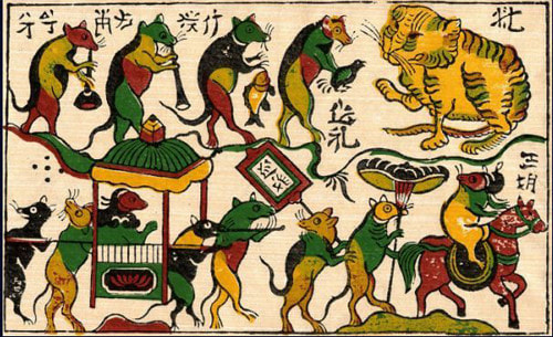
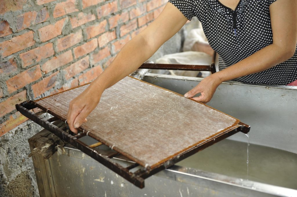
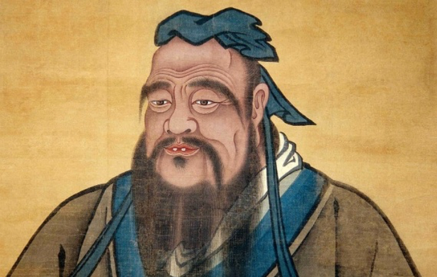
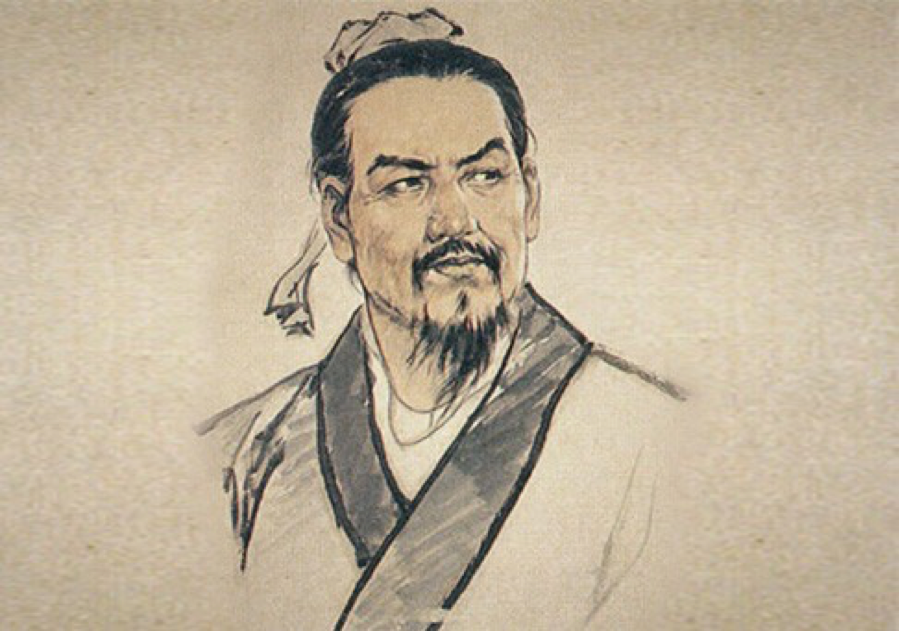
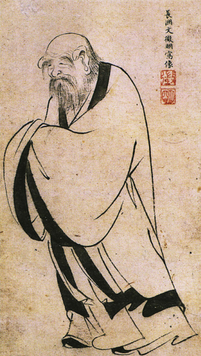
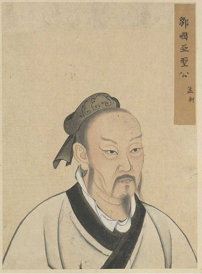
By Ren Ta Dó paper is Vietnamese traditional hand-made paper that first presented itself to Vietnam in the 3rd century; however, its origins began in the 13th century. It is a resilient, chemical-free paper, that is so durable, it could last up to 800 years. This type of paper was commonly used in Vietnamese folk art, with such artists like the legendary painter Dong Ho as a user of this paper. Since the rapid industrialization and urbanization that has been continually occurring in Vietnam, the craft of traditional paper making has halted. The lack of desire for this process of papermaking has created a project to inform the community about the art of this paper. The Zo project has really brought back the cultural dynamics of papermaking and informed many on the ethnical ties that this paper has to the Vietnamese culture. Dó paper is made from the bark of the Rhamnoneuron balansae tree, which the Vietnamese call the Dó tree found in the Northern parts of Vietnam. Behind the paper itself, there is a process of over 100 steps to get it to be the paper that it is. However, the modern day process has made it attainable within ten steps. Since this process is made of all raw material, those materials have to be collected, harvested, and steamed. After that, the bark of the Dó tree is boiled with a 12% lime solution and continuously mixed. From there, the bark is then beaten by an oak stick so that the fibers could be loosened. Onwards, the pulp from the beating, water, and "mo" are throughly stirred into a mixture, in which the mixture would be shaken back and forth evenly on a bamboo screen (liềm seo). The water from the pulp would then be drained and repeated for a desired thickness. Finally, the water should be all pressed out, sheets should be stripped apart, and left to dry out in the sun. The paper could also be colored by fresh plants as well. Now-a-days, the Dó paper is at risk of extinction. Modern day urbanization and the shortage of Dó sets back the already so rare production of Dó paper. On top of that, Dó paper is only seasonally produced because it is only good to harvest in between August and October when the bark strips itself away from the tree. What once used to employ a whole village of people is now the labor of only two important families that are willing to keep the tradition of heritage alive, Mr. Pham Van Tam and Mrs. Nguyen Thi Huong being one of those families have more than 20 varieties of Dó paper in their store. They reside in the Bac Ninh province, famously known as Phong Khe village. This village is now being taken over for industrial paper production, resulting in the lessening of Dó paper. Dong Ho painting called "Rat Wedding" His traditional folk paintings usually include every-day activities and farmers religious routines painted on Dó paper. Dó paper being flattened out by shaking back and forth on the bamboo screen. Citations. 1. http://zopaper.com/do-paper-making-process/ 2. https://www.vietnamonline.com/culture/dong-ho-paintings.html 3. http://www.bbc.com/travel/story/20160817-the-handmade-paper-that-lasts-800-years 4. https://english.vietnamnet.vn/fms/art-entertainment/159872/stories-behind-vietnam-s-traditional-do-paper.html 5. http://zopaper.com/general-informations-on-do-paper/ 6. http://zopaper.com/do-paper-made-by-phong-khe-village/ Qingyun Zou The five major philosophical schools in ancient China 1. Confucianism Confucianism is the most influential school in ancient China. As a manifestation of the inherent value system of China, Confucianism is not an academic or a school in the usual sense. Confucianism has a profound influence on Chinese culture. For thousands of years, the society has taught the four books and the Five Classics. The traditional sense of responsibility, moderation, and loyalty and filial piety are the result of the combination of Confucianism and authoritarian rule. Therefore, Confucianism is the mainstream thought along with the contemporary. 2. Legalist The Legalist is a political spokesperson for civilians during the Warring States Period. As a major faction, they have put forward the ideas and concepts of the rule of law that still have far-reaching influence. This is easy to see that they pay great attention to the legal system and the law, using law as a kind of compulsory tool for organizing social rule. These ideas embodying the construction of the legal system, have been used until now, and have become the main ruling means for the centralists to stabilize social unrest. The birth of contemporary Chinese law is influenced by the thought of Legalism. The legalist, cultural, and moral constraints of a country are still very strong, and the impact on the modern legal system is also profound. 3.Taoist In the Spring and Autumn Period time, Laozi gathered the wisdom of the ancient sages. Taoist sums up the essence of ancient Taoist thoughts and forms a moral theory of "doing nothing for nothing", which indicates that Taoist thought has been formally formed. Taoism takes "Tao" as the core, believes that Heaven and Taoism is inaction, advocates Taoism and nature, and proposes political and military strategies such as inaction, female protects male, use softness to fight with doughty. It is one of the most important philosophical schools in China is in the cultural fields of China and has a tremendous impact on the culture of China and the world. A large number of Chinese and foreign scholars have begun to notice and draw on the positive thoughts of Taoism. Therefore, scholars say: "Taoism can be seen as a great product of the Chinese nation. It is the center of national thought, and there are many people who see it as a benevolent person. It is said that the people use it without knowing the temperament." 4. Mohist The main ideas of the Mohist School are: equal love among people, opposition to war of aggression, promotion of thrifty, inherit the cultural wealth of predecessors, master the natural law and so on. Because of the unique political attributes of the Mohist thought, and the official and collusive policies of the Western Han Dynasty Emperor Wu of the Han Dynasty, "the slogan of the unique Confucianism", the Mohist family was constantly suppressed and gradually lost the realistic foundation of the existence of the Mohist thoughts; At the end of the Qing Dynasty and the early Republic of China, scholars re-excavated the Mohist family from the pile of paper, and found its progressiveness. In recent years, through the efforts of many new ink-makers, the Mohist theory has recovered, and it has shown its potential for progress. 5.Military The military family is a school that studied military theory in China in the early Qin and early Han dynasties and engaged in military activities. It is the essence of the ancient Han military thought. One of the hundred families. According to the "Han·Yi Wen Zhi" records, the military family is divided into four categories: military power, military situation, soldiers, yin and yang, and military skill. Representatives of the military family include Sun Wu and Sima Yi in the Spring and Autumn Period, Sun Wei, Wu Qi, Yan, Zhao Lux, Bai Qi, Han Liang, Zhang Han, Han Xin, etc. Today, there are military books such as "The Art of War", "Sun Bing's Art of War", "Wu Zi", "Six ", "Xunzi" and so on. The military family's works are rich in naive materialism and dialectic thinking. Sophistry, or debate itself, is a methodology. More precisely, the debate is a method of argumentation. Its fundamental feature is a distorted argument. The sophistry is different from arbitrary and rumors. There is no reason at all for arbitrariness. People treat it as a strong word; rumors are made out of nothing, sounds malicious. However, when being argued about its truth, it always needs a lot of "bases" to prove it. So, it can always confuse people. Famous Debate Stories:
You Are Not a Fish Zhuangzi and his friend Hui Shi walked on a bridge in Surabaya. Zhuangzi looked at the squid in the water and said, "The squid is leisurely in the water. This is the joy of the fish." Keiko said: "You are not a fish, how do you know the happiness of the fish?" Zhuangzi said: "You are not me, how do you know that I don't know the happiness of the fish?" Keiko said: "I am not you, I didn't know you. You are not a fish. You don't know the happiness of the fish. It is completely OK." Zhuangzi said: "Please return to the topic we started. You said: 'Where do you know the happiness of the fish', etc., I already know that I know the joy of the fish and ask me, I know it on the banks of the Lishui River. " White Horse is not a Horse (sophistry) Guest: Can you say that white horse is not a horse? Gong Sunlong: Yes. Guest: Why? Gong Sunlong: "Horse" is the regulation of the "shape" of the object, and "White Horse" is the regulation of the "color" of the horse. The regulations on the "color" and the prescriptiveness on the "shape" are obviously different. Therefore, the result of different regulations on different concepts, white horse and horse are also different. Guest: Here is a white horse. It cannot be said that no horse is here. Since it can't be said that there is no horse, then isn't the white horse a horse? Since there are white horses called horses, why are white horses not horses? Gong Sunlong: If you ask for a "horse", both the yellow horse and the black horse can meet the requirements; if you ask for a "white horse", the yellow horse and the black horse cannot meet the requirements. If the white horse is a horse, then asking for a horse is exactly the same as asking for a white horse. However, if there is no difference between asking for a horse and asking for a white horse, then why do yellow horses and black horses sometimes agree to have horses instead of agreeing to have white horses? "Since you can promise to have a horse and you can't promise a white horse." This clearly shows that asking for a "horse" is completely different from asking for a "white horse." Therefore, the same yellow horse or black horse can promise to have a horse, and can not promise a white horse. "This is to say that the original "White Horse is a horse" hypothesis cannot be established." Therefore, "white horse is different from horse" is a clear truth. Guest: As you can see, it is different from a horse to have a color. But there are no colorless horses in the world. So, can you say that horses with colors in the world are not horses? Gong Sunlong: Ma has a color, so there is a white horse. If the horse has no color, there is only a "horse". How can it be called a white horse? However, the horse that stipulates that the horse is white is different from the "horse". The so-called white horse is limited to white, and the horse that is limited to white is different from the horse. Therefore, the white horse is not a horse. Guest: Ma, is a horse that is not limited by "white"; white is white that is not limited by "horse". It is certainly not possible to combine the two concepts of white and horse to define and become a new concept to call an unrestricted concept. Therefore, it is wrong to think that a white horse is not a horse. Gong Sunlong: As you can see, there are horses in the white horse, but can you say "Is there a yellow horse in the white horse?" Guest: Of course you can't say that. Gong Sunlong (the answerer again): Since acknowledging that "there is a difference between having a horse and having a yellow horse" is to distinguish the yellow horse from the horse. This means that the yellow horse is not a horse; since the yellow horse is separated from the horse Come, instead of equating the white horse with the horse, isn’t this just a bird that sinks into the water and makes it so funny in the West? This is a complete logical mess. Gong Sunlong: I think that there is no white horse to say that there is no horse. This is not to consider the "white horse" but the horse shape. However, "White Horse" is a concept of "cannot be separated" with horses. Therefore, the concept of a white horse cannot be called a horse. Therefore, what is called a "horse" is simply called a horse in the shape of a horse, but cannot be called a horse in a white horse. Therefore, the concept of a horse is not a concept of any specific colored horse. White is not limited to the whiteness of any kind of thing. The specific thing does not hinder the essence of "white" as "white", so it can be ignored. White horse is a horse limited to white. White (such as white horses) limited to specific things is different from abstract, general "white." "The same reason", "horse" is not limited to which color, so yellow horses and black horses can count; white horses are limited to white horses, yellow horses and black horses have "white horses" Different colors can't count. Therefore, only White Horse can count. "In other words, only White Horse can agree to the concept of "White Horse". Both Huang Ma and Dark Horse can't agree with the concept of "White Horse". The concept of unqualified is different from the concept of being limited. So, there is a difference between white horse and horse. Divide Strength and White I can't see the stone's strength, I can only see the white color of the stone, so "no strength". My hand can't feel the white color of the stone, it can only feel the stone's strong, so "no white"; when you see white, you can't feel its Strength, when I can't see the white, I feel strong, seeing and not seeing, and the result is separated. It is inferred that the "strength" and "white" in the "stone" cannot coexist, so they are separated from each other. Lauren Copley Art has a unique power to bring abstract scientific concepts into a tangible experience. I am interested in presenting my research and imagery from this semester as an interactive installation in which the participants learn about the topics and are then given a chance to practice what they have learned. Borrowing from examples of scientific studies and psychological art works, I plan to spend next semester building a show that is both educational and experiential. Last summer I was fortunate enough to encounter Ozge Samanci’s and Gabriel Caniglia’s You Are the Ocean in SIGGRAPH’s Art Gallery: “A participant wears an EEG (Electroencephalography) headset that measures the user’s approximate attention and meditation levels via brain waves. Through relaxation and concentration, the subject can control the water and sky.”* Controlling the landscape through brainwaves was an incredible and impactful experience, but I have since been dreaming of how much more impactful it would be to watch a real-time rendering of another’s emotional response as I attempt to empathize with them. I recently discovered Guto Requena’s Mapped Empathy, a large, CNC structure with projected light and sound that maps the heartbeats of interactors: “In each session, guests’ heartbeats are recorded in real time at the touch of a finger via sensors installed on the bench. This vital data is sent to speakers and lights that transform the architecture into a large sculpture of emotions. At the beginning of the session every individual heartbeat can be heard, and then they gradually mix and transform into a symphony driven by the vibrant pulse of life.”** The artist was inspired by the quote, “empathy is feeling with the heart of another.”** The combined concepts and techniques of You Are the Ocean and Mapped Empathy reminded me of one of my favorite studies on validation and emotional state. In a 2011 social experiment conducted by Allan Fruzzetti and Chad Shenk, participants were divided into two groups and were all given math problems that appeared easy but were actually impossible to solve. Stress levels were measured before the participants were given the problems and then after solving the problems was attempted, via EEG. As would be expected, stress levels rose as the participants became frustrated with the task. Participants in both groups were asked how they were doing by the test administrator; they generally responded to indicate frustration and anxiety. The test administrator in one group assured participants that everyone got stressed and their emotional responses were normal, while the administrator in the other group told participants that their responses were unusual and most people found the problems easy. Stress levels were measure by EEG once again: the stress of the validated group began to drop closer to the levels before the task was presented, but stress levels of the invalidated group continued to rise. Validation/empathy acted to regulate the heightened emotional state and give the stressed person the ability to be calm.***
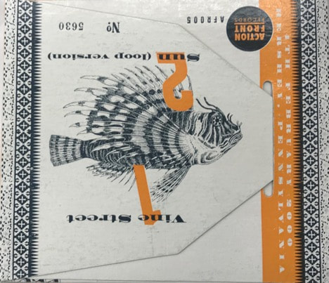
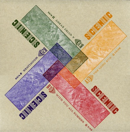
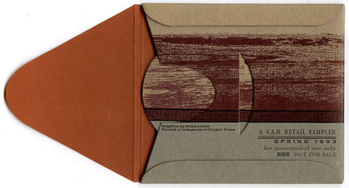
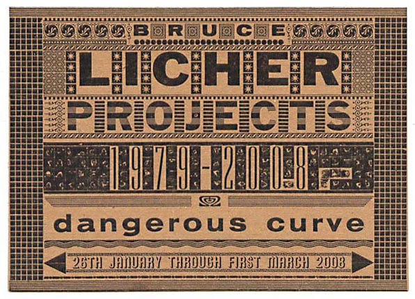
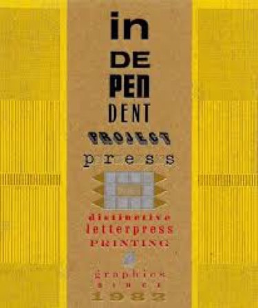
Next semester I plan to use this research as inspiration for an interactive installation that will allow participants to learn empathy and validation techniques, practice what they learned by listening to the stories of a fellow participant, and see real time renderings of how their empathy and validation (or non-empathy and invalidation) affect the emotional state of the other. * https://s2018.siggraph.org/conference/conference-overview/art-gallery/ **https://www.youtube.com/watch?v=uSkSprG138E ***https://guilfordjournals.com/doi/pdf/10.1521/jscp.2011.30.2.163?download=true Chelsey Boyle This research is focused on Bruce Licher, who is a musician, artist, entrepreneur, and designer currently based in Sedona, Arizona. Licher was originally born in Los Angeles where he attended the UCLA Fine Arts Department and studied various art forms such as film, photography, silk screen printing, and sculpture. But while his pieces often reflect the work of a graphic designer, Bruce never studied graphic design. After graduating college, he got his start in professional printing at the Women’s Graphic Center. There, he took a letterpress class learning how to create album covers for his own band SAVAGE REPUBLIC. Licher was able to combine two of his passions and from there, he turned to printing a variety of things such as postcards, record sleeves/jackets, and so on (Licher Art and Design, n.d.). He was commissioned by many bands, especially underground LA bands. Following his education at the Women’s Graphic Center, in 1982, he founded the Independent Project Press (IPR) as both a record label and art experiment. Over the years he has created album covers, postcards, promotional stamps, stationary, invitations, wine labels, promotional booklets, and much more. On several occasions, Licher has also collaborated with his wife who is a visual artist. Everything produced in the Independent Project Press is printed on the Chandler and Price Platen presses or the Vandercook 219 Power Proofing Press. The shop also contains a vintage Rosback pinhole perforator and other various antique type, ornaments, paper cutters corner rounders, and sequential numbering machines. Along with that, many projects at the Independent Project Press are created from digital files that are made into magnesium, copper, or photo-polymer plates for printing on one of the many presses. (Licher, n.d.) Bruce is well known in the letterpress community and one of the reasons he is so widely recognized as Richard Kegler says is “Bruce Licher’s Independent Project Press is a contemporary studio that has bridged technological eras and produced an unparalleled body of work. It has culled from the past while simultaneously turning it on its head with a distinct visual vocabulary that continues to influence current aesthetics” (Richard Kegler, n.d.) His graphic design and letterpress printing work has been featured “in two exhibits at the Cooper-Hewitt National Design Museum in New York City -- the "Mixing Messages: Graphic Design in Contemporary Culture" show in 1996, and the first "National Design Triennial: Design Culture Now" show in Spring of 2000” (Licher Art and Design, n.d.). While Bruce’s style has evolved over the years, his work is most well-known by the chipboard and metallic inks he prints with which has become his signature style. It is important to note that printing on chipboard is in no way consistent as it is made from recycled materials and thus every sheet may be different in shade, color, or texture. These inconsistencies with the chipboard make Licher’s trademark printing even more unique as each and every piece is truly different. (Yardumian, 2016). This approach to design and printing can be traced to the constructivists, dadaists, and most specifically to HN Werkman (Heller, 2018). For this signature design of his he has been nominated twice for a Grammy for his album packing. Lastly, while many trends go uncredited to the original artist, Bruce is recognized for starting the trend of using letterpress printing on chipboard. Heller, S. (2018, April 26). Bruce Licher: Letterpress Hero. Retrieved April 5, 2019, from https://www.printmag.com/daily-heller/bruce-licher-letterpress-hero/
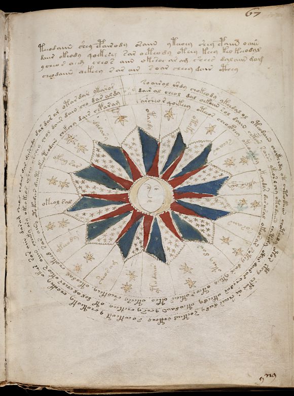
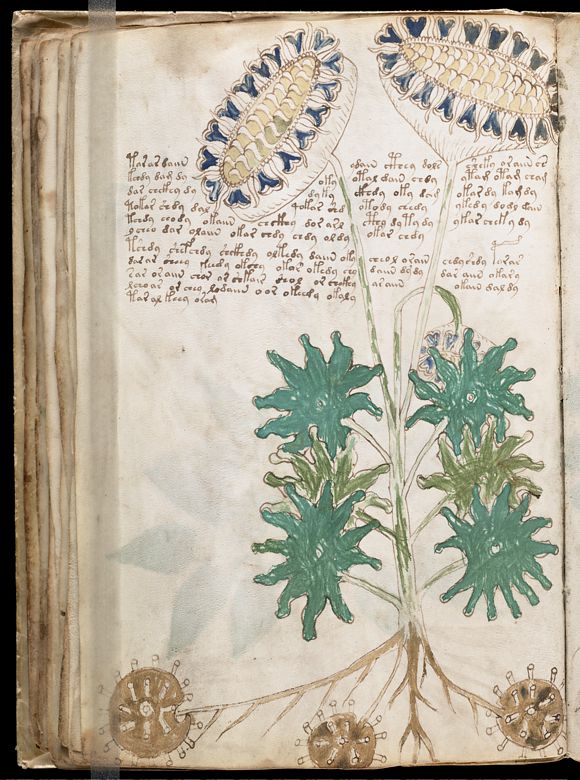
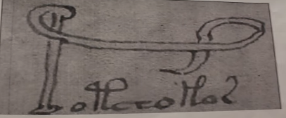
Kegler, R. (n.d.). Savage Impressions: The Book. Retrieved April 5, 2019, from https://www.kickstarter.com/projects/p22/savage-impressions-the-book Licher Art & Design. (n.d.). Retrieved April 5, 2019, from http://www.licherartanddesign.com/index.php/about/ Licher, B. (n.d.). Independent Project Press. Retrieved April 5, 2019, from https://www.independentprojectpress.com/ Raggett, N. (2013, June 24). Interview: Savage Republic’s Bruce Licher. Retrieved April 5, 2019, from http://daily.redbullmusicacademy.com/2013/06/bruce-licher-interview Yardumian, A. (2016, February 15). An Interview with Bruce Licher – Prolegomenon. Retrieved April 5, 2019, from http://www.timesquotidian.com/2016/02/15/an-interview-with-bruce-licher-prolegomenon Madison Pennisi Named after one of the book’s many owners, Wilfrid Voynich, The Voynich Manuscript is a 9x6 inch vellum codex that dates between 1404 and 1438. (1) It is partially damaged with 240 of 272 pages intact, but is otherwise in readable condition. It was hypothesized the book is a type of medicinal guide due to its illustrations of plants, zodiac charts, and various images of women bathing. This manuscript is a famous cryptography case due to its mysterious writing system, only becoming partially deciphered last year. Up until then, armature cryptographers and WW1 and WW2 code breakers have not been able to decipher the text. The text remains infamous for its many wild hypotheses: was it written by aliens or part of a government conspiracy? Or was the language was completely fabricated by its author? Guesses for its language include Latin, medieval Hebrew, Malay, Arabic, and Amharic. (2) After hundreds of years of mystery, Amet Ardic, a Canadian researcher, claims the text resembles the Turkish language from his home country and was “written in a poetic, rhythmic method called "Phonemic Orthography" which describes speech visually” (3). Working with his son, he was able to translate one of the manuscript’s many astronomical calendar pages. Months like November are roughly translated into modern Turkish as “Seper Ayi” meaning “moon of rain”. Folio 67-R depicting the 12 months as a type of astronomical calendar. Folio 33-v (which depicts two blue blooming flowers surrounded by text) was successfully translated; here are some notable portions: “…the head of the plant becomes heavy and bends its head to a side and might surprisingly split the stalk.” In the accompanying illustration, you can see a wilting flower below the right flower. “The taste of the first fruits (nuts) and the attractive appearance of the ornamented crown captivates those buying the plant and takes full control of the buyer (impressing), for even the dying person will remain impressed.” “The harvester (farmer) cuts the spikes and fills the bag and barn. The buyer weighs it and feels heart warmed (satisfied).” (4) Folio 33-V depicting three blue flowers, one of them wilted and hidden Combined “P” and “L” making a visual representation of an “eep” sound, which translates into Turkik as “rope”. The visual depiction is rope-like. The word below translates to “measurements”, meaning the whole word is “rope measurements”. However, Ardic’s research isn’t free from criticism. It is hypothesized that the manuscript draws from multiple languages, not just Turkish. Another team of Canadian researchers approached this book, this time with AI and Google Translate to help. Using a manmade computer algorithm, the researchers were able to identify 80% of the sampled manuscript pages as Hebrew. When it came time to decipher the phrases, they relied on Google Translate with some luck. However, because the text is written in some form of Medieval Hebrew, and not Modern Hebrew, there is more room for error. The goal of this study was to specifically pinpoint the code and language used in the Voynich Manuscript, not to translate the entire book. What could be translated and observed by studying the scrip’s illustrations reveals this text is most likely women’s health guide and herbiary. Major portions of the book are dedicated to illustrations of plants that have been identified as “native to or cultivated in the Mediterranean region, in particular, Italy”. (5) Though some of these illustrations have fantasy elements (the roots of the plant in folio 90-V are cats’ bodies), it can be understood that it is some sort of plant guide. The illustrations of round women bathing in green liquid leave more to the imagination, however. Citations:
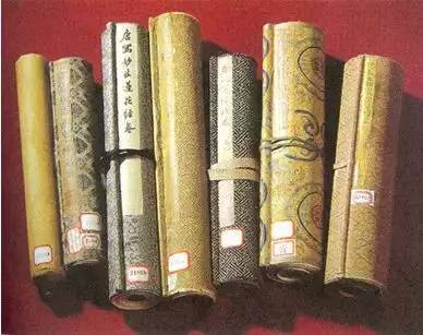
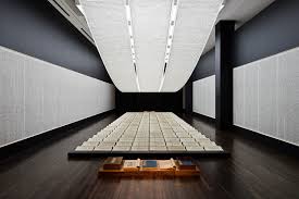
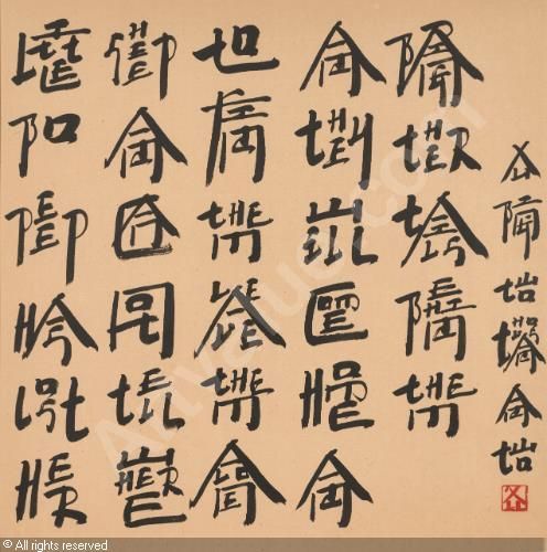
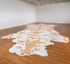
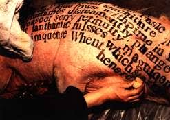
1. https://www.smithsonianmag.com/smart-news/6-things-know-about-mysterious-voynich-manuscript-180964847/ 2. https://news.nationalgeographic.com/2018/02/voynich-manuscript-cipher-code-hebrew-europe-spd/ 3. https://www.ancient-origins.net/news-history-archaeology/voynich-manuscript-code-0010859 4. http://voynich-manuskript.de/ms408/index.php?id=folexi33v 5. http://www.edithsherwood.com/voynich_botanical_plants/ Yezi Dai In this research, I would like to talk about some history of binding books in China. As is known to all, China is a country with an ancient civilization. The records of letters appeared as early as 4000 years ago. These letters revolved over a thousand years into the Chinese we use now. Printing, paper making and bindi8ng also evolved over thousands of years. Throughout the history pf the spread of Chinese characters, from oracle to the present, the way of communication has gone through many forms such as oracle bones, bronze, bamboo, silk, carving stones, rubbings, writing and printing. Among them, the oracle bones, bronze and stone carving can be seen the predecessor of books. However, they are not book and they do not have binding. Jian ce binding is the earliest binding method in the true sense of China. it is a book made of bamboo and wood with holes in it. And all the pieces were connected by ropes. The title was putted in the back of the last bamboo piece. When the Jian ce was rolling up, we can see the title above the book. This kind of binding form were used during Shang and Zhou dynasties. When the paper was made and used in the book, this binding form was replaced by other binding forms. Then, scroll binding and folded binding went into the history. Scroll binding form consists of four parts, namely, scroll, scroll, and belt. It is similar to Jian ce binding with different materials. The head of a roll is usually attached to a piece of paper or silk called "float", which is tough and unwritten. The head is then tied with a silk "band" to protect and bind the scroll. This kind of binding always used in binding drawing and writing works. Folded binding is a long scroll, along the book space, one back and one positive fold, forming a rectangular fold. The first and last two pages of hard paper binding form. It is totally different from the two binding forms I wrote before. It seems much like the books now. The ancient Buddhists, perhaps influenced by the Buddhist sutra binding from India, prefer to use the folded folder binding. Then the butterfly binding and back binding appeared. These two binding methods were similar. Butterfly binding is the predecessor of back binding. In the process of long-term reading, the connected part of folding books is often broken. After breaking, there is a situation of one page and one page, which gives people enlightenment, and gradually appears the bookbinding system with pages. It appeared in the late tang dynasty and prevailed in the song dynasty. It is a binding form in which the leaves of the book are arranged according to the middle slit, the printed side is turned in and folded in half. Then the middle slit is used to align the pages of the book, stick to another wrapping paper with paste, and finally cut into a book. When people reading these kind of books, the pages just like butterfly and this is the origin of its name. However, people found that this kind of binding will make book has many white pages. Then, they change the direction of the fold. And this kind of binding is back binding. Finally, line binding appeared. It is a binding form in which the pages are bound together with the front and back over. It used in the recent hundreds of China. I really consider the traditional bindings are so amazing and they can bring me ideas to mix them with new things. Reference: https://www.sohu.com/a/203602799_562249 https://tieba.baidu.com/p/5149657014?red_tag=1859244969 http://www.sohu.com/a/201973902_292883 A book called: 《中华印刷通史》 Sam Fresquez Xu Bing was born in Chongqing China in 1955. His mother was a librarian and his father was the head of the history department at Peking University. In 1975 the Cultural Revolution was coming to an end in China. As a part of Mao Zedong's "re-education" policy he was moved into the countryside and forced to work as a sign painter making propaganda.This experience eventually became the foundation to the work he would make. In 1977 he returned to Beijing and enrolled in the Central Academy of Fine Art to study printmaking. He earned his masters in 1987, and later in 1990, moved to the United States because of the pressure being put on artists after Tiananmen Square. He lived in the States until being appointed the new vice president of the China Central Academy of Fine Arts in 2008. Xu Bing often uses calligraphy and sculpture in his work to explore his experiences with communication. He is most known for his piece Tianshu or Book from the Sky. This installation was made of rows of hanging scrolls that filled a room. On these scrolls were over 4,000 character that he had designed to look like like Chinese text but were actually meaningless. Another piece he is known for is New English Calligraphy, a projected he started after living in the United States for four years. He designed characters that were made to look like Chinese but are actually made out of English words. He then gave lessons on how to write in these characters. When New English Calligraphy is displayed he often uses nursery rhymes to give an example. Xu Bing started his tobacco projects when he was invited to be the artist-in-residence at Duke University in 2000. He was interested in the Duke Family history which led him to tobacco. This led to a series of work using cigarettes, and tobacco. The most known of these is a tiger skin rug made from around a half a million cigarettes. Tiger-skin rugs are a symbol go human dominance. “It confirms our superiority by transforming one of nature’s fiercest predators into a lifeless skin beneath our feet.” Xu Bing also compares the way fur and skin rugs can glamorize hunting with the way smoking can often be glamorized. Other projects that were a part of this series included prints on tobacco leaves, a tree with branches made of matches, and a compressed cube of tobacco with the words “light as smoke” on the top o
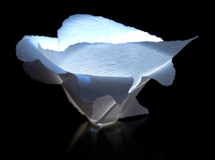
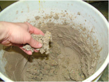
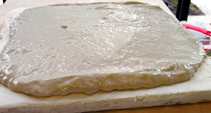
Sam Staas What is paper clay? Paper clay is “any clay with processed cellulose fibre added” (1). Paper clay can be purchased with fiber already added, or the fiber can be beaten and added to already processed slips. There are many benefits of using paper clay over regular processed clays. A few of those benefits may include overall structural strength, less changes of warping, as well as the ability for it to be pushed super thin, aiding in creating translucent porcelain. The best part, paper fiber can be added to any type of clay, earthenware, stoneware, and porcelain. But is most effective when added to porcelain due to its ability to reduce warping at such a high scale, and is used most for repair and attaching parts. To make paper clay, a cellulose fiber is required. Most paper fibers will work just fine. Recycled paper such as newspaper and regular printer paper can be used, even purchasing a sheet of cotton linter or already processed fiber works just as well. One advantage of using purchased cotton linter is the lack of printer ink or dye that may be added to recycled papers, they also do not rot the clay as fast. Since fiber is a natural material, rotting can/will occur. Using types of paper such as toilet paper will result in rotting of the clay in as little as a couple hours, this is due to the starch that is added to toilet paper, with promotes the growth of mold. Although, the mold can be killed with a small amount of bleach added to the mix. It has been recommend to use spay insulation due to its strength, and due to the way it is sold, it will help cut down on time that would be required to break down the fiber yourself. (2) Although, these cellulose fibers that are within spray insulation contain borax and boron, which is used to reduce the fire hazard from home insulation. Borax acts as a flux, which helps to reduce the melting point in most glaze chemicals, but when added to a clay body, reduced the maturity point of the fired clay (1). This often resells in slipping of the form. After the paper and slip mixture is created, it is added to plaster to help remove access water and dry out to the point of use. This method of creating paper clay can easily be applied to crating a casting slip. Since you would already be making a slip prior to adding any fiber. This fibrous slip can be poured directly into a plaster mold and cast to create a very strong and thin form. (2) To my surprise, there are quite a few artist who work with paper clay. It does not come as a suprise to me to find that these artist also have worked with paper processes such as hand made paper and book arts. Carol Farrow is one of those artist who worked with both making paper and paper clay. Her work with paper very closely resembles her work with the paper clay. Jerry Bennett has created a way of making paper clay that is very simple and has been made available to the public. This is his website: http://jerrybennett.net/category/blog/. Also, here are some more images of paper clay works by artist: Sara Ransford, Angela Mellor, Nathalie Domingo, and Jerry Bennett, as well as others. Overall, I believe paper clay can be a very useful material. With paper clay making porcelain a stronger clay, with less of a chance or warping, I can see many applications of this and possibilities in the future. Thought my research I have discovered a love for paper clay and a desire to work with it myself. With my background is ceramics and my familiarity with paper making, this might be something I see myself doing in the future.
Bibliography:
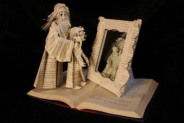
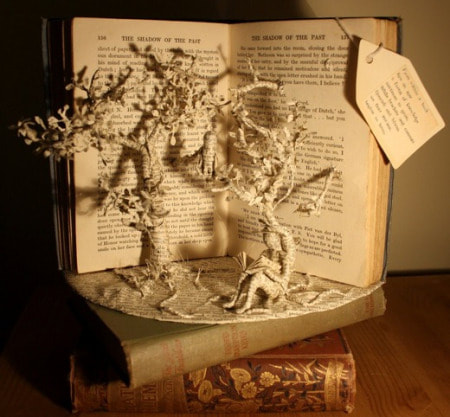
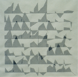
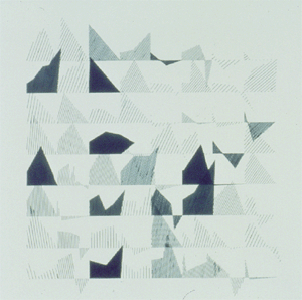
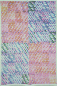
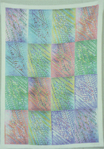
(1) Http://www.grahamhay.com.au/paperclay.html. (n.d.). Retrieved from https://www.grahamhay.com.au/paperclay.html#.W-ulDXpKjMI (2) How to Make Paper Clay. (2018, August 02). Retrieved November 13, 2018, from https://ceramicartsnetwork.org/daily/ceramic-supplies/pottery-clay/make-paper-clay/ Tardio-Brise, L. (n.d.). PAPERCLAY. Retrieved November 13, 2018, from http://www.terrepapier.com/paperclay-en.php Carol Farrow: http://www.carolfarrow.net Sara Ransford: http://pyrogirlaspen.com Angela Mellor: http://www.angelamellor.com Nathalie Domingo: http://nathaliedomingo.com Jerry Bennett: http://jerrybennett.net/ Chris Campbell: http://www.ccpottery.com Thérèsa Lebrun: http://www.wcc-bf.org/membre/lebrun-thérèse 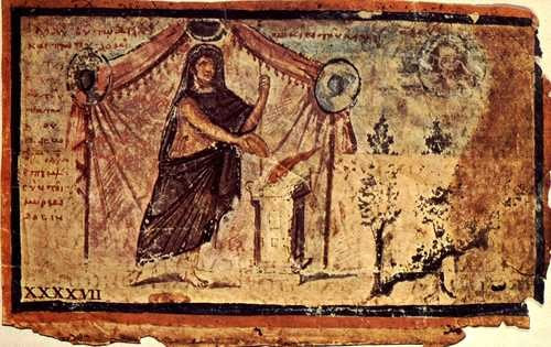 By Chayna Truex Illuminated Manuscripts are a type of book form that was used primarily during the middle ages. The word ‘manuscript’ was taken from the Latin term ‘manus scriptus’ which means ‘handwritten’. This term refers to the creation of illuminated manuscripts and the painstaking process of making these books by hand. Illuminated manuscripts date back to the 4th century the earliest being the Vergilius Augusteus which is only seven pages and many scholars believe it to be from a larger recreation of Virgil’s literature. The manor of creating illuminated manuscripts had changed significantly over the years. One can see the shift in its creation through the work of, the Ambrosian Iliad that dates back to the 5th century CE, an illuminated manuscript that details Homer’s work. Though technically this work is used to signify the shift to what many of us know as the medieval version of illuminated manuscripts; which use colors like gold, silver, and make use of bold lettering. We know a great amount about the creation of illuminated manuscripts due to their popularity though very few have survived today. It was until the 13th century that illuminated manuscripts were primarily created by monks in a place called a scriptorium. Scriptoriums were rooms that were used strictly for the many processes of creating illuminated manuscripts such as the writing, copying, binding, and illuminating of these books. The creations of illuminated manuscripts was a huge group effort that could take from months to years to finish depending on the level of detail. The materials used in the creation of illuminated manuscripts is a bit different than what we would use in our modern books today. Illuminated manuscripts were written on animal skins until around 1450 BCE and were referred to as parchment or vellum. After the parchment was done it was then ruled or scored, so the scribe was able to write in straight lines. They then used lead based or colored ink and used a quill pen, taken from a goose or swan. The illumination was done by embellishing the drawings done by the quill, by painting over it with gold leaf. They would then use substances such as bole, which is a red clay, or sap to make the material stick. It was during this process that the illuminator would then mix pigments and add the rest of the colors to the drawing. The last process in creating the illuminated manuscript was the binding where they would fold together the parchment pages and sew them together using leather cords. They would then lace together supports taken from wood boards and cover the book in a leather binding. Illuminated manuscripts are still a significant piece of book history and are still looked on today due to the amount of detail that was put into them. It is because of painstaking process in their creation that cause them to be studied by scholars today to understand the importance of art in the middle ages during a time before we had printing presses. It is easy for us to see today why these books were major symbols of art. “People often don’t realize that the greatest artists, the finest artists, of the Middle Ages and the Renaissance are illuminated manuscripts” (Samplers). Bibliography Mark, Joshua J. “Illuminated Manuscripts.” Ancient History Encyclopedia, Ancient History Encyclopedia, 13 Nov. 2018, www.ancient.eu/Illuminated_Manuscripts/. Samplers, Dropcloth, et al. “How Illuminated Manuscripts Were Created During the Middle Ages.” My Modern Met, 10 Mar. 2018, mymodernmet.com/how-to-make-medieval-illuminated-manuscripts/. Wight. “An Introduction to Illuminated Manuscripts by the British Library.” The British Library, The British Library, 25 Aug. 2005, www.bl.uk/catalogues/illuminatedmanuscripts/TourIntroGen.asp By Noa Paden Altered books is an art form that refers to the practice of taking an already existing book, rather than making one by hand, and in some way destroying or adding to it to create a new piece of art. There are many forms of this such as black out poetry, collages, sculptures, and other things. Sculptures in specific can be created by folding, cutting, gluing, sewing, or otherwise changing the physical structure and properties of the book. It is unclear when book sculpture as an art form first appeared, but it seems to have only become a widely known art form within recent years and it continues to spread rapidly. The above picture shows piece by Jodi Harvey-Brown is an illustration of a scene from the popular book Harry Potter, made from the book the scene takes place in. This is an example of turning literal pages into sculpture, based on the text it came from. It's a clear cut message with very little that needs to be interpreted or translated to understand what's going on. In contrast, Emma Taylor makes pieces that are less relevant to the books she makes the pieces from, ignoring the original text completely and just using the book as a medium to get her art across. She says that the ending of a book is tragic, and appreciates them as objects as much as she appreciates the stories inside of them. Her works are simple in concept, such as the trees depicted above, but have a very detailed and precise execution. Her pieces often showcase nature, turning back time on the paper the books were originally made from. Another artist of note is an anonymous paper crafter who leaves sculptures around Edinburough for people to simply find at random. These sculptures often going undiscovered for quite a long time before they get noticed and taken somewhere safe. The artist says that some might never be found and others might get immediately thrown away due to the locations the art is left in—but has no problem with this fact and continues to make work and leaving it to be found in its own time. This artist plays with the sculptures staying inside the book as well as making free-standing sculptures that have broken away from the structure of the book they were created from. There are no rules to how these sculptures are made or designed, though some people adhere to their own code of how these works of art should be made. Ultimately, it's a fairly new art form that's still growing and being explored. Listen to what these artists and art historian have to say about altered books and how they're rediscovering books as art: https://www.youtube.com/watch?v=ItBDO3OylM0 Christine Antaya, an art historian based in London featured in this video, says that these alterations are not the death of books, but rather a transition. While some people still get angry at the idea of destroying existing books for to make new art, hopefully it will not be seen in such a negative light in the future. By Samantha Vo  The digital revolution during the 1970’s provided a platform for the new artist. Practicing non traditional mediums, digitally versed artists gave new meaning to the computer and its advances in culture. Joan Truckenbrod was amongst these pioneers and has been highly influential in the development of not only the digital artist, but the inclusion of women in technology. In a time where the potential of the computer was envisioned to be more transformative than ever imagined, Ruth Leavitt proposed the following from her influential book Artist and Computer (1976): “Computer art challenges our traditional beliefs about art: how art is made, who makes it, and what is the role of the artist in society. The uninitiated artists asks: What can this machine do for me? Really, the question should be: What can I do with this machine? The artist has only to choose what role he/she wishes the computers to play. The computer helps the artist to perceive in a new way. Its features blend with those of its user to form a new type of art” (leavitt 1976, vii). Joan Truckenbrod is an international exhibited artist based in Chicago, Illinois. Intrigued by the physical sensations of transparent yet palpable phenomena, Truckenbrod translates mathematical formulas from physics into code to create artwork that can materialize this data. Such phenomena includes but is not limited to, light wave reflections off of chaotic surfaces, wind patterns that reshape materials in their pathway or magnetic fields with undulating boundaries. Computer imaging was a vehicle to unify the synthesis of the analytical and physical perception of these experiences. Her work is influential largely because it did not remain in a digital form but often transformed into physical works such as drawings and textiles. Aside from coding, Truckenbrod experimented with unconventional printing methods to translate her code onto paper and other materials. In 1975 Joan Truckenbrod created her series of line drawings using code she developed in FORTRAN, a computer programming language. The process she described, was long and unpredictable as much of the equipment was not available in the art department leaving her to depend on faculty in the science and geography labs to process her material. Her code was developed from mathematical equations that describe the phenomena of wind and light patterns. Line by line, she translated the formulas onto key punch cards for the computer to read and produce code. Using a pen plotter in the geography department, she was able to feed her code into the machine to draw the embedded coordinates. Truckenbrod’s line drawings was an introduction of how she could utilize the computer in her art. However she was unsatisfied with the disconnection between such phenomena and the drawings and desired to create a more symbolic union with the natural world. She received a grant from Apple computers in 1978 to pursue her exploration in textiles. Using an apple IIe, Joan created a series of patterns representing the invisible phenomena in motion. She placed the monitor upside down on a 3M color-in-color copier to create individual pattern frames. Truckenbrod hand ironed the patterns frame by frame using heat transfer xerography onto fabric. By using textiles, Joan felt that it would connect with the natural world by responding radically to light patterns and wind currents in its environment. These electronic patchwork textiles were then exhibited in the IBM Gallery in New York City. After receiving her MFA from the School of the Art Institute of Chicago in 1979, Joan Truckenbrod became the first chair of its newly created art and technology program, a former nondigital school. She is responsible for developing one of the first courses in computer graphics called “creative computer imaging” and helped establish an international reputation for Chicago’s art community. She was a pioneer for women in the digital arts in a time where technology held little to no room for female artists. Joan Truckenbrod reinvented the possibilities of technology within the arts and paved the way for multi-faceted artists. She is a prime example of the way women bring a diverse perception into any field. As described by Dr. Lina Wainwright “Technology is a valuable handmaiden in the advances of culture but only when wielded with a spirit of empathy, collaboration, and care, skills in which women, in my opinion, excel.” BIBLIOGRAPHY
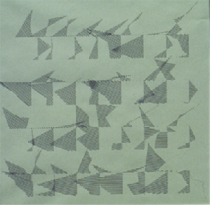
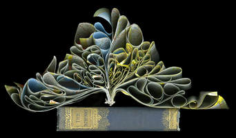
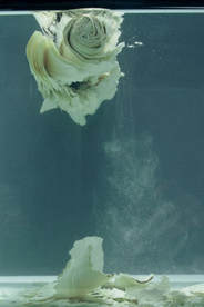
“An Awesome Page.” , Artist - Video Sculpture Artwork and Exhibit - Nanoscapes, joantruckenbrod.com/joan-truckenbrod.html. Cox, Donna, et al. New Media Futures The Rise of Women in the Digital Arts. University of Illinois Press, 2018. Truckenbrod, Joan. “Biography.” Teaching Texture Mapping Visually - Page 9, 2000, www.siggraph.org/artdesign/profile/Truckenbrod/biography.html. Truckenbrod, Joan, director. Joan Truckenbrod. Vimeo, 13 Nov. 2018, vimeo.com/286992423. Wenhart, Nina. “Prehysteries of New Media.” 06/25/08, 2008, prehysteries.blogspot.com/2008/07/ruth-leavitt-artist-and-computer-1976.html. 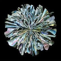 By Zelda Hurd “I hope to raise questions about these changes, the ephemeral and fragile nature in which we now obtain knowledge, and the future of books.”-Cara Barer Cara Barer is an American Artist from Texas born in 1956 who transforms old books into a form that is very beautiful. Barer uses books that have been abandoned and that no longer have a purpose. She has seen the shift of books and how technology is taking over the physicality of having a book. Cara hopes to make her viewers think about the fragile aspect of books. Another inspiration came from yellow pages that she saw soaked from rain on the ground outside and intrigued by the new form it created she documented the book using photography. Barer examines the books before starting her process and depending on the content she sometimes will leave the book the way it is. Barer explains that she sometimes arrives with her image by chance through experimentation, using clothing pins, curling irons, water and dye. Creating by chance and not as planned allows her to create her artworks with flow. She says that sometimes she catches herself reading the book, instead of creating art. She then captures her book sculptures with photography to document and symbolize how fragile the physicality of books are and that technology is taking over for every resource. Cara Barer has been showcasing her work in Canada and the United States since 1994 and her most recent exhibition is called Scrapbooks. It is the first exhibition of monograph of her sculptures. She has taken memories, such as pictures, and guest traveling books, and made a book out of them, and then starts her process of turning that book of memory into something new. Her thesis for this exhibition is “ that a book is never broken, and memory never lost, only made anew with time.” This exhibition is dedicated to the flood in Houston Texas. As she continues this journey of creating abstract art with books, she hopes to capture a lot of information. Jacqueline Rush Lee an artist from Hawaii, has a very similar art concept as Cara Barer, she states that these books aren’t being ruined, they are given a new life. Lee creates her form using experimentation too, but she uses a kiln- firing approach. She fires each book in a different temperature and this depends on the book itself. Lee discovered that the books made in 1940s and 1950s had a better paper quality that holds up better in the heat of the kiln. One of her books called Absolute Depth changes form before the viewer by decaying and dissolving in water, as an example of transformation. Like Barer, Lee only uses old, books and volumes that she then buys a lot of. Both artists use books that have content, in which they gain their inspiration. Barer looks at the book before she starts her experimentation in a way of remembering the book in it’s old form before its transformation and Lee uses the content of her book for inspiration and only uses the book if the contents resonate with her. Citations
|
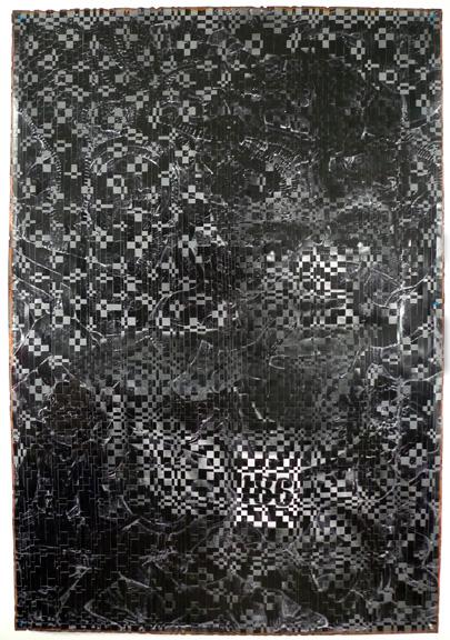
| The same type of weaving would be seen in his later works called From Vietnam to Hollywood. In this series, Le integrated stills of Hollywood films of Western-Vietnam wars and the photographic images produced by photojournalists. This series was to address the way that war propaganda was perceived from the popular culture while living in the U.S. and what was happening in Vietnam. | |
"Dinh Q. Le (Vietnamese- American, b. 1968)." Gund Gallery, http://www.thegundgallery.org/2015/02/dinh-q-le/.
Kolesnikov-Jessop, Sonia. “How Vietnamese Artist Dinh Q Lê Manages to Create Beauty with Tragedy.” Prestige Online - Society's Luxury Authority, Hubert Burda Media, 22 May 2018, prestigeonline.com/sg/art-culture/-/beauty-tragedy-artist-dinh-q-le-captures-cambodias-dark-past/.
“Dinh Q. Lê.” ArtAsiaPacific: Bharti Kher, artasiapacific.com/Magazine/85/DinhQLe.
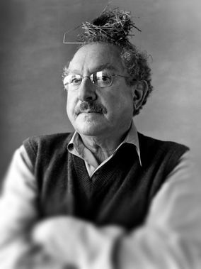
Walter Hamady, born in Flint, Michigan, of a Lebanese father and an American mother in 1940, graduated from Wayne State University and Cranbrook Academy. Since 1964, he has run Perishable Press, where he published intricate, inventive small-edition books. He has often referred to books as “the Trojan Horse of art,” thinking of the way they sneak artistic ideas into a familiar format that can be handled with ease.
Hamady is a pivotal figure in book arts; he helped the art world to perceive the book in a new perspective. His books are humorous, inventive and interactive works of art. I will be delving into Walter’s poking entertainment and innovation – specifically in his fifth Gabberjabb; he challenges conventional ideas about the structure and function of books. For this purpose, I further investigated his satirical behavior and ingenious complexity.
Upon looking through Hamady’s Gabberjabb #5, I was immersed with its personality, this book was given life… he called attention to the art of the book itself having been printed, perforated, drawn, cut, stamped, collaged, taped, embossed, grommeted, signed, notarized, numbered, notched, torn, and bitten. Flipping through pages I noticed the endnotes at the end of words. Any scholar, I would presume, would automatically think, “a source?” Puzzled, I searched for these “sources” to finally stumble upon a manila book pocket with the silhouette of a man’s side profile collaged by a postcard. Inside this pocket, contained a small pamphlet titled,
I returned to the very beginning of the Gabberjabb while constantly referring to the footnotes at my side. Travelling through, I could not help but laugh or smile a bit. Truthfully, I was having a conversation with this book. These notes reflected his own voice, it was almost like speaking with Walter Hamady himself.
“the Druze call it THE FORCE114” followed with the footnote, “Preceeds Star Wars. See ftN Forty-SiX through Seventy.”
“Copyright 1981 by Walter Samuel Hätoum Hamady” had a finger pointing to his name with the number 103, the note reads as follows: “(SEE: 38, 42, 47 & 95) My father once told me that in the old country, Hamady is a common name and has 5 branches; this one is ours.” Hamady settled in Wisconsin in 1966, he is a midwestern artist with roots in the Levant; hence, Walter Semi-Hittite Hamady or (WshH), one of several phrases of his name – Walter Samuel Hätoum Hamady.
He adopted a narrative mode associated with scholarly essays; Hamady loved footnotes so, provided they are, in his view worthwhile. Numerous scholars would presume footnotes to be “offensive” as the notes can be “trivializing the text” and hence, a “waste of time.” Nonetheless, Hamady’s notes are pleasurable to read given that they are fundamentally, another story in themselves.
Along my journey of the Gabberjabb I noticed how he played with text. There were misspellings, fascinating punctuation, bolds, italics, capitalization, and so on and so forth. If one is willing to preserve, there are wonderful discoveries to be made. The mood of the book progresses. Reaching near the end of Gabberjabb #5, I took notice of a small alteration to the word “ibid”. It began with footnote *23, a personal reflection he stated. The play on words proceeded to various modifications: “*25 “ (you bite Maybe , “*28 “ It bit Need period after word me.”, “*29 “ tid Bit ColopHaperPun.”, “*30 “ tit bite.” Inside my head I would respond to each note thinking how much is that, what bit, is this a tid bit, and tit bite? The legibility and illegibility act on the pleasure and instruction of the book. There is an equal distribution between the printer and the writer.
There is a continuous disruption of extensive notes produced in the chronology of the text which generates a positive parallel in Hamady’s view – where the footnote is pushed as far as it can, or perhaps ought to, go, and yet he encourages his reader to follow his footsteps as the series moves forward.
May the dedicated reader, forewarned, wait with interest and some apprehension to see what will emerge from Walter Hamady’s Gabberjabbs.
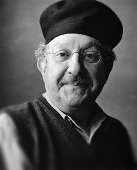
“The book, is perhaps the most personal form an artist can deal with. It encompasses a multiple and sequential picture plane, it is tactile, and to be understood, it must be handled by the viewer, who then becomes a participant.” - Walter Hamady
Behrens, Roy. “The Gift of Gabberjabbs.” Print, vol. 51, no. 1, 1997, pp. 64–71
Derrida, Jacques. “Living on.” Deconstruction & Criticism. New York: Continuum, 1979, pp. 75
76.
Hamady, Walter. For the Hundredth Time &Quot;Gaebboerjabb Number (5) Five&Quot; : 12
&Amp; 17 November 1980 : Journal Liftings. Perishable Press, 1981.
Lydon, Mary. "The Trojan Horse of Art: Walter Hamady, the Perishable Press Limited and "Gabberjabbs 1-6"." Visible Language, vol. 25, no. 2, 1991, pp. 151. ProQuest.
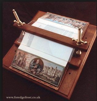
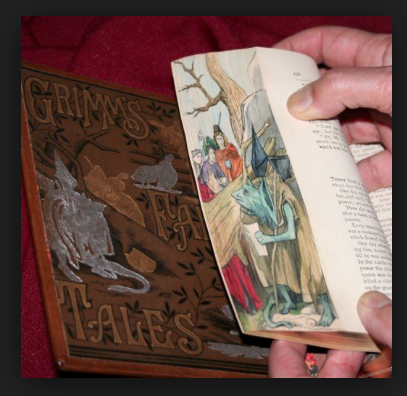
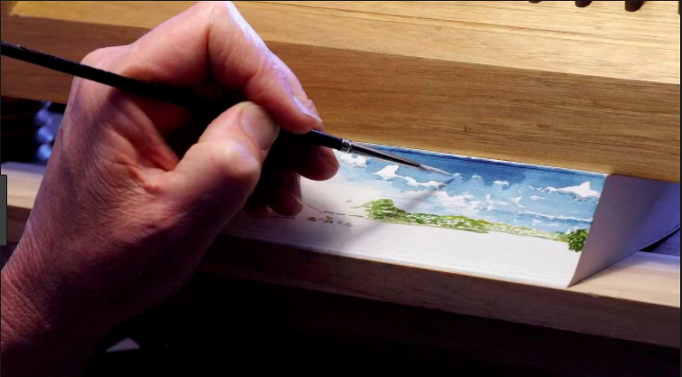
Fore-edge Paintings on Manuscripts
By Elizabeth Wheeler
A fore-edge painting can be described as a small but often heavily detailed piece of art that is drawn or painted on the edges of the pages of a book in a manner in which the full image can only be seen when the book is closed and the leaves of the book are fanned out. At first glance on a shelf the book could seem just as ordinary as any other book but by fanning out the leaves and exposing every edge of every page a never before seen image would then appear. There are a variety of forms of fore-edge paintings including, a single for-edge which the painting is on only one side of the book page edges as well as a double fore-edge painting which shows a different image when the book is fanned in either direction. There are also triple fore-edge paintings as well as split double paintings and even more amazing and complicated variations were the leaves would need to be pinched or bent in a particular manner for different scenes to appear!
The history of fore-edge paintings isn't exactly clear, with examples of the style being seen dating as far back at the 10th century. These very early versions were mostly simple images done in gold ink. The first example of the ever popular disappearing fore-edge painting was seen in 1649 and then the easiest one that was signed as dated was a family coat of arms done in 1653 on a 1651 family bible. It was because most fore-edge painter and book binders did not sign their work that we have so much trouble dating the times that these pieces were done. The painting is often an extra that is added on many years after the original binding of the book
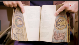
The fore-edge painting was often seen on copies of books from personal libraries, done during a time in which having a personal collection of books was a sign of great wealth and people were as you would assume, very protective of their books. It was likely because of this fact that a bit of a legend grew to surround the idea of how the first fore edge painting came to be. It was said that Charles the II who was the King of England, lent a book to a Duchess after having commissioned the court painter to make it so he would always be able to identify his books if needed. After some time, while visiting the Duchess the King noticed his book on herself and pulled it down, preparing to take the book back home with him. The Duchess tried to say that, that particular book was, in fact, hers. The King slyly smiled and spread the leaves of the book to display his coat of arms, painted on the fore edge of the book but completely hidden to the naked eye by the books gilded edges.
Bibliography
Bromer, Anne C. "Fore Edge Painting - An Introduction". On the Edge: The Hidden Art of Fore-Edge Book Painting. Boston Public Library.
Dutter, Vera, E. "The Ancient Art of Fore-Edge Painting" American Artist, January 1969.
Weber, Carl J. Fore-Edge Painting, A Historical Survey of a Curious Art in Book Decoration. 1966.
An example of inclusive bookstores are Quimby’s, and Women and Children First, both located in Chicago, Illinois. Quimby’s specializes in alternative comics, graphic novels, obscure small-press books and, “...in particular, photocopied, self-published zines”. Women & Children First is known for its’ diverse and queer-friendly selection of literature, and is women-owned and operated.
Within these spaces, one can see just by the covers of these books that this is no ordinary bookstore. Looking at the shelves, there are professionally published indie books, hand-bound artist books, and stapled-together zines that all tell and illustrate stories with both vulnerability and freedom. In addition to the difference in the tactile quality of these books, the stories they share are also different. There is a deep honesty about experiences- mundane and intense alike.
Within Quimby’s bookstore, a patch-work approach in the form of artist books and zines has been taken, but an inclusive store for all voices has been created, nonetheless. Stories like “Butch nor Femme”, a zine about the complicated feelings that come with being queer and not fitting quite into either box; "First Aide to Face Adversity”, a book written by Kuwa Jasiri, explaining safety precautions one should take when preparing to participate in a protest; "SPEAK", Lawrence Burney's collection of reflections that provide an unfiltered voice to the underrepresented musicians of color from Baltimore, come right to the forefront. There are hundreds of stapled-together zines, comics and handmade artists books for one to dig through. They cover incredibly specific and vulnerable topics to the author, allowing the reader to peek into, and even feel their personal experiences and lives.
https://www.womenandchildrenfirst.com/wcf-history-and-purpose
https://www.quimbys.com/
http://www.afsaadmin.org/wp-content/uploads/2012/02/Creating-an-Inclusive-Environment-handout.pdf
In the mid 1700s, books became both more economical and more popular. This caused the movement of books from tables to shelves, upright, and with spines out (Maser 8). In the years between 1750 and 1760, a transition was made between books being a part of small libraries, often with few books stacked on tables, chests or shelves with their fore-edges (pages) visible, to large libraries, whose number of books necessitated the quick identification of a number of books (Maser 8). The trend was reflected in the bindings.
As is the case with many traditions, popularity, industrialization, and mass production reaches a wider audience but at the cost of personalized craftsmanship.
Bibilography
Burdett, Eric. The Craft of Bookbinding: A Practical Handbook. Vancouver: David and Charles Limited, 1975. Print.
Crane, W.I.E. Bookbinding for Amateurs: Being Descriptions of the Various Tools and Appliances Required. New York: Charles Scribner's Sons, 1903. Print.
E Walker et. AL, The Art of Book-Binding, Its Rise and Progress;A Descriptive Account of the New York Book-Bindery. New York: E. Walker and Sons, 1850. Print.
“Eliot Indian Bible.” Digital Collections at the University of Illinois at Urbana-Champaign Library, UIUC Rare Book & Special Collections Library, 18 Feb. 2002, digital.library.illinois.edu/items/d9031410-0d93-0135-23f6-0050569601ca-6#?cv=0&r=0&xywh=-473%2C1968%2C2393%2C1355.
How Its Made: Traditional Bookbinding. Narrator: Lynn Herzeg. Discovery Channel, 2013. Website Upload.
Marten, John: Director. Traditional Bookbinding Techniques of “A Reformed Druid Anthology.”Independently Filmed, 2013. Website Upload.
Maser, Frederick E. Book Binding in America: 1680-1910. Bryn Mawr: Bryn Mawn College Library, 1983. Print..
Alisa Banks is a full time visual artist whose work confronts memory, tradition, and notions of home, place and self. Growing up as a black woman in the 60’s and 70’s, Banks work often incorporates fibers materials and found objects that reflect on personal experiences, and cross-cultural tones of intolerance during that time period. Banks received her BS from Oklahoma State University and later her MFA from Texas Woman’s University. Her work has been exhibited nationally and internationally, and is in several private and public collections. Currently Banks resides in Dallas, Texas.
Cotton, doilies, wood, silk and synthetic hair are all materials Alisa Banks interlaces within and throughout books, transforming them into meticulously crafted, intimate sculptural objects. Underlying themes of identity and cultural memories are commonly explored through Banks’ repurposed books. In a series of work titled “Edges”, the artist elaborately crochets synthetic hair to the edges of each page of the book. Presented open faced the transformed book resembles a half circle, embodying a gravity defying, frizz prone, African hairstyle. The series of four books presents four different hairstyles of traditional African braiding techniques. The hair fibers create textures against the pages while simultaneously embellishing the edges of the pages symbolizing “ the marginal, the end, the between, and duality.” Banks states, “the hair treatment symbolizes how much activity, creativity, and life happens at the ‘edges’ of mainstream society, regardless of whether or not it is recognized…” Growing up during a time period of racial integration, Banks edge series captures the tones of intolerance faced during the 60’s and 70’s and even today when regarding immigration status.
“A Bee Press- Alisa Banks.” Primrose Press, www.vampandtramp.com/finepress/b/A-Bee-Press.html.
“VCU News.” VCU Forensic Toxicologist's Work in Helping Solve Bizarre Death to Be Featured on National Forensics Television Show, news.vcu.edu/article/More_than_words.
“About Alisa Banks.” Alisa Banks, www.alisabanks.com/about-the-artist/.
"Alisa Banks- The Edge Series." Abecedarian Gallery, abecedariangallery.com/store/reviews/2012/12/14/alisa-banks-the-edge-series/.
ManagedArtwork.com. “Alisa Banks.” Http://Www.seagergray.com/ - Richard Shaw - Artists Detail, www.seagergray.com/Artist-Info.cfm?ArtistsID=521.
Some of the first examples of interactive art can be dated back to the 1920s. This is an art form that needs the spectator in order to achieve its purpose or fullest potential. Interactive art continues to grow and evolve rapidly, gaining attention from numerous museums, venues, and urban installations as they integrate the genre into their collections in greater numbers. On the other hand, art books date back to the Medieval Period. Although practiced for generations, art books found the ancestor of their true form in the works of William Blake, who set the tone for later artists’ books by merging handwritten text and images. Nowadays, an art book could be anything- a traditional book of poems, a braid of hair, different types of sand, or even microscopic experimentations and their findings. If we merge interactive art with an art book, the result elevates its component parts to a new, higher form. Such an example lies in the book “My 9 Migraine Cures” by Ann Kalmbach and Tatana Kellner, which I came across while experiencing the Special Collections at Arizona State University’s Hayden Library.
Categories
All
Altered Books
Artists
Artists' Books
Asian Artists
Asian Books
Asian Paper
Asian Typefaces
Ceramics
Collections
Comics & Graphic Novels
Designers
Digital Art
DIY
Environmental Impacts
Feminism
Fore-Edge Painting
Herbal
History Of Paper
History Of The Book
History Of Type
Illuminated Manuscripts
Interviews
Letterpress
Letterpress Shops
Marbling
Museums
On-demand Book Publishing
Paper Fibers
Papermaking
Phoenix
Photographic Artist Book
Photography
Photopolymer
Pop-ups
Portland
Printmaking Techniques
Rare Books
Sculptural Paper
Software
Technology
Type Foundry
Typography
Walter Hamady
Watermarks
Zines
