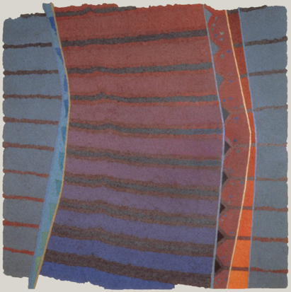
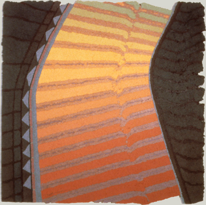
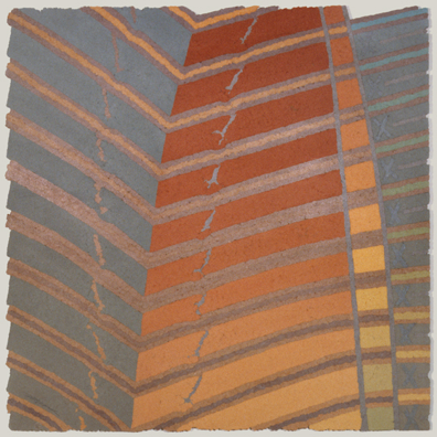
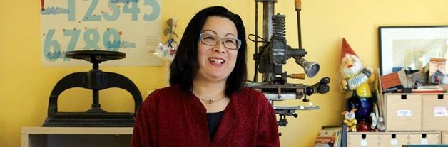
 by Mia Adams Julie Chen is a well-renowned book artist and instructor that is famous for her inventive and non-traditional style. Chen was born in 1963 in Inglewood, California but currently resides in Berkeley, California. She has received her undergraduate education at the University of California, Berkeley and a graduate degree in Book Arts from Mills College in Oakland, California. Chen is currently producing limited-edition book works under the Flying Fish Press imprint in Berkeley, California where she has worked for over 20 years. She currently teaches in the Book Arts Program at Mills College in Oakland, California and conducts book arts workshops across the country. Her artist’s books are displayed in libraries and museum collections all around the globe. Her works can be found at libraries of the Museum of Modern Art, New York, the Victoria and Albert Museum, London, the special collections library at Arizona State University in Tempe, Arizona, and many other locations.  Julie Chen, Glimpse, 2015 Chen prides herself on her thorough concepts where everything is organized and well understood. This allows viewers/readers to easily connect to the content of her works. According to Chen, “These systems of organization allow me to present content in ways that can be understood and translated into the reader’s own life experience. An essential part of my creative process involves a deep investigation of my understanding of and response to a chosen topic or concept through a combination of research, personal observation and inquiry, and intensive exploration in the studio of various ways to express my ideas through writing and image-making in purposeful combination with the physical form of the book”. 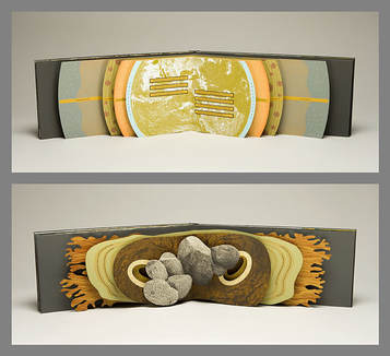 Julie Chen, Panorama, 2008 For viewers to have an experience, Chen believes it starts at the shell of a piece and continues as they turn pages and interact with its structures. The artist is well known for her three dimensional and movable book structures that completely engulfed her readers. As stated by Chen, she strives “to present the reader/viewer with an object that challenges preconceived ideas of what a book is, while at the same time providing a deeply engaging and meaningful experience through the presentation of my own text and imagery in a purposefully structured format. Often the reader must engage in unexpected physical actions such as the unfolding or sliding of pages, the turning of a wheel, or the tilting of a box in order to fully read/view a piece”. Her books are often interactive that make the reader and book come together to form a full-fledged experience. Chen also uses a personal narrative that can be interpreted by readers in their own way. She pairs her intimate text with captivating designs and objects that can be viewed similarly to any painting or sculpture. 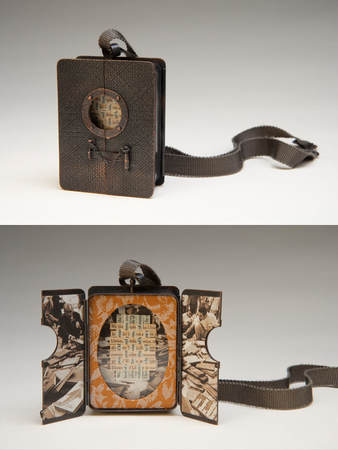 Julie Chen, Memento, 2012 Chen utilizes techniques such as letterpress printing, hand bookbinding, and modern technologies such as laser cutting and photopolymer plates. Limited editions of her work can range anywhere from 10 to 150 copies and function traditionally as books or as sculptural objects. With the use of vibrant color, evoking text, and extravagant dimensional structures, Chen lures readers/viewers into a book that they will never want to put down.
Sources: https://tinkering.exploratorium.edu/julie-chen http://www.vampandtramp.com/finepress/f/flyingfish.html https://nmwa.org/explore/artist-profiles/julie-chen http://www.flyingfishpress.com/about/index.html by Cheyenne L. Black  Hedi Kyle Hedi Kyle is a German-American artist who specializes in folded book structures. Her work has become something of a mainstay in the book arts community as she has given artists such structures as the Flag Book, the Blizzard Book, the Spider Book, the Fishbone fold, and many, many more. Some have called Kyle the most influential book artist of her time. Kyle’s generosity with her craft is perhaps the most endearing element of her work. The readiness with which she has made available instructions, offered of her time, and shared her most creative ideas is nothing short of remarkable. In art school Kyle studied illustration and graphic design and in an interview with Alastair Johnston at the Fine Press Book Association, Kyle says that she learned book design such as covers and typography in this program but not book craft. From there, she went on to learn advertising and spent some time drawing advertisements as produced through the J. Walter Thompson agency. Her work at the time included such brands as Philadelphia cream cheese and Lux soap. Also according to her interview with Johnson, Kyle first developed her craft and style with Laura Young in the 70’s in New York and eventually began teaching at the center for book arts in New York, a position she claims to have fallen into by accident. Over time, she moved on to teach in the book arts program at Philadelphia Arts, but, she says to Johnson, she is prone to overwork as she gets excited about things and when she is teaching this pushes her to take on too much, frequently. Kyle claims that giving away her work has been satisfying but she would prefer to see some more innovation as the tone in at least this interview implies she is worried for her structures becoming cliche’d. This may be a valid concern as the Flag Book, created by Kyle in 1979, is referred to by the Guild of Book Workers as “the single most influential structure in the world of contemporary bookmaking.” Though it may be tempting to focus on the structure of her books, to keep the folds and ingenious innovations center stage, Kyle says she doesn’t want blank books calling it a “missed opportunity.” The structure exists to support the art contained therein, and Kyle emphasizes the work of the book by using her structures to support and showcase the material contained inside. Kyle is the cofounder of the Paper Book Intensive, the “annual working sabbatical in book arts, papermaking, and conservation” which is the largest gathering of it’s kind in the nation; a professor at the University of Arts in Philadelphia; and has lectured worldwide on her craft. Of her work, Mills College book arts professor Julie Chen says, “She is a rockstar in the book art world,” adding, “The whole book art community is indebted to her for her contributions and for what she has created.” Hedi Kyle does not merely push the envelope. She folds it first, fills it, and gives it back to you as a book. A few instruction sheets for her work can be found here: https://guildofbookworkers.org/sites/guildofbookworkers.org/files/standards/2005-Kyle_Hedi.pdf More information on Kyle: http://www.fpba.com/parenthesis/select-articles/p25_hedi_kyle.html http://www.thecampanil.com/inventor-and-artist-hedi-kyle/ https://guildofbookworkers.org/sites/guildofbookworkers.org/files/exhibits/100anniversary/retro/Kyle.shtml Information on the intensive mentioned herein: http://www.paperbookintensive.org/ The program for which Kyle teaches: http://bookprintmfa.uarts.edu/ Information on ordering a catalog of an exhibit she held can be found here: https://www.sfcb.org/the-world-of-hedi-kyle Several structures not seen here can also be seen at: https://makinghandmadebooks.blogspot.com/2016/04/hedi-kyle-and-sf-center-for-book.html  Hedi Kyle, April Diary 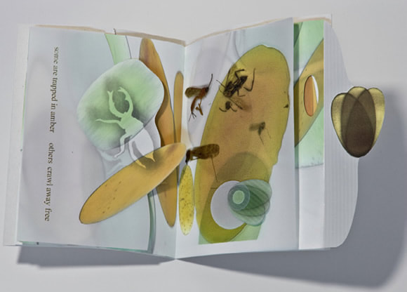 Hedi Kyle, Soap Opera 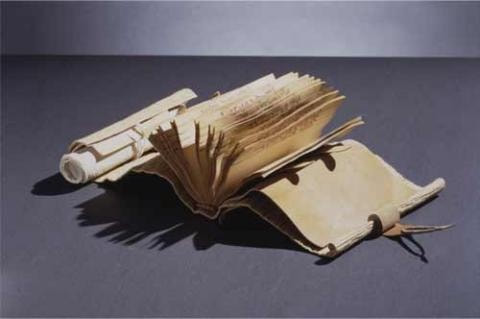 Hedi Kyle, L'atelier 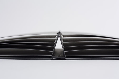 Spider Book 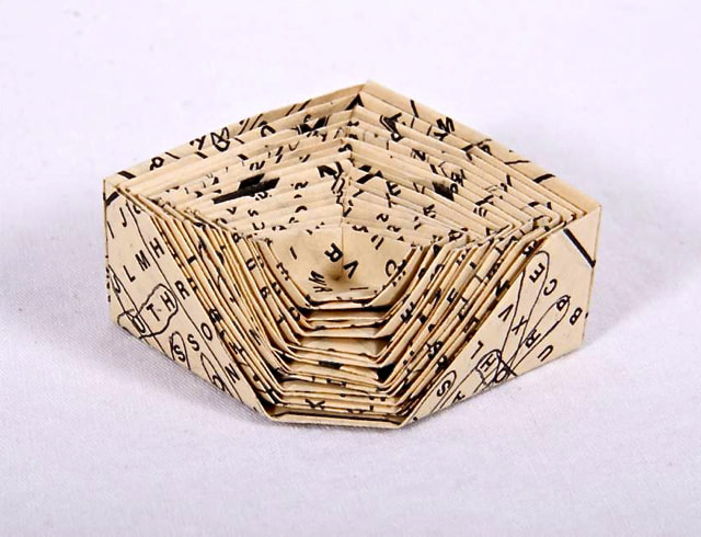 Hedi Kyle, (Title Unknown) By Farah AlRasheed Books were always objects that were utilized for knowledge in the Islamic world. Collections were made for calligraphy, illustrations, as well as religious knowledge. What is now Iraq was the ancient Sumer, where trading was a big part of the businessmen's world. They had difficulties keeping track of all the transactions they had made and so clay tablets were made in tiny shapes to mark some details. Then comes paper, a gift that was brought by Muslims from China. It happened after the battle that took place between the Chinese and the Muslims. Surprisingly, the secret of paper making was told by Chinese prisoners to Muslims. After taking a course in papermaking, where paper can be made by everything and anything that surrounds us all, it wasn't strange to hear that Muslims "employed linen as a substitute for the bark of the mulberry. Rags of linen were to be disintegrated, saturated with water, and made to ferment. After the rags are drenched in water and are prepared to be fermented, the alkaline residue and the dirt were eliminated as they are boiled. Unlike what we are blessed to have now the rags were beaten to a pulp using a trip hammer, a tool of maceration invented by the Muslims. Baghdad was known to be the first to establish many paper mills and that is how the industry grew even further. Europe used the paper mills in Damascus as a resource for paper and stationary. A library of organized collections of materials that were written. If you see the word papyrus, know that that's where the word paper came from in the Ancient Egypt times. It was used before the invention of paper that came out way before Christ. Bones, stones, and turtle bones were used to record information and write before paper came out. The reason why the Muslims and earlier on, the Chinese were adamant on the use of paper to avoid forgery during trades and anything business related. What interested me the most was that the Islamic society had a "paper economy". Not only that they had retail and wholesale for the business of paper but they also took longer to accept the use of paper " as a fitting support for God's word." The invention still comes from the Chinese but was discovered by Muslims in the 8th century. It then arrived by North Africa through the silk road Muslim travelers and finally arrived to Europe with a huge market. A highly renowned paper maker mentioned an artist whose name is, Radha Pandey, who focused on the invention of papermaking in Islam. Pandey made it quite evident in her research the comparison of the use of Islamic papermaking and flexible molds to Japanese and Korean papermaking techniques. I thought it was amazing to see that Pandey connected with one of the families that first implanted this tradition in their lives. She got to continue her research with Kagzis. Also, Pandey gives workshops on how paper is made in the ancient Islamic times by "dipping the vat once, the mold is then floated and pushed gently back down into the vat until the freshly-formed sheet floats off the mold gently. It is then dipped a second time before couching. Dyes are traditionally added to the vat, and then brushed onto the finished sheets before burnishing with an agate stone." She describes the technique on her research of Islamic papermaking which is also mentioned in her website linked below. https://www.radhapandey.com/islamic-world-papers http://www.muslimheritage.com/article/beginning-paper-industry 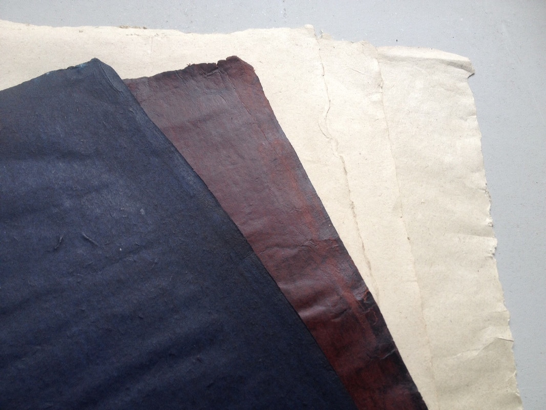 Radha Pandey  Suminagashi is an ancient technique of marbling paper with inks. The history of its conception is one for debate. We know for sure that Suminagashi dates back to the 12the century during the Edo period. However, Shigeharu a Japanese poet references the techniques as early as 825- 880 c.e. In the 12th century, Japanese Shinto priests where practicing the Suminagshi techniques for a few different applications. Some applications include decorative works that accompanied calligraphy of haikus. The Japanese believed there where a strong parallel between the fundamental essence of haiku poetry and the unpredictable results of Suminagashi. This connection made Suminagashi and haiku poetry a perfect match both conceptually and aesthetically. Alyson Kuhn a paper artist who has been practicing and teaching Suminagashi for years. Alyson elaborates on this further, “Making Suminagashi is very fluid, if the wind blows, it will ripple your design. It’s very much about the senses, about combining nature, yourself and art all in one. It’s so fitting that many Suminagashi prints are crafted to illustrate haiku. You can’t really control the process, and you aren’t really supposed to.” The Japanese royal court enjoyed and lifted the practice out of obscurity for not only for the beauty of its craft but also for a more functional application. Aside from haikus Suminagahsi was also used for correspondence as well as official documents. This was adopted for its ability to ensure authenticity. While researching Suminagashi I found that often their where references that compared Turkish marbling techniques with Japanese. Consequently, I developed a brief consensus on both crafts. In its essence, Suminagashi is viewed as more purist due to in its simplicity. Meaning that is there fewer variables such as in the colors, tools, and ingredients necessary in compared to Turkish marbling techniques. The process is one that requires few supplies and is generaly pretty simple and accessible. Sumingashi is generally more minimalist in its approach compared to other forms paper marbling. To begin you will need a tray of water an about 2 inches deep, two brushes, ink and a surfactant. A surfactant is an agent that lowers the surface tension; the options vary from traditonal ox gal, which is oil from the ball gland of ox to carrageenan an agent used from seaweed. Some people even use Kodak Photo Flow or acrylic flow. Once you are setup you work with the two brushes, one dipped in ink and the other your surfactant. You then dip the brushes in the tray and go back and forth ever so slightly dipping the brushes into the tray. It is important to just touch the surface to not have the ink sink to the bottom of the tray. Once you are satisfied with the pattern you place a suitable paper down for a few seconds and then pull it off the water and lay it out o a board to dry. The ability to take your time is a luxury unique to Suminagashi. The freedom to not race against the clock allows for a more therapeutic experience. Turkish marbling has many attributes that Suminagashi does not, however drying time it not one of them. Turkish marbling is much thicker and the sizing reduces the movement of the ink, providing for a more controllable state. This allows for more technical precision. In contrary, Suminagashi's movement is based on the wind and even your breath. This may be the most polarizing aspect between these two techniques. Beautiful in their own way, one must ask if they want that control or not. Suminagashi has a long history and is now experiencing resurgence not just in Japan but also in many parts of this world. Some artists have maintained the traditional techniques such as Diane Maurer Mathison. Diane is a renowned paper artist. Dianne is also the author of the Ultimate Marbling Handbook. Another artist I recommend checking out is, Andrea Peterson. Andrea putts a strong emphasis on the variety of paper she uses. Andrea believes that the importance of the paper choice for Suminagashi is equally as important as when you decide on paper for printmaking, there are many variables to consider. Tadao Fukuda is one of the most respected traditional Sumingashi artist in the world. In his eighties he still has the energy to teach workshops on a regular basis Fakuda resides in Kyoto and is designated as an intangible cultural asset in Japan. Other artists have blurred the lines between Turkish marble techniques and Suminagashi, working less traditionally. Often I see the mixing and matching of different materials from the different techniques. One example is Natalie Stopka. Natalie uses silk allowing for them to be hung on a wall or worn as scarves. Below is a few examples of Natalie’s work. 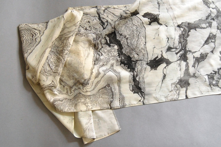 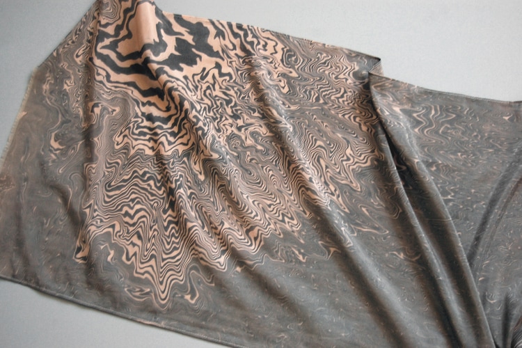 Many artists are taking inspiration from Suminagashi and applying it to their ceramic wok. One such artist is Carol Forster. Below are a few examples her work. 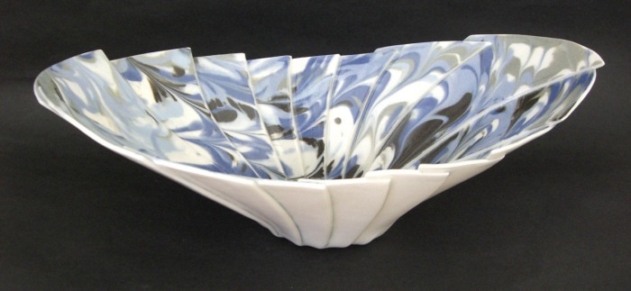 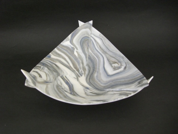 Another contemporary approach to paper marbling can be seen in the works coming out of Brooklyn New York's Calico Wallpaper. Calico Wallpaper is a company founded by Rachel and Nick Cope. Rachel and Nick combine principles and techniques from a variety of forms of paper marbling. Combining multiple methods, Rachel and Nick have developed their own unique contemporary adaptation of paper marbling. Below are a few works from Calico’s collection 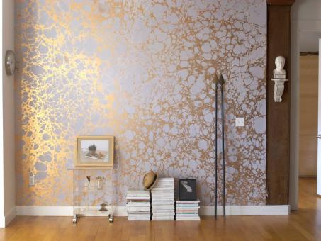
Sources: Suminagshi- Zome by Tokutaro Yagi.
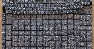
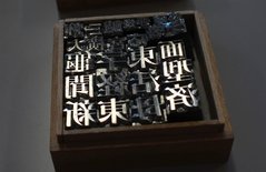
http://www.dianemaurer.com/ http://www.nataliestopka.com/goingson/1763 http://calicowallpaper.com/about/our-story/ https://www.mohawkconnects.com/feltandwire/2012/01/09/andrea-peterson-gently-enlightens-us-about-suminagashi-drop-by-drop/ http://suminagashi.com/overview/ http://thekidshouldseethis.com/post/the-art-of-suminagashi-or-japanese-paper-marbling Monica Wapaha Hot Sand Paper Casting Processes of papermaking have a variety of techniques in creating paper art. Creating work out of something that is traditionally used as a two-dimensional surface for drawing, writing, and painting has caught my attention. I am drawn to paper taking the form of solid objects and became very interested in techniques by the artist Roberto Mannino who incorporates this in his art. He is an artist from Italy who is very attuned to processes of papermaking as well as sculpture and creates new experimental printmaking techniques. Through his amazing styles of paper art, I was most interested in his hot sand paper casting processes. Roberto Mannino’s art is primarily made with handmade paper and techniques such as rubbing with graphite, papermaking, sculptures, hot sand paper casting, pulp painting, creating huge sheets of paper and experimental printmaking. In a dvd titled Paper Relief, Mannino took his fresh wet handmade paper to the beach and used the hot sand that was at the beach for his casting technique. The hot sand paper casting comes from pouring sand on the wet paper. The paper needs to be freshly made or wet. The sand creates weight that can take the shape of the mold or object. The hot sand speeds up the process of drying and keeps the paper in contact with the relief mold and prevents the paper from shrinking. The surface can be basically whatever you desire that can with stand the paper and hot sand. The process is fast and your project can be done within a few minutes depending on how hot the sand it heated. There can be multi castings going on at one time. If you are not on the beach, it is preferably to work outside because the sad get everywhere. Heating sand can be done in a heat proof tray, pot or pan on a stove, oven or microwave. Make sure it’s not a pan used for cooking and be sure to wear heat proof gloves to prevent any burns. The sand will also need to be mixed because the sand closets to the paper will get wet. If the sand is went the paper will not dry. It can also be put outside to dry fast. Once the paper is dry it can be taken off the mold. Through my experiments, it is good to use objects that are bigger than little plastic army toys. Super small objects tend to get stuck in the paper and can cause unwanted rips and tears. The processes of hot sand paper casting is a very fast process once the processes have been successfully executed. It can get a bit messy so keep that in mind. A rigid surface is an ideal object to cast and can be made at the beach on a hot summer day, at home or in your studio. It will be a great project to work on in the summer especially here in Tempe. References Landes, Barbara. Sculptures of Handmade Paper. http://www.barbaralandes.com/roberto-mannino. Accessed 28 March. 2017 Roberto Mannino, Ariel Genovese. Paper Relief]: A Review of Papermaking Techniques : Roberto Mannino, Officine Video, 2005 Mannino, Roberto. http://www.robertomannino.it/contact.html. Accessed 9 March 2017  by CeCe Ramey Typefaces are the clothes that our words wear. They are often chosen carefully to apply another layer of meaning to a piece of literature or art, or they are used to add identity to a brand. The word "people" has a different feeling when it is in Comic Sans versus Times New Roman. A funny thing to ask yourself as you walk by store signs is "What does that typeface make me feel?" A great tip is to quickly look and compare lowercase e, a, and g's when you get a chance. Many food companies choose typefaces with very wide smiling e's. But anyways.. To get back on topic and to my point, typefaces easily imbue meaning into words. They set a tone. However, this ability is also distracting under the wrong circumstances. Sometimes you need silence in typeface design, so that the information comes across clear and unadulterated. One instance of this is in road signs. I very much doubt you have ever stopped at an intersection, looked at the road sign above the stop light, and said "Wow, what a pretty typeface!" To be honest, road sign typefaces are the ugliest boring typefaces I have ever seen. And this is why I find them oddly charming and very interesting. 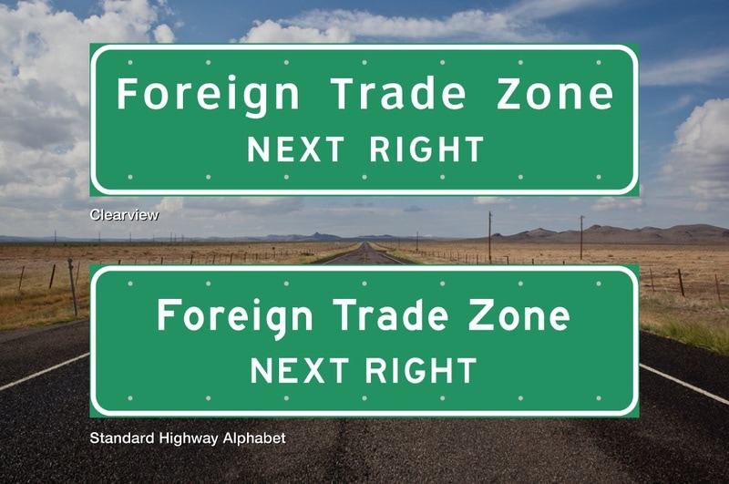 There are two typefaces used in the United States, Clearview and Standard Highway Alphabet (aka FHWA, also aka Highway Gothic). FHWA or Highway Gothic is the older typeface developed in the United States during the Second World War. Recently, it has slowly been phased out with Clearview which is easier to read since the letters have more counter space, the space within letters. Notice how the Clearview lowercase e extends further than the Standard Highway Alphabet. The terminals in Clearview also all end with strong horizontal edges unlike the Standard Highway Alphabet (compare the ascender/vertical line of the d's). The x-height, or the height of the lowercase letters, is also larger in Clearview, causing the lowercase letters to be seen from farther away.  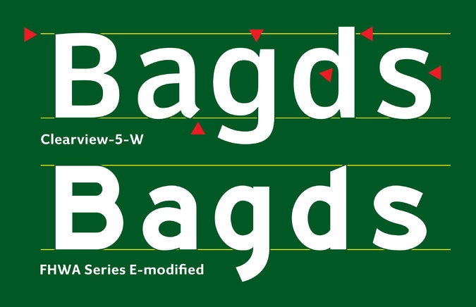 Small details in typeface design make all the difference. To make a typeface "silent" is not to make it indistinct, it is still important that each letter of a typeface clearly legible from another. Every typeface chosen for a text, book, paper, sign, billboard, or art is chosen for a reason by the maker. Even in our boring road signs. References: http://www.houstonpublicmedia.org/articles/news/2016/03/19/141599/font-on-texas-highway-signs-set-for-another-shift/ https://www.nytimes.com/2016/02/25/opinion/easy-reading-road-signs-head-to-the-offramp.html?_r=0 http://www.popularmechanics.com/technology/infrastructure/a19174/clearview-road-sign-font-phased-out/ Created by Vanessa Mendoza My main focus on this research was to focus on Representation, I've noticed that I personally didn't know any people of color printmakers. Luckily ASU's Hayden library has a Chicano research department and special collections of books that I had as a great resource. My personal journey of seeking out people of color in the printmaking community has always been somewhat of a struggle for me. So to realize that ASU has a large collection of prints surrounding the Chicano culture and an array of topics like discussing the social issues surrounding immigration was more than inspirational and powerful to physically touch and see these prints in person. Arizona State University has an amazing collection of printmaking prints throughout campus. One of the collections I've decided to research was created by Culturestrike called Migration Now which is located at Hayden Library in Tempe on the Luhrs Room which is on the fourth floor. Migration Now portfolio consists of 37 prints that surround the social issues that affect migration. The limited edition portfolio consists of 140 portfolios and was created in 2012. The political posters are 12x18 in size and include different printmaking styles like relief, letterpress and screen printing. Id hate to copy and paste but if you're looking for printmakers of color here are the contributing artists: Lalo Alcaraz -- Santiago Armengod -- Felipe Baeza -- Jesus Barraza -- Shaun Slifer & Janay Brun -- Kevin Caplicki -- Melanie Cervantes -- Irina Crisis -- Raoul Deal -- Emory Douglas -- El Mac -- Molly Fair -- Thea Gahr -- Art Hazelwood -- Ray Hernandez -- Nicolas Lampert -- Josh MacPhee -- Oscar Magallanes -- Fernando Marti -- Colin Matthes -- Cesar Maxit -- Dylan Miner -- Claude Moller -- Oree Originol -- Diane Ovalle -- Roger Peet -- Jesse Purcell -- Favianna Rodriguez -- Erik Ruin -- Julio Salgado -- Meredith Stern -- Mary Trem onte -- Kristine Virsis -- Pete Yahnke Railand -- Imin Yeh -- Ernesto Yerena Montejano -- Bec Young Chicano Research Collection at the ASU Hayden Library. http://libguides.asu.edu/chicanocollection http://library.lib.asu.edu/record=b6412637 http://www.culturestrike.org/ http://migrationnow.com/ If you want to look at the portfolio in person you can by giving the librarian this info: Migration Now : a print portfolio of handmade prints addressing migrant issues Call # JV6335 .J87 2012 Folio 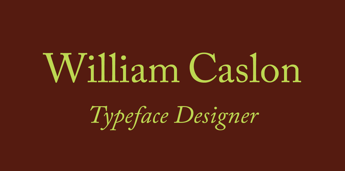 by Katie Sutton Walk into a library and you will find books. Big books and small books. Books with pictures and books with only words. Books that are funny and books that will make you cry. Books that offer facts on molecular biology and books that make you want to move to Ireland. Now open a bunch of these books and you are guaranteed to stumble across one of the most widely used inventions of book history that typically goes unnoticed: the Caslon typeface. 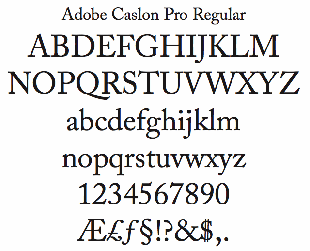 Caslon is named after the English type founder William Caslon, who designed the typeface in 1722. Getting into type design was not as easy as it is today. You couldn't just sit down with a pencil and paper and then scan in your sketches into a computer to refine your letterforms. William Caslon started out as an apprentice to an engraver for gunlocks and barrels. For seven years, he learned all of the ins and out of metalwork, and became an excellent letter engraver. His metal craftsmanship was noticed by a printer, and he was asked to cut type punches for several presses. Through jobs like this, word spread of his type engraving, and he was eventually asked to design an English Arabic typeface for Christian publications to be distributed in the Middle East. This typeface was a huge success, and led him to design an English version of Roman letters and italics that is now known as the Caslon typeface family. 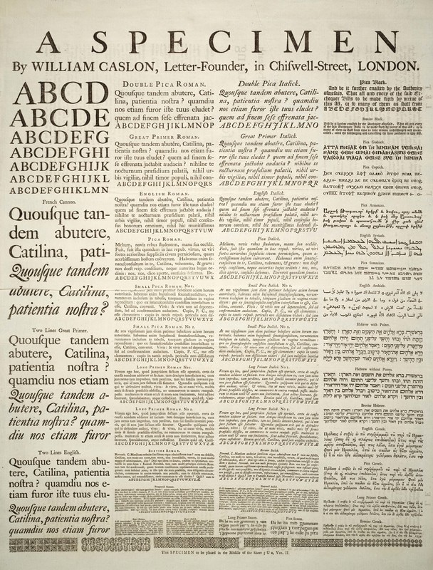 In 1726, he set up his own type foundry. One of his most noted pieces is a one page type specimen that shows 47 different typefaces, which were inspired by Dutch Baroque typefaces. His became so good at type design and metal type casting that he surpassed all of his competitors and became the exclusive type foundry for the King's printers. 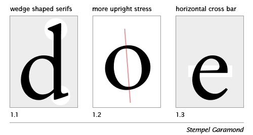 His type was extremely legible, yet graceful and classic making it an excellent choice for printed communication pieces. Caslon was one of the last "Old-style" typefaces before "Transitional" typefaces were designed. Old-style type has characteristics of wedged serifs, greater contrast between thin and thick strokes, upright stress, and horizontal crossbars. Typefaces have a rich history, and the design of letterforms were hugely influenced from the tools that were available to write, engrave, or carve with. 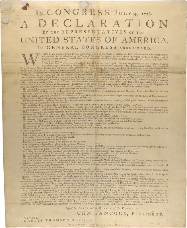 William Caslon doesn't get enough credit nowadays, just like most type designers in general. His type foundry paved the foundations for future type designers like Baskerville, which continued to evolve into more type styles. William changed how the printers of London were communicating. He changed the visual voice of the text during the time period of the Industrial Revolution and his Caslon type is even used on the first printed copy of the American Declaration of Independence. By 1742, Caslon's son, also named William, was designing his own type specimens and eventually took over the foundry when his father retired in 1750. If you're printing a lot of text that you want to read well, and have a traditional, friendly feel, look at the works of William Caslon. His letterforms are everywhere at your local library. References: https://www.fonts.com/font/adobe/adobe-caslon/story https://www.britannica.com/biography/William-Caslon https://www.linotype.com/348/william-caslon.html http://spitalfieldslife.com/2013/08/16/william-caslon-letter-founder/ http://ilovetypography.com/2007/11/21/type-terminology-old-style/ Michelle Gonzalez Over spring break I had the lovely opportunity to visit Tokyo, Japan for a full two weeks! Immediately I was surrounded by crazy typography everywhere! Signage and posters filled the streets everywhere we went. During our first week there we went to Kyoto for a spontaneous two day trip. While there we stumbled upon a small letterpress shop called The Writing Shop. 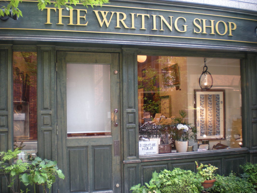 http://writingshop.net/ It definitely had a western flair to it, most of their paper was made out of cotton instead of thin delicate Japanese I was expecting to find. The shop sold note cards letterpress printed with original designs as well as limited edition prints! I unfortunately couldn't take pictures inside but they had a wide variety of metal type cases displaying their type. For some reason I wasn't expecting all the type to be in Japanese (which is silly, I know). But more unexpectedly, all of the type was square. Every character; and there were so many different ones, all were square. Their culture reflected the way their type was even structured! Precise, clean, efficient.
I thought that how fascinating it must be to work with Japanese typography! All of their characters are square yet so many intricate pieces are formed, grids are broken and shapes are made! The ancient practices of Chinese And Japanese woodblocking and metal type is making a huge comeback in the recent years. 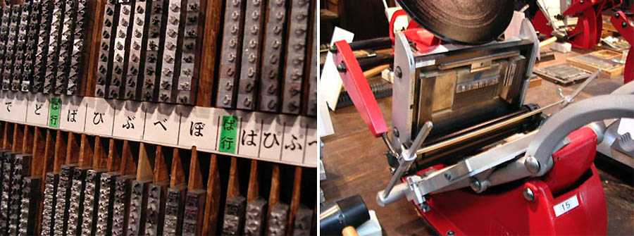 It is a common misconception that Johannes Gutenberg created the first movable type system and the printing press in 1450 A.D. The world's oldest movable metal print book is considered to be Jikji. It was published in 1377, seventy-eight years prior to Johannes Gutenberg's printed Bible. It is true that he formed moveable type with led and other metals, but in China and Korea moveable type was formed around 1040 A.D, because of the sheer amount of characters their language contains, they needed to find a more efficient way of printing books and manuscripts. They were first developed with wood, but because of the inconsistencies of how the wood would soak up the ink, ceramic and clay type was then developed, and then later on with plated bronze. This method was a lot more durable and quicker and because the type was all the same dimensions, it also made setting easier. But how was it all set up? Japanese and Chinese languages contain almost 400,000 characters. Most shops organize them by alphabet, type of symbol and meaning, and some even go as far as to organize them by rhyming groups.  By: Kiana Tahiri The earliest found fragments of paper date back to China in the second century BC. It is believed that a man by the name of Ts’ai Lun collected bark from a mulberry tree, pounded the fibers and created a sheet of paper out of its pulp. Later, the quality of paper was improved with fibers such as cotton, hemp, and old fish nets. Paper soon spread to the rest of the world with the help of the silk road. During this time, people only transcribed on silk or bamboo however, this was very expensive and unpractical. Bamboo would take up so much room on the silk road and silk was very expensive and only a few could afford it. Paper became the perfect substitute and quickly spread with the help of the silk road. More fibers were used to make paper and it had spread to Korea. In the 6th century, Koreans made paper out of mulberry, bamboo, rice straw, seaweed, and rattan. After this, paper making was soon introduced to Japan by a Korean monk. Other fibers that were used to make early paper included hemp, linen, and cotton. Currently, paper can be made from a plethora of plants and the natural fibers. In order to make paper from plants, the first step is to harvest the plant materials and cut them into ½ inch to one inch pieces. Next, they need to be cooked down with an alkaline substance such as soda ash and water. This dissolves any unwanted starches and sugars. Often times, it will also turn the concoction into a black paste. It is recommended to use a 2:5 ratio when cooking soda ash and plant materials. Bring this concoction to a boil and then simmer for up to two hours. The plant material will be ready when it separates along the grain. Next, the water from the pulp will need to be strained. Cheesecloth bags work perfectly for this. Sometimes, pulp will need to be rinsed out a few times with water in order to get all of the dirty residue out. After this, the pulp must be blended with hot water in order to separate and smooth out the fibers. Fill up a blender ¾ of the way up and add the ball of pulp. Finally, the last step to finish the plant based pulp is to add a thickening agent such as formation aid. Formation aid makes pulp thicker and makes it adhere to the water. This will also preserve the plant pulp so that it will not go bad. After this, the pulp is finished and ready for making sheets of paper! In conclusion, paper making is a sacred art. Through paper, so much history has been transcribed and kept through the ages. Paper was made more available through the silk road and was used more than silk because of it’s inexpensive materials. I am happy that there are still people making paper and practicing this ancient process. Works Cited "Hand Papermaking with Plants (Illustrated Infographic)." Paperslurry. N.p., 04 Aug. 2015. Web. 12 Apr. 2017.   by Jonathan R. Wright From the thirteenth century on, Greek manuscripts were written increasingly on watermarked paper imported from Italy, and soon from other sources in Western Europe. Watermarks were developed by Italian papermakers. They may originally have served to identify papers produced by different workmen within a factory (who were paid by the piece). Picture several workmen working at adjacent workstations in a factory, all producing paper of the same size and appearance. It is easy to imagine a workman suffering from backache, getting behind in his work, and being tempted to steal from another who had produced a larger pile of paper. However, the watermark originated, this new development in papermaking technology was quickly adapted to new functions by the paper factories, which began using them as "trademarks" and to distinguish different grades or batches of paper. "Watermarks were made by bending pieces of wire into filigree designs (French: filigrane) and tying them onto the wire mesh which served as the bottom of the paper mold. As the paper pulp drained, this device would be imprinted in the paper along with the lines of the wire mesh. Watermarks took many different shapes, such as natural things (Fig. 1) (e.g., birds, hands, flowers, mountains); tools and weapons (e.g., anvils, hammers, arrows, rifles); household implements and clothing (e.g., vases and pots, scissors, hats, gloves or gauntlets); mythological beings (e.g. dragons, mermaids, unicorns); religious symbols (e.g., angels, crosses, paschal lambs, chalices); and heraldic symbols (e.g., crests, monograms, crowns, trophies). As the use of watermarks became standardized, so did their location in the sheet of paper. The watermark was normally situated in the center of one half of the sheet, so that when the sheet was folded to form two folios, the watermark would appear approximately in the center of one of the folios. Sometimes this usage was varied; for example, papers were sometimes made with double watermarks so that when the sheet of paper was folded, each folio showed a watermark in the center." This little info stuck with me while researching I learned different methods used the traditional way it done with wiring the screen and a more contemporary way is done with foam of all sorts, easy but the only down fall is foam can last so long before its starts to deteriorate. The system with the wiring to the screen has been the go to method if you want fine mark making. "Beginning in the sixteenth century, in addition to these watermarks, many papers also were given smaller, secondary marks called countermarks. Countermarks were usually small letters or numbers or simple shapes such as flowers or shields. (Fig. 2) Countermarks were situated in a corner of the sheet of paper, usually on the opposite half of the sheet from the watermark. In codices, they usually appear on one of the outer corners of the folio, if they have not been trimmed off during binding and rebinding the codex." Researching Countermarks it was a way to further your identification/security in case the original watermark was unseen. I'm interested in doing this also with my further projects. if done right your countermark and watermark can make one solid watermark to make an interesting pattern/image. Work cited https://abacus.bates.edu/wmarchive/Information.html#wms images http://papermoulds.typepad.com/simon-barcham-greens-pap/page/2/ https://eng244.wordpress.com/bookgloss/countermark/ By Zixiang Jin A watermark is a pinpointing image that comes with variety of darkness or lightness when viewed by transmitted light. Government documents, including the field of currency and postage stamps are known to employ water mark in order to avoid forgery. Cylinder Mould and dandy roll processes are used in producing watermarks in paper. The new technique of laser’s watermarking has a wide range of benefits. They include secure data protection methods are easily incorporated, easy customization per document, high-contrast mark and time and money is saved on changing tools.  Various skills and techniques have been invented. Example include water fluid that water fluid that does not damage the paper even after wetting it. Examinations employs watermark. They are used in determining the quality of a sheet of paper, identifying sizes, dating, mill trademarks and locations. New technology breakthrough has made watermark a necessity. Watermark is incorporated in document security such as driver’s license, banknotes, passports and other state issued-photo IDs (Benderly, 2015).  Today, paper can be watermarked using three processes. One way is use of Fourdrinier which is made during paper manufacturing process. It is often referred to as a true watermark. Dandy roll applies varying degrees of pressure. The dandy roll contains the image to paper that is still wet. The paper is impressed in select areas of varying thickness making the watermark to appear when illuminated from the back. The thicker layers of paper block and absorb light (Benderly, 2015). This ensures the darker color. The thinner portions appear lighter in color because they let light to pass through them. 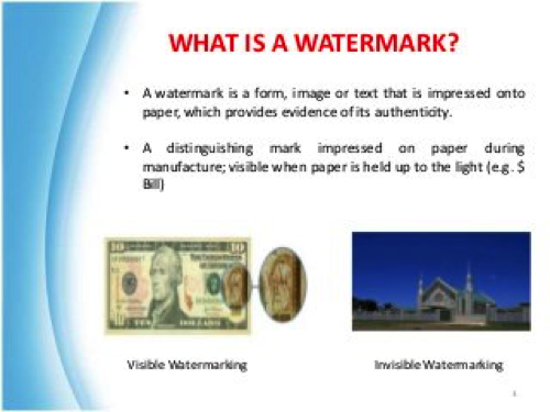 Artificial is another type of mark. It is created by printing an image using an opaque, transparent ink, white ink or using varnish. The process is quite unique because it can be seen from one side of the paper when viewed from an angle reflected with light. When illuminated from one side of document it is invisible.
Cylinder mould is also a common type of watermark. It includes depth with shaded, grey scale image. Shading is caused by areas of relief on the roll’s outer surface. Paper is rolled once it is dry to produce a security mark of varying thickness and density. This process appears more detailed and much clearer compared to using the dandy roll process. It is commonly used in motor vehicles titles and other documents where measures of anti-counterfeiting are taken. The laser technology has made it possible to have made it possible for synthetic paper to be watermarked. The process used can either be wet or dry process. It is done by deforming the selected portions of the micro-porous structure in a pattern corresponding to the mark and changing its light transmission characteristics. The synthetic paper pores is distorted by radiant energy from the laser beam. Careful selection of laser parameters will help the paper’s top layer to remain the same. The technique under normal conditions provides low visibility. When illuminated it becomes highly visible. References David Benderly (2015) New watermarking techniques provides additional security benefits in Authenticating documentation. Photoscribe Technologies Buxton B.H (1977) The buxton encyclopediaof watermarks. Tappan, New York. Dongpu Ling Paper production is one of the four incredible developments of the immense creations of China and Xuan paper is one of the four fortunes of study, which happen to be the composition brush, ink stick, ink stone and the paper. It is the remarkable illustrative of customary carefully assembled paper with a background marked by over 1500 years. Xuan paper is created in the southwest of Jing Area, Anhui Region. The mellow atmosphere, bounteous precipitation and unique Karst mountain zone gives a great domain to the development of the Tara Wingceltis tree – which is known by the name of Blue Sandalwood Pteroceltis tatarinowii and rice; both the plants are utilized as crude materials for the making of paper (Compestine & Xuan, 2016). There are many waterways in Jing Province, particularly two tributaries upriver of Wu Stream, one of them, which is handling the crude material, and the other one is acidic, which is good for creating paper.   The tree covering is utilized as the main material of Xuan paper and blended in extent with rice straw. There are more than 140 stages required in creating different kinds of Xuan papers. With constant advancement new papers have been effectively imagined since 1949 (Compestine & Xuan, 2016). The Xuan paper has a solid, smooth surface and an unadulterated, clean surface as a result of its imperviousness to wrinkling, erosion, moths and mould, it is notable for its life span. The Xuan paper is an aesthetic creation made with smoothness by the Chinese working individuals. It is likewise trusted that without it, the Chinese calligraphy and painting can't completely express the excitement of workmanship. The conventional attributes are upgraded by the manual creation of Xuan paper, which does not utilize present day hardware. The material Xuan paper uses are identified with the geology of Jing District. The generation of Xuan paper can be approximately depicted as an 18 stage handle, and a point by point record would include over a hundred. Some paper producers have concocted steps, which have been kept mystery from others. The procedure incorporates steaming and fading the bark of the tree and in addition the expansion of an assortment of juices. The Chinese individuals have adored Xuan paper since the times of the Tang Tradition. It achieved its prime amid the Qing Tradition and many brands showed up, for example, the Wang Liuji and Wang Tonghe; those who won enormous prizes consistently, at home and abroad. Presently their image Hong Xion has turned into a renowned national brand qualified for Band of Origin Protection from the Department of Technical Supervision (Owen, 1996). It is likewise getting to be famous in Japan and different spots that adoration fine paper. Today, Xuan Paper faces many difficulties; the individuals who develop the trees and rice for the crude materials are thinking that its difficult to bring home the bacon, and imitators, especially those of lower quality, likewise undermine the brand, subsequently there is no conviction for the eventual fate of this astounding paper with its long, glad history. References Compestine, Y. C., & Xuan, Y. S. (2016). The story of paper. Owen, S. (1996). An anthology of Chinese literature: Beginnings to 1911. New York: W.W. Norton. Papermaking Research on Artist John Babcock Lizzy Taber As an emerging papermaker, I find inspiration the most in papermakers who are utilizing paper in a unique way. When looking at artists work online I was in particularly drawn to John Babcock’s work. John Babcock is a California based artist who focuses mainly on paper as his medium. Babcock has shown in over thirty museums in Europe, the US, and Japan. Babcock uses large scale and small scale works to evoke emotional responses and focuses mainly on color. I was so intrigued by his work I sent him some questions about his technical process and his conceptual process. I’ve included some images from his website but all of the in process shots were photos he sent me in the interview. Anything in quotes are direct responses that I have included from the interview.  The above image is a work that caught my eye. I was particularly drawn to the cut out negative space within the paper because of it’s repeated pattern and mostly because of the cast shadows behind it. This is what John Babcock had to say about it when I inquired how it was made.; “Kozo pulp, beaten by hand, two masters, blue and green. made thin by massaging pulp into a water bath see photo below.”   finished kozo sheets ready to be adhered to mylar. Below: spirit wave image cut on vinyl cutter.  Many of Johns concepts are really interesting to me. He focuses on a wide variety of ideas throughout his work- but still manages to keep his entire body of work cohesive visually. Some concepts he touches on are expressing ideas of love, commemorations, animals, spirituality, and many more. I was interested in his process of executing ideas. I wanted to know if he went into his studio with a specific concept in mind or if he let the highly technical process of papermaking guide his inspiration. This was his response; “I am a builder. I work with the pulp as a sculptor manipulating the fiber into place. Since I have many techniques of working over a span of 40 years, it is difficult to generalize “this is how I work”. Color Rules. Color is my first decision. Size is next. Sometimes I will sketch out patterns. For commissioned work I might even make up a maquette with collaged papers. Sometimes my concept isn’t clear at all. If it isn’t, I might start making pulp, pigment the pulp and start mixing the colors. In that process of getting involved with the material, usually ideas start to emerge and the ides of form evolve. If I want to make a work based on feeling, I will visualize the feeling with colors in mind.” I then asked how his process has developed throughout his career; “The process has developed because I have a lot more tools and techniques available. We didn’t know much about structure of paper fiber when I started. In the nineteen seventies my cotton came from linters mixed in a washing machine or very lightly beaten in a hollander. The pulp when spread out on a large plastic surface invited manipulation. In the archive click on “statement” in Faults and Fissures http://www.babcockart.com/faults-fissures/ When abaca was introduced to paper artists in the very early eighties I discovered a translucent shiny fiber that transmitted light differently. I was fascinated that by working cotton and abaca side by side I could make the abaca match or contrast with the cotton thus developing hidden images and color fields that changed as the viewer changed position or as the light changed during the day. http://www.babcockart.com/collage/” FREE CASTING John works with a lot of free casting. One of his bodies of work I am inspired by is his Ladder series. “ The ladder has a special significance for me. It is a path to higher ground or a higher plain. I have climbed ladders all my life both physically and metaphysically, as perhaps you have. In this series I have enjoyed exploring the chemistry of color and the color of aspiration.” – John Babcock “I mix 15 gallons of a master color pulp. I will make from 2-4 master batches. from 30 - 60 gallons. I intermix these pulps to make a gradation in 10-20 buckets five gallon buckets partially full. I call this building the color and it will take a few days to get the blending correct to my eye. I will then repeat the process for abaca. Free Cast: I concentrate the pulp like cottage cheese and place it on a waxed plastic surface and manipulate the pulp about a ¼” thick to the desired shape. I can make sharp edges if I want. I work blind. Face side is down. 1991 late ladder series photo below.” 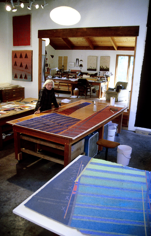 “April 2000 Soquel Studio The cotton fiber is in place, abaca pulp will be placed in and over the top of the cotton to hold it all together, working blind. So “free cast pulp” is casting without a mold.” 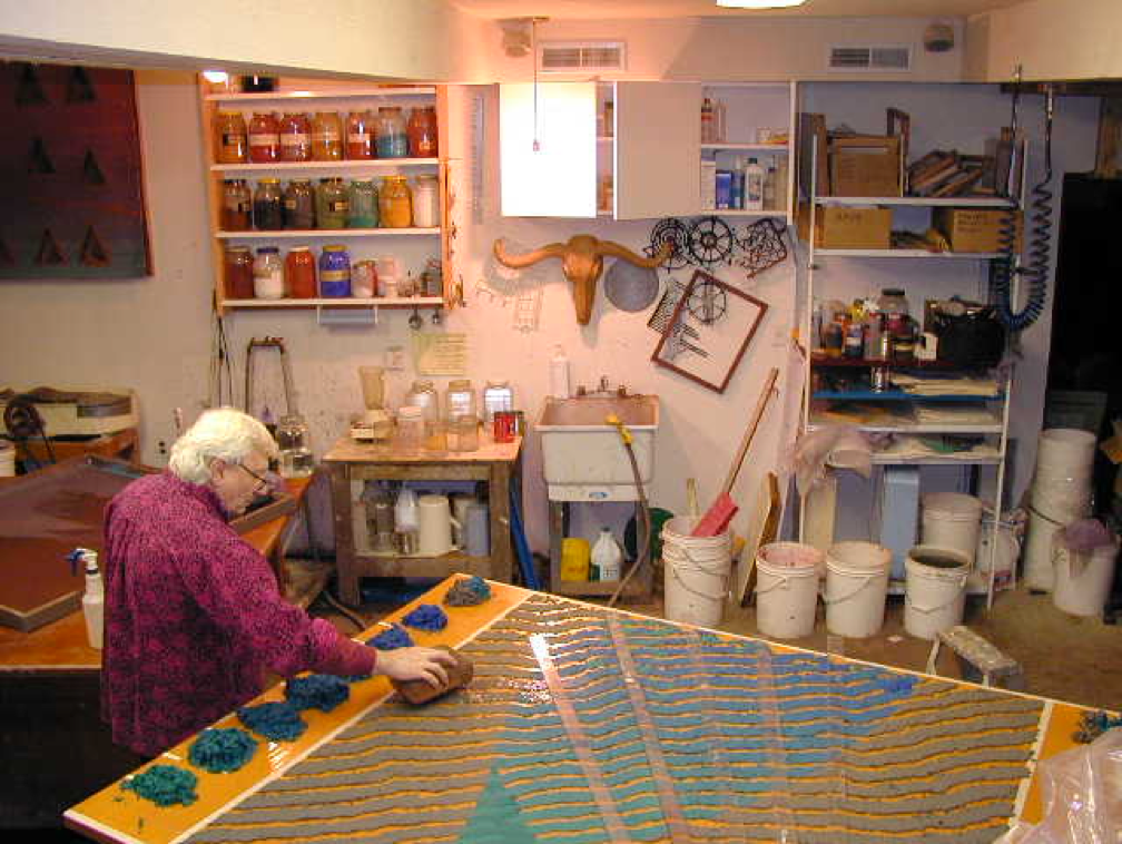 Some more of John Babcock’s free casted paper; (my favorite series) 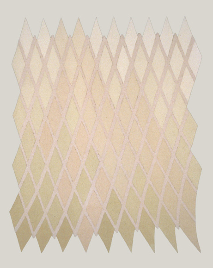 Perceptor 1984 71” x 56” Perceptor is a spirit piece that for me is an overlord of the gallery space it lives in. It was one of the first explorations of a changing color and fiber gradation, which creates a shifting pattern from different views. free-cast cotton and abaca fiber pigmented in the pulp 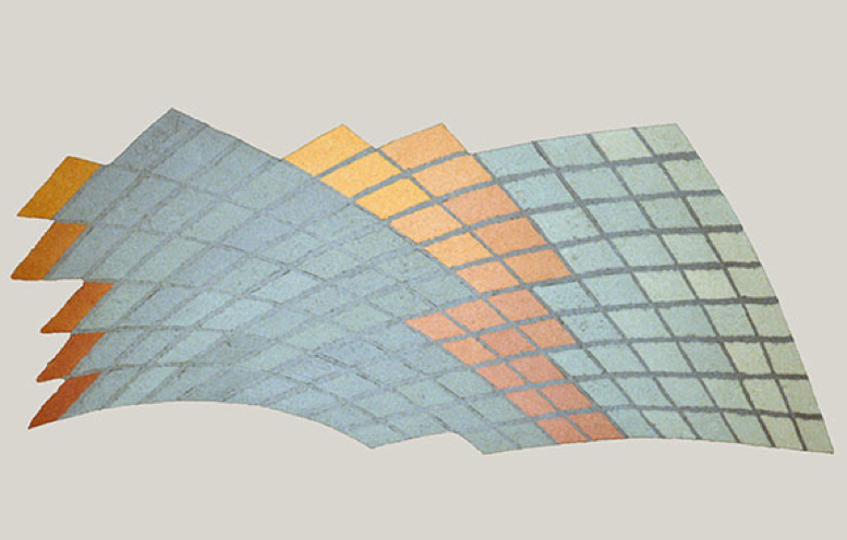 Messenger 1984 44”x 112” Secret messages within. The tiles are made from from varying combinations of abaca and cotton pulp creating subtle patterns that are only seen in a certain light. free-cast cotton and abaca fiber paper 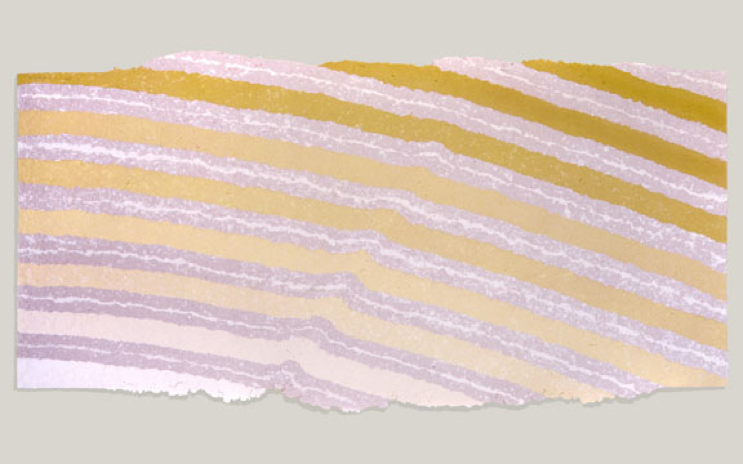 Lastly, a sculptural piece that I find very interesting – which was inspired by Arizona; 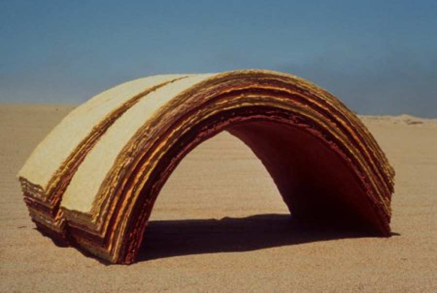 Faulted Arch 1979 16”x 16”x 32”
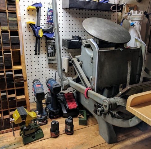
This is one of a series of sculptural works dealing with topography and landscape. It is about what we don’t see usually, but get to see for instance, when visiting an Arizona canyon where erosion gives us a glimpse of times past. Collection : International Paper Company. Exhibited in “Paper/Art – A Survey of the Work of Fifteen Northern California Paper Artists” at the Crocker Art Museum, Sacramento CA. January, 1981 sheets of laminated earth pigmented cotton fiber paper by Erin Thomas Although it is fascinating to learn about professional print makers, what they produce, and how they got to where they are, I find it interesting to understand how letterpress and other forms of print making are put into practice by those who do it as a hobby. These individuals have pursued careers in other fields that maybe allow for more substantial salaries capable of supporting families, or careers that simply fulfill a different interest of theirs. I met Joe Mildenhall at church and came to learn that as a working professional in the education sector, he enjoys print making as a hobby. “I was introduced to letterpress in high school. It was still an active form of printing for small jobs like business cards, menus, etc. back in the late 1960's. In college I usually took one "fun" class in addition to the required course work. One semester I took a class called industrial communication or something. It provided instruction on several printing techniques including silk screen, rubber stamps, lithograph and letterpress. Later I had a student job at the university press where they were still printing books using lead typesetting and printing equipment. I didn't operate that equipment but did operate other presses so I learned the fundamentals of printing.” Although he has worked in software development and technology management his entire career, he has found a lot of enjoyment in art and design. He says “[he has] always enjoyed the intersection of mechanical devices and art.” Print making appeals to many who sit in the crosshairs of the more rigid right side of the brain, and the creative, loose left side. “I dabbled in photography and silk screening so several years later when I saw that letterpress greeting cards, etc. were becoming popular I decided to see what was involved in producing them myself. My initial motivation was the idea of producing our own Christmas cards rather than buying them. I think I have reasonable design and layout skills and our oldest daughter has some really good drawing skills so I thought we could join forces.” And this was how Joe became more involved in his practice. He started with a small table top press and, through buying and selling four different presses, has settled on his current Chandler and Price Pilot 6"x10" tabletop press. He has printed several Christmas cards and some miscellaneous Thank You and birthday cards. His style shifts back and forth between vintage and modern styles, but mainly looking for opportunities to use crisp lines that will highlight the letterpress effect. Where some may find the tedious intricacies of print making, and letter press in particular, to be exhausting, he really enjoys the manual process of layout and printing with letterpress. The physical part of the process gives him more personal satisfaction than running something out of a modern printer. However, Joe is not exempt from the frustration that comes with setting the press and printing—his experience is that “the only part of letterpress printing that can become taxing is when things like inking, roller height and positioning aren't quite dialed in. [He doesn’t] print frequently enough to quickly and easily resolve issues so it takes some trial and error.” Ultimately, Joe has enjoyed having letterpress as an occasional outlet. He doesn’t have very much time to spend on it, but gets a lot of satisfaction when he does. I think these experiences and this perspective is such for many who practice as a hobby. Creating, in whatever form, grants substantial satisfaction and fulfillment. It is always exciting and interesting to me when I find characters like Joe who understand the importance and beauty of creating, and do so in a way that fits into their careers, lifestyles, and schedules. Interview conducted personally with Joe Mildenhall
Within papermaking there is a lot of equipment – you got your vats, your molds, deckles, buckets, hoses, presses, dryer boxes, blotters, etc, etc, etc. But above all the beater is king. Without someway to break down the fiber you got nothing. After all most of the items are pretty common place. Take some water, a blender two old picture frames and some old window screen and you can pretty much make paper. Problem is that it will be kind of lump and bumpy, not hold up real well, be hard to write or draw on, and generally not perform for anything than being able to view it as a piece of paper that you made. Begging question – if it doesn’t function the way we ask paper to function than is it really even paper? Regards of its paperness we must look at the reason why. The reason paper turn out so poorly when made using a is because the paper that comes from a blender is chopped while the paper that comes from a beater is macerated. The action of macerating elongates the fibers allowing them to flow together creating a strong woven hydrogen bond while also being able to compress down into a flat even sheet, and the way to do this is with a beater. Since around 1673CE (Library of Congress) western papermaking has been reliant on the design of one tool for its papermaking – The Hollander Beater. This oval trough with a cogged wheel and a bed plates does a fantastic job on macerating fibers of all kinds. The issue with it is accessibility. The market for these machines is pretty limited and they are built to last so new Hollander Beaters are made to order and run you somewhere in the ballpark of $10,000. That right there is a pretty heafty sum of money to come up with on the front of starting a new papermaking studio, and to my mind is the main prevention of papermaking expanding within the arts. I became interested because it would seem to me that in the age of the Do-it-Yourself movement, wiki-how and youtube fix it videos, we could come up with a solution to this problem. I got to wondering if papermaking has been around since 105 CE (Asunción 9) but the Hollander Beater didn’t come on the scene until around 1673CE how was the paper being beaten for for other 1500 year? Maybe this could be a clue into how to make a beater that is more affordable and still produces the same product. Here you will find a survey of different paper beating machines and methods. Hand Beating – In the beginning there was hand beating. The Chinese made paper from rags, finishing nets, mulberry tree bark, nettles, and hemp that were softened with lime and fermented before crushing and grinding them by hand to a pulp using a hand mortar. (Asunción 14) Though a very early and possibly considered rough, primitive method some of the most beautiful papers are still made today using a similar process. For many fibers like Kozo or Gampii a cooking in caustic solution followed by a hand beating with mallets or wooden paddles is used. From afar someone seeing the rhythmic beating of wet pulp with a piece of wood may even seem slightly barbaric. However, after the suspending in water and pulling a sheet it creates some of the must beautiful and delicate paper often with slight wispy hairs suspended within. Japanese Stamper – Not surprisingly following hand paper beating came a tool that would beat paper in a similar way but without the laborious work. Though in Japanese papermaking the beating is really secondary to the preparation of the fiber in the cooking and washing stages. “Fiber selection, cooking and washing are the most crucial preparatory steps in Japanese papermaking” “Minor variations in cooking and washing can produce very different papers even from the same fiber” (Barrett 35) While there are many variations based on area, mill and the papermaker the general process is “boiling the fiber in a strong alkali solution to dissolve most of the lignin, pectin, waxes, and gums, leaving primarily cellulose fiber and hemicelluloses.” (Barrett 36) After that the fiber is put into clean water and meticulously inspected – picking out and removing small bits of left over bark or imperfections until the fiber is a consistent tone. Following the cleaning the fiber is ready to be beaten. “The fiber is twisted into thread and woven into tight patches of cloth” “millions of long straight fibers, all laying closely together” “The fibers stand loosely together in the bark…ready to come apart” (Barrett 44) after this the fiber is beaten for only around 30 minutes. The beater itself was invented in “1920’s to substitute for hand beating” (Barrett 46) The stamper beater consists of a metal shaft with a hardwood striker mounted to the bottom, that can travel freely vertically as well as rotates. It is bolted into a sturdy wooden frame and powered by an electric motor that when running raises and lowers the striking part of the machine into a small basin at the bottom where the fiber is kept. For final processing a Naginata beater is often used (Barrett 46) 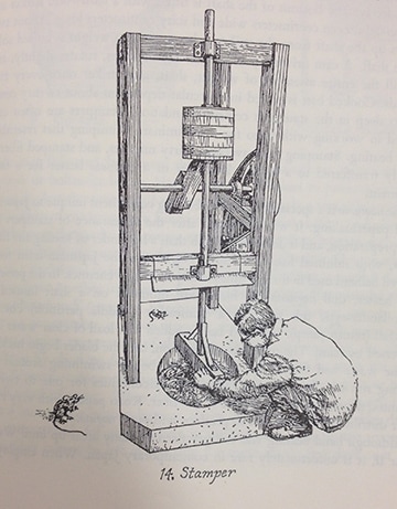 Naginata Beater – The Naginata beater came on the scene after the invention of the stamping beater. In the use of the stamper the purpose is not to chop, cut or macerate the fiber. The goal is rather to separate the fibers from each other. After stamping the fiber is put into the Naginata to “tease” the fibers apart. The Naginata looks very much like a western Hollander beater, an ovular trough with a mechanical apparatus that the fiber and water passes through. Unlike the the Hollander the roll and the bedplate have been removed. In there place is a series of curved dull knife like thanes attached to a rotating horizontal shaft and powered by an electric motor. These curved “blades” are what gives the Naginata its name, originally coming from the the name for the curved halberd used in battle. While the Naginata is running for about 20 minutes or so depending on the fiber the dull blades chop at the water and fiber freeing the strands of fiber from each other and separated them from each other – suspended in the water and ready for sheet forming (Barrett) 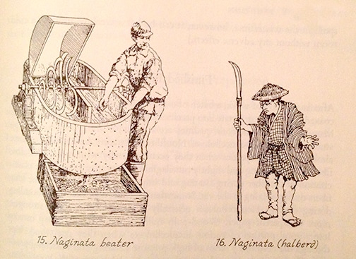 Western Stamper – Before the invention of the Hollander beater in the western world the use of the western style paper stamper was the main tool of the papermaking industry. The stamper normally consisted of 3 or more hammer like heads that would land their blow inside of a rounded bottom stone trough. Often metal was used at the bottom of the trough to increase longevity. The head of the hammer that came in contact with the bottom of the trough would be outfitted with a gridding of nails or sometimes a custom cast plate or head – similar in appearance to the bed plate of a Hollander beater. The arm of the hammer attached to a pivot point that would allow the hammer to raise and fall. The force causing the raising and falling of the hammer was powered by a rotating shaft outfitted with pegs interspersed so that the hammers would raise and fall in separate timing from each other. This shaft would often be powered by water and a mill running alongside of the building the beater was housed in. Prior to beating rags, where were the primary source of paper, was cooked or most often retted (rotted). The fiber was then poured into the trough and processed –typically taking around 3-5 days. “The behavior of the pulp under the hammers perfectly fits the various descriptions made in the 18th century. When a hammer is raised, it creates a depression which draws in the pulp expelled by the drop of the neighboring hammer.” (Moulin à papier) 601 Production LTD, Traditional Paper Making Process, https://www.youtube.com/watch?v=lltkdyE1OG0, May 25, 2012
Asunción, Josep. The Complete Book of Papermaking. Lark Books, 2003 Avi Michael, Chancery Papermaking, https://www.youtube.com/watch?v=e-PmfdV_cZU, May 28, 2003 Barrett, T., “European Papermaking Techniques 1300–1800.” Paper through Time: Nondestructive Analysis of 14th- through 19th-Century Papers. The University of Iowa. Last modified July 14, 2014. http://paper.lib.uiowa.edu /european.php. Barrett, Timothy. Japanese Papermaking. John Weatherhill Inc., 1983 Library of Congress. Papermaking Art and Craft. Vinmar Lithography Company, 1968 Moulin à papier. http://www.moulinduverger.com/papier-main/article-42.php. 2006 sararingler, Kozo Beating, https://www.youtube.com/watch?v=AgXZLkwJqZ0, July 16, 2009 stampochpress, Handmade papermaking and handcasting type, https://www.youtube.com/watch?v=7MTb7Nt9jNY, November 7, 2007 A printing press is a machine for applying pressure to an inked surface that rests upon a surface to be printed on (such as paper or cloth), transferring the ink. Typically used for texts, the invention and spread of the printing press was one of the most influential events in the second millennium revolutionizing the way people understand and explain the world they live in, and ushering in the modern era.
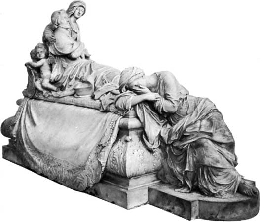
The printing press was invented in the Holy Roman Empire Johannes Gutenberg of Germany around 1440. Gutenberg, a goldsmith by profession, developed a complete printing system, which perfected the printing process through all of its stages by adapting existing technologies to the printing purposes, as well as making groundbreaking inventions of his own. His newly devised hand mould made for the first time possible the precise and rapid creation of metal movable type in large quantities, a key element in the lucrativeness of the whole printing enterprise. Upon further investigation, I found that a “hand mould” or “matrix” was used in hot metal typesetting, a matrix is a mold for casting a letter, known as a sort, used in letterpress printing. However, in printmaking the matrix is whatever is used, with ink, to hold the image that makes up the print, whether a plate in etching and engraving or a woodblock in woodcut. In the Fall of 1909, Robert Vandercook founded Vandercook & Sons in Chicago, Illinois. His first press was made with a geared cylinder. Before the development of his press, all proofs were made on a roller press, a hand-operated crank press that relied on gravity to make an impression, or on a Washington Hand Press, which was pre-ink-rolling—you had to hand ink each print, and could only do 4 prints at a time, on the large press bed. The press in the Petko studio that we visited looks to be a Washington Hand Press. Here’s a video demo: https://vimeo.com/67678996 Over the next half-century, Vandercook introduced 60 different press models—29 before World War II, 17 of which were still being manufactured for years after the war. Manufacturing was halted during the war, as Vandercook was greatly involved in making things for the war effort, for which they received the E Award. The President's “E” Award was created by Executive Order of the President to afford suitable recognition to persons, firms, or organizations which contribute significantly in the effort to increase United States exports. With a couple exceptions that were gravity presses, all of Vandercook’s presses were geared cylinders. The SP’s or Simple Precision presses and the Universal series were the last designed. The SP15 was the most popular of all of the Vandercook presses. Take a look at this demo: https://youtu.be/jxwRlQib1EQ Although the company has changed hands a couple of times, it still operates under the name NA Graphics out of Silber City Colorado—making parts and supplies for many Vandercook models. Without the efforts of Mr. Vandercook and his sons, we may still be using gravity to create prints. 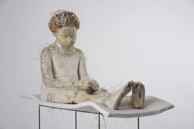 Vally Nomidou creates life-size figurative sculptures out of paper that may be haunting at first glance, and yet become gorgeous throughout the contemplation of her process and content. Nomidou is an artist from Athens, Greece and a Graduate of the Athens School of Fine Arts, and of the Saint Martin’s School of Art of London. The body of work I have researched centers on Nomidou’s exhibition “Let it Bleed” which occurred in 2010 at the Fizz Gallery in Athens, Greece as a part of Art Athina, a yearly international art fair hosted in Athens. In this exhibition Nomidou presented seven sculptures of female figures including adult women and young girls. The sculptures offer an immediate sense of recognition given by their extremely life-like presence, attention to detail, and naturalistic gestures. To start her process Nomidou plaster casts body parts from her sitters and goes through an extensive method of documentation taking several photographs of her models. After this Nomidou sorts through her collection of substrates including printed materials, newspapers, paper towels, handmade paper, and cardboard while consciously deciding on a color palatte attributed to the natural materials. She starts with an internal framework made of cardboard as an armature and works from the inside out. After this, the artists attaches the plaster cast pieces and then builds layers of the paper material using wood glue, acrylic medium, and often sewing and stitching which then reflect a surface reminiscent of skin. Further some of the surface is rubbed, sanded, and polished to evoke sensuality and play with the viewer’s visual perception activating their sense of touch. Many of the sculptures make great use of negative space as they are exposed in areas where the figure is incomplete possibly creating a sense of emptiness, but also giving the figures a light quality. This openness is a direct invitation for the viewer to contemplate the relationship between exterior and interior surfaces. 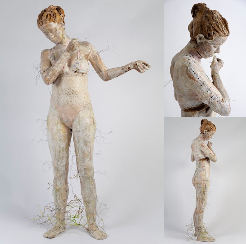 The message I believe Nomidou suggests is that her material is used to venerate that which is vulnerable, available, and temporary. Because she chooses not to use anything else she fully exposes the viewer to her process and materials leaving almost nothing to the imagination. Although there is a grand sense of naturalistic illusion the transparent content of the piece is best reflected by the translucent layers of paper built up on the surface. It’s a strange mixture that prompts the viewer to struggle between the thought of witnessing something pleasant or possibly vile. Her methods may also suggest feelings of loss and possibly suffering as Nomidou is very fond of the haphazard assembly of the works in reference to the stitching and sewing which is indicative of wounds, and scars, and effects on the body. After all one of the main themes in her work is fragility as the artist states: “…I work out my figures spontaneously with the intention to show the mental state of ‘’between’. Between different trends, orientations, routes, decisions. The situation to be between and to do connections, fragile connections with a variety of possibilities, with uncertainty. Without a final decision. With tyranny. The difficulty, the sensitivity, the contrary emotions that coexist, the agony, the empathy, the cowardice, the fear. The game and the pleasure to express all these situations sometimes gently and sometimes hard...All these are a fragile world written on the female body which I build… People I know, anonymous people, simple people, children, (my son, a refugee girl, a lonely girl with a famous family) an abnormal dancer…All of them have something vulnerable. They are personalities under formation, defenseless against their fate.” 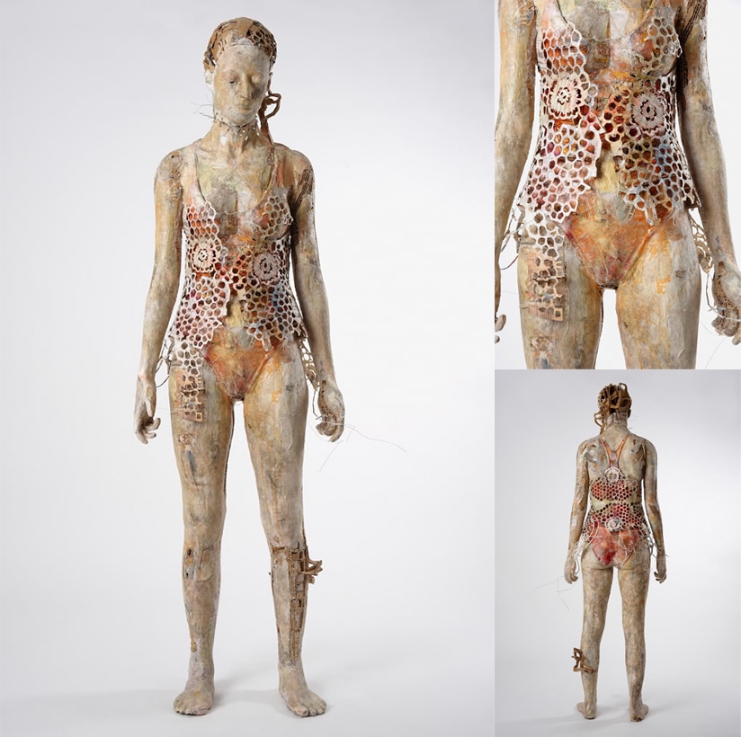 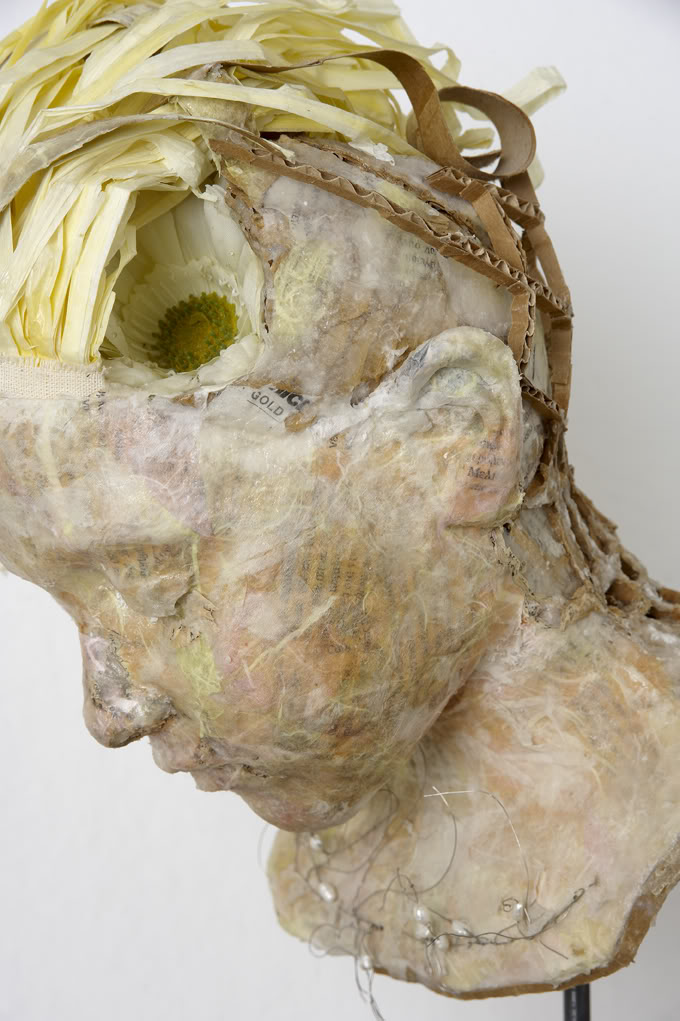 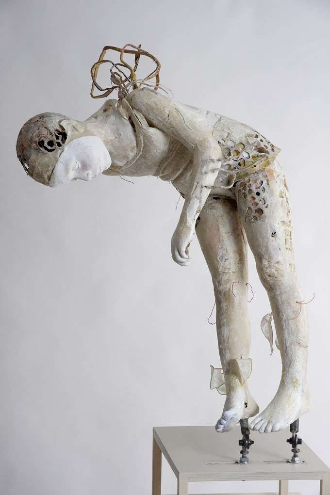 Turkish Marbling is a process for creating decorative papers that have a patterns that resemble the organic patterns found in marble stones. The process originated in the middle east and spread to Europe around 1600. It involves dropping pigment suspended in water into a shallow tray of water mixed with sizing. Then the artist can drag combs and brushes through the water in order to move the pigment and change the pattern. The pigments can be layered to create very colorful patterns. Once the design is finished, the artist lays the paper across the water and then picks it up. The paper picks up the pigment in the pattern that it laid in on the surface of the water. Marbling can also be done on paper, wood or other porous surfaces. Sizing is added to the water so that the pigment will float on the surface of the water. The traditional sizing is made from carrageenan seaweed, but methyl cellulose can also be used. The pigments can be suspended in water based inks, gouache, oil paint, or acrylic paint. But in order to use acrylic paints, the paper must be coated in a mordant such as aluminum sulfate to act as a fixative. There are many named patterns within the marbling technique, such as the French Curl pattern, or the shell pattern. But many patterns are simply classified by how they are made: either combed or thrown. The library at the University of Washington has an extensive collection of marbled papers, a gallery of which can be viewer online here. Suminigashi, the Japanese form of paper marbling, was practiced as early as the 10th century. There is also documentation of paper marbling during the Ming Dynasty in China around the 14th century. Marbling became an art form in Turkey in the 15th century, but it is difficult to determine whether the Turkish form originated from those East Asian countries. However, people began importing marbled paper from Turkey to Europe in the 16th century. In addition, they tried to replicate the process. But, they used different pigments, papers and chemicals depending on what was available to them locally, and this resulted in different patterns. Therefore, scholars can determine a book’s country of origin based on the pigments, papers and patterns used on its marbled end-sheets. Europeans were the first to develop the practice of marbling the fore edge of books. Mostly contemporary books are commercially produced, therefore hand marbled end sheets are not as common as they once were. But today, marbled paper is still used in artists books and limited edition finely bound books. Furthermore, the practice has recently gained widespread appeal in mainstream crafting communities and has become a popular motif in interior design. One of my favorite contemporary examples of artists working with marbling is Pernille Snedker Hansen, who is based in Copenhagen. She marbles planks of wood and installs them as flooring. I believe that her contemporary sense and use of color is really modernizing and re-contextualizing the tradition. Sources: http://content.lib.washington.edu/dpweb/essay1.html http://digitalcollections.lib.washington.edu/cdm/search/collection/dp http://marbling.org/how-its-made/ http://www.danielsmith.com/content--id-110 http://www.snedkerstudio.dk/marbelous-wood-refraction1  Image: https://blog.etsy.com/en/files/2013/05/etsy-how-to-clare-mcgibbon-marbling-marbled-scarf-021.jpg 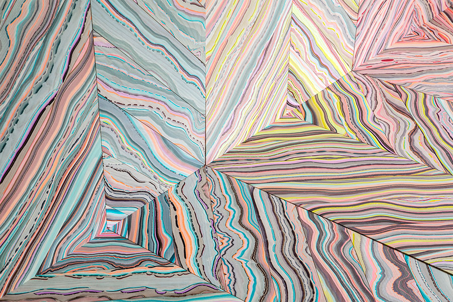 Refraction #1, Pernille Snedker Hansen Impacts of Paper Paper is a material that is present in almost every aspect of life. It is how humans often communicate and share information in the form of books or paperwork, how many food products are packaged, is a substrate for various forms of art, and so many more uses. With millions of tons of paper being produced each year, how is paper impacting the environment? The process utilizes gallons upon gallons of water as well as enormous amounts of plant matter. How has papermaking remained sustainable, or was it ever sustainable in the first place? Industrial production of paper obviously wastes much more than an individual. Creating larger quantities of paper requires more energy, more water, and more pulp with less concern about reuse of water or concern of waste. The quality of the final product and the money made is the priority. Within the processes of industrial papermaking, I will cover water usage, habitat disruption, a little bit about plant usage, different paper products, and recycling. How do all these different elements of paper affect the environment, and how can we change the negative impact? Paper was first created in Ancient Egypt around 3700-3200 BC, and ever since it has been an essential part of human life. Papermaking techniques we know of today were developed in China in 105 AD. The paper mill was introduced in 1282, which innovated the production of paper. However, it wasn’t until the Industrial Revolution that the mass production of paper was made possible and costs were significantly reduced. Over the centuries all over the world, the process and materials used to make paper evolved. This increased the demand for paper-based products and led to the paper and pulp industry we experience today. In the last two centuries, advances in papermaking technologies, increase in global commerce, and affordability of paper products have led to alarming increases in paper consumption, which, unbeknownst to most individuals, has caused significant environmental damage. The global demand for paper product is significant, with more than 350 million tons produced annually in 2010. Generating over $200 billion annually, the paper products industry is big business, and it is only getting bigger. (The Environmental Sustainability of Paper) What are the environmental impacts of the papermaking process? The first impact is the source. Wood is the most commonly used source for industrial papermaking. Deforestation occurs to obtain paper pulp, and is a critical environmental concern. One of the leading contributing factors to endangered wildlife species is deforestation. Environmental impacts of deforestation include: energy consumption for logging, the destruction of natural ecosystems, reduced water quality, soil erosion, diminished habitats for plants and animals, and the elimination of old-growth forests. Reforestation is becoming more common, but finding a sustainable solution should be the main focus. (The Environmental Sustainability of Paper) In addition to deforestation, another impact of industrial papermaking is pollution. The process of making paper itself is toxic. Chemicals are found in most papermaking processes. Pesticides used in the forest and a variety of chemicals are used in the process to create pulp. Some of the commonly used chemicals are chlorine, mercury, absorbable organic halogens, nitrates, ammonia, phosphorus, and caustic soda, each of which damages the environment differently. The primary element used when making paper is water. According to the EPA, the paper industry is the largest user of industrial process water per ton of end product. Paper producers are becoming more competitive for water supplies as water shortages are becoming more common. In addition, the paper industry is the fourth largest contributor to toxins on surface water. How can we make papermaking more sustainable? The impacts of paper become interconnected. If we use less paper products, then the need for virgin paper would decline. Less demand for paper would equal less paper made. Sustainable forestry practices are required to ensure that virgin paper is available at a reasonable cost, and so that habitats are not destroyed. The forest industry is establishing sustainable forestry initiatives, which emphasize natural resources and wildlife conservation, prompt reforestation, and a deeper awareness of environmental responsibility and stewardship. (The Challenges of Sustainable Papermaking) Utilizing non-wood fibers, such as bamboo, reeds, or cereal straw, would also decrease deforestation. In addition to sustainable forestry practices, recovering paper as a raw material is important as well. Papermaking is one of the leading recycling industries. Fiber can be reused up to seven times before the fibers become too weak. Utilizing these two strategies will lead to a more sustainable papermaking future. As the world becomes more and more digital, somehow we have increased our paper consumption. Hopefully as environmentally aware companies and approaches grow, so will our approach to the paper making process. As the world goes digital, the need for more paper should decrease, as well as the environmental impacts. Blanco, Angeles, Carlos Negro, Concepcion Monte, Elena Fuente, and Julio Tiger. "The Challenges of Sustainable Papermaking." Environmental Science and Technology (2004): 414A-20A. Smith, Richard. "The Environmental Sustainability of Paper." Graduate Studies Journal of Organizational Dynamics 1.1 (2011): n. pag.   Gisant, or recumbent effigies, are tomb sculptures depicting the deceased at or near their moment of death.
The earliest known version of this type of funerary art comes from the Etruscans, working smaller than the more (relatively) modern Catholic examples I am focusing on. They also typically depicted the deceased at a feast, rather than at the cusp of or immediately after their demise. Typical European gisant show the subject in this ‘eternal repose,’ although variations such as the transi, or cadaver tomb, used during the Renaissance, depict a person’s corpse instead, naked with embalming scars or already decomposed. This transi is of the former type, skin half-peeled away and posture yearning; this particular sculpture too artful and untrue to the reality of decomposition to be unsettling. This is one of the latter designation, very common for Medieval transi: an earnestly rendered corpse left to rot. It is a very literal way to convey time and mortality through art. What really gets me is that it is intended to be reverent rather than morbid: this is the image of themselves these people wanted immortalized ever after. It is an interesting thing to think about: the reasoning behind having your image captured and displayed in death, rather than in life, as is the modern custom. The subjects are definitely made prettier and aestheticized, but the message they’re leaving behind is still the fact of their mortality, rather than their worldly presence and achievements. A lot of it has to do with the religious associations of the gisant: ideally, they’ll be housed in a place of worship, and an image of piety in death lends itself to the suggestion of ascension to heaven. Still, a literally stone-carved monument to having died is a fascinating thing, especially since, in a perfect world, these would all be publically displayed. A non-transi gisant, this is the tomb of Cardinal Richeleiu, a French clergyman, nobleman, statesman, and villain of The Three Musketeers novels (no, really,) literally held in the arms of piety as he passes. To have your gisant kept in a church or abbey, especially a notable one, is a very high honor, and the end goal for the construction of a tomb like this. Westminster Abbey, where I had my first exposure to these sculptures, is full of them, tucked lovingly into every niche and against every wall. Beyond their individual significance, this grouping of them interests me as well. Its an instance of the multiple that could not be premeditated by the sculptors: who knew where in a church a certain tomb was going to be placed, or what would be put near it in the years to come? While beautifully upkept, they are somewhat hodge-podge in this way, monuments to pious death shoved like sardines into a chapel. Though not strictly intended, I think that they function as a much more effective memento mori, crammed into churches as they are: sculptures carved hundreds of years apart, all God-fearing individuals, all frantic to immortalize that to the world, all equally dead, tucked against walls and behind each other. Works Cited https://www.britannica.com/art/gisant https://en.wikipedia.org/wiki/Gisant David Hockney is a Britain born artist who moved to Los Angeles and became famous shortly after…Proving that moving to Los Angeles will actually make you famous. Hockney fell in love with art at a young age and began exploring his artistic side all through college. He attended Bradford College of Art, then moved on to study at Royal College of Art in London. A short 2 year intermittence working at hospitals to complete national service requirements between 1957-1959 gave him some experiences and other grown up things to contemplate before diving back into his art. Once in graduate school, he began experimenting with different techniques and matters of subject. His main medium throughout his early career was painting, stating, “I prefer living in color.” his material was acrylic and his style was expressionism, similar to that of Francis Bacon. In 1962, the RCA would not let him graduate so he protested, refusing to write the required essay for the final exam. The school recognized his reputation and talent had a second thought over its regulations, awarding him the diploma. How rad is that!  Lithographic Water Made of Lines, Crayon and Two Blue Washes Without Green Wash. -David Hockney print from series of LA Pools A visit to California revitalized his hopes and aspirations of his art. He fell in love with the style, architecture, and culture. His first series in LA involved paintings of swimming pools as the subject matter. These beauties are minimalistic and the color pallet is pleasing to the eye. He later began a series of paintings of living rooms in LA and whilst doing so, photographed them for reference. One living room was documented using a string of polaroids. Once taken, he put them all together for a reference but then realized that the photo collage itself was art. This would inevitably become his claim to fame. He called these pieces "Joiners".  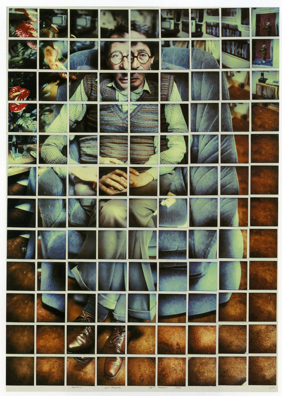 Hockney was introduced to printmaking while he was attending Royal College of the Art. He gained recognition by the college for his work and they wanted to publish his Rakes Progress series as a book. He had to expand the collection from 8 to 16 by acid etching fifty plates. In 1976, Hockney created a portfolio of 20 etchings titled, The Blue Guitar: Etchings by David Hockney Who was Inspired By Wallace Stevens Who was Inspired by Pablo Picasso. In 1985 he was commissioned to design the cover of Vogue. After experimenting with Polaroids, they became his main medium of focus. Photo collage and lithography fueled his art for the next ten years. David Hockney has a vast collection of works, most of them being prints and multiples. mainly working through etching and lithography. His subjects range from portraits to architecture to abstract expressionism. He is an openly gay artist and he was never shy in displaying it within his works. From left to right- Myself and My heroes. Two Boys Aged 23 or 24. Artist and Model WORK CITED
 Monotype By: Mia Adams Monotype is a printmaking method that has been around for thousands of years but has no determined origin. Yet some of the oldest monotypes have been documented from the 1500s from artist Hercules Seghers who has a legacy of being one of the most influential printmakers till this day for his experimentations with ink, paper, and reworking prints. Monotype is the simple configuration of ink, a non porous surface (such as plexiglass), and miscellaneous tools. Artists can work positively or negatively or even both. Given its nature, the prime concept of monotype is the idea of only having one. Although artists can still have the freedom to challenge this. With these basic concepts, there are no rules or “traditions” with monotype. One is able to take control and manipulate their surface however they desire and how much they desire. There are no limitations yet more so a challenge of the artist's ability to utilize the flexibility of monotype. With Seghers as an example monotype is creatively flexible with Techniques, Tools, and styles. “Mountain Valley with Fenced Fields” - Hercules Segers https://www.rijksmuseum.nl/en/rijksstudio/artists/hercules-segers/objects#/RP-P-OB-840,5 Techniques: Additive, Subtractive, and use of light  Pablo Picasso http://www.sothebys.com/en/news-video/videos/2014/10/A-private-collection-picasso-prints.html As stated above, one can create a monotype using Additive or Subtractive. Additive is where ink is added to a surface (such as plexiglass) to create the positive space of the image. Pablo Picasso’s print above is an example of additive monotype where he “painted” the surface to create this figure. Subtractive is where one coats a surface with ink and an image is created by whipping away at the negative space to create a positive space. Depending on how heavily the ink is whipped away, it can interact with the surface to create different tones as shown below. Picasso's piece above also has subtle subtractive techniques such as the thin white lines on the left of the image being scratched away with a small toothpick-like instrument. 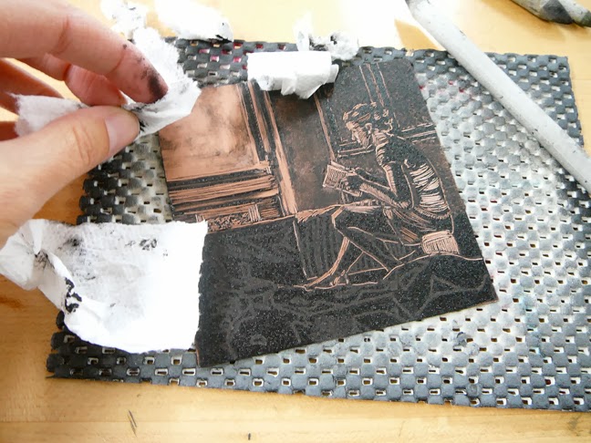 http://www.belindadelpesco.com/2013/10/monotype-printmaking-italian-vacation.html Artists manipulate this technique to make light a main component. The use of light in monotype can create life like shapes and depth onto a 2D surface. Although extravagant sources of light can be generated with both techniques, I have seen through online examples that the subtractive method is much more successful. 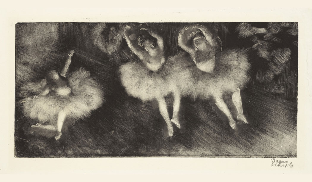 "Three Ballet Dancer (Trois danseuses)" - Edgar Degas http://www.blouinartinfo.com/news/story/1285633/a-brief-history-of-monoprints-and-monotypes-from-edgar-degas Monochromatic VS Multicolored With the subtractive approach it seems that you are somewhat limited to one color (unless the surface is inked with multiple colors). On the other hand with additive, it is much less complicated and multiple colors can be added onto the surface or even layered.  “Mountain Study 3” - Cathrine Tuttle http://www.akuainks.com/additive-monotype Style: Tools, Ink, Paper, and Textures 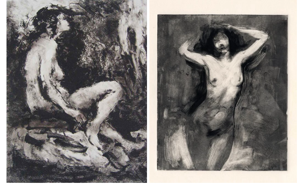 Unknown
https://rekonstrukt.wordpress.com/2016/01/ Any sort of tools can be used to create various textures, characteristics, and features. Tools can vary anywhere from cheese cloth, brushes, toothpicks, Q-tips, Rags, or even liquid solutions. Images can also vary from the ink used (water or oil based) and the paper (Smooth or textured). Every tool will interact with the surface differently. The image shown above is a comparison of contrasting techniques. From what I have seen and read, monotype is all about experimenting. What works with what? How do the tools, paper, ink, and the painterly strokes create one complete unique image? Experimenting with these can open up endless possibilities that are waiting to be discovered. Work cited:
By Emily Irwin Liminality refers to the space in-between. It is experienced as a sensory threshold, barely perceptible because of its ephemeral nature and conditionally intermediate state. Liminality is characterized by three stages: separation, marginalization, and reaggregation. Originally coined as an anthropological term, liminality referred to the quality of ambiguity or disorientation experienced in the middle stage of rituals. During this passing stage, participants no longer identify with their pre-ritual status but have not yet fully transitioned to version of their self realized upon the completion of their ritual. During the ritual's liminal stage, the participant “stands at the threshold” between their previous identity, community, and time, and a new way established by the ritual. This term has broadened to encompass periods of change in political and cultural climates beyond rituals. Additionally, the term applies to dimensions of time, space, and narrative. Liminality as a temporal dimension relates to the passing of time. Liminal time can refer to any amplitude, from sudden moments to expansive epochs, because of the nature of a given threshold or transition. The most common motif of liminal time is the concept of twilight- the threshold between day and night. Twilight serves as a middle ground between light and shadow, and the known and unknown, among many other dualities. During this time, these dualities meet and intermingle becoming one another, and forming a spectrum. On a larger scale, biannual equinoxes and solstices are also viewed as liminal times in the same sense. Cultures that participate in quarter days also view them as transitioning periods between the seasons. New Year's Day celebrations are also associated with the liminal state in many cultures as a time for personal growth, fortune telling, establishing luck, and supernatural visitations from liminal beings, (beings neither here nor lost) such as spirits. Like time, liminality as a spacial dimension can also refer to many different scales, from a specific place, to entire countries or even larger regions. Common motifs with liminal space include borders, frontiers, no man's lands, disputed territories, appropriated territories, crossroads, bridges, airports or hotels, which people pass through but do not live in. The difference between space- spatial areas without culture, significance, humanity, or contextual importance ascribed to it- and place- spatial areas with cultural context and ascribed precedent and importance- can engage liminality due to the transitional nature of culture and human life. Liminal spaces characteristically have a transitional nature to them, such as the previous examples of hotels and airports. Multiplicity can also enact liminal spaces because they are “non-places.” The liminal multiplicity of identical, interchangeable landscapes can range from gas station chains, to shopping centers, to metropolises. These non-places exist simultaneously across the country, perhaps around the world in identical limbo, never lived in, but existing for what seems eternally. Their sterile, manufactured neutrality creates a juxtaposed tension between arbitrary existence and ascribed importance. In mythology, religion, and esoteric lore, liminal spaces include realms such as Purgatory. In conventionally naturalistic settings, springs, marshes, caves, shores, rivers, volcanic craters represent other forms of transcendence. In these spaces, major transformations occur due to instability which invites a participant to access esoteric knowledge or understanding from both sides. Because of this, liminality is often sacred, alluring, and dangerous. In narrative, liminality refers to the period of growth a character endures during their monomyth- the common template of a broad category of tales that involve a hero who goes on an adventure, and in a decisive crisis wins a victory, and then comes home changed or transformed (otherwise known as “The Hero's Journey,” coined by Joseph Campbell). Its often a period of discomfort and waiting. The period of liminality in the narrative is destructive, chaotic, and transforming. Transformation requires the death of an old self. This causes the tension experienced when entering the liminal space, as a character attempts to resolve their disorientation and find a new self. This process is full of discomfort and tumult. When the character finally resolves to live with the tension they are experiencing, the threshold to development and transformation can be passed and contentment is found. Liminality can be achieved visually through both conceptual and formal elements. Formally by removing or blurring the barriers between real and perceived worlds and between the painted world and real world. A liminal space can be engaged between the viewer and an artwork when the artist is aware of these boundaries and actively manipulates or removes them. Liminality can be accessed through intermedia by breaking down medium specific barriers with earth art, body art, performance, installation art, among many others. Early intermedia advocate and instructor, Hans Breder, believes that because intermedia is collaborative, conceptually grounded, performative ritualistic, and site-specific, it “exists in liminal space where the interplay of two or more media propagate new ideas, new forms, new ways of seeing and being.” Conceptually, liminal space can be created with juxtaposition by challenging binary dichotomies and dualities, such as gender, good and evil, real and illusory, beginning and end (the space between), archaic and modern, etc. Liminal space can also be conceptualized through narratives that are neither linear and realistic, nor completely fantastical or surreal, but somewhere in between. Utilization of time, conceptually or formally, can also create disambiguation, sensation, and new space occupied by the sense of transition. Multiplicity as a formal or conceptual element can also engage this theme due to the connotations of multiplicity discussed above. Liminality can be read through much of Claude Cahun's photography. In many pieces of her work, ideas about gender roles and nonlinear narratives are explored, giving her work an ambiguous and dissociative quality. There is an element of liminality applied to both the idea of femininity and the overarching narrative of reality throughout her work.
Bibliography
Breder, Hans. “Intermedia: Enacting the Liminal.” Performing Arts Journal; vol. 17, no 2/3, 1995, pp. 112-120. www.jstor.org/stable/3245784. https://www.facebook.com/joebunting27. "What Is Liminality And Why Does Your Story Need It? - The Write Practice." The Write Practice RSS. N.p., 2013. Web. 13 Nov. 2016. “Liminality” Merriam-Webster. Merriam-Webster, n.d. Web. 13 Nov. 2016. "Liminality." Wikipedia. Wikimedia Foundation, n.d. Web. 13 Nov. 2016. Image Sources: http://www.famousphotographers.net/wp-content/uploads/photo-gallery/claude-cahun/claude-cahun-03.jpg https://s-media-cache-ak0.pinimg.com/736x/c6/b4/6f/c6b46f326aa2f052cb90fb6b9b881c98.jpg By Shay Harrelson Anselm Keifer is a German artist, born two months before the German surrender in 1945, whose sculptures combine traditional materials—such as metal and plaster—with less traditional ones such as concrete, cloth, and plant life in monumental sculptures and installations, mainly dealing with the Holocaust and his life in Germany at the tail end of World War Two. While mainly known for his paintings, his sculptures’ use of multiple mediums and their sheer size makes them very unique, and are very successful—more so than his paintings in some respects, though they too are monumental in size—in the exploration of aforementioned topics. One such work is Die Erdzeitalter (Ages of the World in English), which is a combination of metal, found objects, and thin concrete slabs, all stacked together precariously and is approximately 10 to 12 feet tall and wide (no exact dimensions found). An interesting feature of this work is that it is an installation in the center of the room with paintings of the sculpture surrounding it and so while the paintings are just in one medium, they amplify the sculpture’s depiction of time and history.  Large and monumental is definitely the name of the game with Keifer, one of the smallest sculptures he has, an untitled piece with the subtitle of Secret Life of Plants, is a painted and inscribed lead sculpture about three feet by four feet by four feet. With is desire to have Germans face their past that they are ashamed of, making his pieces extremely large serve to demand attention, the pieces cannot be pushed to the side and forgotten; their heavy weight, just like the country’s history, cannot be moved and must be faced if they want to continue on. 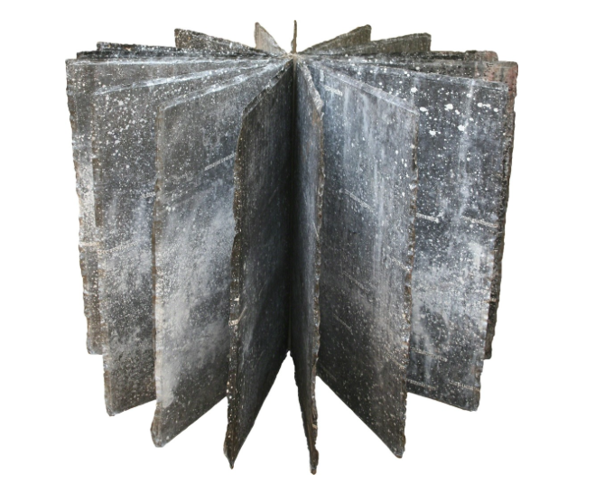 This combination of mediums is not limited to his sculptures, however, he also builds off his paintings, such as Von den Verlorenen gerührt, die der Glaube nicht trug, erwachen die Trommeln im Fluss (The drums in the river came alive, beaten by the lost ones, who were not supported by faith in English) a 14 by 25 foot piece wherein a large section of a concrete staircase is laid across the painting, which is partially covered by sand as well as the paint, sticking out by about three feet. While this may seem incongruous and a combination of mediums and objects that should not be combined, the colors and the use of sand on the canvas itself as well as the precarious and almost delicate placement of the staircase block work to bring the piece together.  This use of multiple mediums and unconventional and nontraditional items in works of art, the pushing of the boundaries of each medium and seeing how they interact and play off each other, really appeals to me as this is definitely what I enjoy doing in my own work and want to explore more (especially using nontraditional components such as organic matter and textiles), but maybe not on such a large scale as Keifer employs.
References/Image credits: https://www.artsy.net/artwork/anselm-kiefer-untitled-secret-life-of-plants-1 https://www.royalacademy.org.uk/exhibition/anselm-kiefer https://www.artgallery.nsw.gov.au/collection/works/59.2006.a-e/ |