|
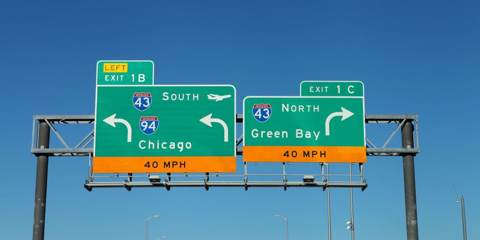
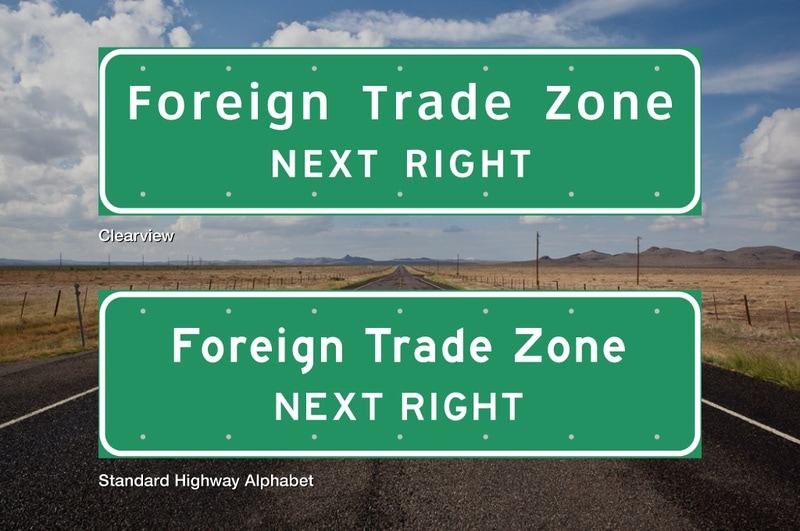
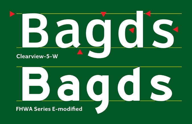
by CeCe Ramey Typefaces are the clothes that our words wear. They are often chosen carefully to apply another layer of meaning to a piece of literature or art, or they are used to add identity to a brand. The word "people" has a different feeling when it is in Comic Sans versus Times New Roman. A funny thing to ask yourself as you walk by store signs is "What does that typeface make me feel?" A great tip is to quickly look and compare lowercase e, a, and g's when you get a chance. Many food companies choose typefaces with very wide smiling e's. But anyways.. To get back on topic and to my point, typefaces easily imbue meaning into words. They set a tone. However, this ability is also distracting under the wrong circumstances. Sometimes you need silence in typeface design, so that the information comes across clear and unadulterated. One instance of this is in road signs. I very much doubt you have ever stopped at an intersection, looked at the road sign above the stop light, and said "Wow, what a pretty typeface!" To be honest, road sign typefaces are the ugliest boring typefaces I have ever seen. And this is why I find them oddly charming and very interesting. There are two typefaces used in the United States, Clearview and Standard Highway Alphabet (aka FHWA, also aka Highway Gothic). FHWA or Highway Gothic is the older typeface developed in the United States during the Second World War. Recently, it has slowly been phased out with Clearview which is easier to read since the letters have more counter space, the space within letters. Notice how the Clearview lowercase e extends further than the Standard Highway Alphabet. The terminals in Clearview also all end with strong horizontal edges unlike the Standard Highway Alphabet (compare the ascender/vertical line of the d's). The x-height, or the height of the lowercase letters, is also larger in Clearview, causing the lowercase letters to be seen from farther away. Small details in typeface design make all the difference. To make a typeface "silent" is not to make it indistinct, it is still important that each letter of a typeface clearly legible from another. Every typeface chosen for a text, book, paper, sign, billboard, or art is chosen for a reason by the maker. Even in our boring road signs. References: http://www.houstonpublicmedia.org/articles/news/2016/03/19/141599/font-on-texas-highway-signs-set-for-another-shift/ https://www.nytimes.com/2016/02/25/opinion/easy-reading-road-signs-head-to-the-offramp.html?_r=0 http://www.popularmechanics.com/technology/infrastructure/a19174/clearview-road-sign-font-phased-out/
Lizzy
4/16/2017 04:17:06 pm
This is so randomly fascinating! I never really think too much about type - especially not like my graphic design friends. But having just moved here from the East coast, I noticed this sense of familiarity driving on the highway. Even though its far more scenic out west with cacti and multiple mountains ranges in the background, I still felt like I was driving to work in North Florida. It finally hit me that the roadsigns are exactly the same! It's the little things in life that I enjoy.. like consistencies that give me a sense of home.
Mario Munguia Jr.
4/17/2017 01:30:15 pm
This is a very interesting study and it definitely highlights the importance of typeface in design. I like your comments about how certain fonts have a tone or voice that can be heard when read, it is very true. I had no idea also the that the subtle changes in your examples could make so much of a difference. Your research really prompts me to wonder about the history of who made the decision for the nation's highway font. I know design is literally everywhere even if we don't see it immediately, there is always an author whether it be nature or people, like Lella and Massimo Vignelli who designed the subway map for New York City. I'm reminded once again how all the elements of design can be organized for effective visual communication.
Monica Wapaha
4/18/2017 09:19:11 am
Driving on the freeway everyday I have never thought about the type faces on the many road signs. It is very interesting that here in the USA we have been using a old typeface from the second war and how it is changing now. I enjoyed your research and will be looking at the road signs a little differently now.
Erin Thomas
4/18/2017 05:01:43 pm
I can completely relate in regards to noticing typefaces...
Esther
4/19/2017 12:10:40 pm
Ok, I never knew I needed to know the typefaces of the signs on the highway, but I did!! I have a weird fascination with the interstate/highway systems and how and why they were created like they were. I feel like the font for some signs on the highway should have flashing lights around them, you know, just for extra precaution. I think that if the signs on the highway were in any font less bold than the current, we'd be in trouble.
Dongpu Ling
4/20/2017 01:13:52 am
You did a very good job on researching rode sign typefaces. I have never thought that before and did know there is font actually designed only for road sign. It must be taken a lot effort from designers. Each space and heights are carefully designed like the picture you showed. I am very impressed. Comments are closed.
|
Categories
All
|


