|
Emily Pritchard When searching for a subject to research for this project I came across the work of Jean Emile Laboureur. What initially intrigued about his work was his proportionate characters and cubist style; which I found odd especially considering most printers at the time didnt seem interested in cubism. The vast majority of his prints consist of thick dark lines, with roughly half of them shaded and half left plain. “Though Laboureur was initially inspired by Lautrec, as well as by the Primitivism of artists such as Paul Gaugin, he is considered to be the first printmaker to be strongly influenced Cubism.” (Jean Emile Laboureur, Date N/A) Jean-Emile Laboureur was born August 16 1877 and died June 16 1943. He is from Nantes France, and throughout much of his youth he struggled in schools trying to pass exams and failed numerous times. Initially he studied in Paris to become a lawyer by his father's will, but did not enjoy it. He then went onward to study at “...Académie Julian. His mentor, industrialist and art collector Lotz-Brissoneau, introduced him to printmaker Auguste Lepère, who taught him wood engraving. In 1897, he published his first woodcut, and later created his first etchings and lithographs, under the guidance of Henri de Toulouse-Lautrec.” (Jean Emile Laboureur, Date N/A) Eventually he leaves for the United States and travels to Philadelphia and Pittsburg. It is there where he first takes part in a gallery with other american artists. While he spends time in the US he travels arounds and continues to make series of prints during his travels. He then travels to greece where he is inspired by the simplicity of classical vase painting. In 1911 he returns to Paris during the start of cubism and was intrigued too by the simpleness of the style, and then later combines that with his inspiration of greek vases to establish his own style. One of my favorite of his prints is Eau Fraiche. This print is mostly linework with no cross hatching or shading and is black and white. The lines are bold with a consistent thickness throughout the image. While the image is primarily flat, toward the top of the background there is forced perspective in the curvature of the tiles, giving the scene just a small touch of depth. The lines flow well together and I find that overall the image is very quaint and elegant. For this particular work, it is an edition of 30. Another print of his that I find interesting is an etching he did of Broadway, New York in 1907. This particular print is from his earlier days of etching, which is prevalent by the more realistic style. From top to bottom, this image is filled with gestural lines and wonderfully crafted perspective. What I find to be really beautiful about this piece is the way the ink fades into the busy background, and yet still hold clarity in the linework of the buildings. This is a wonderful example of his skill as an artist, even in his earlier travels. Overall his interesting style and beautiful linework really brings to life his body of work. His cubist influence help bring about the turn of art in the early 20th century. Works Cited "David Armstrong." The World's Leading Specialists. N.p., n.d. Web. 13 Nov. 2016. "Jean-Emile Laboureur." Fine Art, Decorative Art, and Design. N.p., n.d. Web. 11 Nov. 2016. 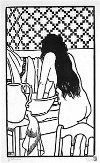 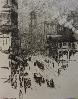 Comments are closed.
|